-
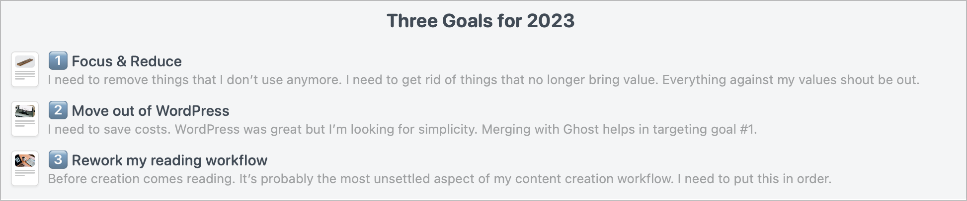
Nothing more to add.Micro.blog things I like:
- No ads
- No likes
- No brands
- No metrics
- No algorithms
- No influencers
- No follower count
- No suggested/sponsored posts
- Reverse chrono social timeline
- Bookshelves feature
- Simple, clean, UI
- Customizability
- Photos feature
- Friendly folks
- Blog hosting
- iPhone app
-
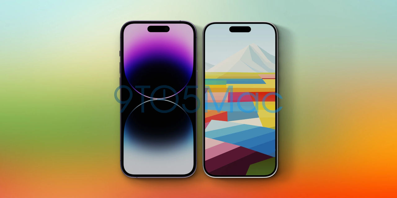
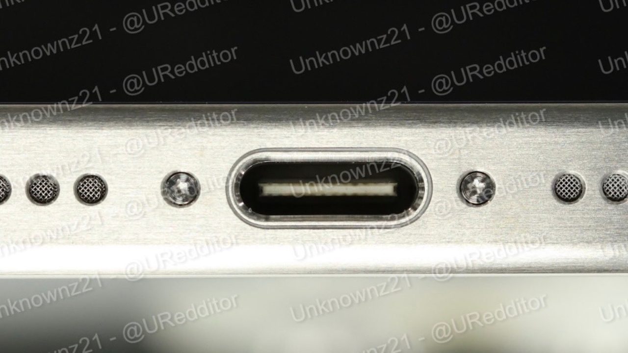
OK, I’m excited. According to recent leaks, the iPhone 15 Pro could be ultra interesting (puns intended). I’m ok with USB-C; the time has come for standardization. The thing that gets me excited is the softer, slightly rounder hedges. I like the iPhone 13 Pro and iPhone 14 Pro flat edges, but they are too rough for my taste. So flat edges with a softer corner radius will be a welcomed tweak.
Next, still about the edge, is the titanium brushed finish, similar to the titanium Apple Watch finish. I Digg this choice if that’s the case. I don’t like the Pro line’s current flashy chrome finish.
This leak of the possible iPhone 15 Pro also reminds me of the iPhone 4, which was a great design, BTW.
Oh, and the black bezels are becoming even thinner, which is also cool. Sure, some Android phones go way further than that, but on the iPhone, it’s a mandatory evolution, in my opinion.
For someone like me who takes his iPhone as a camera, these design changes could make a real difference in holding the iPhone like a camera. I’m really looking forward to this iPhone.
-
Mailbrew still works but sadly feels increasingly abandoned by its founders fooling around with TypeFully, a writing tool for Twitter. Now Twitter is dead. TypeFully too. And Mailbrew is dying too. How sad this story is.

-
👨🏻💻I’ve spent quite some time recently on Inoreader, and I must say that I like it a lot. I’m on their generous three-month subscription. I can test everything without worrying too much about hitting the paywall. I must say that I’m more of an RSS-type-of-guy which fits Inoreader’s mission perfectly. I’m seeing fewer and fewer reasons to consider Matter or Readwise’s Reader… who knew.
-
🤔👀👇🏻
Apple is exploring a stand-alone device that combines an iPad with a speaker hub. The idea is to offer something that users can place on a kitchen counter, in the living room or on their nightstand. But Apple also has worked on an iPad docking accessory that it could sell separately and would accomplish much of the same thing. Source: Apple Working on Whole New Way to Use iPad at Home - MacRumors
Nearly every day, I use my iPad in the kitchen while preparing food to listen to the news or to YouTube videos. I can imagine the iPad UI to be something like CarPlay UI (or HomeKit UI?) with tiles where I could see a video source, some HomeKit controls, the weather, etc.
-
The rumoured launch of a 15-inch MacBook Air this early Spring brings me joy and excitement. As an M1-MacBook Air owner, I understand the actual value of a lightweight and mighty Mac. I’m not looking for a much more powerful machine, but a bigger screen in a still-light package is something that I’m looking for. One of the reasons, you might be surprised, is the notch presence which removes some real space in the menubar to display menubar icons. Even with Bartender, a bigger screen could help reduce competition for the menubar on the left portion of the screen. That’s a small detail but an important one for me. I still have over a year of active Apple Care coverage, which should help resell my Mac.
Now, about the possible pricing. After spending some time on the Apple website looking at the current MacBook Air and MacBook Pro offerings, I expect the new 15-inch MacBook Air to be priced at around $1499..$1699 for an 8 GB of RAM, 8 cores CPU, 10 cores GPU and 256 GB SSD. So the starting price would represent a $300-$500 difference.
I wouldn’t be surprised to see the 13-inch MacBook Pro to be dropped from the product line too.
Spring can’t come soon enough.
-
Are there any Inoreader subscribers here? How do you take advantage of the service’s features? Do you use the Broadcast feature? How about tags and annotation features?
-
Eternally Unsatisfied With My Reading Apps
I’ve been a News Explorer RSS reader user for a long time. It’s a less-known RSS reader compared to Reeder or anything else. It’s really good, but missing a few things that keep bugging me. There is no web version, no filtering feature, and no text highlighting either.
I started testing Inoreader yesterday and Feedbin. Both seem good RSS readers, but none of them is satisfying. In fact, I’m never satisfied with anything when it comes to RSS readers and reading applications or services in general. It’s been going on forever.
Continue reading → -
I thought I was done with the “macOS user interface isn’t touch-friendly” debate but tonight, I’m reading this piece from Jack Wellborn (emphasis is mine):
The Mac was also built for a mouse, and while I would argue macOS is more usable than Windows, there is no getting around the fact that controls optimized for pointers are inherently unfriendly to touch input. It’s foolishly optimistic to think that Microsoft or even Apple can make pointer interfaces as touch friendly as iPadOS without also destroying the very thing that makes them more productive than iPadOS — information density. Smaller controls means these platforms can disclose more information and interactivity to their users at once. That’s why a bunch of windows on even a 11″ MacBook Air feels natural while only four windows on a “large” 13″ iPad feels ungainly. Source: Touchability, Productivity, and Portability — Pick Two – Worms and Viruses
And
Conversely, it’s impossible to make iPadOS more information dense without sacrificing the very thing that makes it the best tablet OS — touch friendliness. iPad users want more information on screen because that will help them be more productive, but the only way to present more information in iPadOS without sacrificing touch friendliness is a larger display. Not only is a larger display not portable, iPadOS’s support for larger displays still sucks. There’s nothing Apple can do about large displays not being portable, but better support for larger displays? That’s a problem Apple can solve.
I don’t agree with the author’s suggestions at the end, but it shows that the debate about macOS being touch-friendly or not is still raging and far from being settled.
-
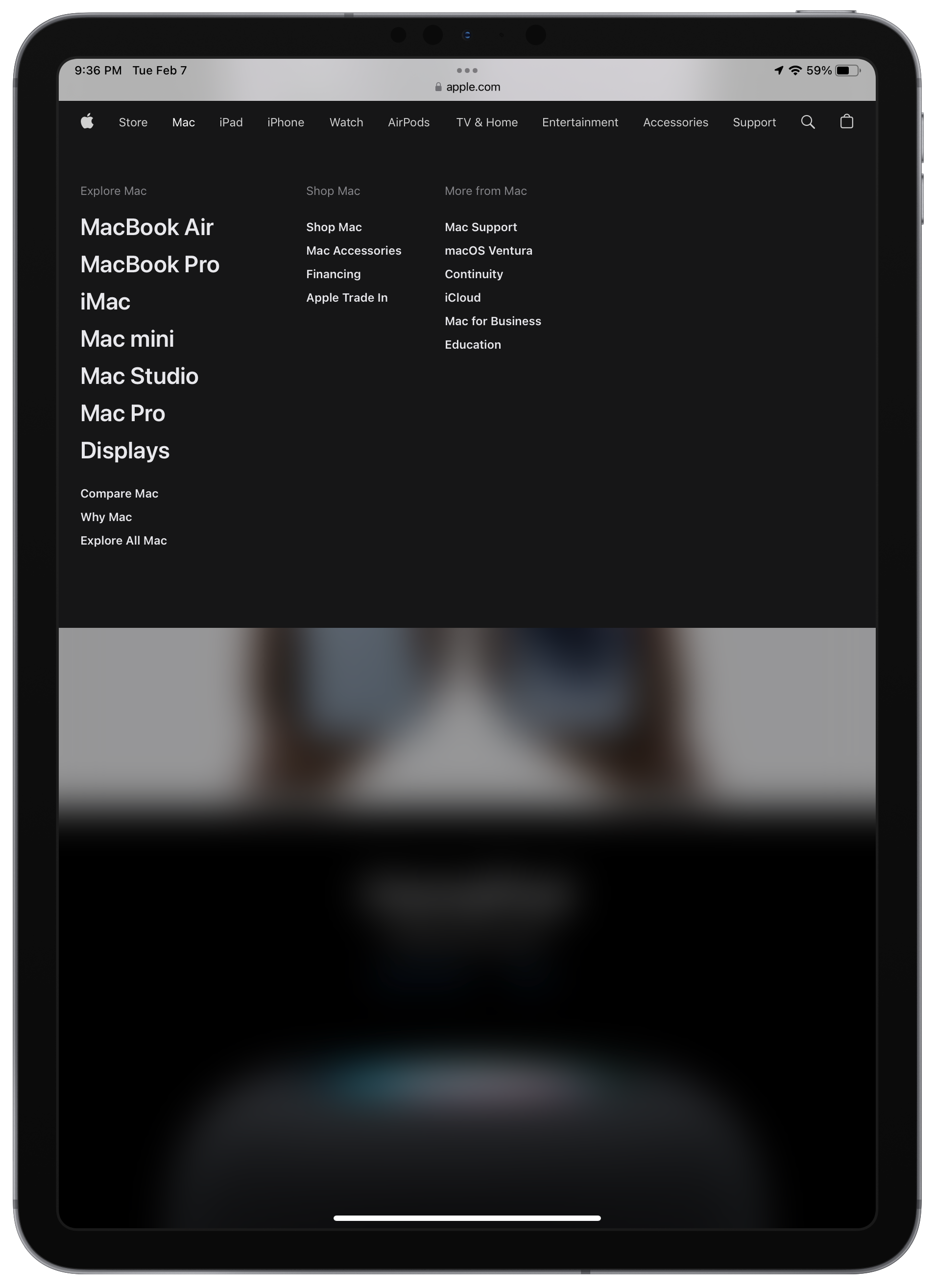
I digg the updated design of Apple.com. The drop-down menus remind me of the Mac in its early days.
-
Dear Apple, I’m done. It took me a long time, but I get it. Today, I turned off Stage Manager on my iPad. I tried with all my heart. I tried. But, even at iPadOS 16.3, after betas and final releases, six months later, I tired of fighting. Stage Manager is a mess on the iPad. In fact, Stage Manager breaks the iPad experience. Plain and simple. What is a nice improvement on the Mac, is a disastrous UX on the iPad form factor. Apple, go back to the drawing board, let me know when you’re done. Thanks.
-
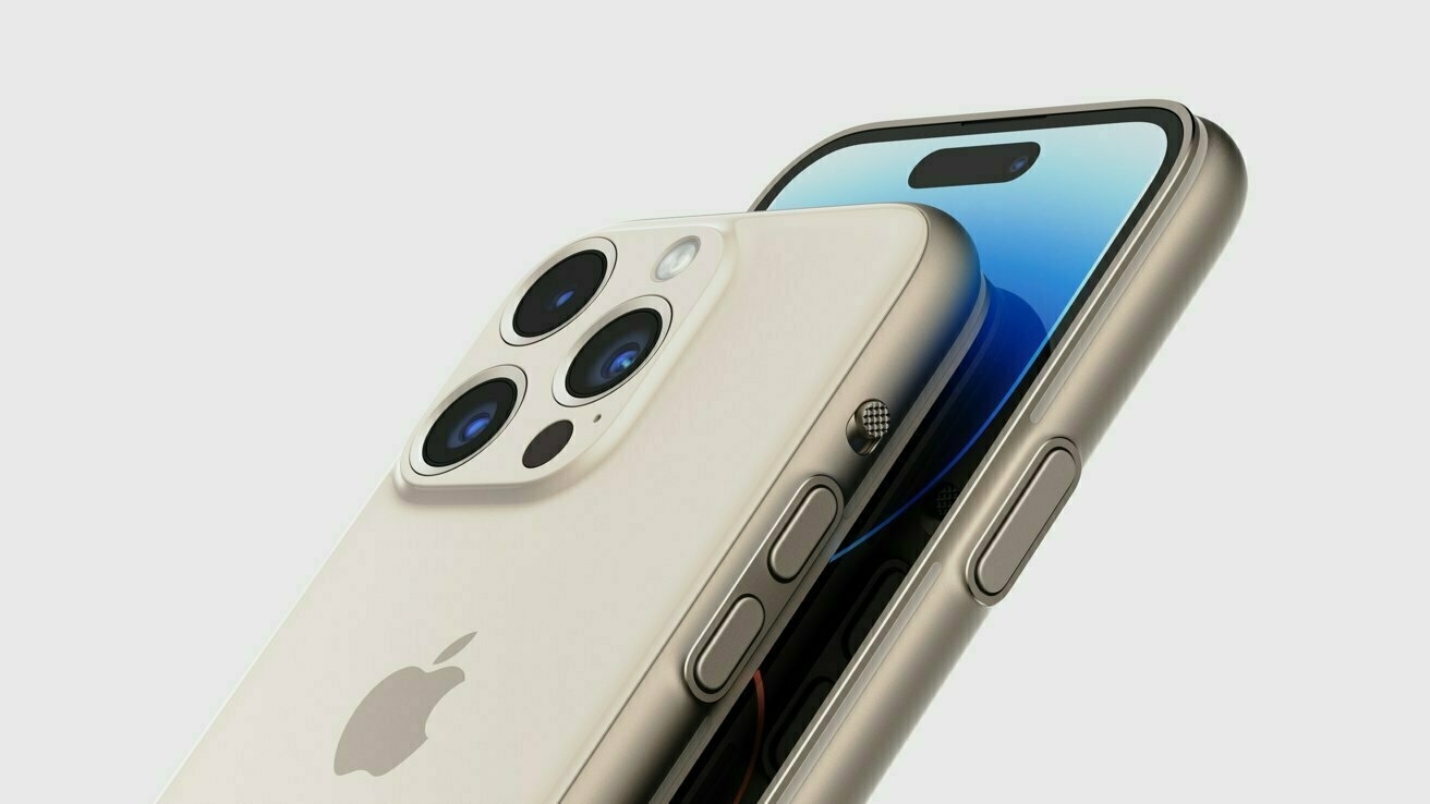
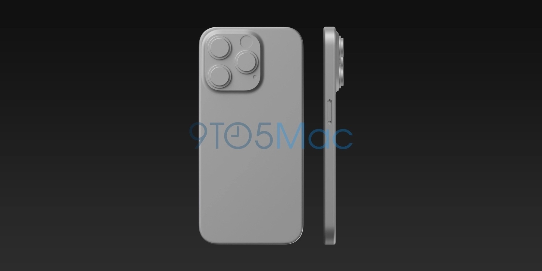
No. Great mockup design but no, I don’t want to get an Apple Watch Ultra in the form of an iPhone. First, I prefer flat edges over rounded ones. They make the iPhone easier to grab from a table and hold for taking pictures. Second, I want the rumoured rounded glass surface on the screen edges which would make the phone a little bit more organic.
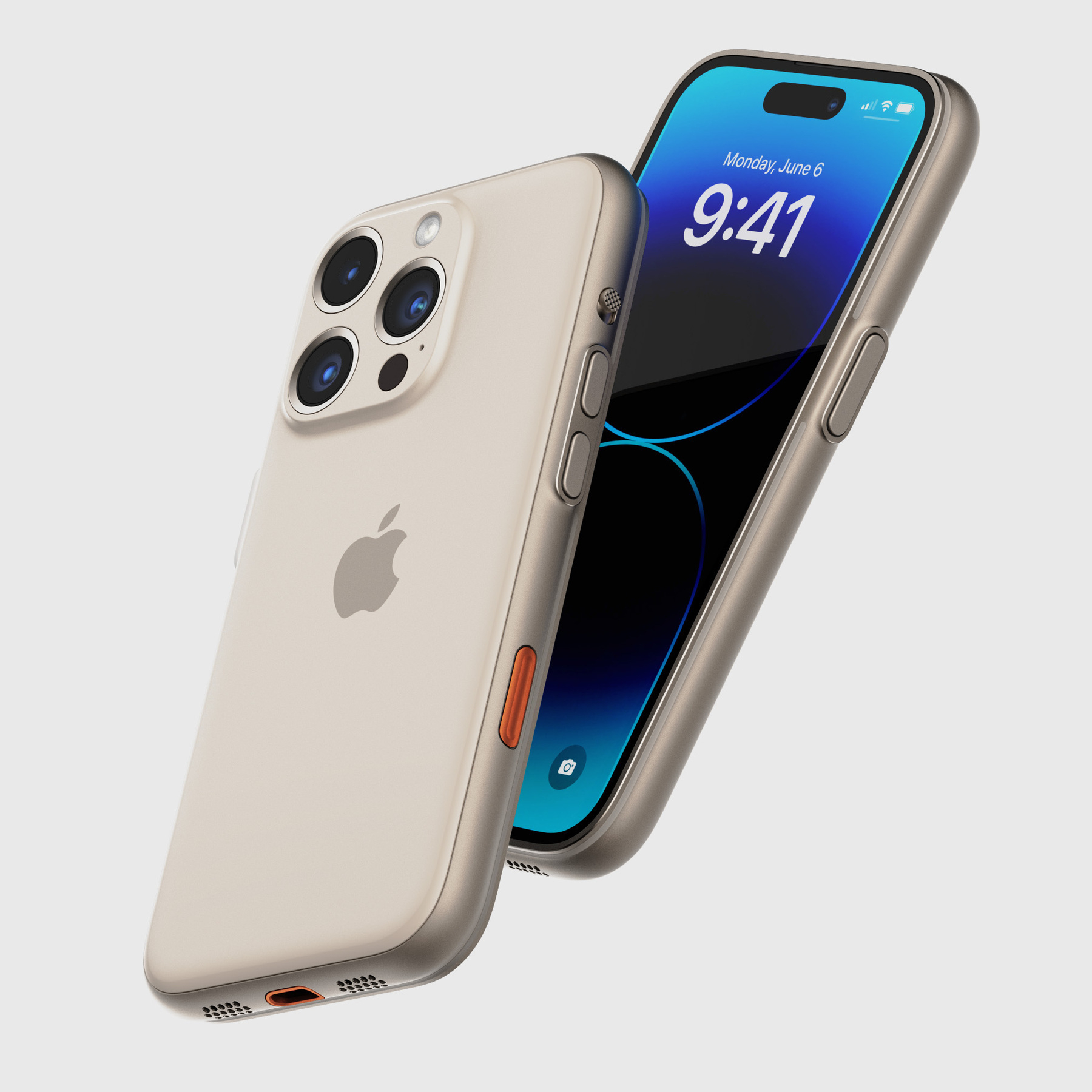
What I would LOVE ❤️ to get though is a dedicated multipurpose button, like on the Ultra. Yet, the probability that Apple add another button is low in my opinion. They would rather prefer to get rid of all physical buttons if they could without compromising usability (which I don’t see how this could be done). A less prominent camera assembly would be welcomed too, even if this means a thicker device (and bigger battery along the way).
-
TechCrunch interview with Apple’s exec Millet:
One rationale for shipping M2 is also that Apple wanted to establish the line in a regular cadence. It was important, Millet says, to make sure people didn’t see the M1 as a “one and done.” Source: Apple execs on M2 chips, winning gamers and when to buy a Mac • TechCrunch
The Mac has never been this thriving, thanks to Apple Silicon. Specs bumps and general redesign when needed are moving the Mac forward. Next stop: Macs with touch screen with an Apple twist.
-
Matt makes a compelling case for the feasibility of touch-based macOS:
I think Apple should add touch to Macs, and I think that this will allow them to not only make current form factors better, but it will allow them to create Macs that are more flexible, more powerful, and more accessible than any Macs before them.
That said, there are people in the Mac community who disagree with me here, and their number one concern is that macOS has a UI that is simply unusable with touch. It’s the ace-in-the-hole argument, and it’s honestly something I haven’t pushed back on because it feels true.
Yeah, I’m one of them. 🫣
There’s a narrative out there that touch is just so incompatible with macOS and that in order to make it work, the macOS UI would have to get blown up to comical proportions, but I don’t think that’s the case. Changes will be made, but I think macOS is more touch-friendly today than many people give it credit for. Source: macOS Isn’t as Small As You Think
I’m happy to report that I’m convinced that macOS is closer to being touch-friendly than I originally thought. Matt spent the required time to demonstrate that 90% of the job was already done. I’m happy to change my mind on this. Would I jump to use a touchscreen Mac? I hate fingerprints on any screen except on the iPad. 🫳🏻😵💫
No more questions, your honour.
-
No Olympic Games for Russians — Here's Why
Should Russians be allowed to participate in the Olympic Games in Paris, France, next year? The question is out, and the debate is already raging. For me, the answer is simple and unequivocal: no. My reasons are multiple. Here are a few of them.
First of all, we cannot pretend that Olympic Games are apolitical. Participation or non-participation in games can also have a political character. History has shown it on several occasions. In addition, the symbolism behind the Olympic Games and sports, in general, is not compatible with the behaviour of Russia internationally. The Russians are doing anything but show fraternity towards other countries like Ukraine.
Continue reading → -
Microsoft Authenticator for Apple Watch to be retired:
The Microsoft Authenticator app for Apple Watch joins a long list of third-party watchOS apps that have been discontinued over the last few years, either because of perceived redundancy or lack of user uptake. Other notable Apple Watch apps that have been discontinued include Twitter, Instagram, Target, Trello, Slack, Hulu, and Uber. Source: Microsoft Authenticator Discontinues Apple Watch App - MacRumors
There is a clear trend.
-
I really hope we get iPadOS 16.4 beta this week because right now, I never experienced so many weird behaviours on my iPad since iPadOS 16. Stage Manager is one problem, weird keyboard placement is another, rotation bugs, etc.
-
Continuing with this usability musing on possible touch-based MacBook, Jack Wellborn writes in response to an article by Federico Viticci:
The Mac was also built for a mouse, and while I would argue macOS is more usable than Windows, there is no getting around the fact that controls optimized for pointers are inherently unfriendly to touch input. It’s foolishly optimistic to think that Microsoft or even Apple can make pointer interfaces as touch friendly as iPadOS without also destroying the very thing that makes them more productive than iPadOS — information density. Smaller controls means these platforms can disclose more information and interactivity to their users at once. That’s why a bunch of windows on even a 11″ MacBook Air feels natural while only four windows on a “large” 13″ iPad feels ungainly.
Conversely, it’s impossible to make iPadOS more information dense without sacrificing the very thing that makes it the best tablet OS — touch friendliness. iPad users want more information on screen because that will help them be more productive, but the only way to present more information in iPadOS without sacrificing touch friendliness is a larger display. Not only is a larger display not portable, iPadOS’s support for larger displays still sucks. There’s nothing Apple can do about large displays not being portable, but better support for larger displays? That’s a problem Apple can solve. Source: Touchability, Productivity, and Portability — Pick Two – Worms and Viruses
I couldn’t put my finger on it (pun intended), but this article brings up an interesting point that might explain something I couldn’t do myself: The size of controls in a user interface largely dictates information density. Many longtime Mac users decry the iPadification of its UI. I’m not one of them but I value information density a lot.