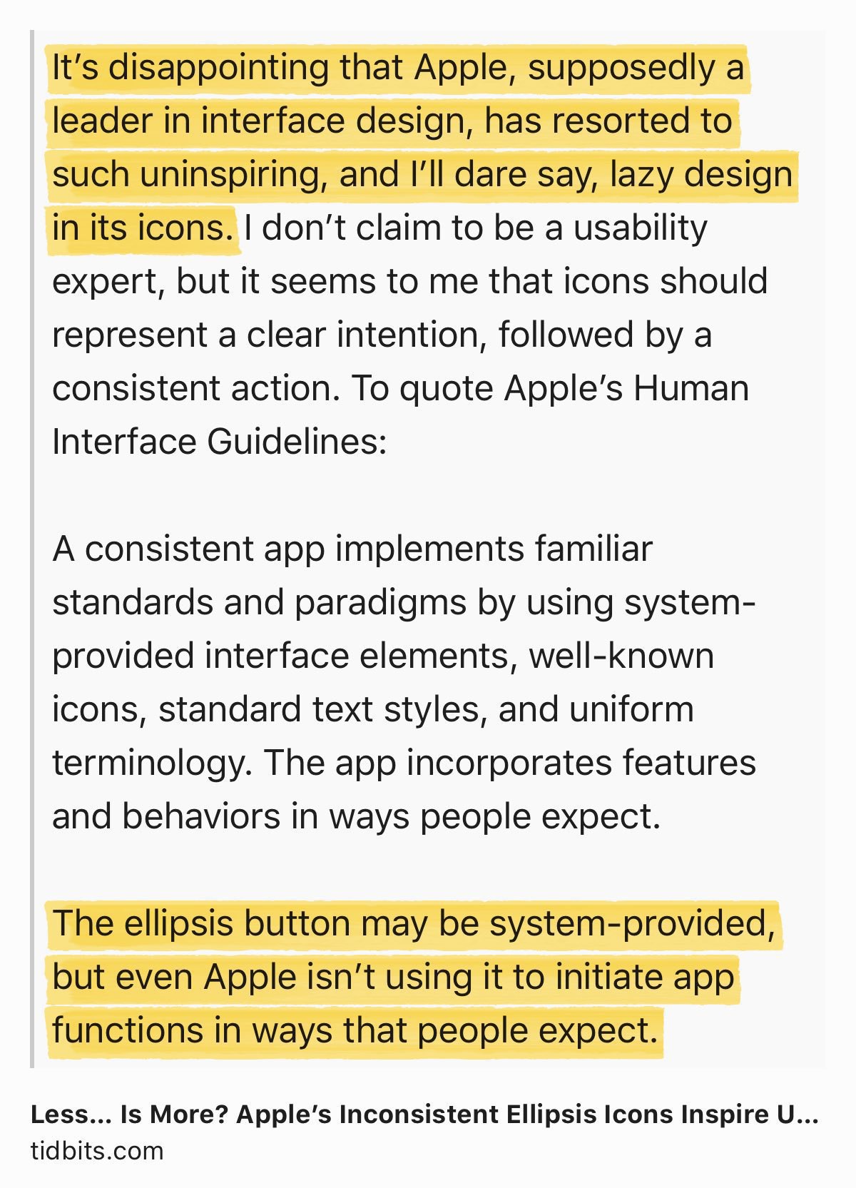
On iOS 13’s Share Sheet Design - Better? Worst?

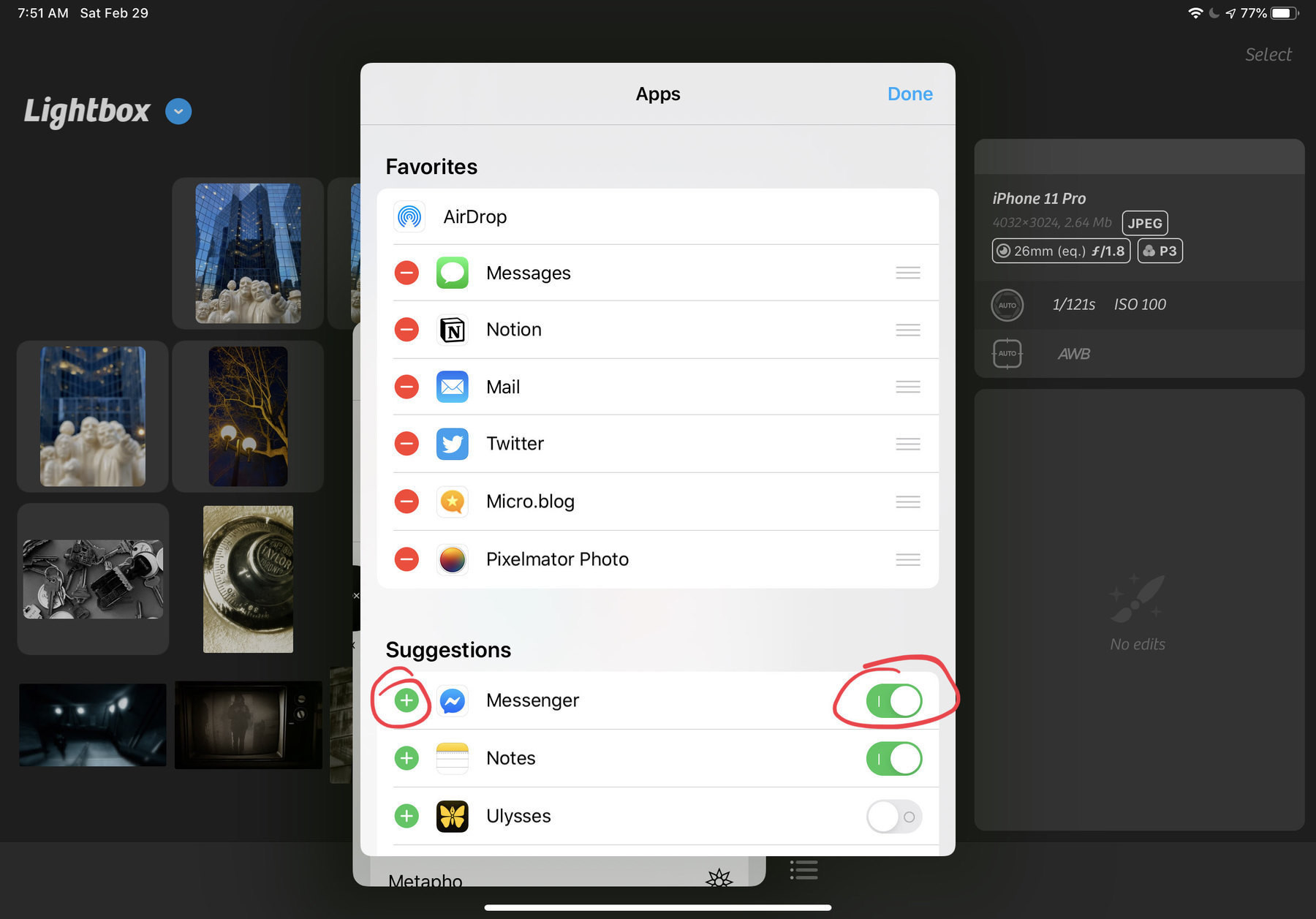
The share sheet design in iOS 13: I find it confusing. 🤷🏻‍♂️ It is a step ahead of iOS 12 but yet I’m not satisfied and I don’t know why exactly. The inclusion of Shortcuts is ok but should they have been put in a separate section? Also missing in iOS 13: a way to maximize/minimize popover windows like this one. I understand the need to keep sight of context of invocation. Your take?
Well, yes, thank you to all developers

I was an indie developer from 2009 to 2013. I made three apps that got me about $5000 in revenue. I don’t know how much per hour this represents. I loved this time of my life where after a long work day I would sit in front of my Mac to learn Obj-C, Interface Builder, etc. until later in the night. Now, I can really appreciate what it is like to build apps and let the world know about them. Expressing Gratitude to Developers

If Apple decides to postpone WWDC2020 (because of COVID19], it could mean, for the first time in a while, Apple will ship new features at the same time of their announcement this fall. Just sayin. #apple #iosdev #WWDC #WWDC2020