As reported by 9to5Mac:
“Apple will be leaning into the vertical stack of Apple TV in Apple TV on Apple TV”
All bets are on the table.
As reported by 9to5Mac:
“Apple will be leaning into the vertical stack of Apple TV in Apple TV on Apple TV”
All bets are on the table.
It’s sad to see Micro Social being abandoned. Are there other ways? Why not make the source code open source? Or sell it? Can someone take over the development?
As reported by 9to5Mac, AltStore is to support Fediverse with its own Mastodon instance:
AltStore is embracing ActivityPub and the fediverse, with its own Mastodon server, allowing developers and users to have a more direct channel of communication and interaction.
This is, among other things, what we are missing with Apple’s tight control on its App Store.
For a few reasons, I’m tempted to subscribe to… The Verge. This would be the first such case of subscribing to a news site. I kind of like the site design and content; there is a community vibe if commenters are any indication. However, even as a subscriber, I may still receive ads served to me. 😑 Anyone subscribing to The Verge here? Thoughts?
OpenAI unveiled some impressive developments today at their developer conference, including apps in ChatGPT and Agent Builder. I’m much more impressed by this than by Sora. 👀
Weirdly, Apple Music Replay are web-only…. even when using music.apple.com, Replay is located on a separate website.
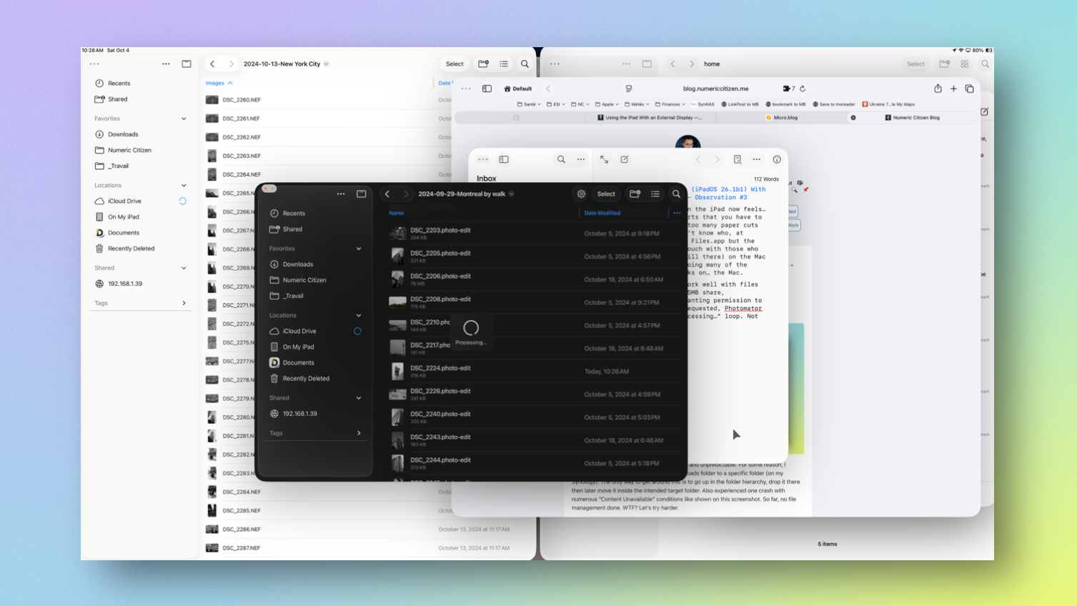
Doing serious work on the iPad now feels… exhausting. The efforts that you have to deploy to avoid the too many paper cuts is exhausting. I don’t know who, at Apple, is working on Files.app but the team should get in touch with those who work (if they are still there) on the Mac Finder. I ended up doing many of the files management tasks on… the Mac.
Photomator doesn’t work well with files located on a remote SMB share, apparently. After granting permission to the root folder as requested, Photomator is stacked in a “Processing…” loop. Not good.
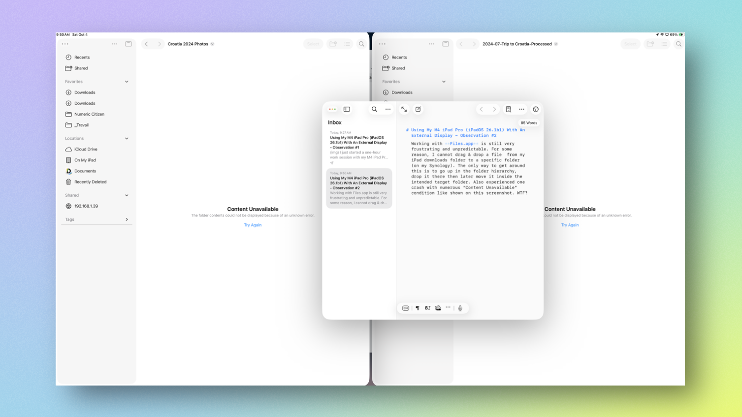
Working with Files.app is still very frustrating and unpredictable. For some reason, I cannot drag & drop a file from my iPad downloads folder to a specific folder (on my Synology). The only way to get around this is to go up in the folder hierarchy, drop it there then later move it inside the intended target folder. Also experienced one crash with numerous “Content Unavailable” conditions like shown on this screenshot. So far, no file management done. WTF? Let’s try harder.
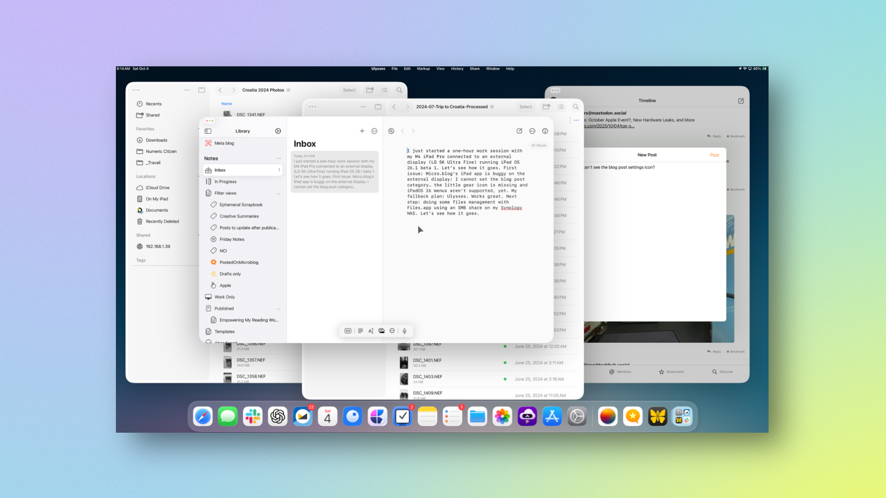
I just started a one-hour work session with my M4 iPad Pro connected to an external display (LG 5K Ultra Fine) running iPad OS 26.1 beta 1. I should probably update this article I wrote more than a year ago: “Using the iPad With an External Display — Space Oddities”. Let’s see how it goes.
First issue: I started writing this blog post in Micro.blog client. Sadly, Micro.blog’s iPad app is buggy with an external display: I cannot set the blog post category… the little gear icon is missing and iPadOS 26 menus aren’t supported, yet. My fallback plan: Ulysses. Works great. Next step: doing some files management with Files.app using an SMB share on my Synology NAS. Let’s see how it goes. Oh, and ShareShot works… but not without strange visual issues.