After 14 major iOS release... and yet...

Everybody is talking about Apple Music new icon since Beta 3 but, think about this: after 14 versions of iOS, and here we are: the “More” “button” lingering bad design. How many times I try to hit this and I bring the detail view of the app instead. Frustrating.

Let me be clear: wrong place, too small, text overlapping, not a real button.

Come on, Apple!

My suggestion: add a “Details” button accessible when sliding the table cell to the left (the same gesture that reveals a Delete button).

On Widgets Management Interfaces on iPhone

Very valid complaint from Dieter Bohn of The Verge on Apple’s implementation of widgets management on iPhone. Two different user interfaces for basically the same objective. I prefer the look of the new design, but I understand the previous one is still there for compability purposes.

iOS 14 Beta 3 brings back the « Edit » button at the (very inconvenient place) bottom of the list. Hitting the button brings you back unexpectedly to the top of the widgets list. Going back down the list and you’ll find a “Customize” button. Really? Also, tapping and holding on old widgets doesn’t invoke edit mode. Not very consistent. I should probably fill a feedback report and send it to Apple.

I do think this is a transitional design. Transitions are rarely pleasant.

twitter.com/backlon/s…

The race for the bottom of everything

On Apple’s 30% cut. Again.

We all know where this all goes. Yesterday it was a deal. Today, 30% is way too much. So, let’s fight and try to force Apple to set the cut to 20%. No, 15%. That is way better, right? A few years down the road, a well known developer comes out and complain about 15% being way too much of a cut. Poor guy. Let’s start a fight and bring that down. Apple respond and set it to 10% because they are forced to. And the story continues.

Let’s face the reality. We don’t like to pay for something. We want it all. We know the price of everything but the value of nothing. How do you think China came to be so powerful? How do you think Amazon or Costco is sucking air from small local businesses in our communities? Why do you think our life is full of shitty ads are everywhere? Why do you think we are the product of Google, Facebook? Because we don’t like to pay for something, anything. We want it all free.

There is a pattern. There is a race for the bottom of everything. And I don’t agree in Brent’s views on what would happen if Apple lowers their demand from developers. I certainly don’t believe developers would lower the price of their apps.

Remember what capitalism is all about?

Change my mind.

inessential.com/2020/07/2…

The iPad still held back with iPadOS 14

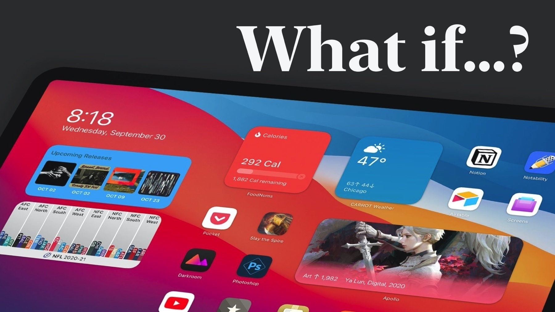
iPadOS 15 concept imagined by Parker Ortolani certainly looks interesting. I’m not sure about some ideas put forward but it certainly shows how the iPad is still held back with iPadOS 14. The lack of flexibility in widgets placement is, put mildly, baffling. I love those widgets on my iPhone but the lack of space forces us to create tons of pages. And the problem will only get worst this fall after developers start adding widget support in their apps. It will be crazy. #iPadOS14 #apple

www.behance.net/gallery/1…

Viticci on iPadOS 14 - when iPadOS is Influenced by macOS #iPadOS14

Good insights by Federico Viticci of MacStories about iPadOS 14. One theme stands out: with iPadOS 14, Apple is no longer taking it’s inspiration from the iPhone but from macOS to push the iPad in its very distinct path.

Exhibit A: the Sidebar in applications like Music, Photos, Files. Exhibit B: the redesigned Search bar.

Still to be improved, though: multitasking. Next year.

www.macstories.net/stories/t…

On Apple's iOS 14, Widgets and Considering Bigger iPhone

One of the unexpected side effect of Apple introducing widgets in iOS 14 is that I’m reconsidering my stance against big iPhone like iPhone 11 Pro Max.. when widgets invade our landscape this fall, we may find the iPhone 11 screen too small for all of them.

If Apple was willing to add the same flexibility to the iPad it would be another matter, though.

« Don’t assume discreet GPU always offer better performance » #apple #applesilicon

I’m one of those who was thinking discreet GPU would provide much better performance. When watching Apple’s transition to Apple Silicon, I asked myself about discreet GPU options in future Macs. This article goes on to report that not only integrated GPU (thanks to SoC) will be faster, it could be easier to support and help Apple reduce costs. Apple never offered discreet GPU in iPad Pro. Why would it be different with Apple Silicon-based Mac? Will future Mac support external GPU? Probably but performance gain will be marginal.

ARM Mac graphics performance could beat discrete GPUs - 9to5Mac

A Visual Comparison of Catalina & Big Sur - Who Wins? #apple #macOS11

Excellent visual comparison between macOS Catalina and Big Sur (see link below). Here are a few observations:

  • Big Sur design is a step back in clrity in many areas. Ex.: Icons and segmented controls in top portion of windows.
  • More padding around items lists. I’m not sure why. I prefer Catalina’s version.
  • Dark Mode is slightly better looking in Big Sur.
  • Battery panel in Settings is horrible.
  • Gone are popup alerts at the top of windows, they now look to be centered within window content and movable. Catalina is better.
  • Menu bar is translucide. Catalina is better too.
  • Safari is much better looking in Big Sur.
  • Notes is much improved in Big Sur.
  • Big Sur icons shapre are much more uniform. Advantage to Big Sur here.
  • Big Sur Side Bars in many apps like Maps is better looking too.

Who wins? Well, the jury is still out.

www.andrewdenty.com/blog/2020…