The return of the Touch ID?

A recent poll ran by 9To5Mac gives surprising results about what people would like to see if Touch Id is to return to the iPhone. Touch ID under the screen wins popular favour… personally, I would prefer Touch ID to go on the power button, just like the iPad Air because it is easily accessible while holding the phone.

Apple in a weakness position…

I keep thinking of this phrase from Phil Schiller who once said:

“whenever we make a change we do it from a position of strength rather than weakness.”.

The window has closed a long time ago for Apple and they find themselves in a weakness position. I thought Mr. Schiller was still partly involved in the App Store related decisions.

Let’s pretend there is side-loading of apps on the iPhone, then what?

InitialCharge:

The only one that stands to lose anything in this scenario is Apple and that’s why they’re doing everything they can to convince us that side-loading is inherently bad. But they’re wrong.Source: Apple’s Head of Privacy Doubles Down on Anti-Sideloading Stance - Initial Charge

I’m a bit late on this one but, let say Apple does go ahead and allow for side loading of apps. Besides the proliferation of App Stores, what will we get in this scenario that we don’t get today? Proponents of applications sideloading are always shy on providing the real long term benefits of such opening. Let me guess: lower prices for apps? Faster install? Better layout App Stores? Apps that use private APIs? What examples of previsouly missed innovations that we get with side-loading? Apps that can trick differently users in thinking they are safe? Or is this choices for the sake of choice?

I’m starting a new trend: open writing.

If you’ve been paying attention in recent months, did you know that you can have a peek at my upcoming blog posts that I’m working on? Thanks to Craft, You can peak at a selection of drafts, ideas, reference lists, etc. I give a name to this: open writing. Think of this as being this observer looking at a painter while he or she is painting a new artwork.👨🏻‍💻

What would be super cool is if someone interacted with this by posting comments… which is something Craft makes possible.

On Apple’s Hybrid work model — Apple’s employees to become targets?

Dave Mark for LoopInsight:

Did the pandemic make a foundational change to the way we think about where we do our jobs? Or was this a blip, with a slow slide back to the old ways?

I certainly hope that we won’t return massively to the old days. For Apple, it looks like the pandemic was a blip and employees will need to be back at the office at least three days a week. It’s a corporate culture thing, which doesn’t get amended easily. Now, for employees not wanted to return to the previous model, even partially, they could become poaching targets by other companies where remote work is fundamental to them. This is where Apple could have to open up more.

What if nobody really knows what is going on? (#google #privacy #surveillance)

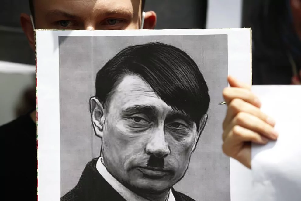
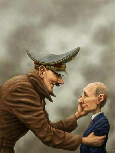
What if nobody at Google knows exactly what their data hungry engine is all about? I mean, what if nobody has a global picture, so nobody can say “oh my god, it’s terrible, we must stop it!”. This makes me think of the nazis in second world war: very few had a global picture of what was really going on. It was devised this way so it was easier to “manage” and keep the machine humming.

Another coat of paint to Windows UI mess? (#windows11)

So Windows 11 is a thing. Is it a revolution to Windows? Maybe, maybe not. It depends if you can install it on your PC, which is far from certain. But let’s say you can, how deep goes the UI refresh? Is it like it was for Windows 10 which was supposedly a redesign of Windows 8 which was tweaks to Windows 7 UI that came before it. Here is a simple question: Did Microsoft really clean up the Windows UI mess that it has become over the years? I don’t care too much about windows transparency level, toolbars, icons. Getting rid of UI legacy feels a more useful and laudable endeavour.

On design trends — sadness

While reading a recent article from Basic Apple Guy about News+, there is this illustration that shows how far Apple News icon has come since its beginnings. I have included the illustration here. It shows how bad design has become in the last five to ten years. That is really depressing to see. As much as things like AR and LiDAR technology help bring real world and virtual world closer together, UI design seems to go the opposite direction. Why is that? When will that trend stop and maybe revert a bit? Why can’t we get visually joyful icons anymore? Is it a matter of design costs being too high?