Apple’s iWork (Pages, Numbers, Keynote) is still not updated for Liquid Glass. Mmmmm. 👀
Yes, Om, I should go out and get some air, indeed. I might visit an Apple Store this weekend to take a closer look at the iPhone Air, even though I’m not upgrading or replacing my current iPhone. Comments are generally positive.
There is no clipboard manager on my office PeeCee… at least, nothing that I could install anyway if such a thing exists on Windozzzz. 😒
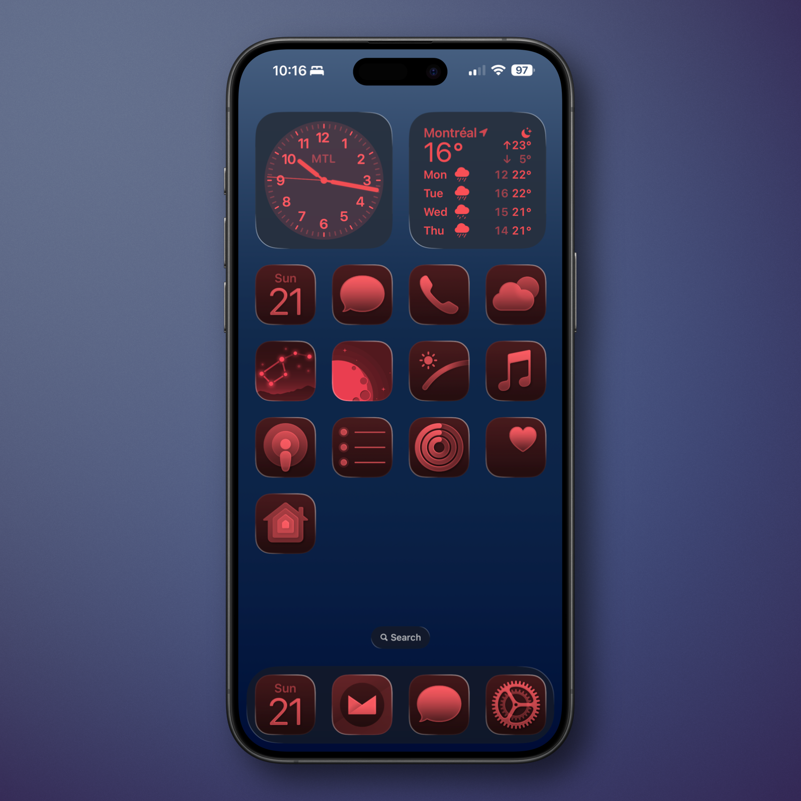
I like this iOS 26 Home Screen customization options for my iPhone when going to bed.
Flighty is increasing by 33% their yearly subscription fees. This is… massive. I recognize the constant improvements to this app but boy, that makes me pause and reconsider.
I have to say that this year’s Apple OS releases are the most unfinished, unpolished, uneven and buggy .0 releases in a long, long time. It’s the only unifying thing across the board, not Liquid Glass. It will take many more releases for Apple to bring some order to this mess. Every day, I discover a new issue.
Watch out, Synology, you’ve got some serious competition. I like what Ubiquity is doing these days, not only in the networking equipment space but in other devices, too. Who knows, I might replace my Synology NAS with one of these.
While read later services are enticing and convenient, I often forget about the saved content and the service itself. 🤷🏻♂️
Just tried Apple Live Translation with my wife. She was purposely talking in English while I was speaking French with my AirPods Pro 2. This is so seemless, powerful and cool.
I’ve been installing and applying app updates en masse for a few days. There is a clear trend. Big corporations like Medium, OpenAI, LinkedIn, Reddit, etc. release notes that are like “We’ve been hard at work updating our app so you get a better experience, blah blah blah”. At the same time, indie devs will write, “We’re happy to introduce support for Apple’s latest innovations like Liquid Glass, transparent widgets and on-device Apple Fondational Model for a richer experience.” See the difference?