Wondering if Digg could be a place for blogging beyond doing link posts… 🤔
I’m really liking my experience with Realmac Software’s Elements to build my new landing page. I’m not an expert at website design but with Elements, I feel empowered. The learning curve is not the easiest one but following all the videos they publish on their YouTube channel plus visiting their forum helps a lot.
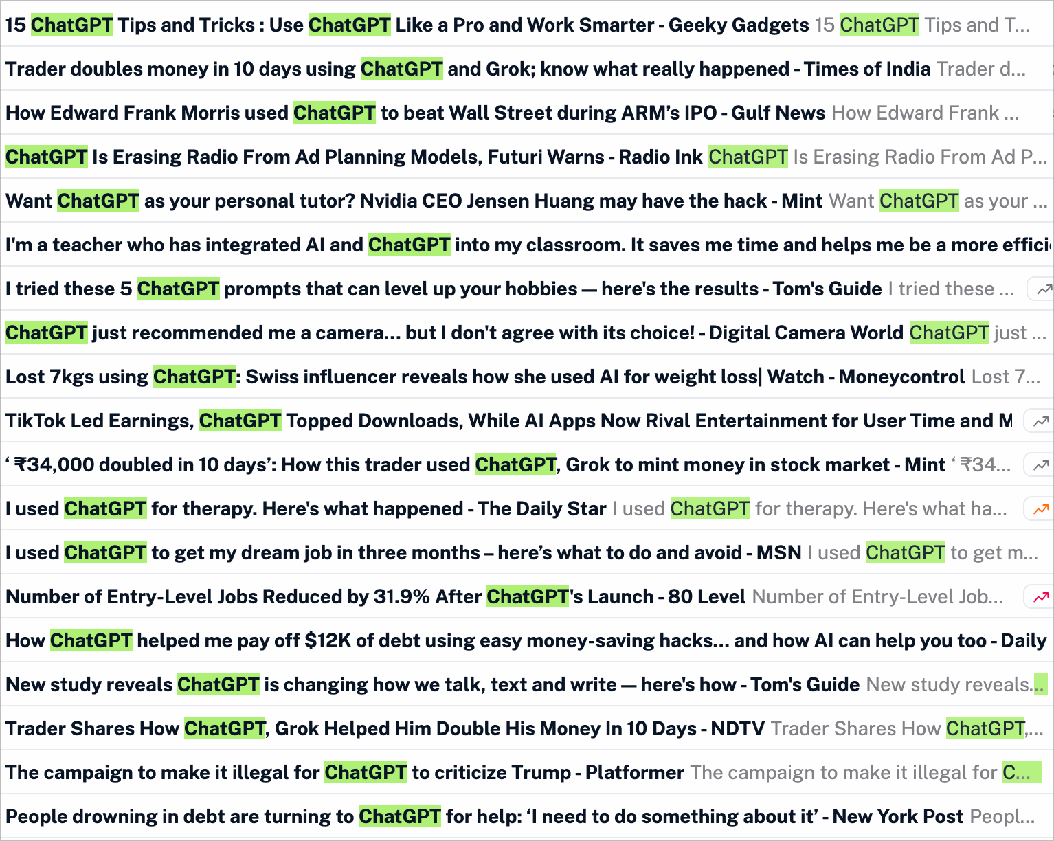
How depressing this is. These are filtered Google News results with the keyword “ChatGPT”. Look at some headlines… Now, consider this quote.
“AI will not replace humans, but those who use AI will replace those who don’t.” – Ginni Rometty
Bye Bye Grammarly?
I received a reminder this morning about my upcoming Grammarly renewal. After reviewing past invoices, I decided to cancel my subscription on a whim. It’s an expensive service. As I’m planning some changes on other areas of my digital presence, I’ll reallocate the money to that instead.
For the next new weeks, my subscription ends on August 14th, I’ll be turning off Grammarly and see how things goes. I might use AI service from Raycast, ChatGPT or even Apple Intelligence Writing Tools to compensate. I do use the free version of LanguageTool, too. I’ll report my conclusions in due time.
The upcoming CMS feature in Realmac Software Elements is sooooo cool, flexible and powerful. Even RSS feeds are supported! You can see that in action in their latest Dev Diary video.
One simple thing that is missing from iPadOS 26: CMD-Q to quit an application. Other things that need work: the CMD-TAB switcher is not glassified and lacks contrats with the background view. Same comment goes for the Spotlight search field which can be really hard to see. Oh and here’s the thing: if you happen to work both on the Mac and an iPad: you kind expect that both platforms behave the same way. As an example, I want Spotlight on iPad to be the same as on the Mac by offering the four search modes.
On iPadOS 26, you can resize the Settings windows as you like. I wish we could do the same on the Mac!
Well, using iPadOS 26 beta3, it seems that I can’t use my iPad in «clamshell» mode while hooked to an external display… really?
Currently starting my week-end long experiment with an 2024 M4 iPad Pro running iPadOS 26 with an external display. This feels so different and yet familiar to the… Mac? The iPad? I’m not sure, just yet. Expect more posts in the coming days.
I often repeat this thought in my head when I’m in challenging times: “everything around me has been done by people not smarter than me.”. It’s inspired by Steve Jobs’ words from an interview he did in the early 1990s, where he was reflecting on how empowering it is to realize that the world is built by people just like us — and that we can reshape it too.