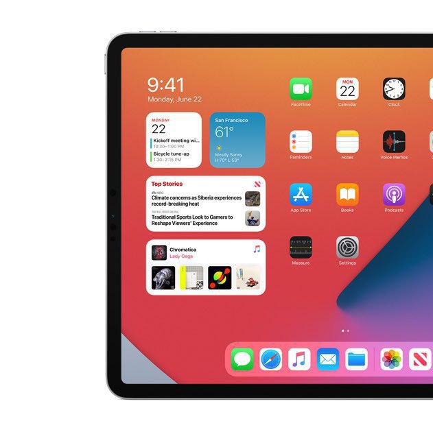
ok, the widgets experience on the iPad is crippled, so what?

When iPadOS 14 beta came out, we were all quick to notice how crippled the widgets experience was compared to iOS 14. So we got frustrated. I’m still unable to get over it. Apple is holding back the iPad. Again.

In the last few days, I tried to understand the possible reasons behind this. To my surprise, it’s not easy and there could be many explanations to why the iPad widgets experience is limited to the Today view. More to come in a blog post this week.

Meanwhile, you are more than welcome to share your thoughts! I’m curious.

A message to attention seekers

Here is something for attention seekers: GTFU. I don’t understand. What do you expect from me by liking 10 photos in a row on my 500px profile page. The same goes for this case (see screen shot) of someone clapping for all my stories on my Medium page. Do you have something to sell? Probably, but I don’t care. You are making noise all around the web, just because you seek my attention.

Software has never been more powerful. The web is a big tracking machine, yet websites can’t figure out a way to recognize such behaviors in order to stop them. Baffling.

On increasing COVID-19 cases...

Quick question: when you say “oh my, COVID-19 cases are on the rise!” and you get the following response “well, sure, they do more testing!!”. Is this a valid response? If not, what is the counter argument?

I have the feeling there is something wrong with this statement but I cannot put the finger on it. Ideas?

I'm never satisfied. Why?

Are you like me and never satisfied with your Apple Watch face arrangement? Why is it so? Why is it so hard to come up with a watch face configuration that totally fit my needs and my taste? iOS 14 helped me solve part of my problem, but it isn’t enough. watchOS doesn’t help either as it allows for even more flexibility. A third-party application named “Buddywatch” is super cool, yet doesn’t fix the problem.

Now, thanks to widgets support in iOS 14, I’m even less satisfied with my iPhone home screen arrangement. I think it’s worse than on my Apple Watch. Widgets, when I find one that is perfectly designed and really useful, lack some flexibility. I never had so much different pages on my home screen. What the hell is happening? Technology should remove the burden on us, not the opposite.

On Developer’s Questionable Choices with iOS 14 Widgets Design

There is something fundamentally wrong with the way iOS 14 widgets are being implemented by many developers. Here is a simple example. The popular Reddit client, Apollo, introduced widgets support, see the following picture. Now, how can a widget with two posts can be useful if you are following many subreddits with dozens of new posts each day? What is the point in doing that?