Numeric Citizen Blog
The Helper
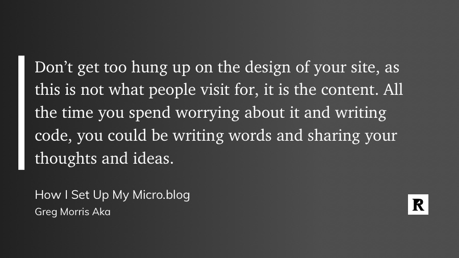
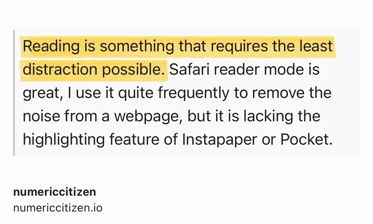
This morning, after reading and asking Kagi Summarizer for a summary of this article, I wanted to write a response and attempted to craft a counterargument, first using Kagi Summarizer, then using Claude AI. I reviewed numerous versions but remained unsatisfied with the results. After reviewing my options, I ultimately decided to create this version, entirely my own. I still have a feeling that AI helped forge my thoughts.
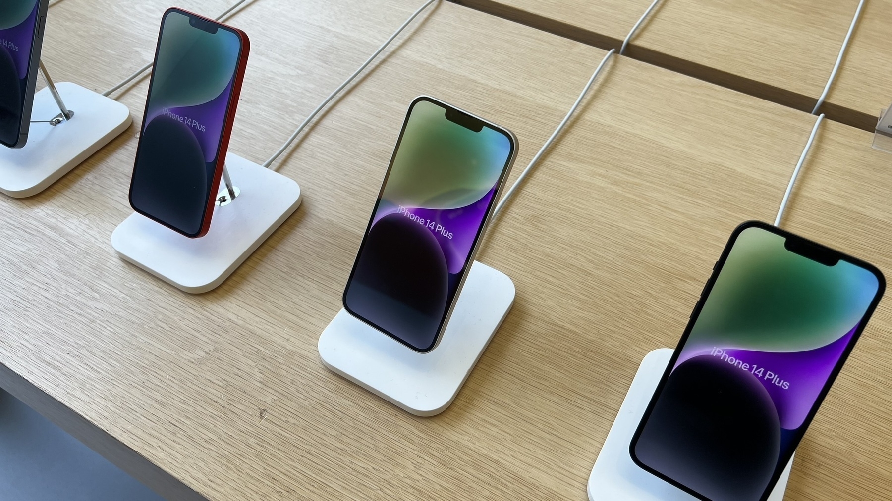
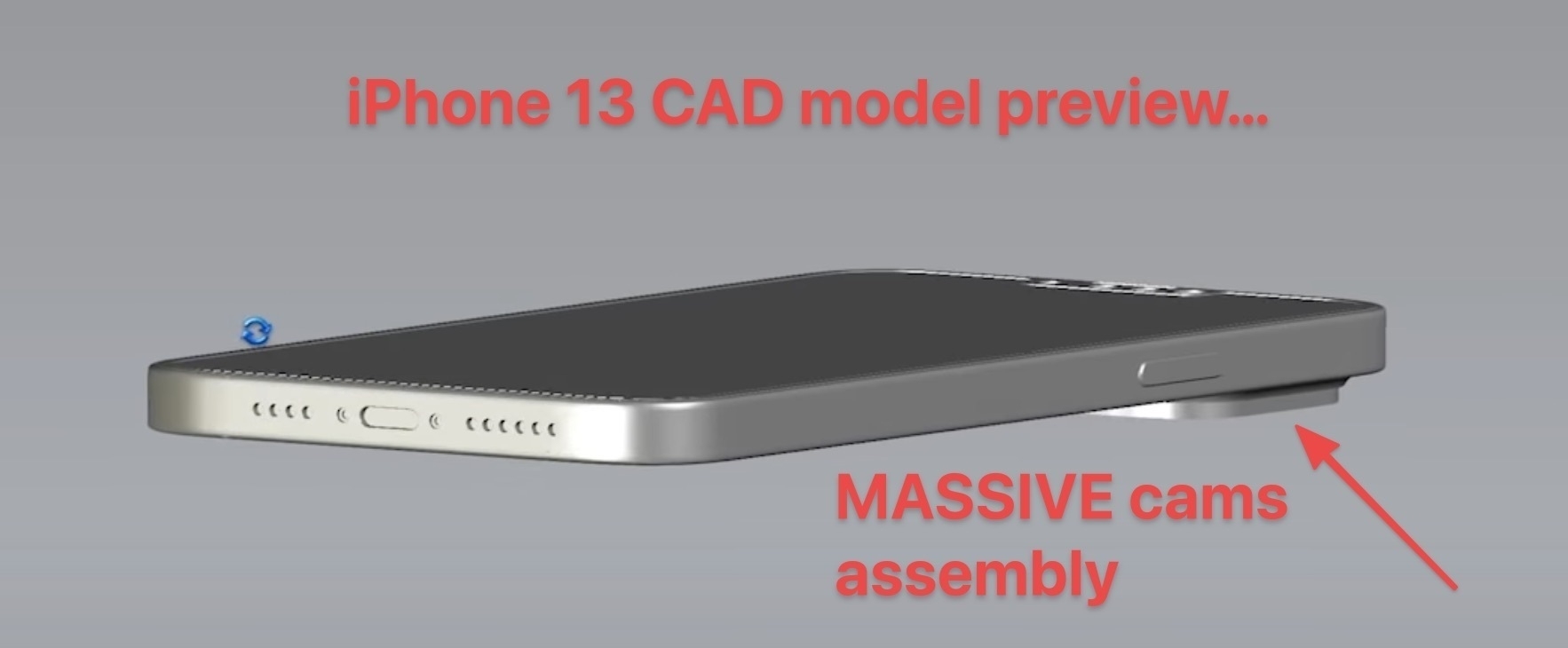
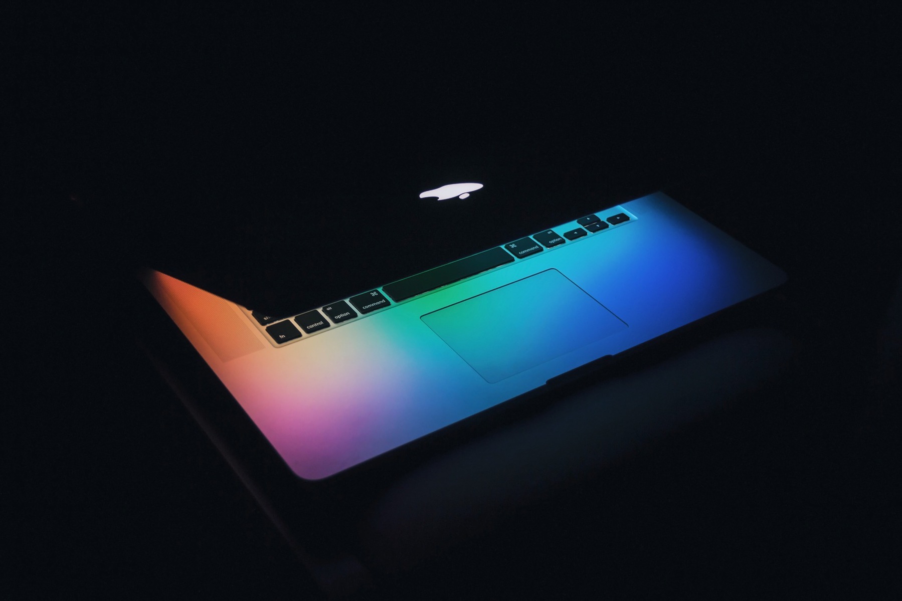
2026-06-02 ∞ WWDC26 Expectations
So you were expecting a long blog post about my expectations for WWDC26, right? Well, I don’t have a clue. I think it would be better to write what I want, not what I expect. Here’s what I want.
- A slider-type control for toning down Liquid Glass. This UI must disappear somehow, to a degree.
- A useful Apple Intelligence, requiring minimal third-party support in order to be useful. Apple’s relationship with the developers is at an all-time low; it’s not the right strategy to depend on them for basic OS feature support.
- Speaking of relationships: I want Apple to care about developers, for real. Don’t pretend. Be honest. Be humble.
- Finally, I want bug fixes, all sorts of bug fixes.
That’s it.
2026-06-02 ∞ Software Quality is Not Goal Anymore
Working on my iPad and Microsoft apps during lunch while attending a webinar… if you think Apple software is full of paper cuts, you ain’t see nothing because Microsoft apps like Outlook and Teams are literally full of bugs, mostly user interface related. 😩🫤
2026-06-04 ∞
Google’s Gemini Mac App Is Native, in a Distinctly Google Way, But Annoyingly Presumptuous, but John Gruber had this to say:
(Sidenote: The Gemini Mac app is a native Mac app, but it is … weird. Gus Mueller poked around at it and found that it’s the product of a Java-to-Objective-C converter that Google made, and much of it was originally written for Android.)
A trillion dollars company can’t make great Mac app, i.e. native Mac app. 🤢 Pass.
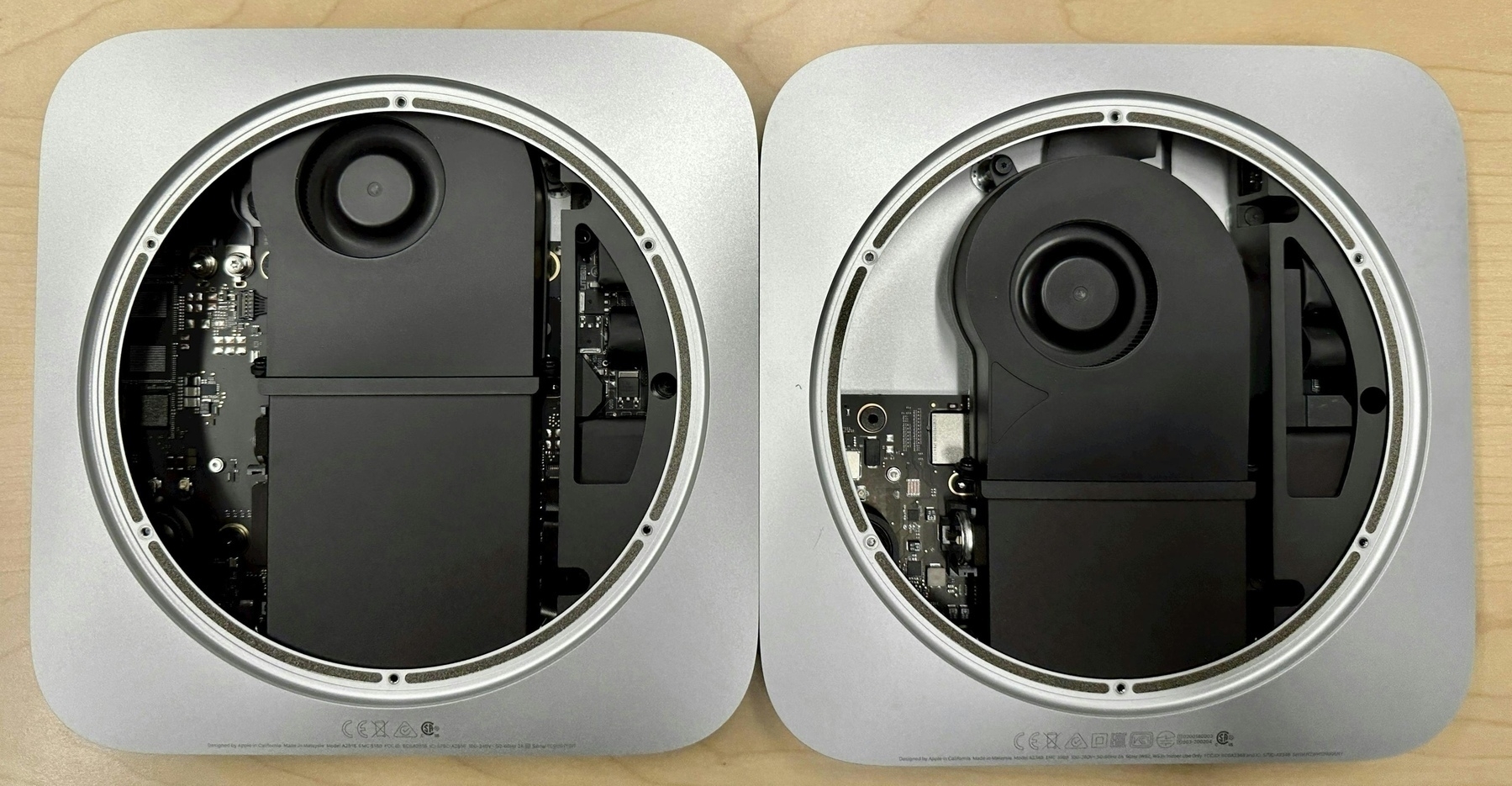
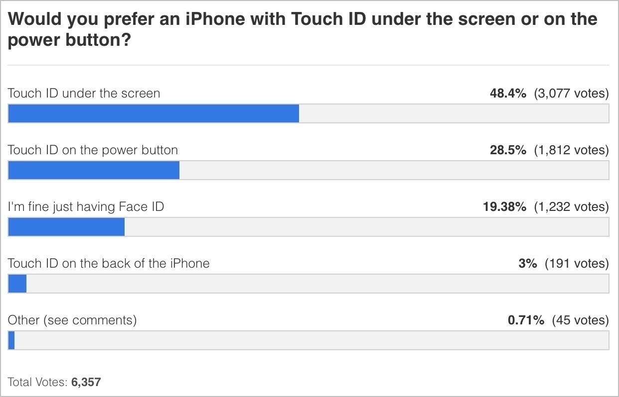
2026-06-05 ∞ Mac mini Canada: 52 configurations, one clear winner
If you’re shopping for a Mac mini in Canada right now, the Apple Store configurator is both powerful and opaque. It shows you one combination at a time, with no easy way to compare shipping wait times across the full lineup. So I decided to do something about it.
Using Claude’s browser automation tools, I navigated the Apple Canada store programmatically, cycling through every possible Mac mini configuration: all 52 of them, spanning two chips (M4 and M4 Pro), two CPU/GPU variants, two memory tiers, five storage options, and two Ethernet speeds. I captured the live price and shipping lead time for each one directly from the store. No guessing, no third-party data. Everything you see was pulled in real time from apple.com/ca.
The result is the reference table below. The headline finding is blunt: if you want a Mac mini without a long wait, your options are narrow. Only the base M4 model ships in 3 to 4 weeks. Upgrade almost anything (memory, storage, Ethernet, or chip), and you’re looking at 10 to 12 weeks. The Mac mini may be Apple’s most configurable desktop, but right now it’s also one of its hardest to get quickly.
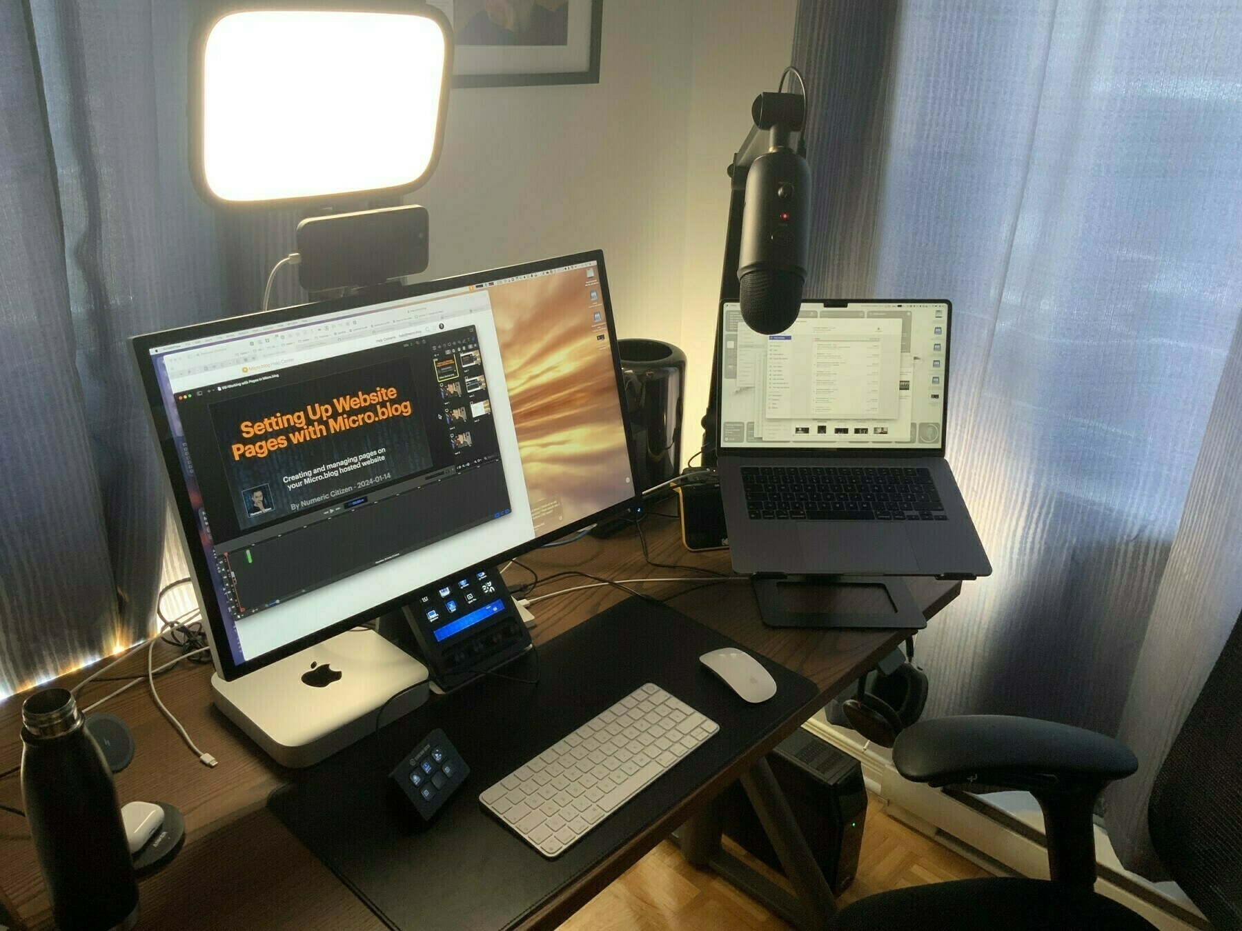
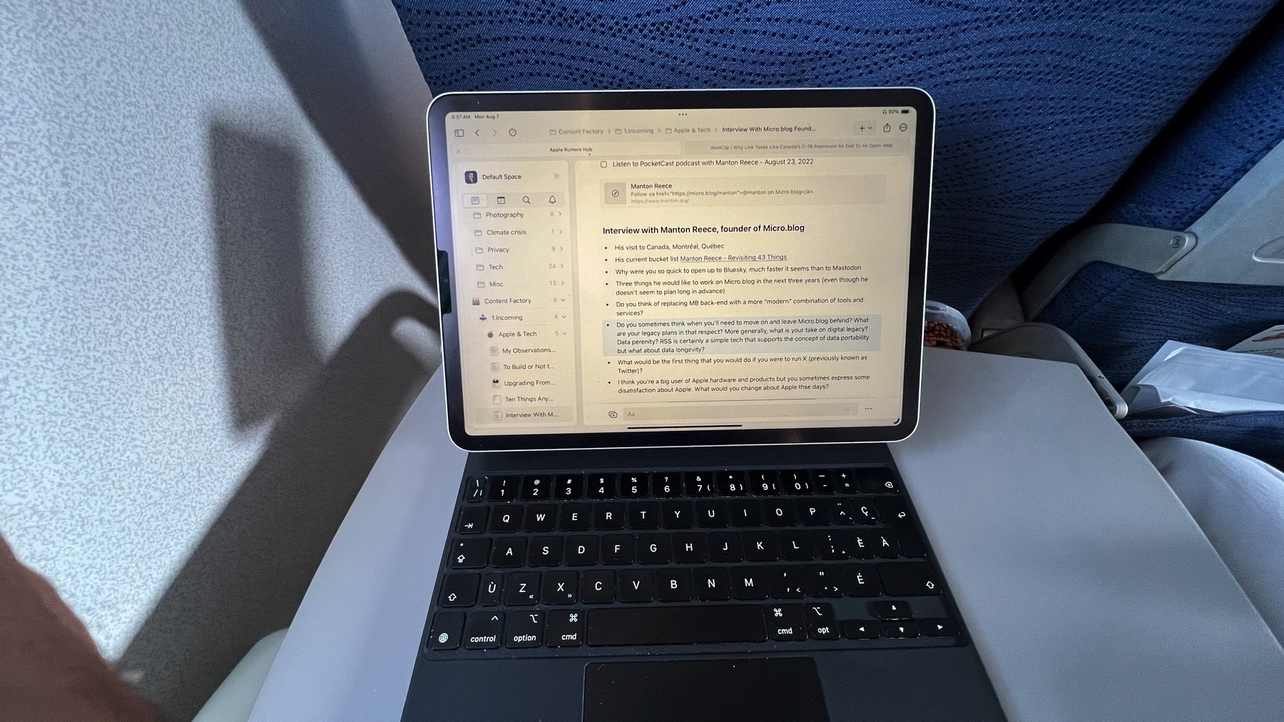
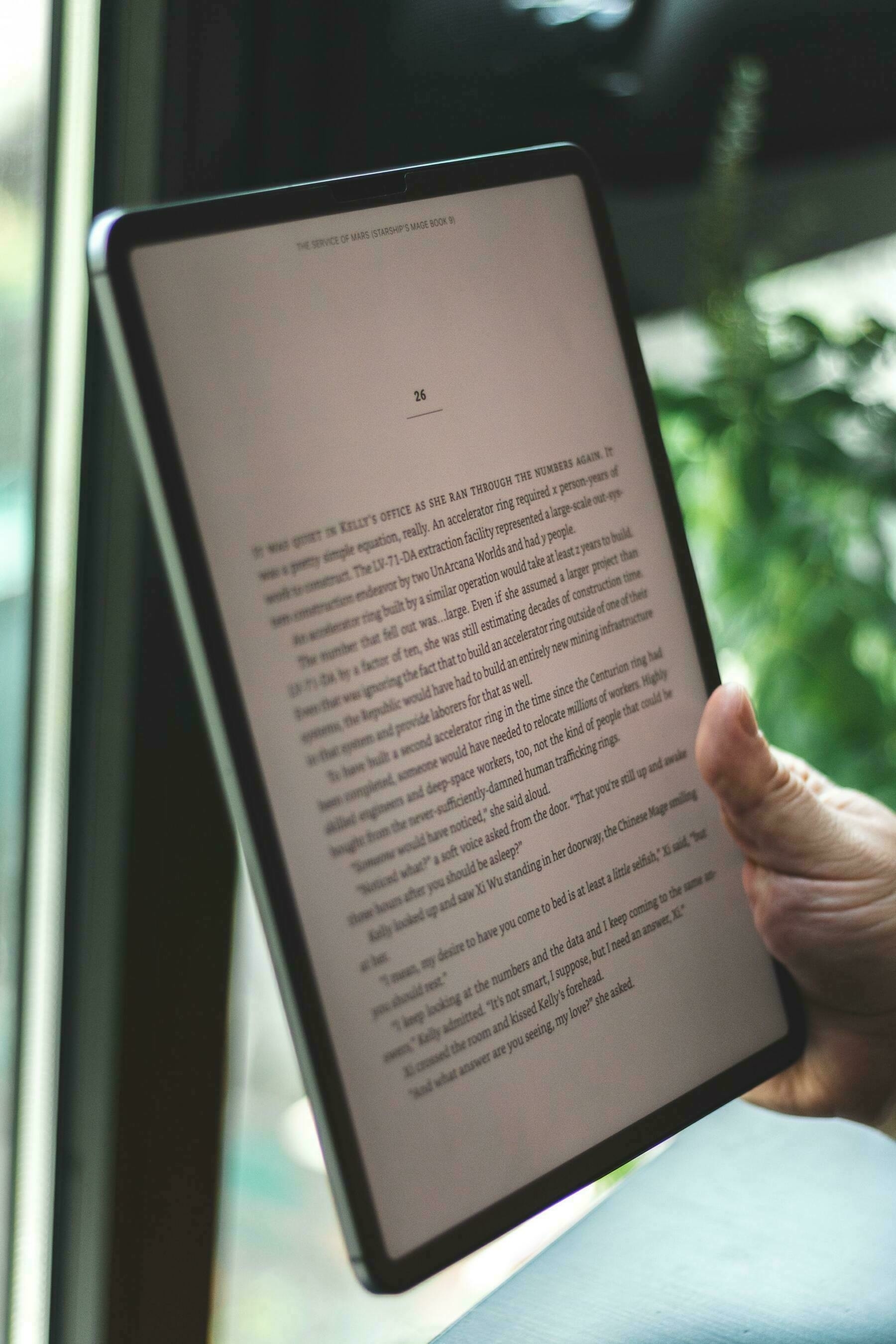
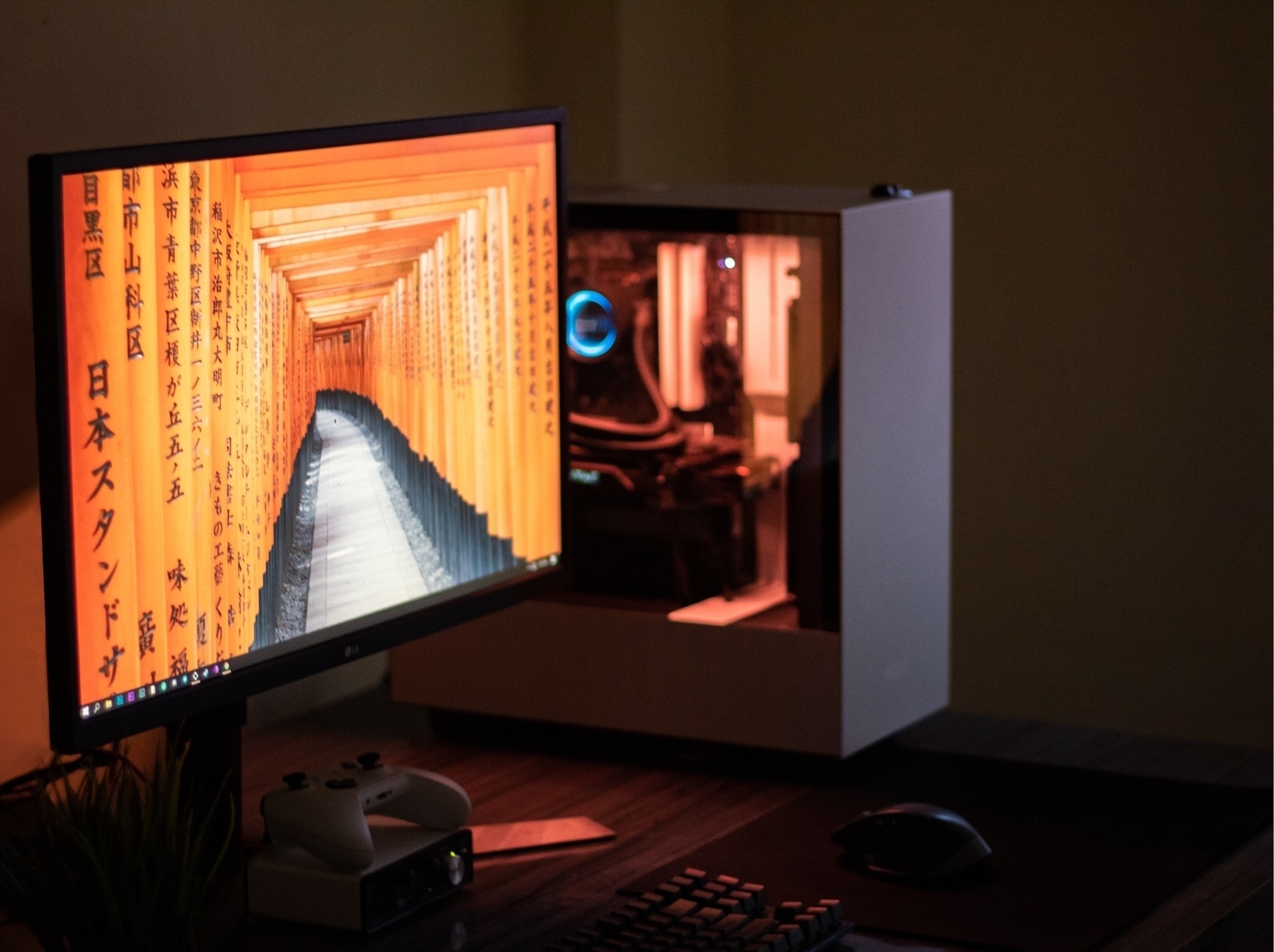
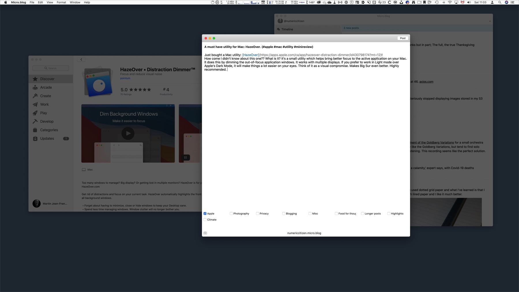
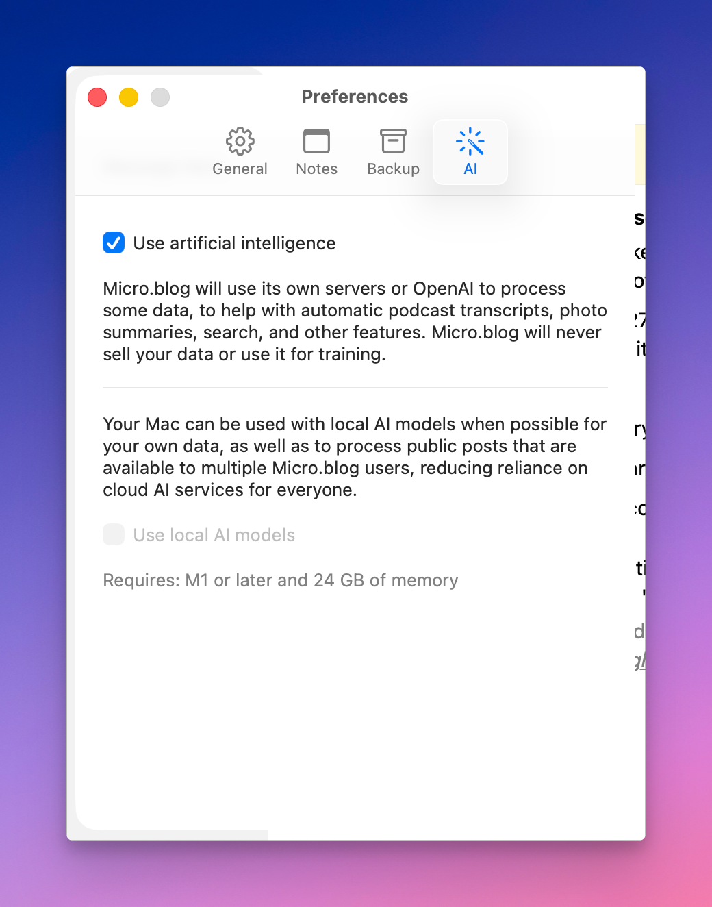
Video 2026-06-05 ∞ Testing Micro.blog for Mac 4.0 beta 1
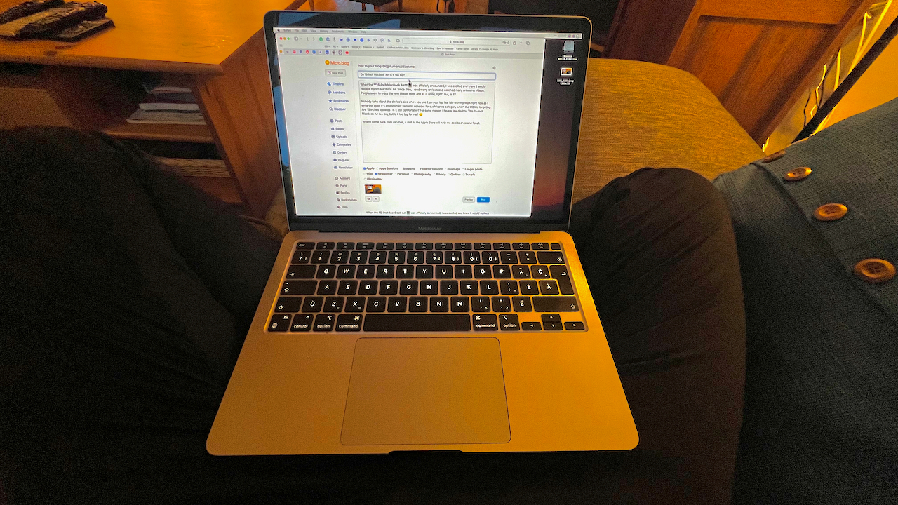
I think the time to upgrade to a beefier Mac is coming… maybe this fall. Even if it’s a native Mac app, I think I prefer my custom-built Microblog Poster web app. Now, returning to normal programming.
 2026-06-07 ∞
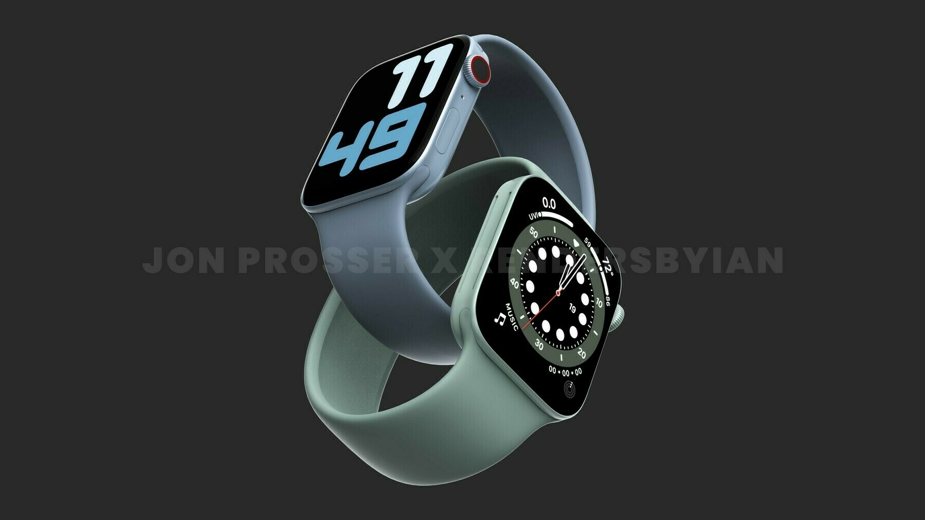
 Wishing for Lil Finder Guy
Apple embraces Lil Finder Guy with WWDC 2026 swag — 9to5Mac
There’s now a physical Apple pin for Lil Finder Guy, the adorable Finder-based Mac mascot who originated from MacBook Neo’s marketing campaign.
I want this little guy to pop up in tomorrow’s WWDC introductory video.
2026-06-08 ∞ Remember Path? I do.
I’ve been fiercely working on something new since yesterday. 😎 Stay tuned.
 2026-06-08 ∞
Google Gemini Could Be the Ceiling on Apple’s AI Ambitions:
Apple analyst Ming-Chi Kuo says the real test of today’s WWDC keynote is whether Apple can deliver better AI experiences than Google using the same Gemini models.
It is not only about the LLM but also about the consumable data feeding the models… and Apple has the edge here.
2026-06-08 ∞ On *OS 27 Betas
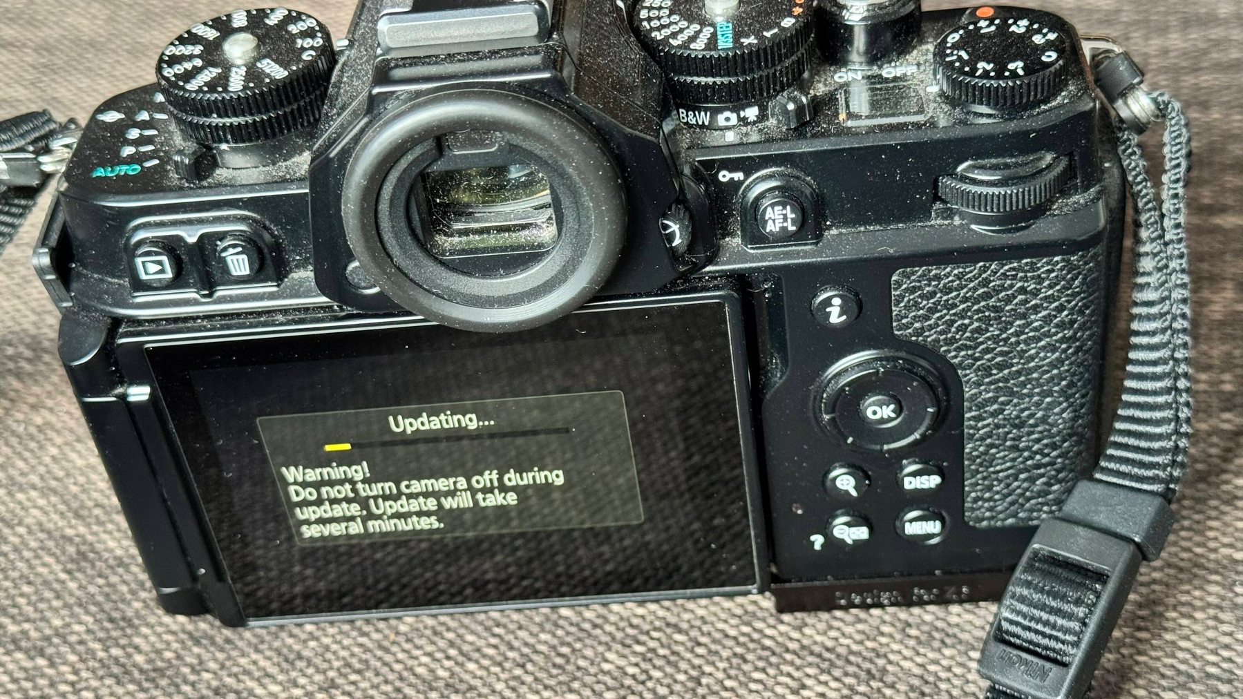
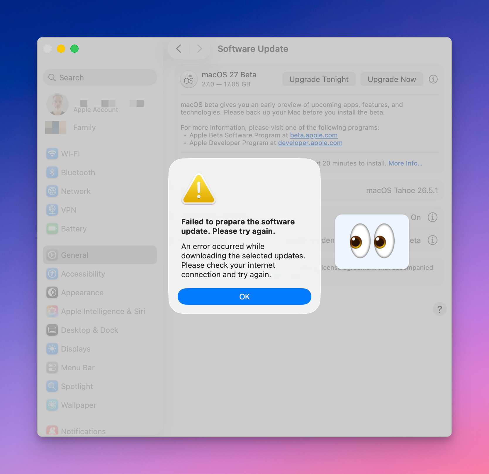
I’ve been rather silent since the release of Apple’s latest major betas, except for a few reaction blips. While I love the new iOS 27 and iPadOS 27, I cannot install macOS 27 beta. Installation always fails at the very end of the download process. Go figure. 🤷🏻♂️
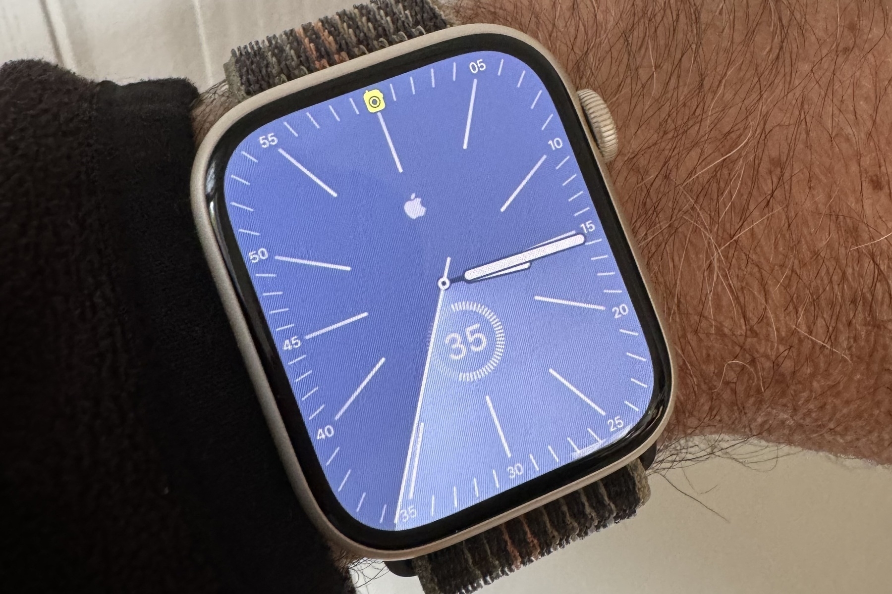
iOS 27 Liquid Glass is what it should have been from the start. Oh, and the speed and stability on my iPhone 15 Pro Max prove to be the best fest beta ever. I’m still waiting on the Siri AI waiting list.
 2026-06-11 ∞
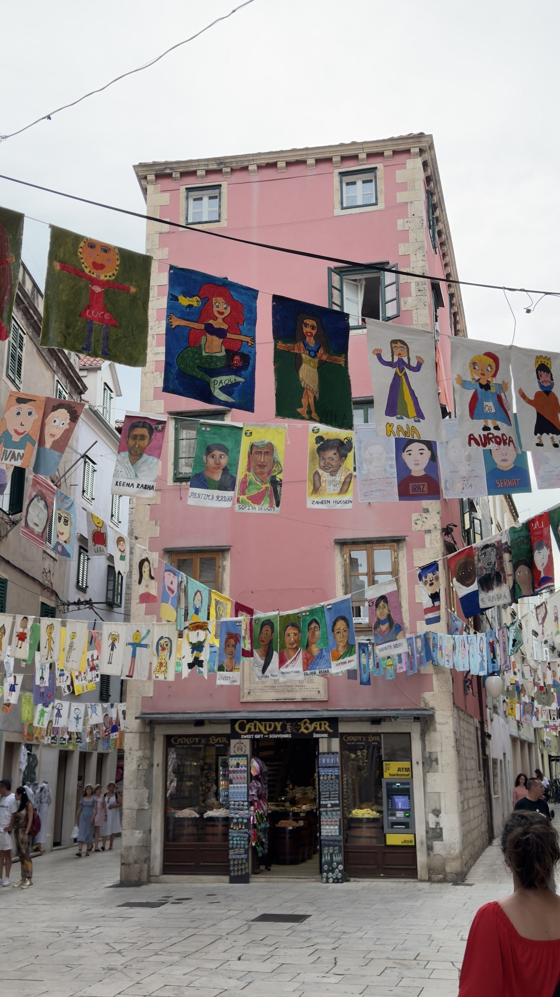
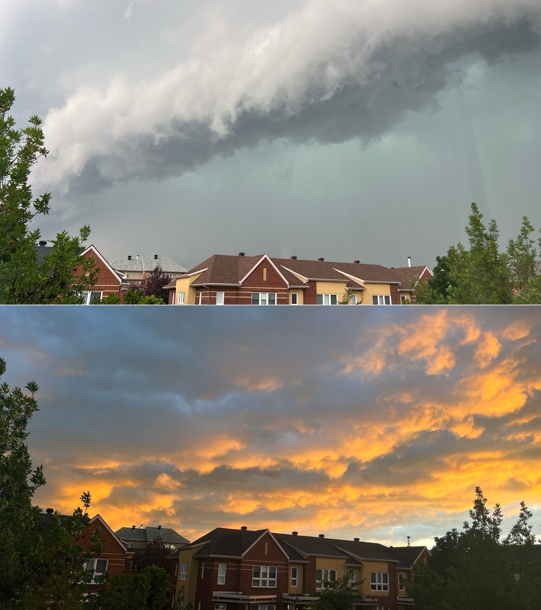
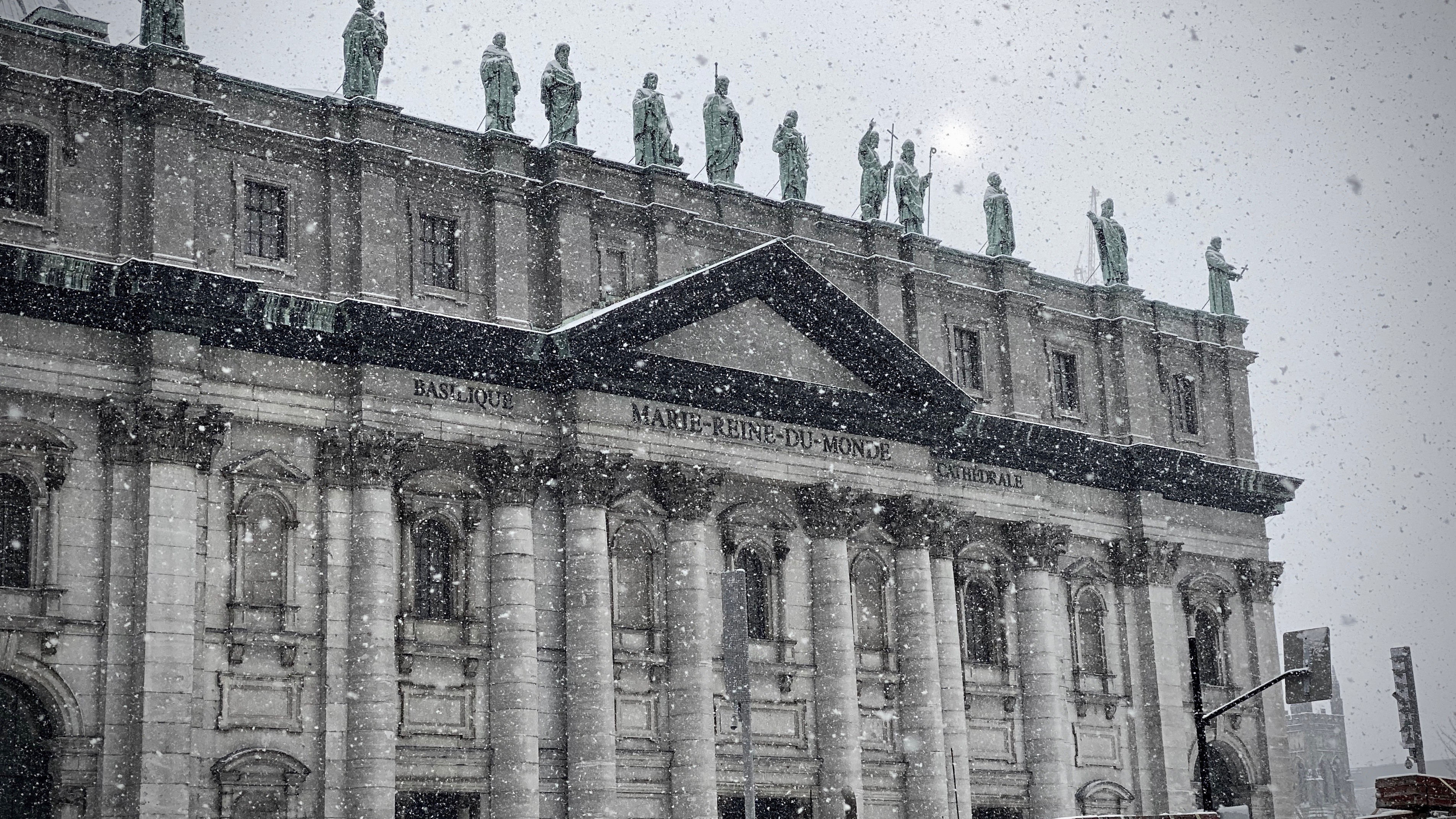
La Sagrada Familia is now complete. When I visited the basilica in 2014, after a few moments inside, I simply cried. So beautiful. I’m happy to see this monumental architectural masterpiece completed.
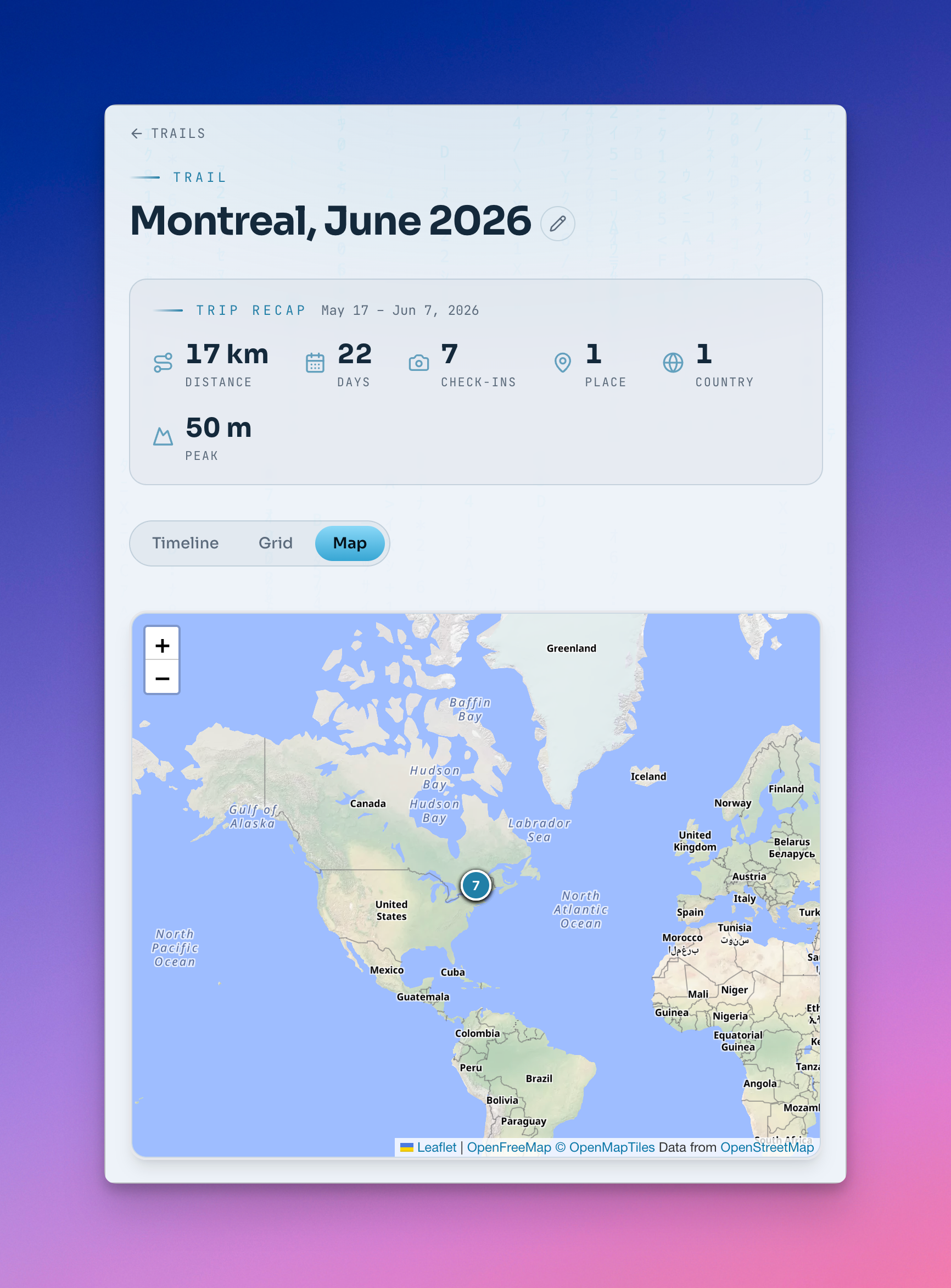
2026-06-11 ∞ A New Foursquare Is Born
I’m making great progress with my new web app. It’s already 90% feature complete and ready for my next trip to Paris, starting next week. When I started this project, I had a fairly clear idea of what I wanted, but as I made progress, it became easy to experiment with new features I didn’t think would even be possible. One such feature is the ability to securely share my check-ins publicly so you can follow me! It’s my only custom-built web app with a public-facing view.
 2026-06-11 ∞
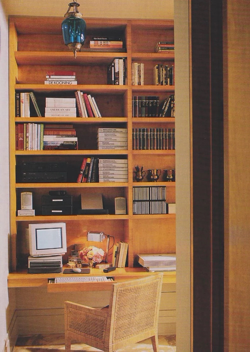
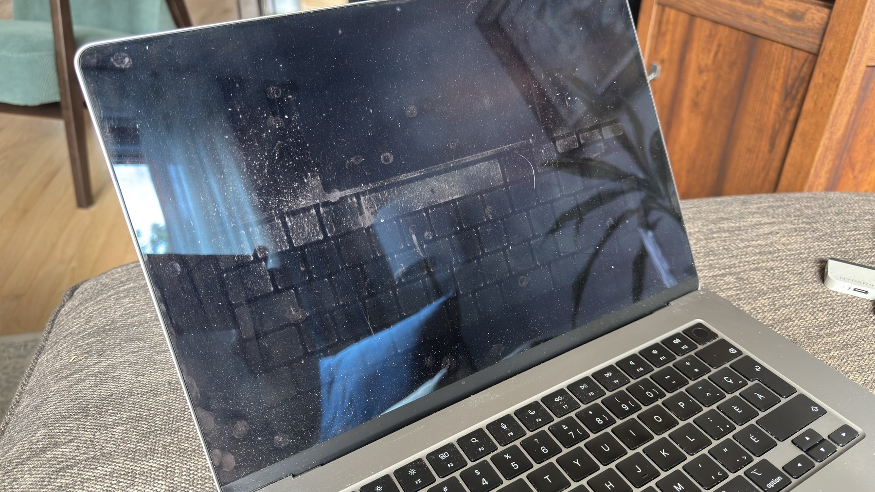
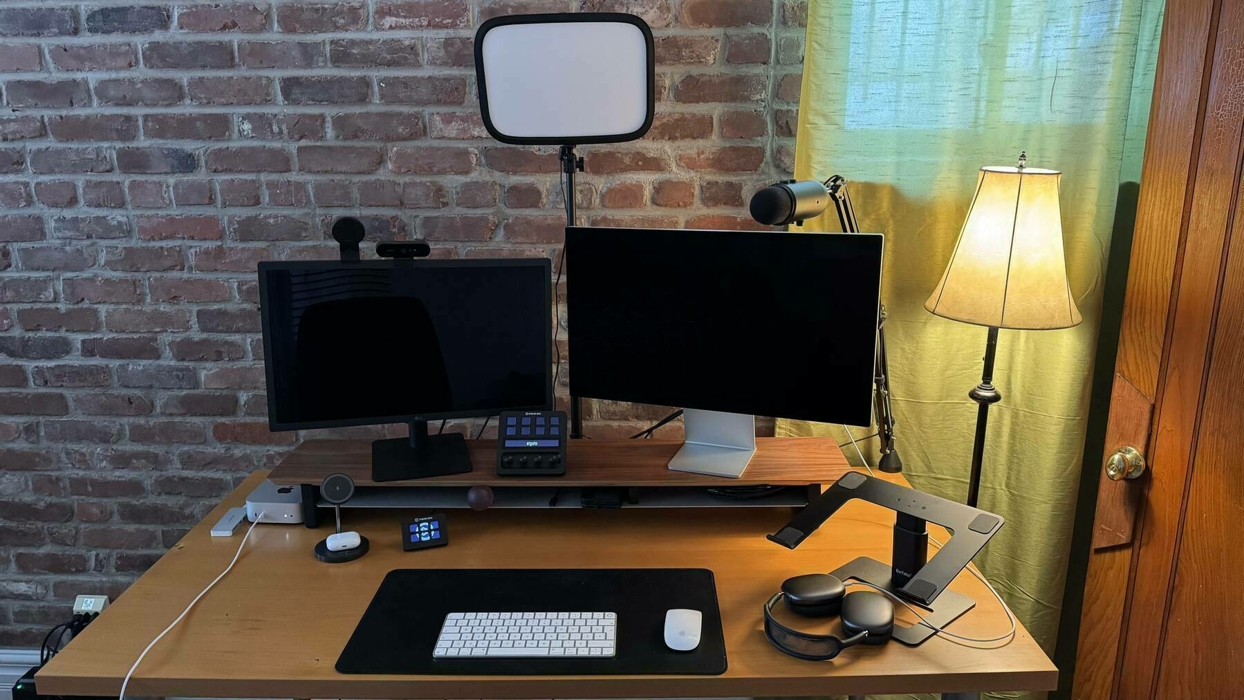
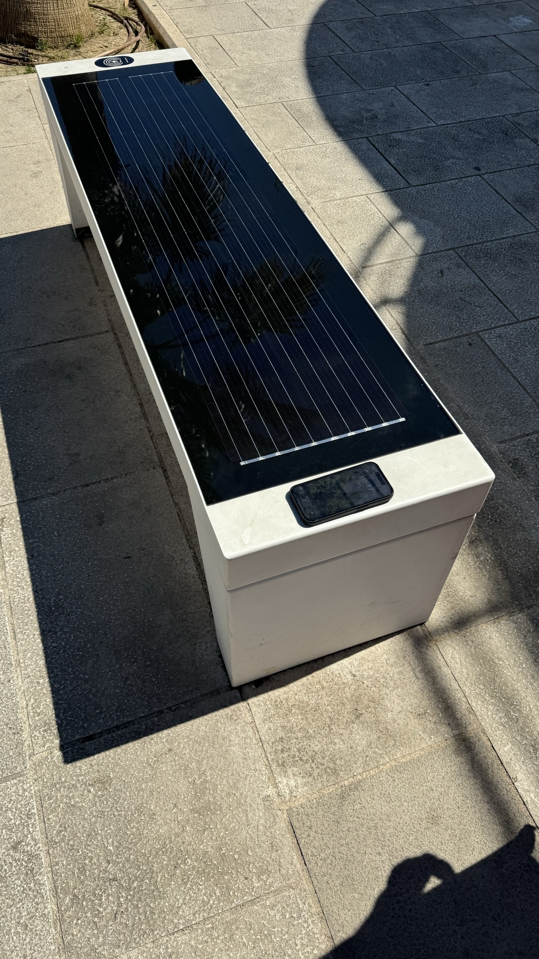
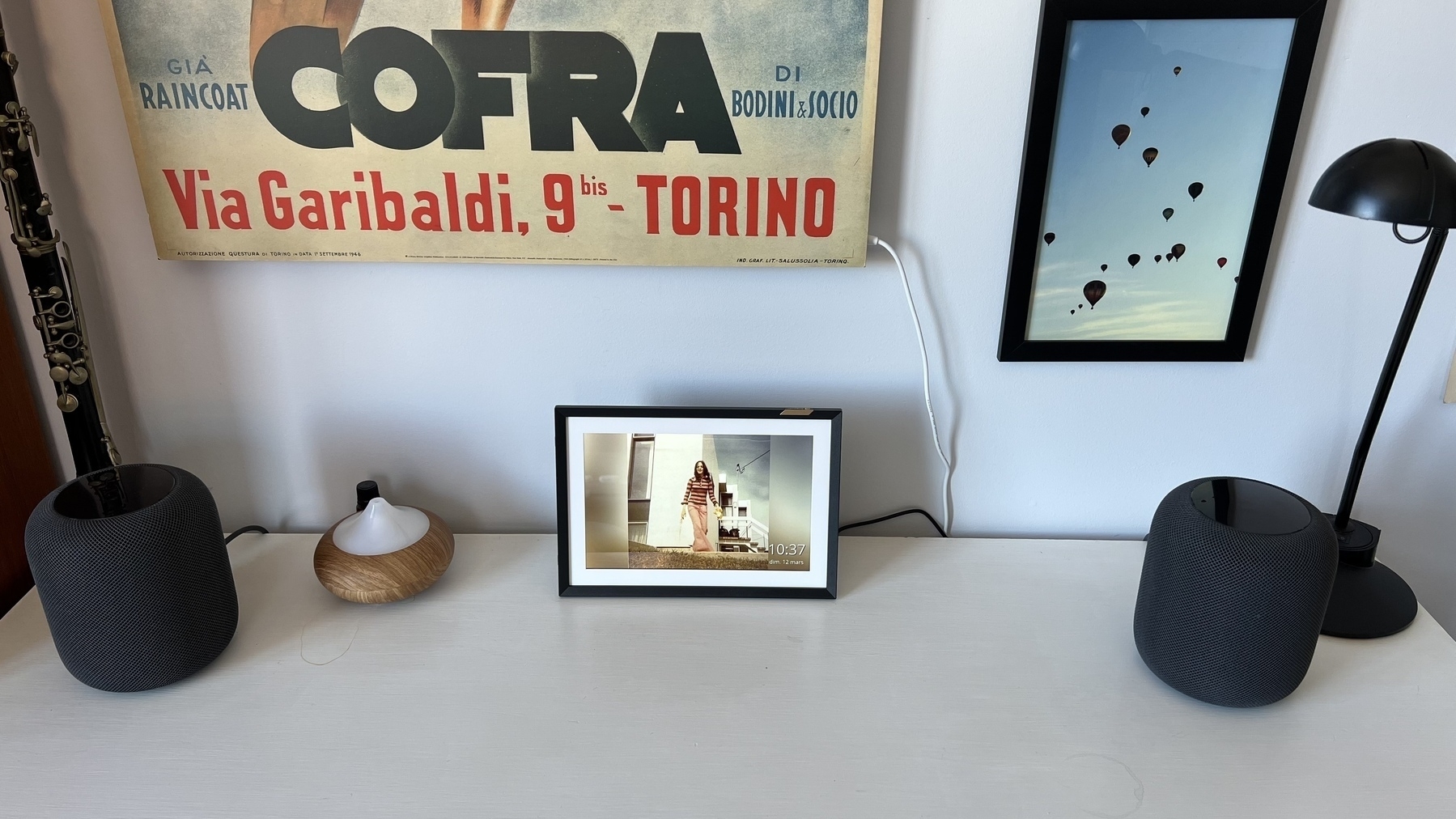
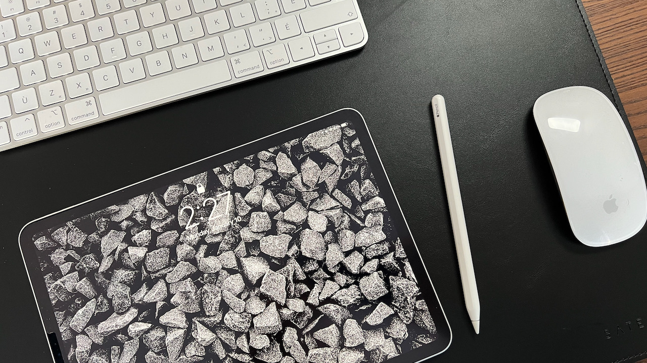
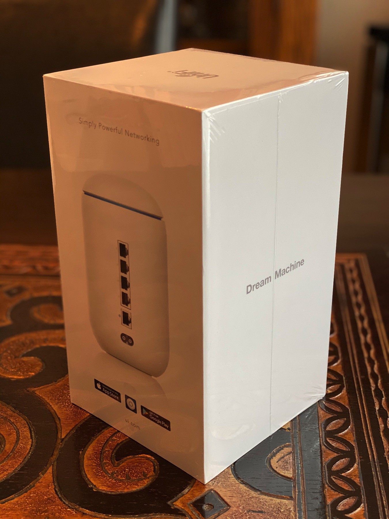
 A Different Type of Project
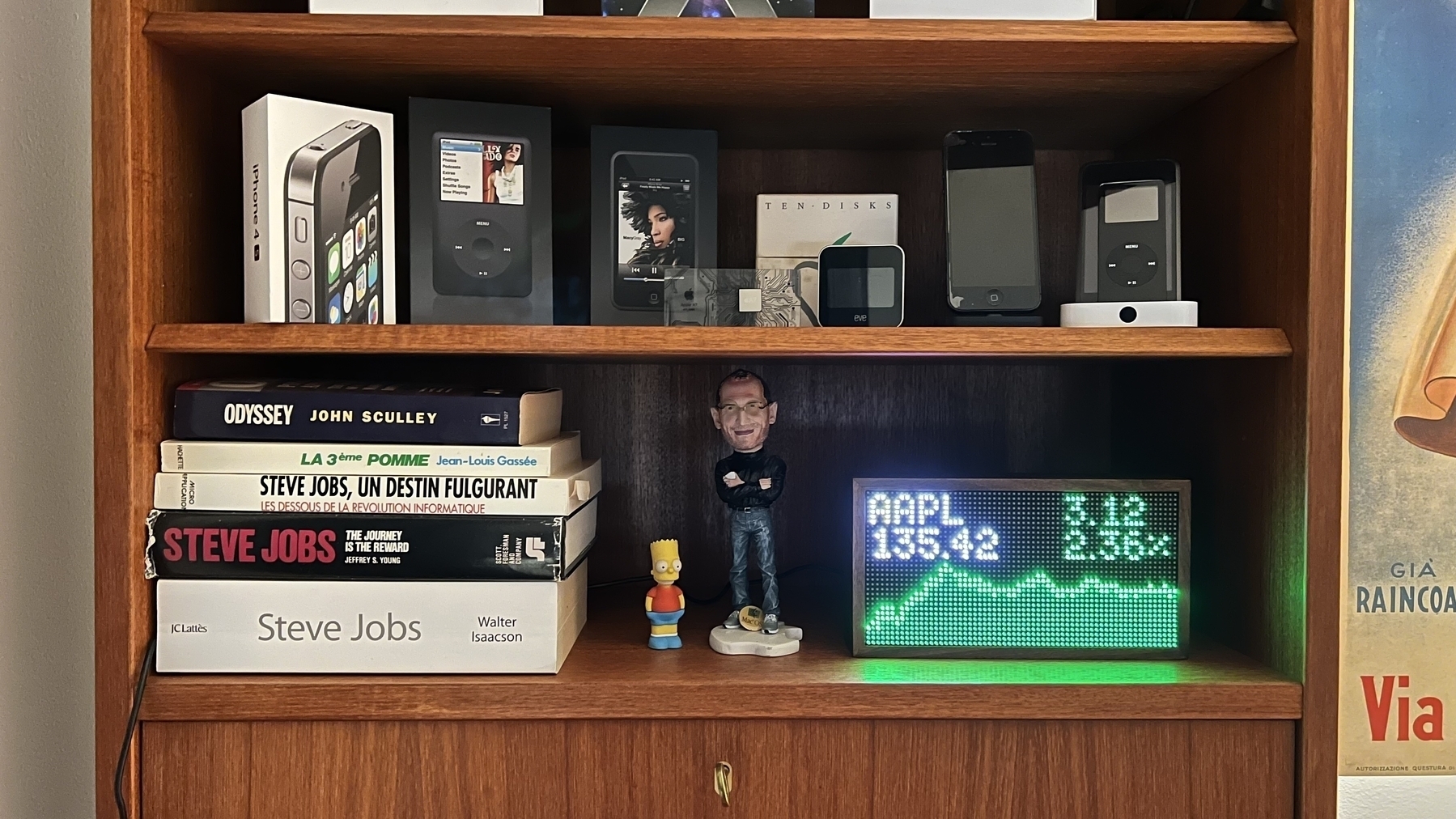
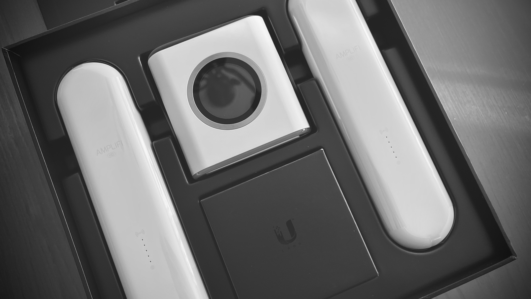
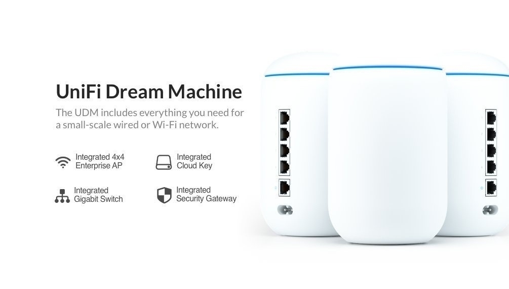
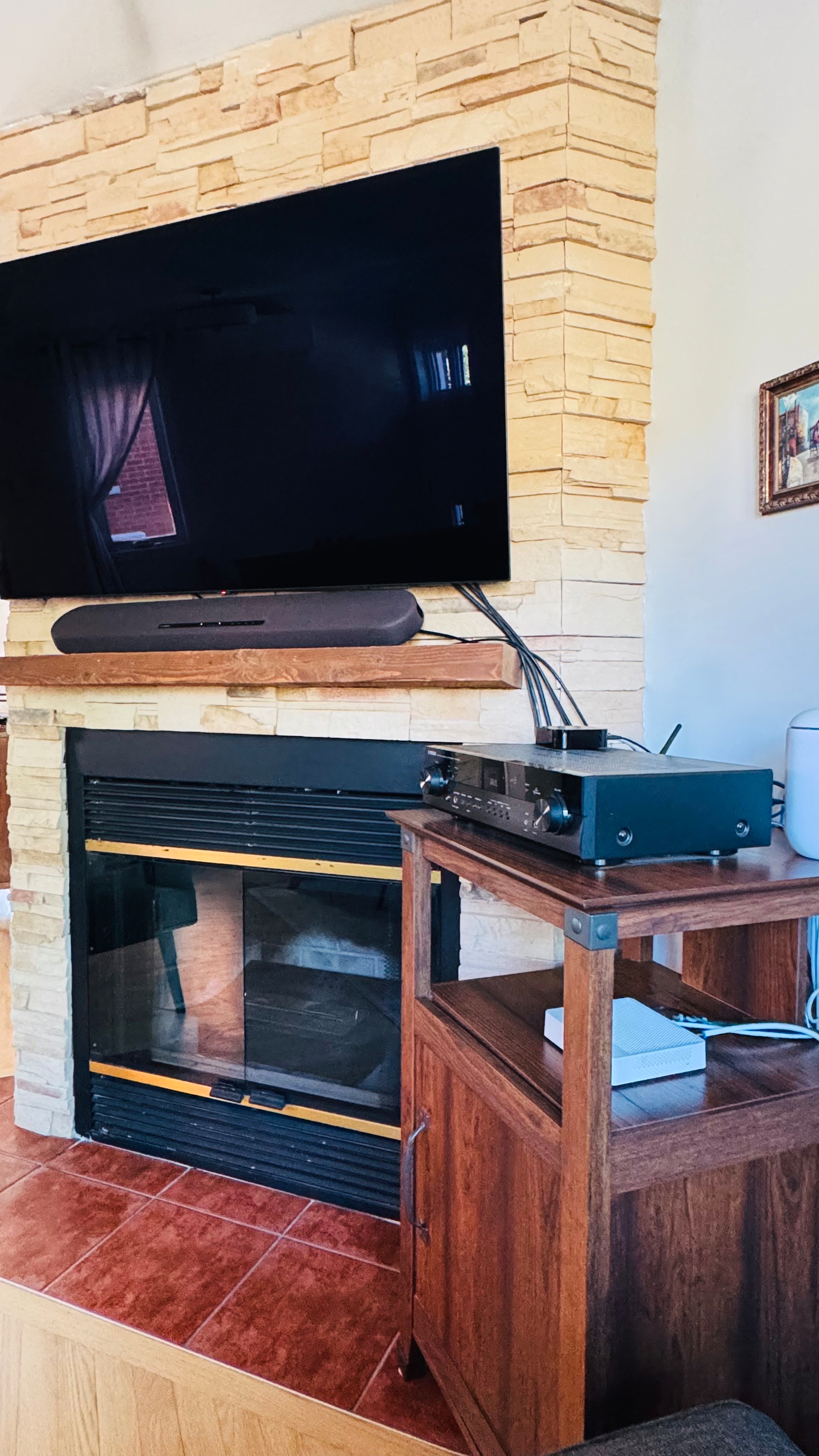
I chose to postpone purchasing the $1,500 Nikon 24-120 F4 lens to prioritize upgrading my home networking setup. This change is driven by my plan to turn the unused fireplace in the living room into a home theater space with related equipment. As shown in the photo, the items on and inside this small piece of furniture will be moved into a new structure to be built on the left, where the fireplace now is. Additionally, my Ubiquiti Wi-Fi router will be replaced with a ceiling antenna connected to a hub housed inside the new installation. More details about this coming later this summer.
 2026-06-13 ∞
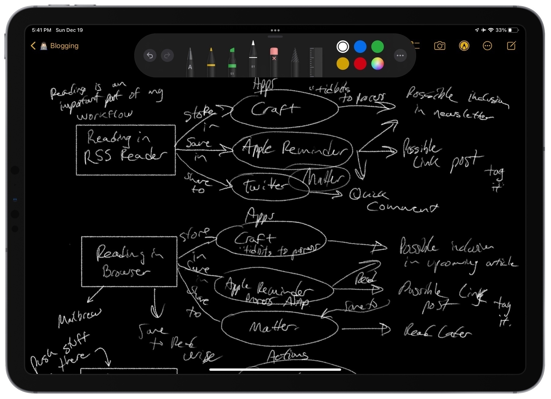
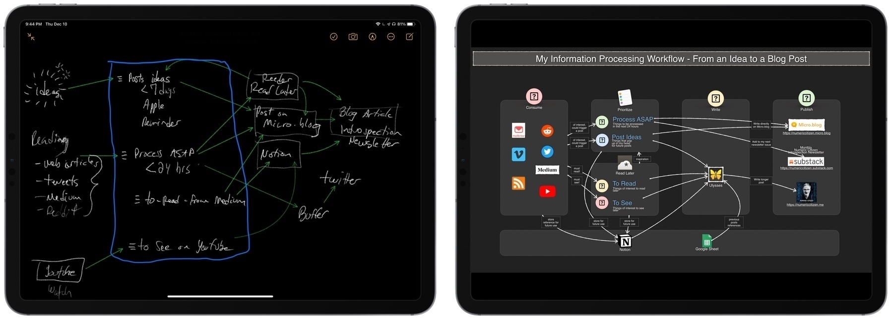
 SwiftUI or Catalyst for Notion?
When reading about SwiftUI and how it leads to less than optimal Mac apps, I’m not convinced that rewriting Notion in SwiftUI is a good idea. Why not use Catalyst instead? Craft is a great example of a Catalyst-based app.
2026-06-13 ∞ Apple First, Devs Later
Apple’s Private Cloud Compute Is Severely Limited for Third-Party Developers:
The bottom line is that — for the OS 27 cycle at least — PCC is primarily a feature for Apple itself to use in Siri AI. Granting access to PCC to any third-party developers at all is better than nothing, but this 2-million-download cap cuts off many developers who are in the Small Business Program. Apple should reconsider that. And I know there are a lot of developers who exceed the eligibility for the Small Business Program who would love to have access to the PCC APIs, even if access was paid. The lack of paid tiers says to me that Apple is worried enough about meeting demand from Siri AI users alone.
Expect this to change sooner rather than later once Apple introduces API consumption tiers for developers. Currently, Apple appears to be managing demand for its PCC infrastructure.
2026-06-13 ∞ Come On
Rewatching WWDC keynote and boy these constantly moving sequences of people talking are very annoying. And, how ironic is it when we know it was filmed with iPhone which comes with sophisticated image stabilization. 🤷🏻♂️🤦🏻♂️
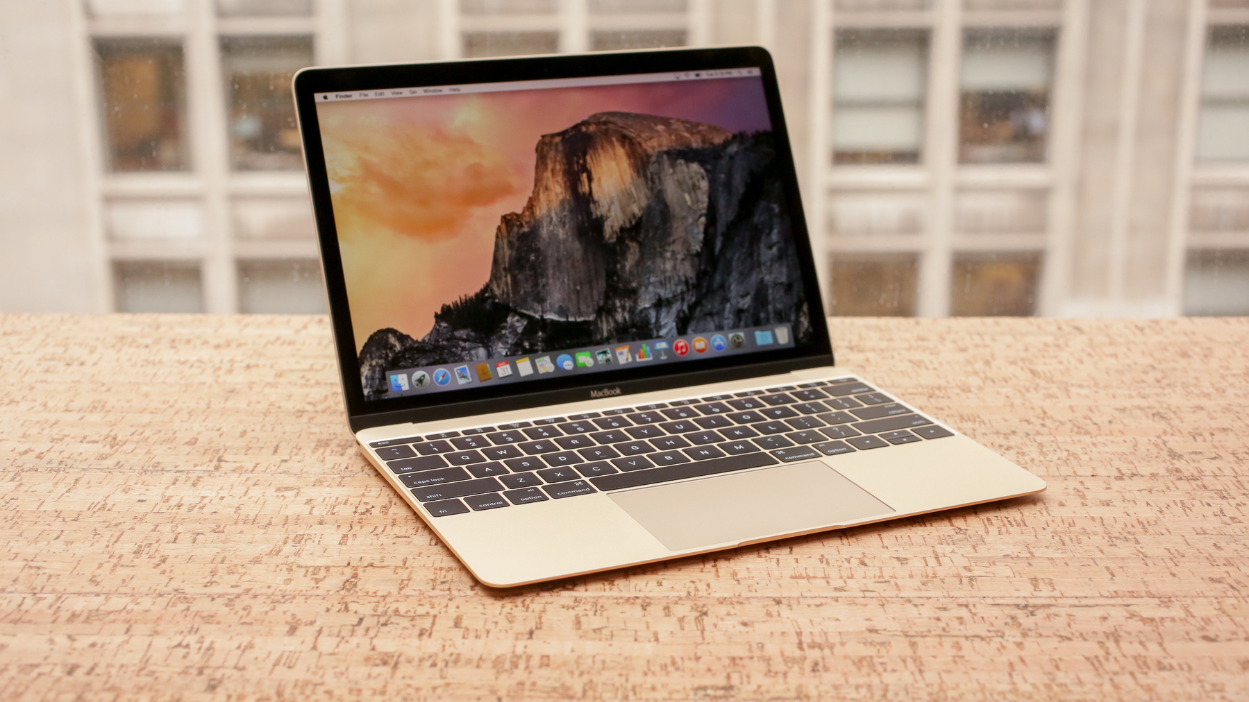
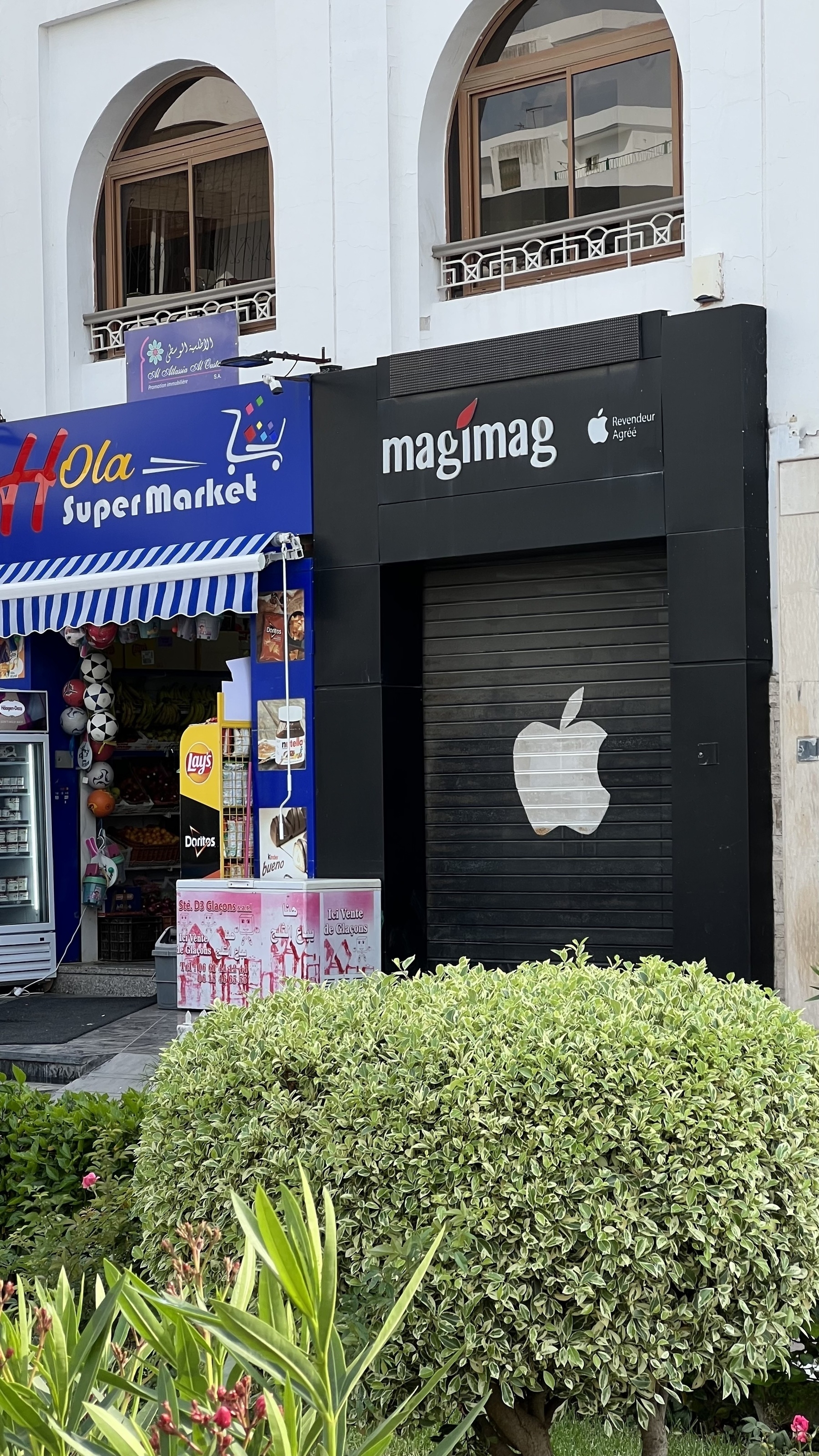
2026-06-13 ∞ Why I'm (Almost) Buying a MacBook Neo Before Paris
What if I don’t plan to use any AI tools? What if I don’t plan to multitask like crazy and focus, instead, for once? What if I don’t need the mightiness of my MacBook Air, yet a trustworthy ally? What if I don’t want to lose my Apple Pencil for a third time during this upcoming vacation? What if I want a small yet powerful Mac while on the plane?
After reading Matt Birchler’s blog post about the MacBook Neo being a great second computer five days before leaving for Paris, I’m considering getting one. It’s so cheap. I have 4 days to decide. My wife wouldn’t understand if I got one. 🤫🫣
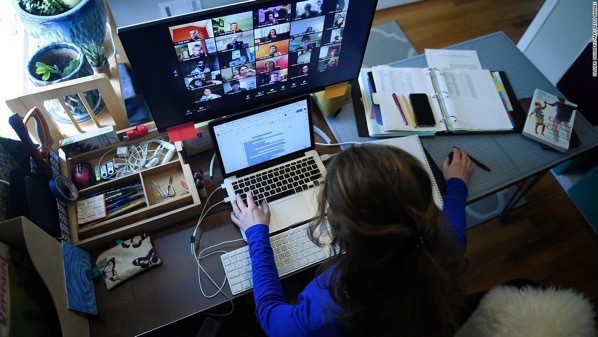
2026-06-14 ∞ Microsoft 365 Needs Better Meeting Preparation Intelligence
At my job, I spend most of my time on Microsoft 365 office products, especially Teams and Outlook. I spend a lot of time preparing meetings, sometimes with 15 or 20 participants. I don’t understand why Microsoft hasn’t invested in tools to help plan these meetings.
For example: I need to prepare a meeting with 15 participants; if the 4 or 5 must-have participants are available, those time slots should be clearly highlighted to make it easier to spot the best time to schedule the meeting. But that’s not what happens. Although some participants are mandatory, they don’t all carry the same weight.
I wish Microsoft would improve this aspect of their products; in fact, I wish they would show more empathy in their functional design. I feel like today’s Outlook is very similar to the one from ten years ago.
2026-06-17 ∞ Describe Extension
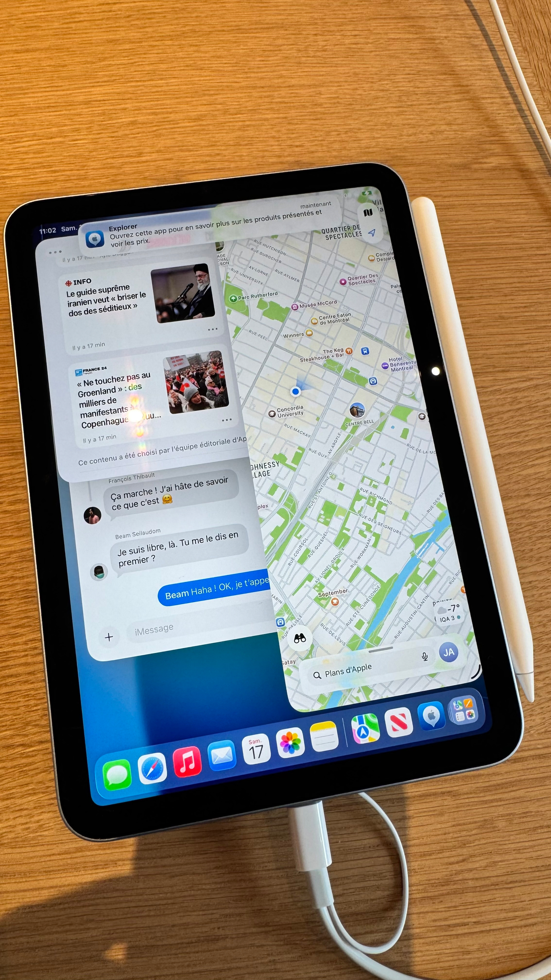
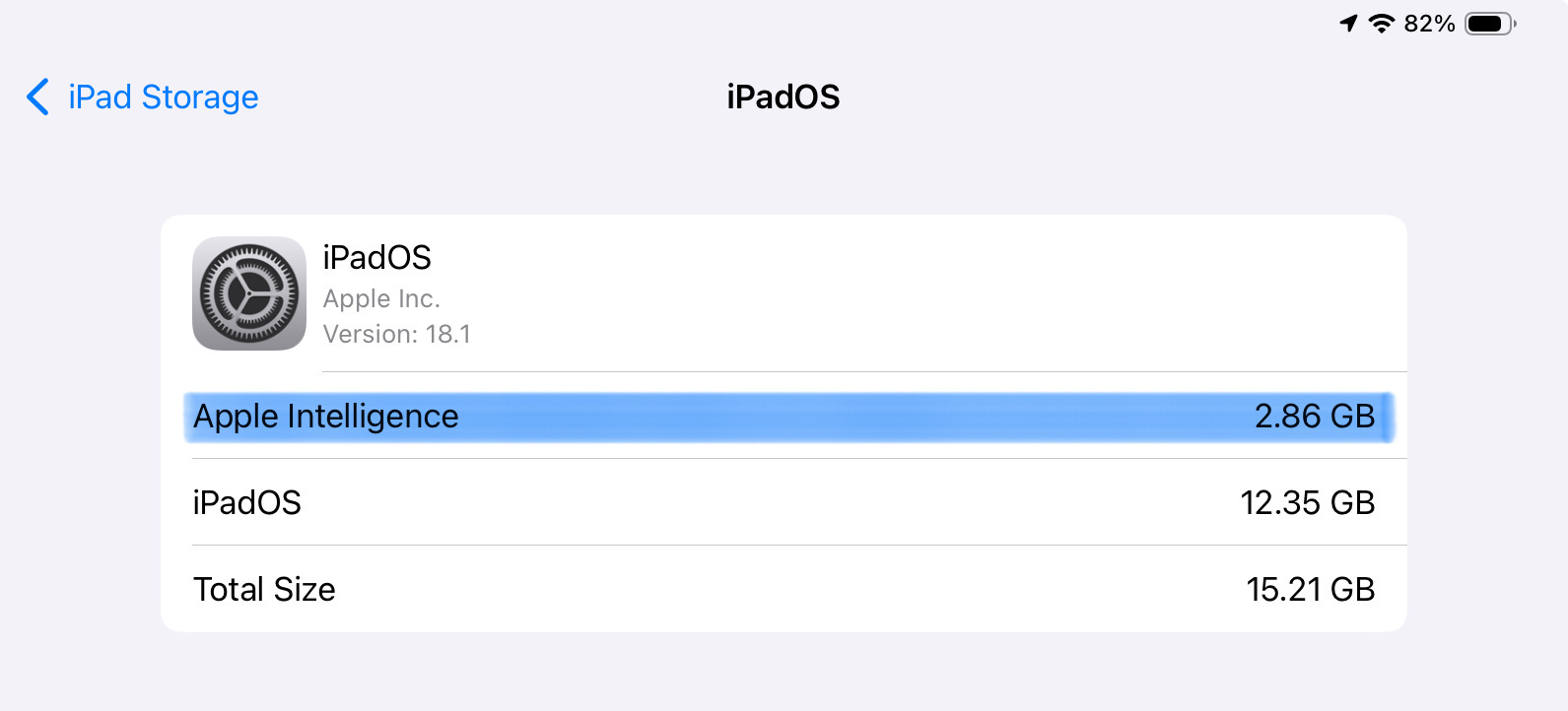
Just finished creating my second Safari Extension using Safari 27’s Describe Extension feature. And it just works on the first try. 😳 This one will save the selected text of the webpage to my bookmarking web app, including the page title, page URL and author. I wonder how much more complex an extension can be.
2026-06-17 ∞
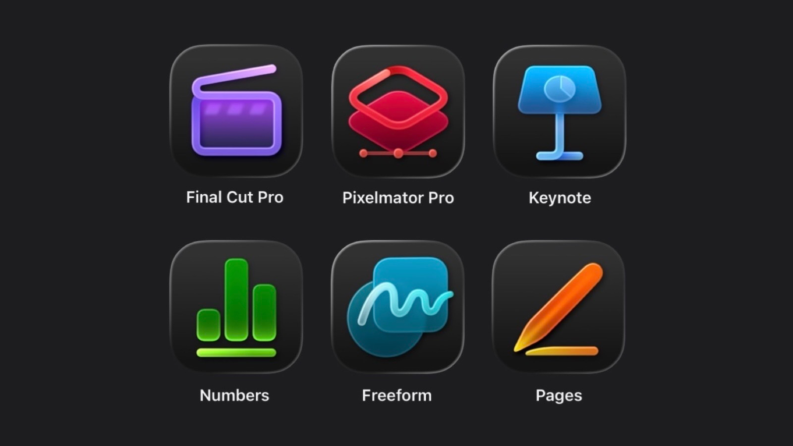
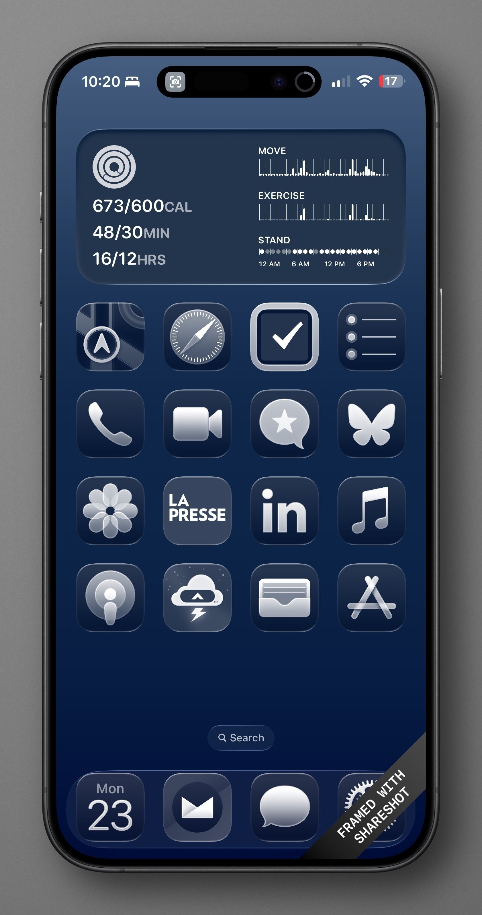
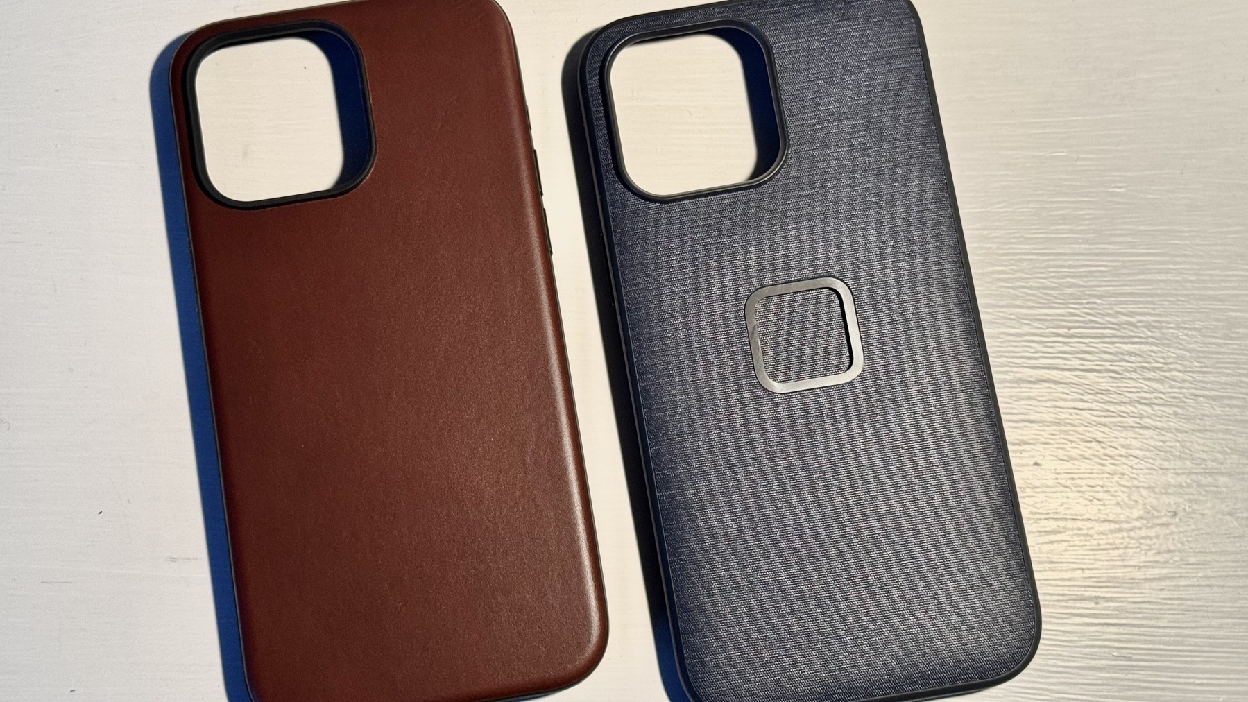
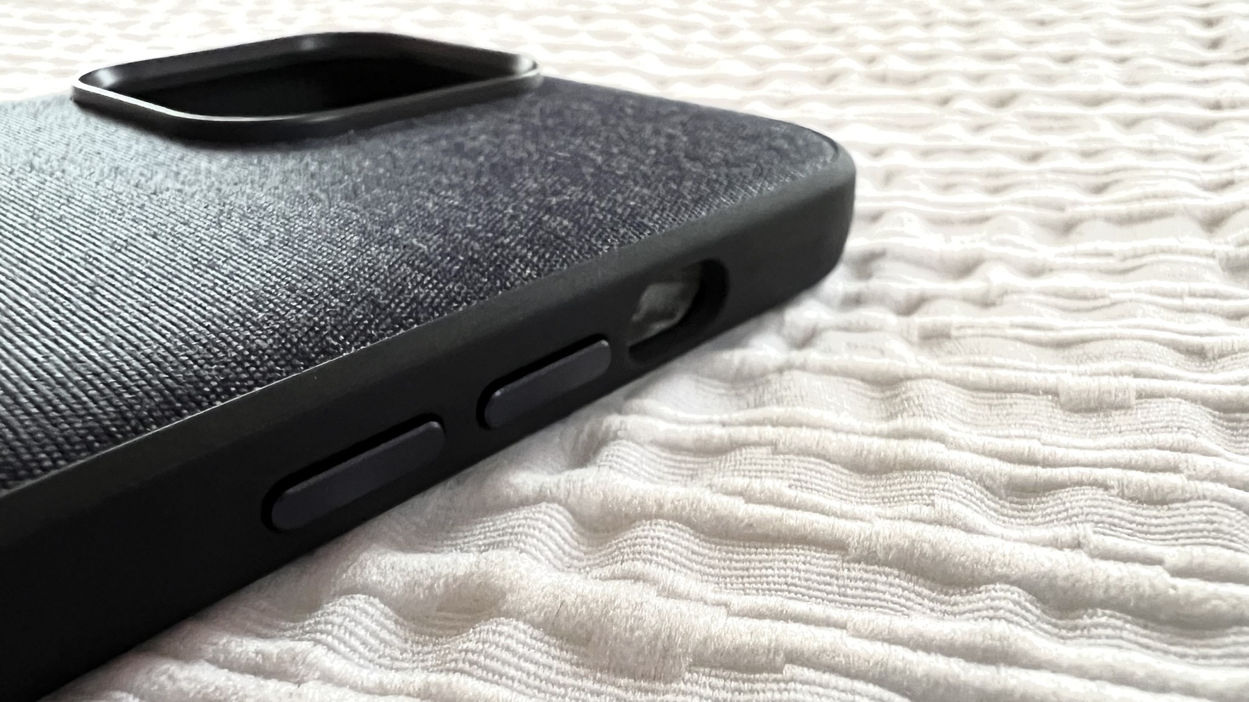
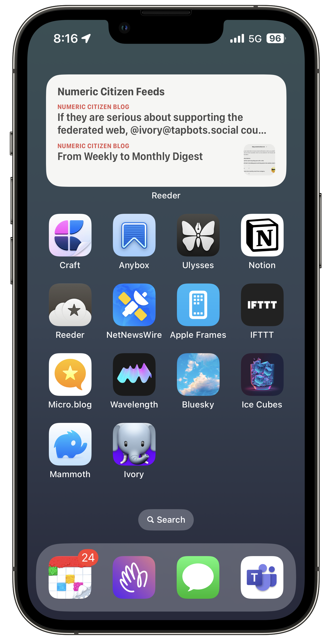
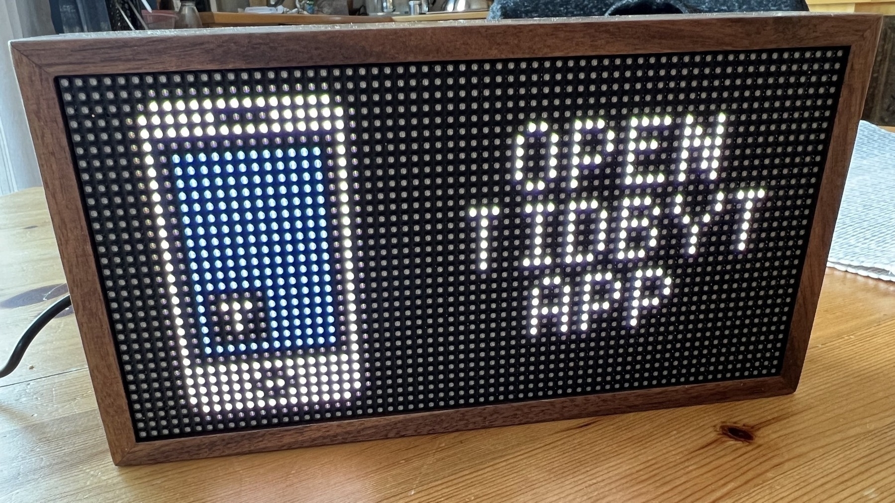
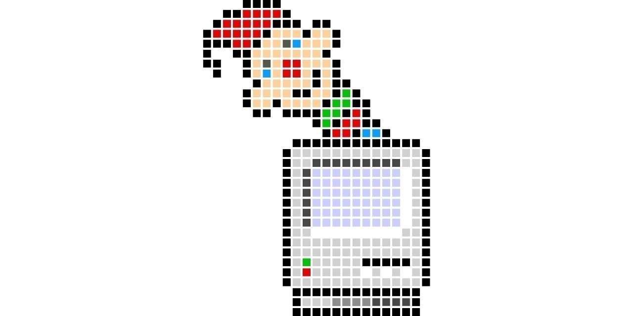
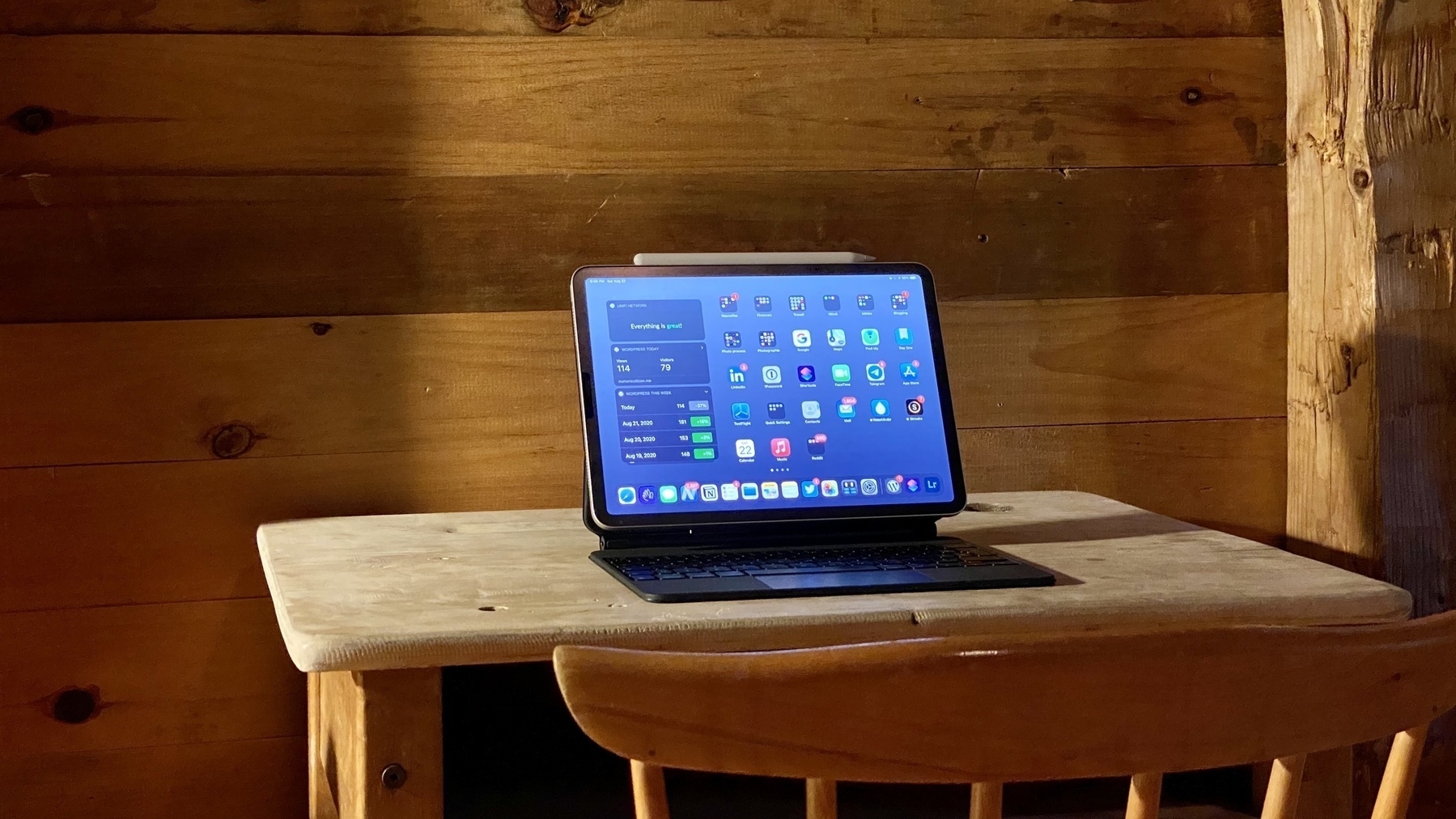
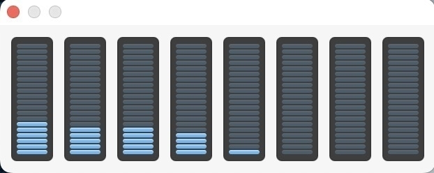
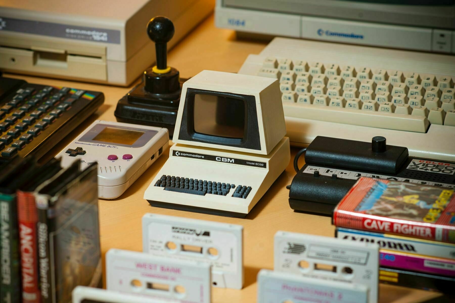
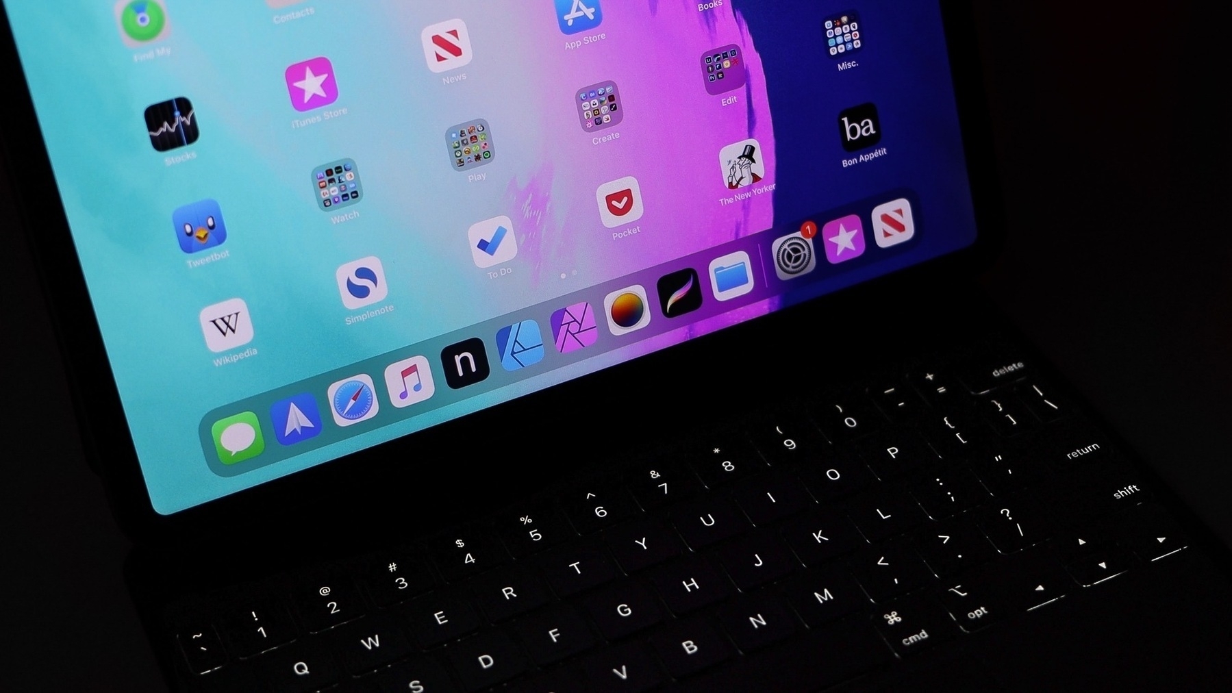
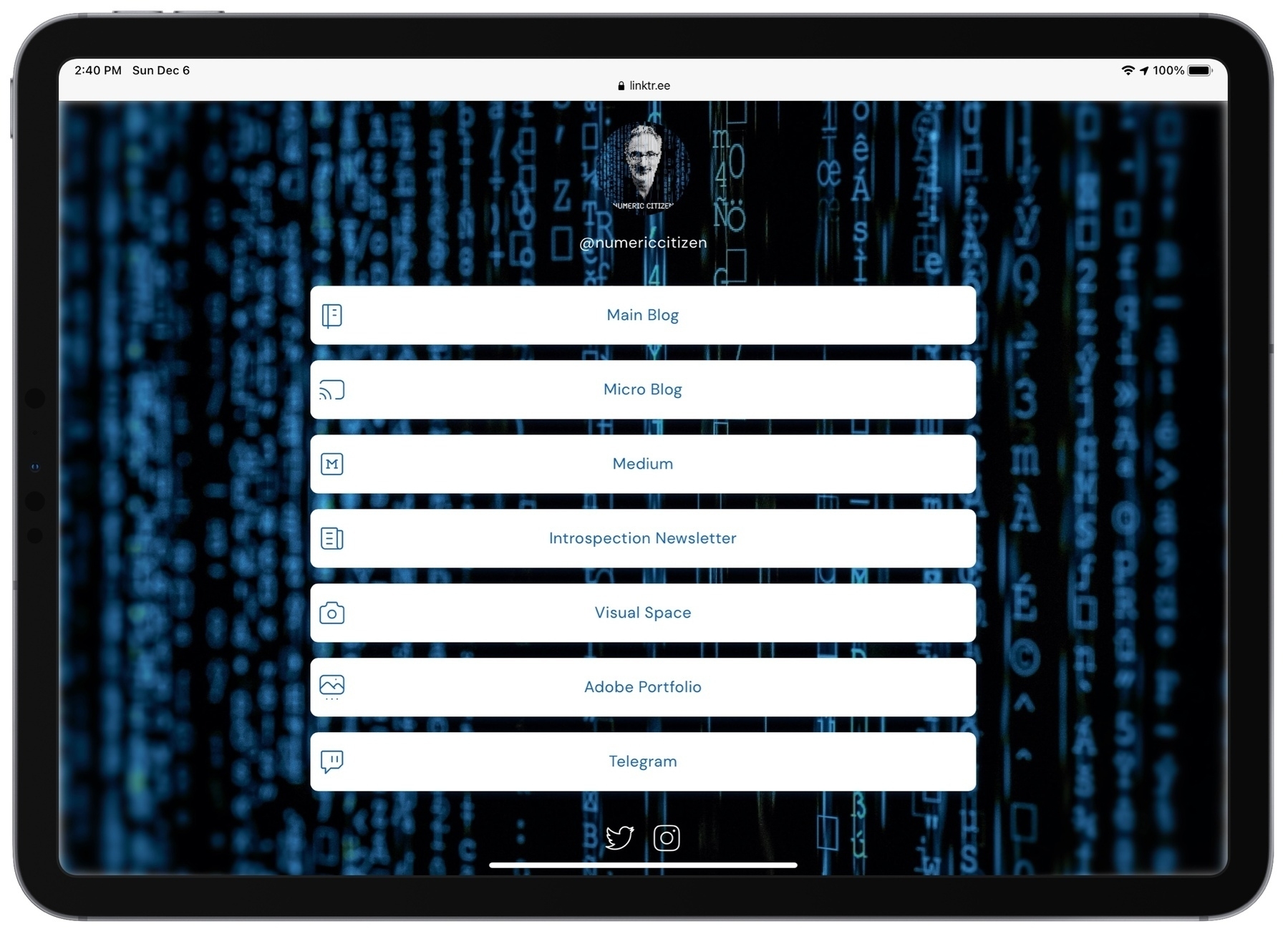
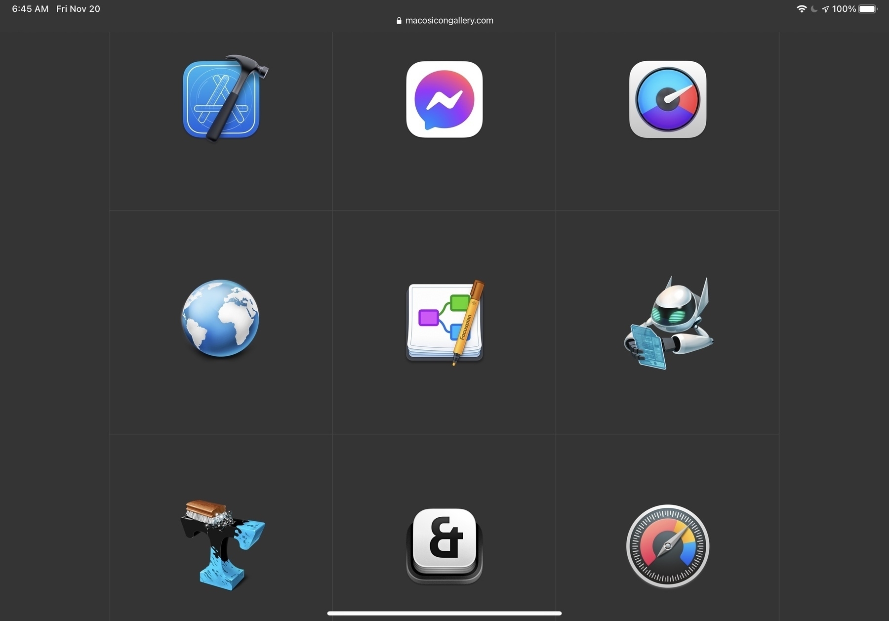
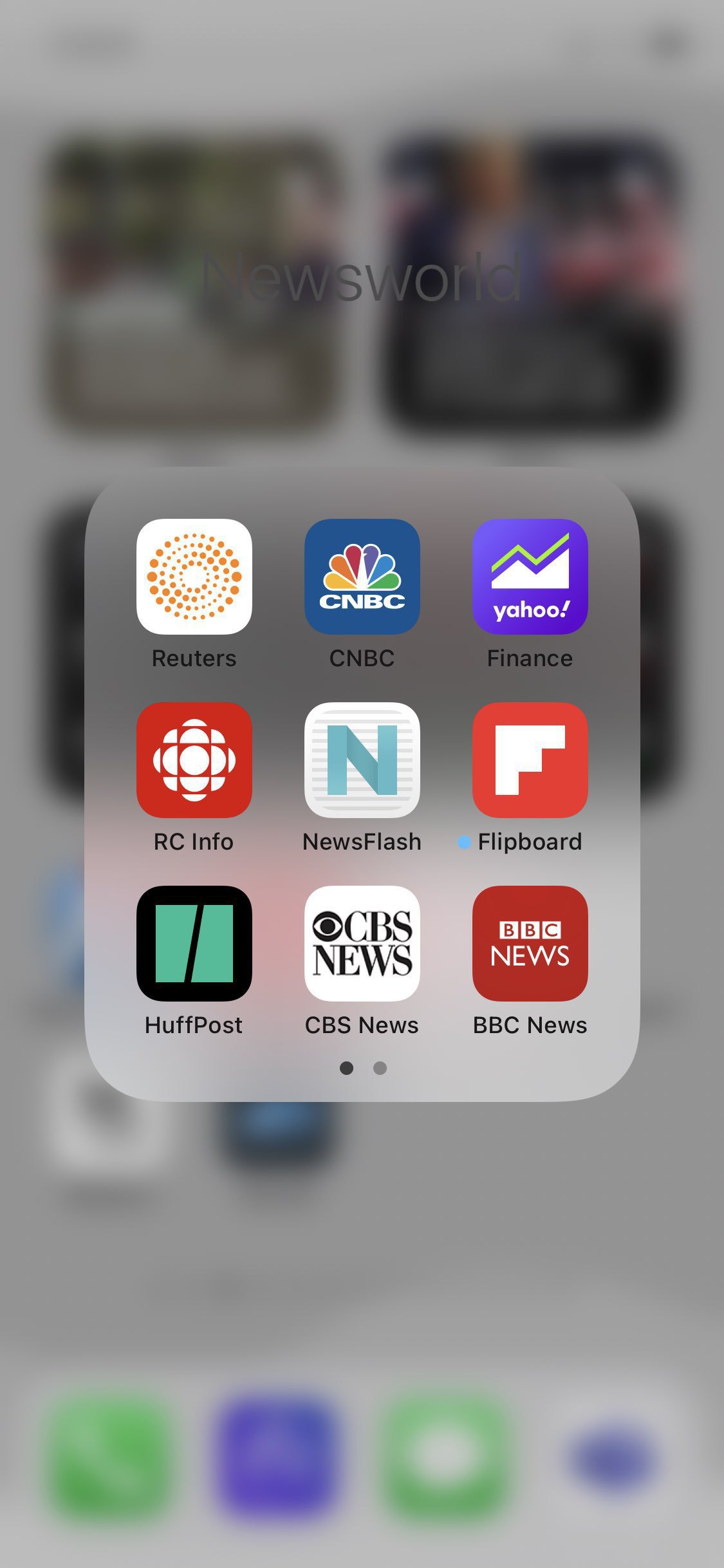
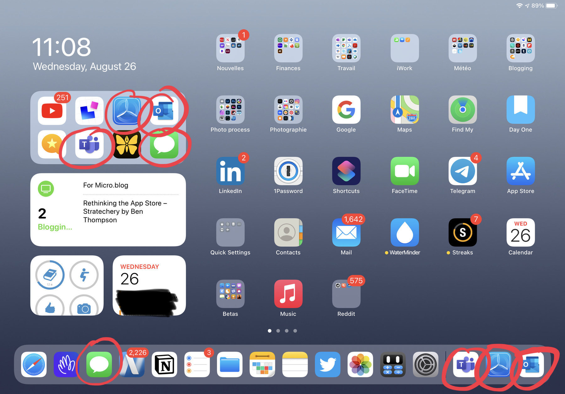
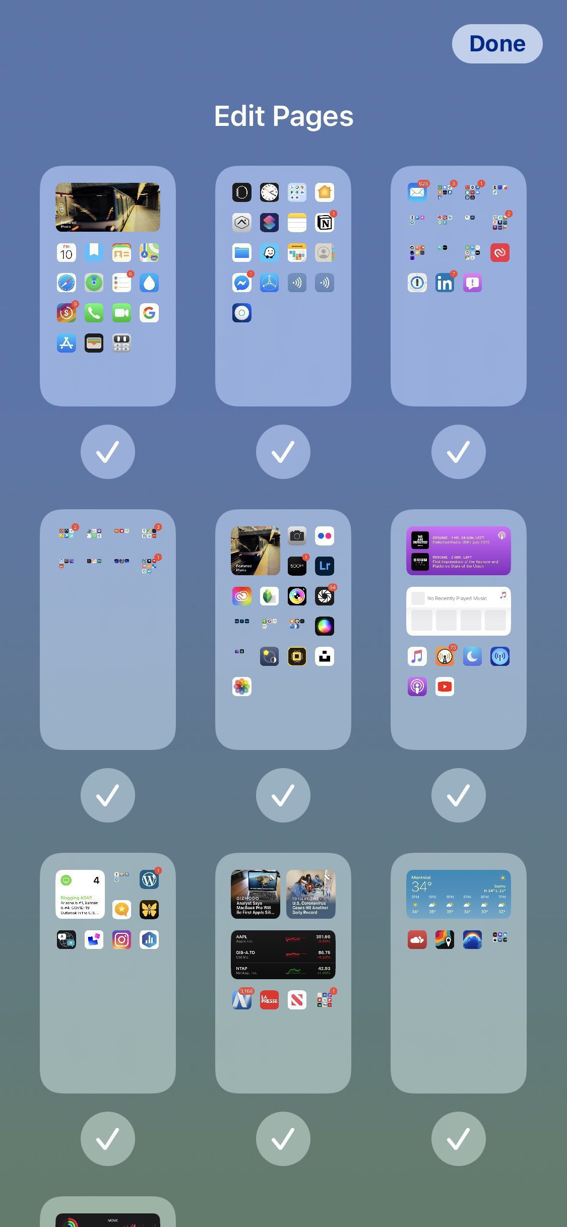
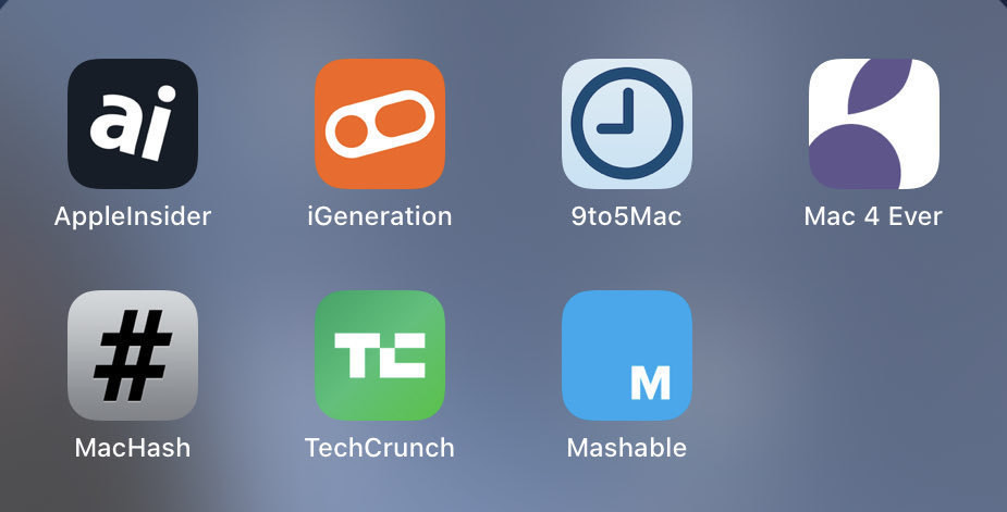
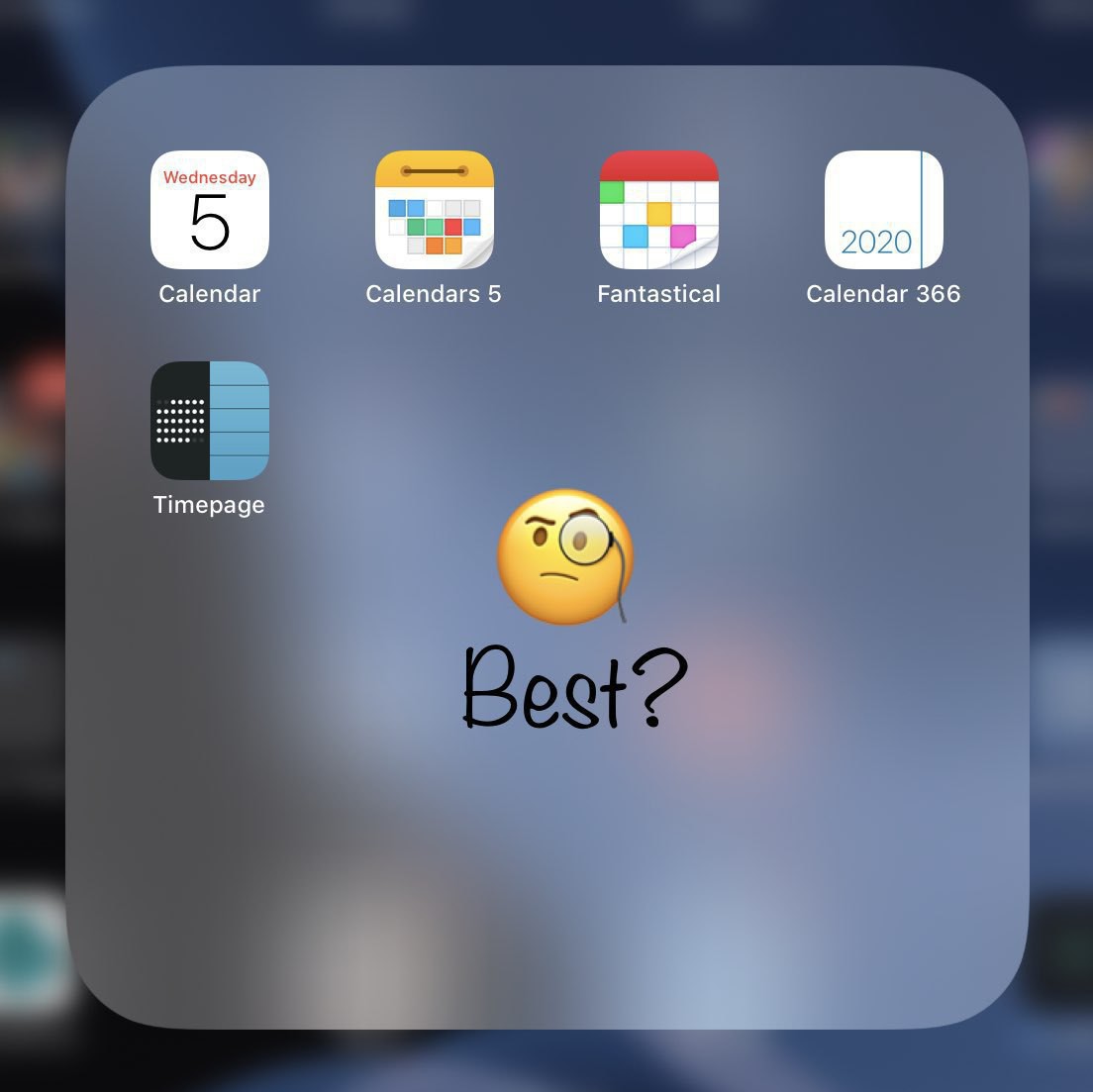
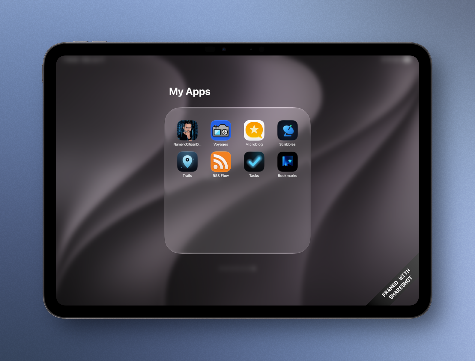
These are my custom-built apps. Icons aren’t the best and my goal is to refresh them to create a visually coherent set. Eventually.
 2026-06-17 ∞
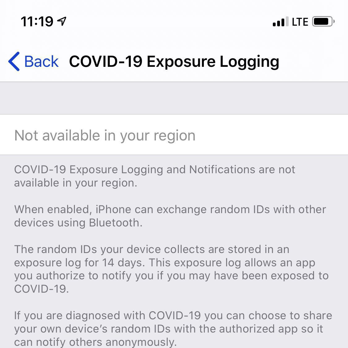
 Can Siri AI Taking Over?
Since I now run OS 27 on most of my Apple devices, I should remember to use Siri AI instead for simple questions I’d usually ask ChatGPT. Habits are hard to break, I suppose. I find it strange that Writing Tools are no longer available—am I missing something?
2026-06-18 ∞ Apple Can't Hold the Line on Prices Anymore
Tim Cook Says Apple Price Increases Are ‘Unavoidable’ Due to Memory Costs — MacRumors
“Unfortunately, price increases are unavoidable,” said Cook. “We’re doing our best to mitigate the huge increases that are being passed to us, and we’ve been trying to shield our customers from the increases, but the situation has become unsustainable.”
This is not looking good, and Apple is getting us ready for it.
2026-06-18 ∞ Anxieties of a Creator
Now that I have everything I need for a public travel journaling experience, I’m starting to think about the anxiety this might trigger while travelling. I want to take and share great images of places that are significant in my travelling experience. But, blogging shouldn’t be a burden, journaling neither, especially while travelling. But as a creator, creating and sharing goes hand in hand. I hope I’ll keep my anxiety at bay!
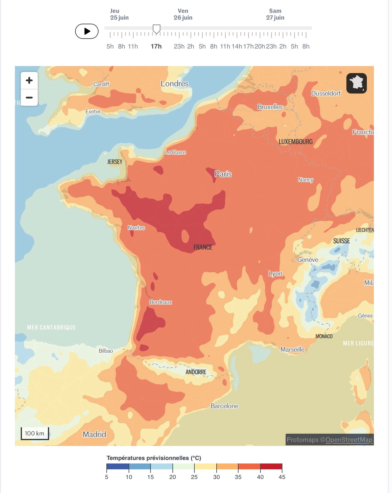
2026-06-18 ∞ High Temperatures Expected
The weather in Montreal, Canada, has not been very good this Spring (lots of rain, too few sunny days, colder than usual). If weather forecasts for the next ten days materialize, improvements aren’t expected soon. Paris, France, is quite another story. They have had plenty of sun, and temperatures are abnormally high and expected to remain so in the near future, as they are still going through a heat wave. The expected high in Paris this coming Saturday is 36C! As a reminder: AC in Paris, or Europe in general, is not common. 😅🥵
2026-06-19 ∞ Not Addicted Yet
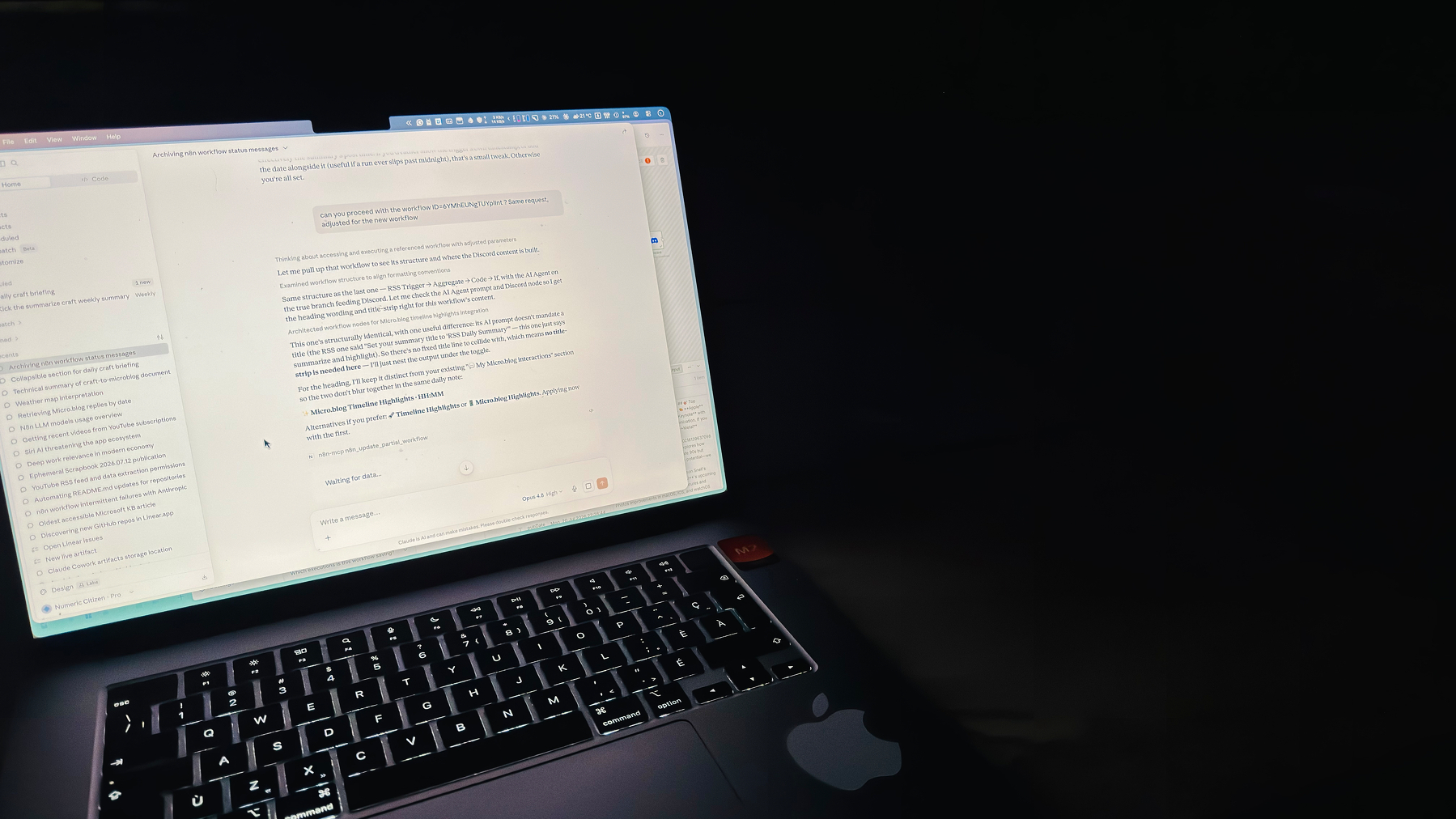
This morning, I realized that my Discord notifications were delayed; the last one was over 24 hours old. After a brief investigation, I found that I couldn’t connect to my n8n instance; it seemed to require a restart. I didn’t have time to investigate further, so I rebooted everything. Everything is back to normal.
What’s funny is that I only realized this morning that my Discord instance wasn’t receiving any notifications, which shows I’m not yet addicted to these notifications; no n8n workflows are essential yet, and I can do without them. It’s just a mild annoyance.
2026-06-19 ∞ More of Siri AI
Since the Siri AI beta is out, I have started using it more and more for simple prompts like the following. It’s not fancy, but it works. Unlike ChatGPT or Claude, Siri AI doesn’t seem to have a memory beyond the data on my device. I’m not quite sure yet, but that’s my current understanding.
 2026-06-19 ∞
 Paris is hot!
First full day in Paris completed. Now starting second day. In case you didn’t know: there is a heat wave affecting most of France. It’s hot 🥵 here in Paris with a temperature of around 26C early morning. Now planning museum visits where temperatures are colder inside.
2026-06-21 ∞ Still hot in Paris
Well, at the beginning our third day in Paris and options for visiting air conditioned museums are limited because of high demand. Apparently, we should plan in advance which we rarely do in vacation. 🫤 Probably going to visit around Le Louvre then see La Seine river nearby where I expect somewhat colder air. Temperatures are expected to be around 35C this afternoon. 🥵
2026-06-23 ∞
Beta 2 on iPhone seems a regression. I do remember that we get a few steps back before jumping back to acceptable stability: visual bugs, weird animations in iMessage, etc.
2026-06-23 ∞ Peak heatwave
Good morning from heated Paris! Today might be the worst of all as we enter peak heatwave. Expected temperatures are around 38C. 😳🥵😩 Photowalk is not a possibility today, this heat removes any glimpses of inspiration. Looking for more museums to visit.
2026-06-24 ∞ Those open space offices suck
Open-plan offices have many drawbacks, and I was reminded of another one today. Instead of a generic, rotating desk, I much prefer having a dedicated, private office. I want a space of my own, and I enjoy seeing how others personalize their workspaces. You can learn so much about people’s interests and personalities just by seeing how they occupy the space where they spend a third of their lives.
2026-06-24 ∞ 28C at 9 o’clock!
Starting day #6 in Paris. After a nearly sleepless night with high temperatures in our apartment, no breeze at all, we are facing another record breaking heatwave day. Heading to Notre Dame this morning while outside temperatures are still ok for waiting inline in a queue. Beyond that, we still don’t know. Max temperature is expected to be 38C at 5PM. 🥵🫤😒
 2026-06-25 ∞
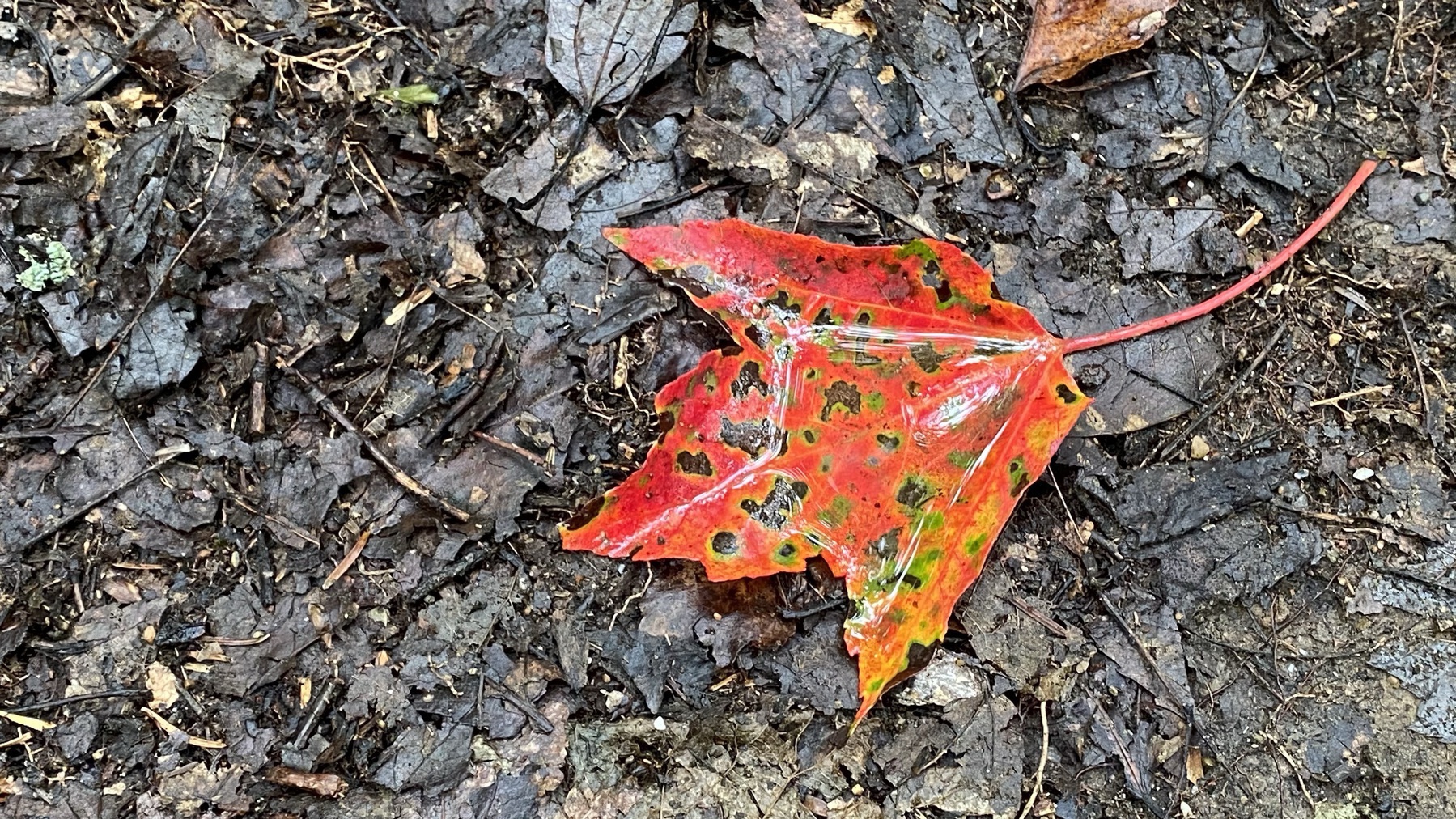
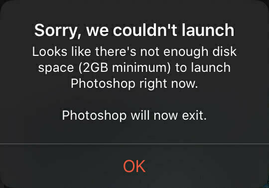
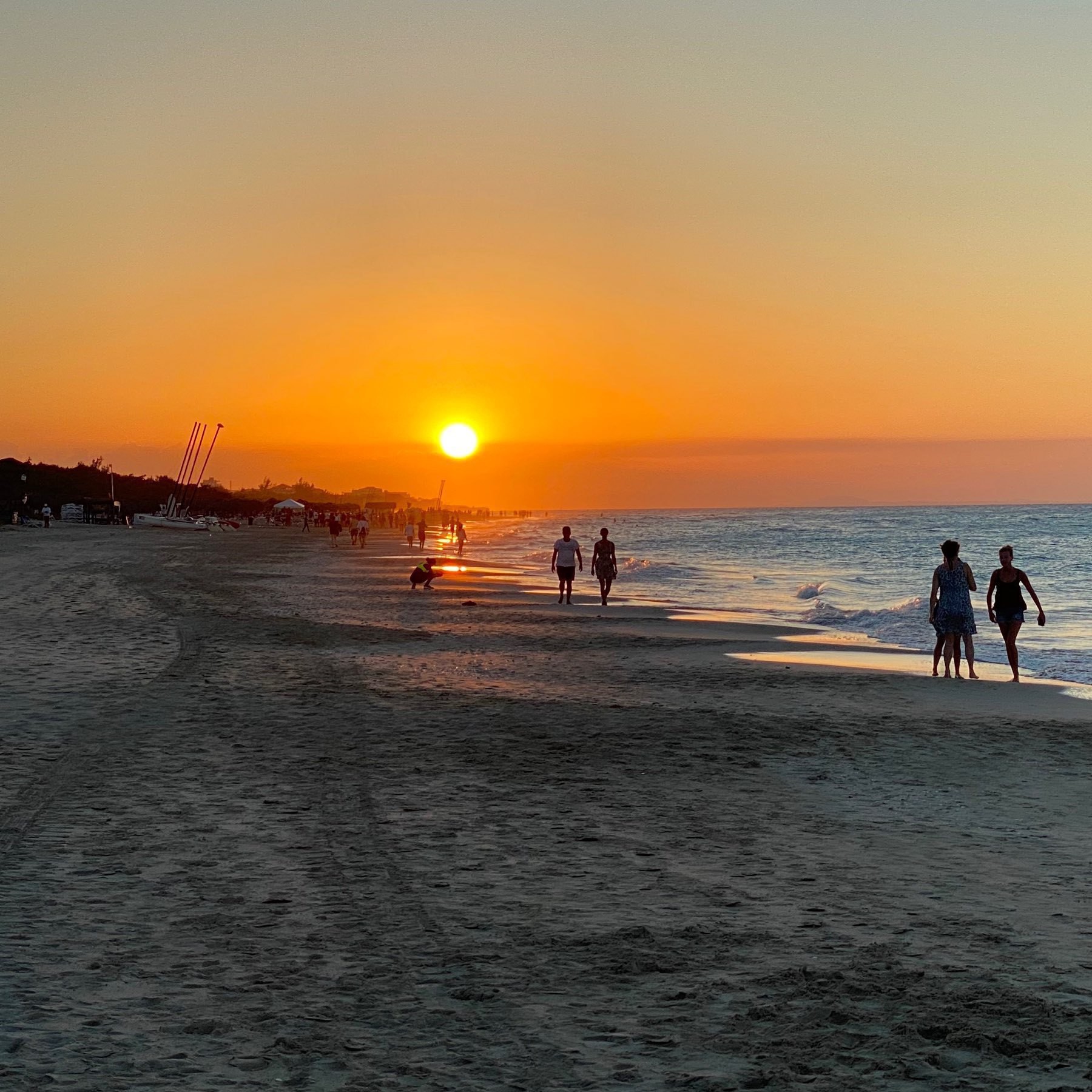
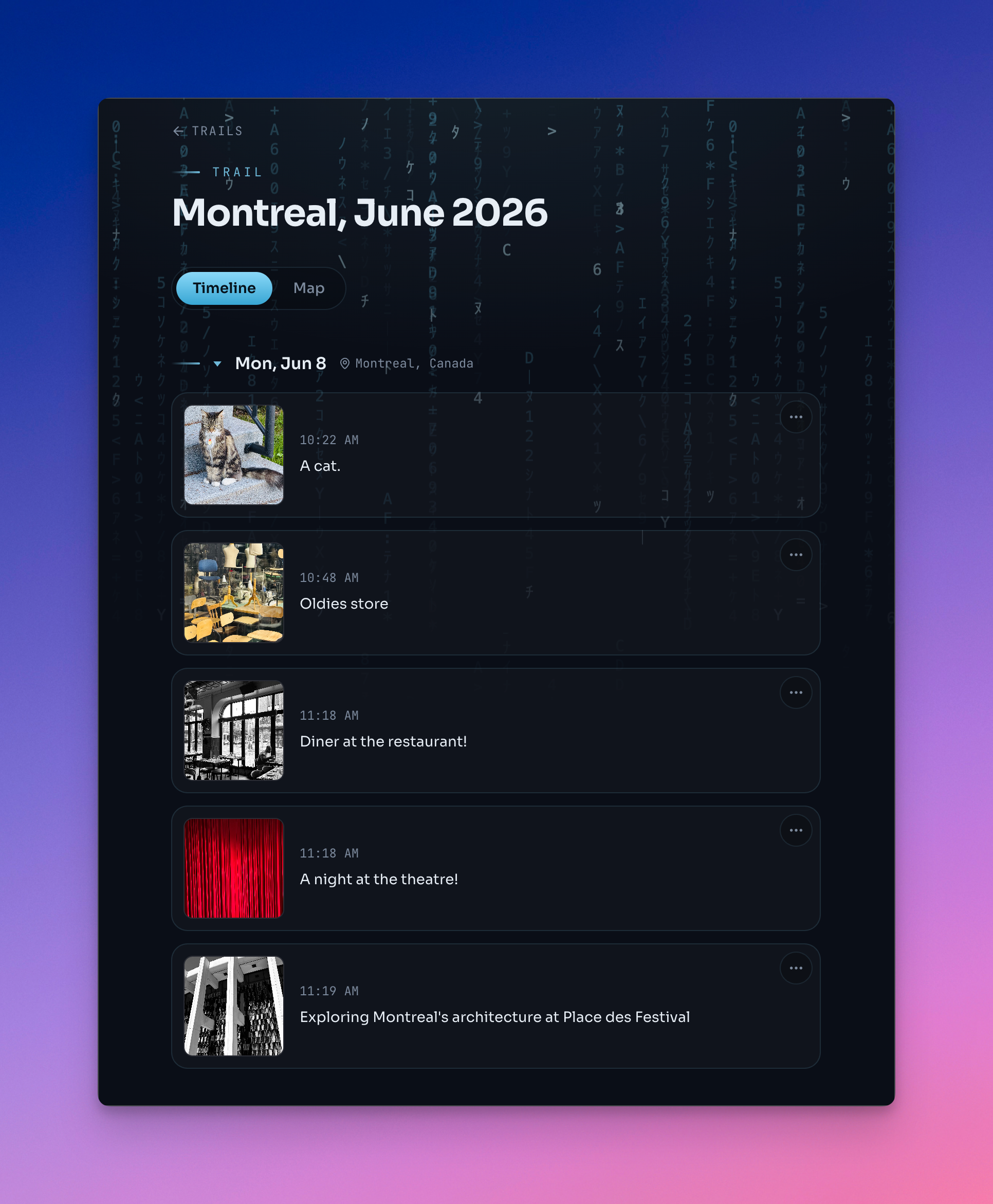
 Too hot for photography?
You might think that, by looking at the trail here, I’m taking a lot of photos in visiting Paris, but that’s not the case. One reason is it’s my second time in Paris, but the second reason is the heat. Sadly, It’s not fun to stop on the street for a few minutes, under the sun, for shooting a few photos. And lastly, my iPhone is overheating quickly while taking pictures! Running a beta version of iOS 27 probably doesn’t help either. 🤦🏻♂️ I’m probably snapping a third of what I would shoot normally.
2026-06-25 ∞ A slight twist
Is the worst of this Paris heatwave behind us? Maybe, as we’re only heading for 37°C today instead of 38°C or 39°C 😒🥵. After three mostly sleepless nights, we decided to leave our apartment a day early to stay in a hotel with AC before leaving Paris for good. Other than that, our plans for the day are still up in the (hot) air.
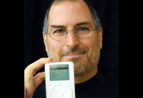
2026-06-26 ∞ RIP Mr Om Malik
I learned of Om Malik’s passing last night when I got back to the apartment through a short message from Manton Reece. What sad news. I had noticed recently that the frequency of his posts had changed and become irregular. He had some health issues and shared a few words about it in the past.
I had been following Om Malik for a few years and appreciated his perspectives on Apple and technology in general. He knew how to read the nuances and contrasts of Apple much better than other bloggers I won’t name here. He was a great tech journalist. Finally, I was a big fan of his photographic style. I had the pleasure of following him on Glass and regularly showed him my appreciation for his unique style, full of nuance. He will be missed by us all.
Om Malik was one year older than me.
I read his last post dozen of times. This feels surreal.
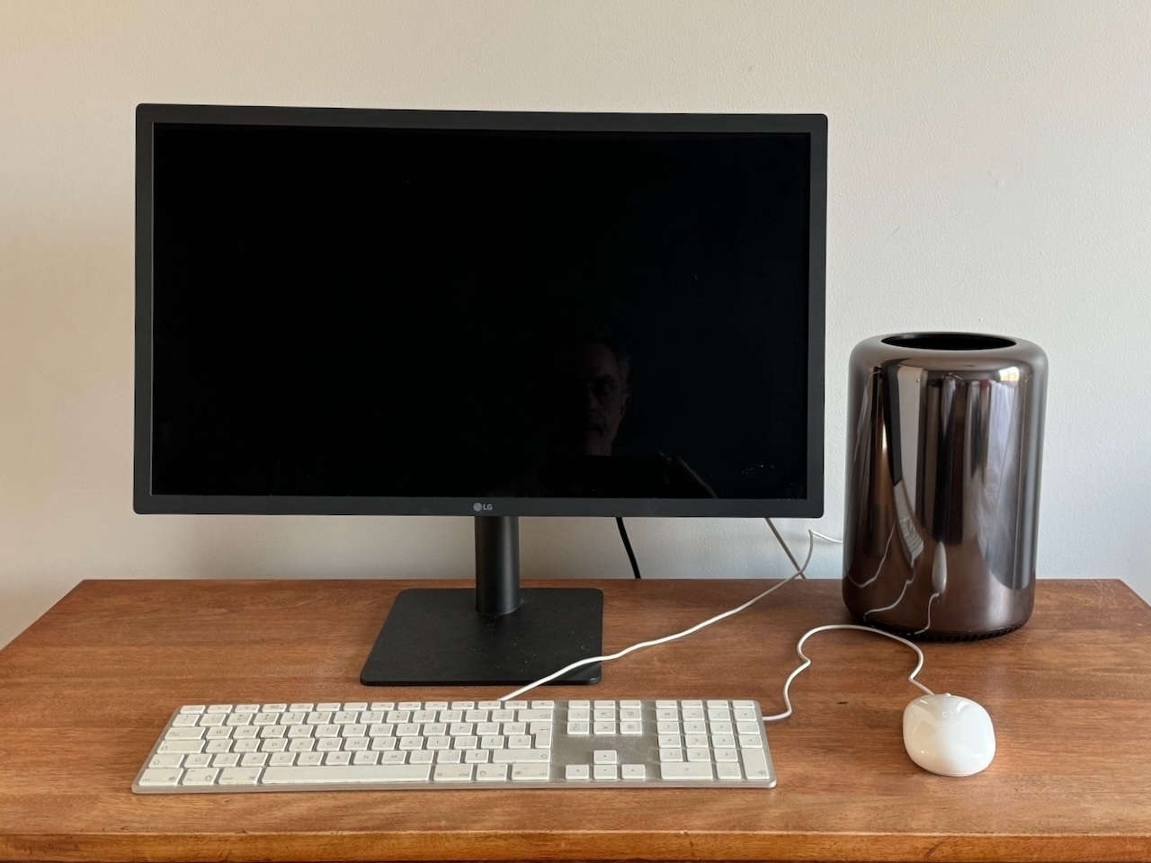
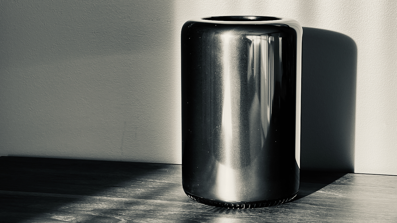
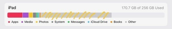
2026-06-26 ∞ The 128 GB trick
Is the Apple TV the new Trash Can Mac Pro? And why on earth do we need a 128 GB configuration? Was it an Apple trick so that people not knowing what they were buying would go the 128 GB route, making Apple smile with 💵💵💵? It’s a shame that Apple keep this around and even increase the price!
2026-06-26 ∞ Bye bye Paris
My last day in Paris. This week flew by. Despite the climate-related challenges, visiting such a wonderful city has been an unforgettable experience. Now, we’re heading south, on a three-hour TGV ride, for a relaxing week on the seaside. Don’t expect too many check-ins. I’m taking a break. I hoped you enjoyed this photo-centric journaling as much as I enjoyed posting.
2026-06-27 ∞ Stop scrolling TikTok and start building YOUR app
AI coding is creating a new generation of makers:
it’s been heartening seeing people reverse engineer things and build weird little things that they never would have done before. I guess they’d be scrolling TikTok instead.
Anything to stay away from TikTok is a win for humankind.
2026-06-27 ∞ Why Inkwell is so useful while on vacation
I use Inkwell quite often and I like it. While on vacation, I tend to spend less time reading my RSS feeds so my unread count goes up quite a bit. How do I catch up efficiently? I stop for a small reading session, I switch to Inkwell and use the Today tab but also the Recent tab which is super useful to see what I have missed. In extreme case of disconnection, the Fading tab comes to the rescue. If you’re an RSS feeds junkie, you should consider trying Inkwell.
2026-06-29 ∞