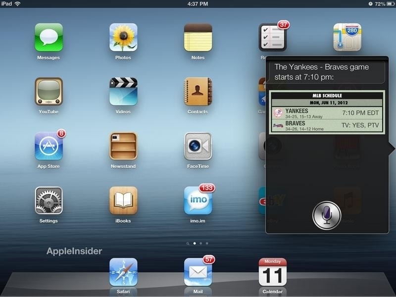
User Interface design dark age era
We are in the dark age (not dark mode!) of user interface design for sure. We get excited for new animated UI elements (example here), but overall, delight has been lost in translation a long time ago. As Mike Rockwell is a link post say:
“I can’t really identify anything that I’ll be nostalgic for in ten or twenty years.”
I wouldn’t go back to pre-iOS 7 days but there has to be some delightful in-between degree of crafted user interface that had some real joyful elements in them. Apple is not the only one at fault here. It looks like it is a design trend spanning many mediums (print, TV, web, etc.).
Has the industry decided that our devices have reached a level of maturity that warrants making everything minimal, sterile, and utilitarian to help “do work” and “get stuff done”?
Excellent question, Tyler Hall.
