Documenting past home screen arrangements
Matt Birchler had an interesting blog post this week about a screenshot of his 2013 iPhone home screen. There are a few interesting things to note. In 2013, it was the arrival of the controversial iOS 7 redesign. It’s interesting to look at the Camera+ icon design which was still not updated for the new style. The dock design style was pretty basic and felt out of place. A few apps are not longer among us these days: Path (which was really a great design example) but most of the third-party apps are still available today.
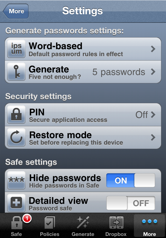
I wish I had kept screen shots of previous home screen arrangements in the past. Something that I have kept is many screen shots of my password manager user interface dating back pre-iOS 7 era. Here is an example below. When I saw iOS 7, I didn’t have the courage to rework my design. The development of my app stopped right there. I made five thousands dollars with this adventure, between 2009 and 2013. Now I’m using a combinaison of 1Password and Apple’s passwords vault.
