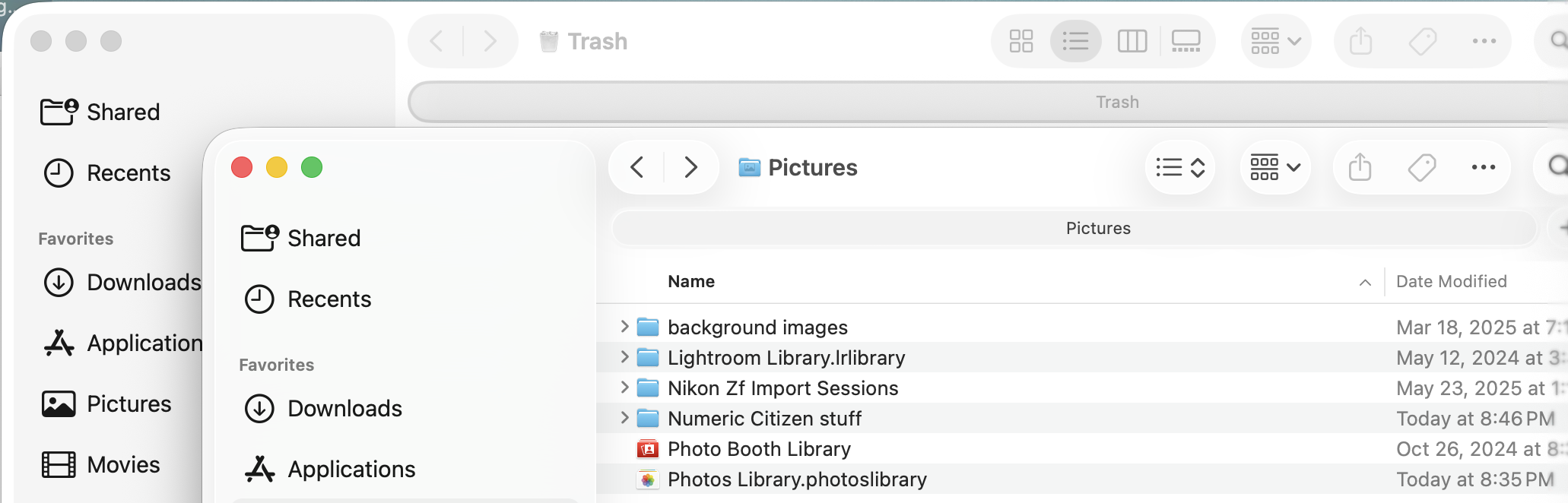
This is the new readability standards from Apple, a trillion dollars tech company. Here’s a screenshot of two Finder windows. Which one is active? Why is the tab of the inactive window darker than the active one? Why can I barely distinguish the tab of the active window? And those “floating over the content” controls in the top portion, are just, weird and out of this place.