On iOS 13’s Share Sheet Design - Better? Worst?

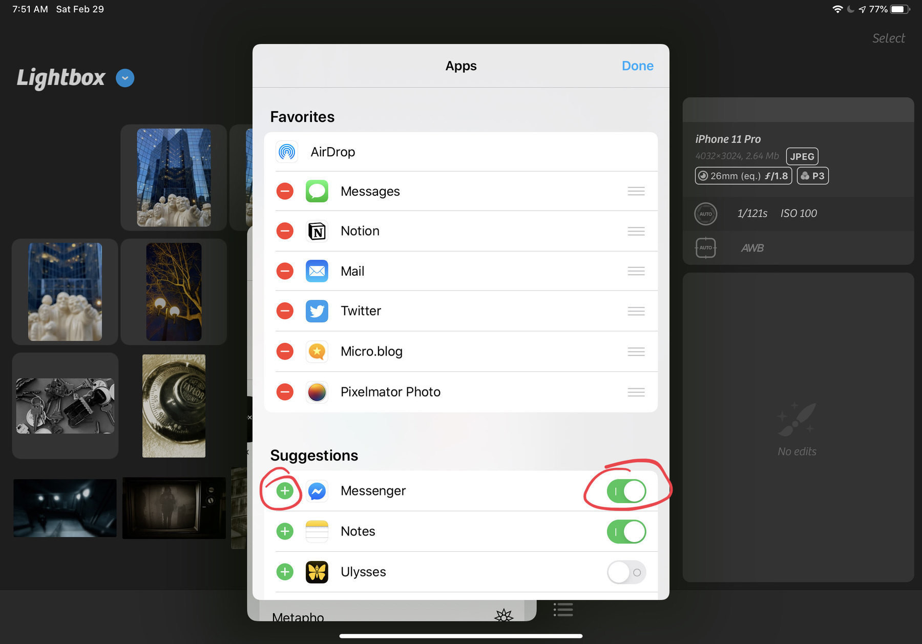
The share sheet design in iOS 13: I find it confusing. 🤷🏻‍♂️ It is a step ahead of iOS 12 but yet I’m not satisfied and I don’t know why exactly. The inclusion of Shortcuts is ok but should they have been put in a separate section? Also missing in iOS 13: a way to maximize/minimize popover windows like this one. I understand the need to keep sight of context of invocation. Your take?

Well, yes, thank you to all developers

I was an indie developer from 2009 to 2013. I made three apps that got me about $5000 in revenue. I don’t know how much per hour this represents. I loved this time of my life where after a long work day I would sit in front of my Mac to learn Obj-C, Interface Builder, etc. until later in the night. Now, I can really appreciate what it is like to build apps and let the world know about them. Expressing Gratitude to Developers

On bookmarking apps and services

Bookmarking apps and services like Pinboard are great but they offer limited features… (I was a user of Pocket before). For me, I decided to use more versatile tools like Notion.io instead. More complete, deeper learning curve but way more than bookmarking service. (I was evaluating Raindrop.io but stopped because of lack of support of multitasking on iPadOS. I wrote the developer about it. Still didn’t get a response). alanralph.co.uk/3721-2/