On macOS Big Fur surprising visual and design attributes #wwdc #wwdc20

Taken out of one of @gruber recent post. 
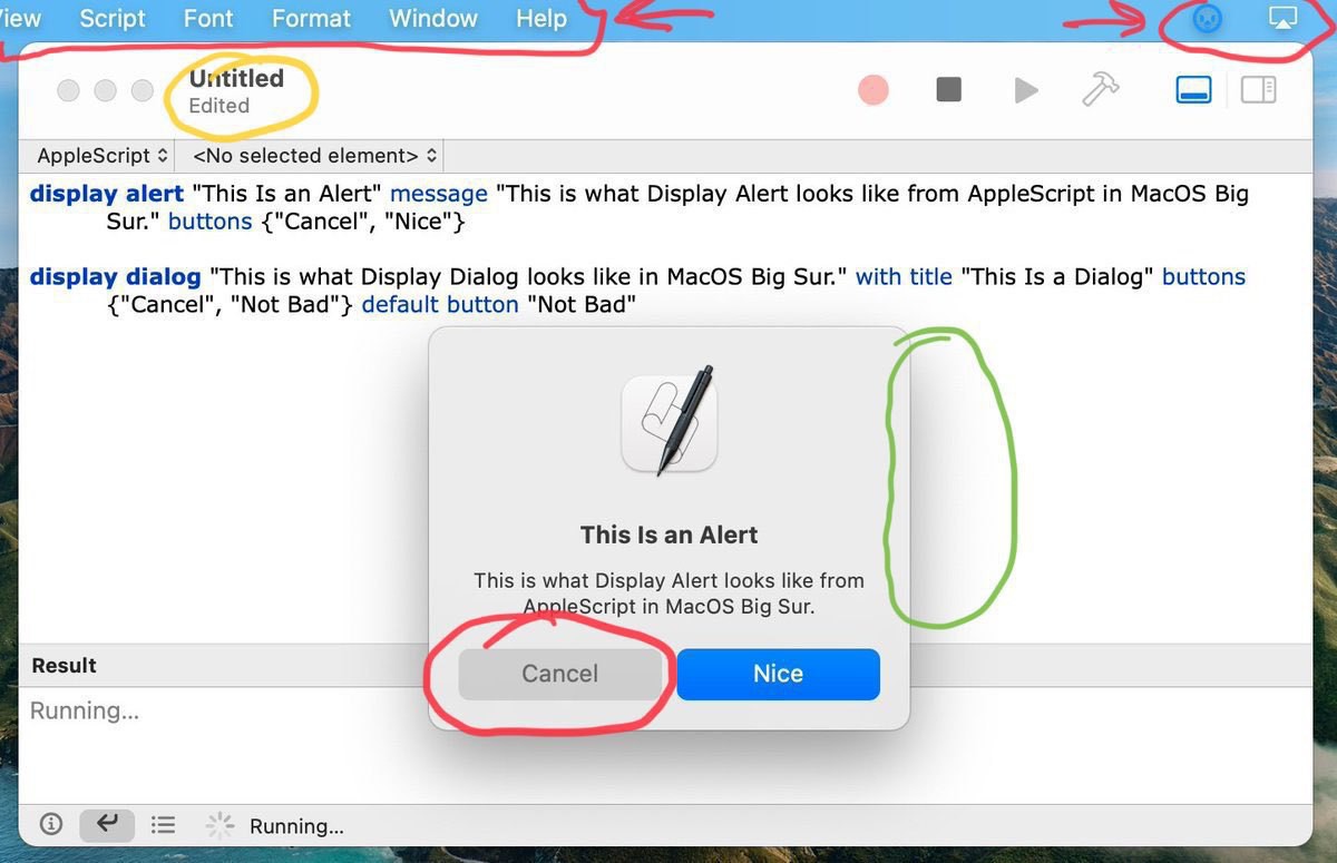
In red: the Cancel button looks like being disabled. Very bad. The menu bar transparency, why? Is Apple trying to make us forget about this distinctive UI element? In yellow: the window title being no longer at the center, to make room for buttons (that look less and less like buttons)…
In green: a depth effect with surrounding shadow, thumbs up. General look of the refresh popup dialog, very iOS is refreshing on the Mac.

For those wondering… I’m still trying to wrap my head around the start of the WWDC20 week, started by this exceptional opening keynote. So far, the best words for describing my feelings are “a near perfect balancing act”. #apple #wwdc20 #wwdc2020 #wwdc

Stay tuned for more.

Oh this is so cool… for photography beginners who want to learn how to use Lightroom… new in release 5.3 of Lightroom: sharing your edits to the world! lightroom.app.link

The following edit from the Lightroom community has been shared with you: Broken Glass and Butterflies

Today, I read on a website that Polarr is a good alternative to Snapseed. Well, truth to be told: it is far from being the case. Polarr is not free. Very hard to replace special effects like Grunge. #photography #photoapps #applications

By refusing to build an iPad version of their app, Instagram makes a big mistake. I think serious content creators would love to use bigger devices. But Facebook just doesn’t care.