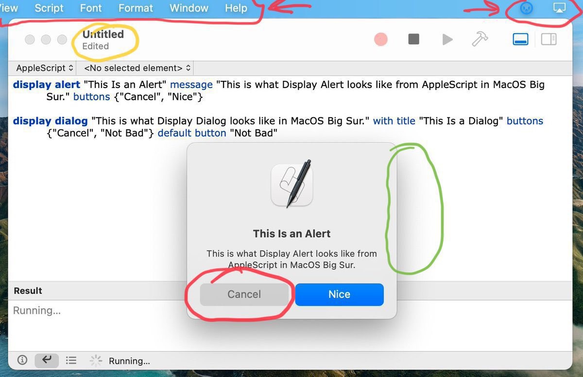
On macOS Big Fur surprising visual and design attributes #wwdc #wwdc20
Taken out of one of @gruber recent post.
In red: the Cancel button looks like being disabled. Very bad.
The menu bar transparency, why? Is Apple trying to make us forget about this distinctive UI element?
In yellow: the window title being no longer at the center, to make room for buttons (that look less and less like buttons)…
In green: a depth effect with surrounding shadow, thumbs up. General look of the refresh popup dialog, very iOS is refreshing on the Mac.
