Weekly Posts Digest from Numeric Citizen Microblog
5 min read
Exploring the World of DJing
I always liked electronic music, but I’m not a musician. In recent moths, I’ve been exploring the world of DJing. It’s a way for me to feel that I can do music without deep knowledge of musical theory. It’s a fascinating world.
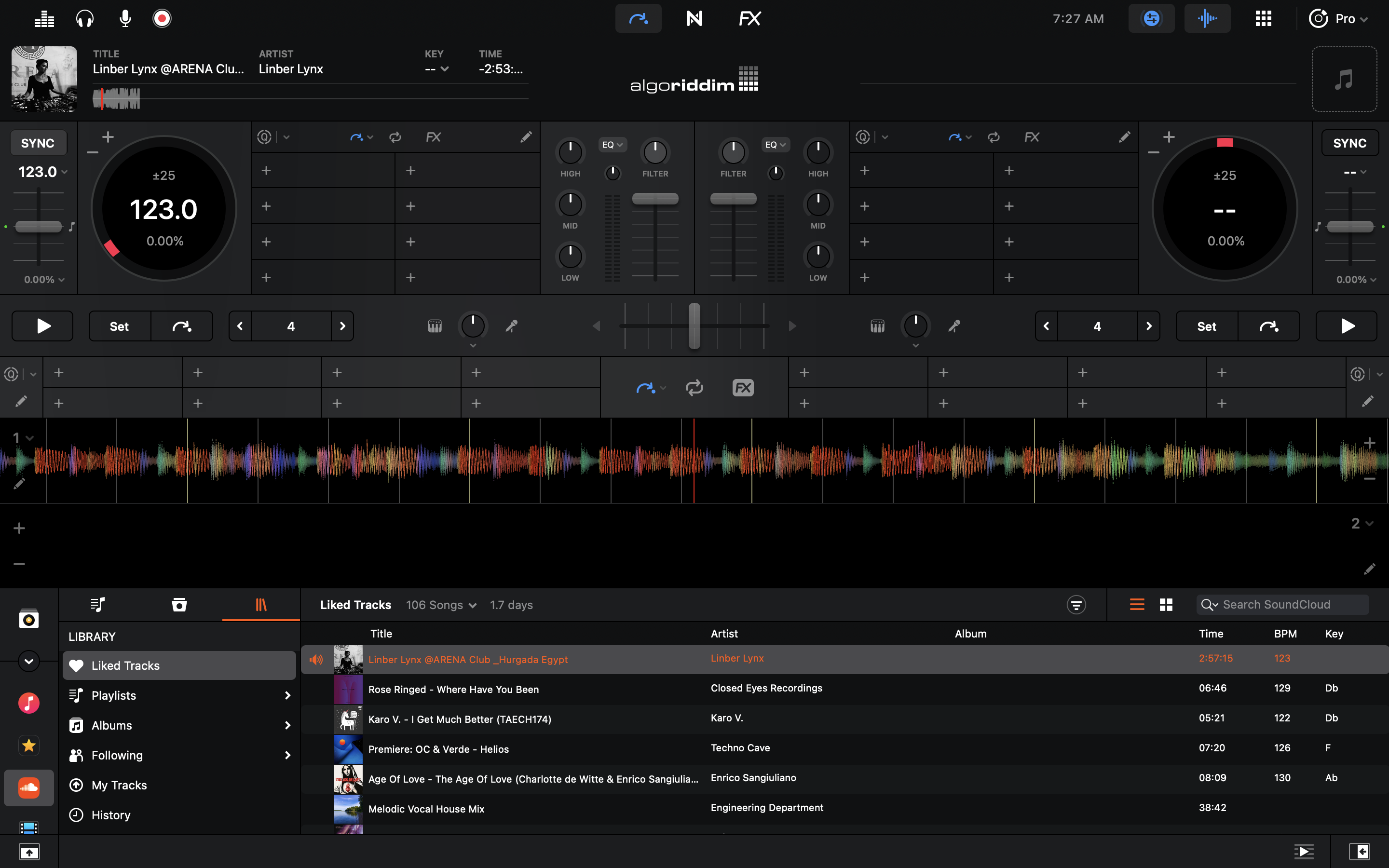
Last year I bought a Pioneer DDJ-400 controller for use with my Mac mini. There is two major roadblocks in my experience so far: finding good quality tracks to mix and selecting the best DJ app. I want to draw your attention to the software side of my story.
Some well known DJ apps are Rekordbox, Serato and DJay. My understanding is that in recent years, software makers all switched to subscription models. Application like Rekordbox will “unlock” some of its features while being used with certain DJ controller models, but to get the whole thing, you have to subscribe to some plan. It’s irritating for someone like me who’s just trying to learn and experiment. But there is another problem: applications design sucks. Rekordbox and Serato are visually terrible. On the Mac, these apps really feels like aliens coming from… I don’t know… even on Windows they probably look aliens. The best looking application is Algoriddim’s Djay, by far. Problem is, the application is lacking many features. For now, my conclusion is that It appears that we cannot have both fully featured applications with a great design.
I’m a Big Fan of Craft But…

As you probably know, I’m a big fan of Craft. This application is really at the center of everything I do online, as thoroughly documented in my blogger workflow. That being said, I always keep an eye open for competing services, thanks to my Twitter list “Apps & Services”. Notion is one of them. Before Craft, there was Notion, which I loved too. But it felt too complicated or overkill for my needs. Craft is nowhere near Notion in terms of features. There is no comparison, even though I wrote one. Really. Yet, according to their recent tweets, Notion has been on a roll lately, adding features, tweaking things or rewriting a portion of the user experience like the text editing engine. So, where am I going with this?
It is tempting to think: what if I came back to Notion? I still have my account, after all. Things always look better on the other side of the fence, right? The thing is the speed of evolution of Craft, while being considered at a fast pace by some, I’m realistic, and I would argue the contrary. The team behind Craft is surely a fraction of Notion’s. Basic things are hard to come by. Said another way, my expectations aren’t met as fast as I wished. Take this week’s update, which was released earlier this week. While I’m happy to see improvements, there is not much to talk about. The release notes starts by the possibility to “star” a document, so it is easier to find in the navigation bar on the left. The second thing on the list is some improvements to the display of backlinks at the end of a page. While being welcomed by many, it’s not exactly mind-blowing. Sure it is a dot dot release (v2.0.3), but I was expecting so much more, as documented in my Craft wish list. Craft eXtensions, announced with the 2.0 release at the end of 2021 sure looks full of potential, but my expectations lean toward Craft’s core experience, which I find somewhat lacking.
I think I’m being overly demanding. Patience is a virtue.
About iMessage - Again
Apple’s Messages app, why does it only support iMessage and SMS? iChat had support for AIM, Yahoo Messanger, ICQ, and XMPP. Why hasn’t Apple gone beyond the blue and green bubbles, introducing support for additional protocols with more message bubble colors?
Apple likes control. They didn’t have it with those protocols. How could they implement things like CSAM?
Source: The Green Bubble Myth - Initial Charge
2022-01-21
Taking Advantage of the iPad Screen

Consider the previous annotated screenshot from Matter. Way too many applications have the same design issue. Why, in 2022, developers cannot fix these wasted space? I see that the content is of the same width if the iPad is used in portrait or landscape orientation. Why not adjust width dynamically? Is it that hard?
Dear Apple: Bring Back the Dashboard

I want this so much. We have to voice our desire to get back the Dashboard on macOS. As explained by 512px a long time ago:
Jobs pitched widgets as mini-apps that let you look up a quick bit of information without ruining your workflow or train of thought. They allowed for quick interactions. They were present when you needed them, and disappeared when you didn’t.
Why try to imagine new solutions to fix the widgets conundrum on macOS? The Dashboard was the only good solution where you could put widgets anywhere on the screen, then invoke them as needed. Dear Apple, are you reading this? 🥺🙏🏻
Let’s enjoy one more time the Dashboard in its full glory.
