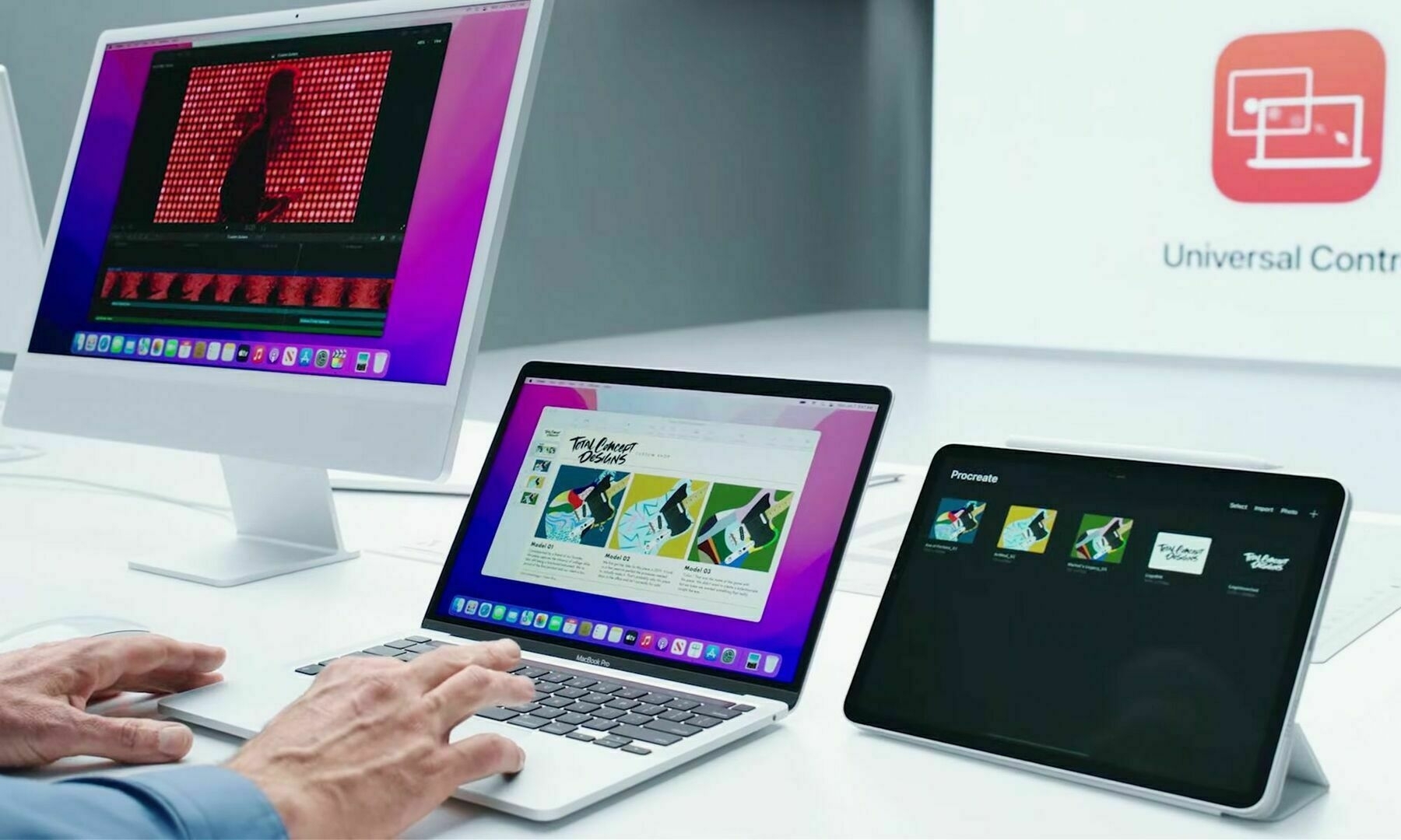
Doing all the things I love

Photo by karl chor on Unsplash

After an emotional week-end, long in coming, today I’m doing all the things I love the most: doing computer stuff — writing in a coffee shop — feeling like a real blogger — doing some photo processing — walking — biking. I know time will fly.

Life is good. Those days are so rare. I’m enjoying every single minutes of it. Work resumes tomorrow.

Photo by karl chor on Unsplash

Apple’s cheap labour: concept creators

Parker Ortolani for 9to5Mac published a two-parts concept on a future version of macOS named Mammoth.

macOS Big Sur did a great job of refining the Mac desktop, but it didn’t fundamentally change any of its behavior. We’d like to see that change with the next version of macOS. With Monterey being mostly full of small refinements rather than big ideas, we’d expect Mammoth to be a monstrous release.

I’m using one of his screen design that pertains to widgets improvements. I recently wrote about those and Apple’s sad design decision to keep them in the notifications center for Big and Monterey. I think Ortolani’s design is interesting and plausible. Freedom of placement certainly makes the experience more satisfying. It’s so true they liberated widgets on iPad with iPadOS 15.

There is so much work going into these visual essays. I mean, there are release notes too! I often considered people doing these mockups has being Apple’s cheap labour. I wonder if Apple’s designers notice those.

Excited for a… keyboard

I got the new Magic Keyboard with Touch ID. I chose the one without the numeric keypad; the desk space being scarce. Setting this thing up took one minute. I had to read the (slim) manual as I wasn’t sure how the pairing would work: connect the keyboard to my M1 Mac mini with the provided USB-C to Lightning cable, quickly press the M1 Mac mini power button two times to trigger the setup process for Touch ID configuration (Bluetooth is automatically configured). The Touch ID setup screen looks similar to the one on the iPhone when settings up Touch ID for the first time. It’s one of the best Apple keyboard; keys feeling is similar to the previous generation. Touch ID is the star of the show here, and I love it. Only works with M1 Macs. This Magic Keyboard brings to the Mini, a feature otherwise only available to the MacBooks (and the M1 iMac). That’s why I bought the keyboard. It’s not cheap, but convenience has a price for Apple.

About the Store, the Store Tab.

There is so much to think or write about a simple “Store” tab. Something so “obvious” can lead to weird design decisions, even for Apple. I love this (rare) blog post from Ken Segall.

Sarcasm ON: “I’m feeling inspired by Apple’s new way of thinking. It’s liberating. Who needs “Apple” when you have “Store”? Generic is just so much easier, don’t you think?” - Ken Segall

To be honest, I don’t remember when there was a dedicated Store section on the Apple.com website. Apple brought it back, leaving “Buy” buttons scattered around every single product pages. It is now so much easier to buy something from Apple these days.

Sarcasm OFF

(Re)Introducing the Store Tab

Yesterday, Apple made some changes to their website with the introduction of a new Store tab at the top of their website. Not only that, but the store design has been completely redone. I find it a bit disorienting at first, but after a few minutes, I think the elements and general reorganization make sense; I find it easier to navigate in general. Apple chose the horizontal scrolling sections instead of going vertical. I’m not always sure this is the best way to go, though. The bouncing effect is inconsistent, it’s there while going to the right but not when hitting the limit on the left. AirTags have their section, which is surprising for such a small device.

It’s interesting to note that Apple’s top navigation bar is now spanning a store, physical products, services, support, search, and a shopping cart.

Apple is getting ready for this fall slew of new products. Oh, one of the first thing I noticed is that the Magic Keyboard With Touch ID that is bundled with the 24” iMac is now sold separately. I ordered one for my M1 Mac mini. It will take less space on my desk and Touch ID will so much more convenient for the mini. One last thing: convenience has a price: 179 CAN$. Ouch.

I Love This Machine

It is light, fast and an absolute design gem. Small, but not too small. It runs a powerful operating system. It’s highly portable. It is venerable. It is a rare “species”. There is something really special about it. Furthermore, it has a real keyboard that I can trust. Battery life is good. It is out of the way. It’s the perfect device for writing and blogging.

It’s a 2013 11” MacBook Air.

I’ll explain in the coming week or so.

Documenting past home screen arrangements

Matt Birchler had an interesting blog post this week about a screenshot of his 2013 iPhone home screen. There are a few interesting things to note. In 2013, it was the arrival of the controversial iOS 7 redesign. It’s interesting to look at the Camera+ icon design which was still not updated for the new style. The dock design style was pretty basic and felt out of place. A few apps are not longer among us these days: Path (which was really a great design example) but most of the third-party apps are still available today.

I wish I had kept screen shots of previous home screen arrangements in the past. Something that I have kept is many screen shots of my password manager user interface dating back pre-iOS 7 era. Here is an example below. When I saw iOS 7, I didn’t have the courage to rework my design. The development of my app stopped right there. I made five thousands dollars with this adventure, between 2009 and 2013. Now I’m using a combinaison of 1Password and Apple’s passwords vault.