 Photo by Karsten Winegeart on Unsplash
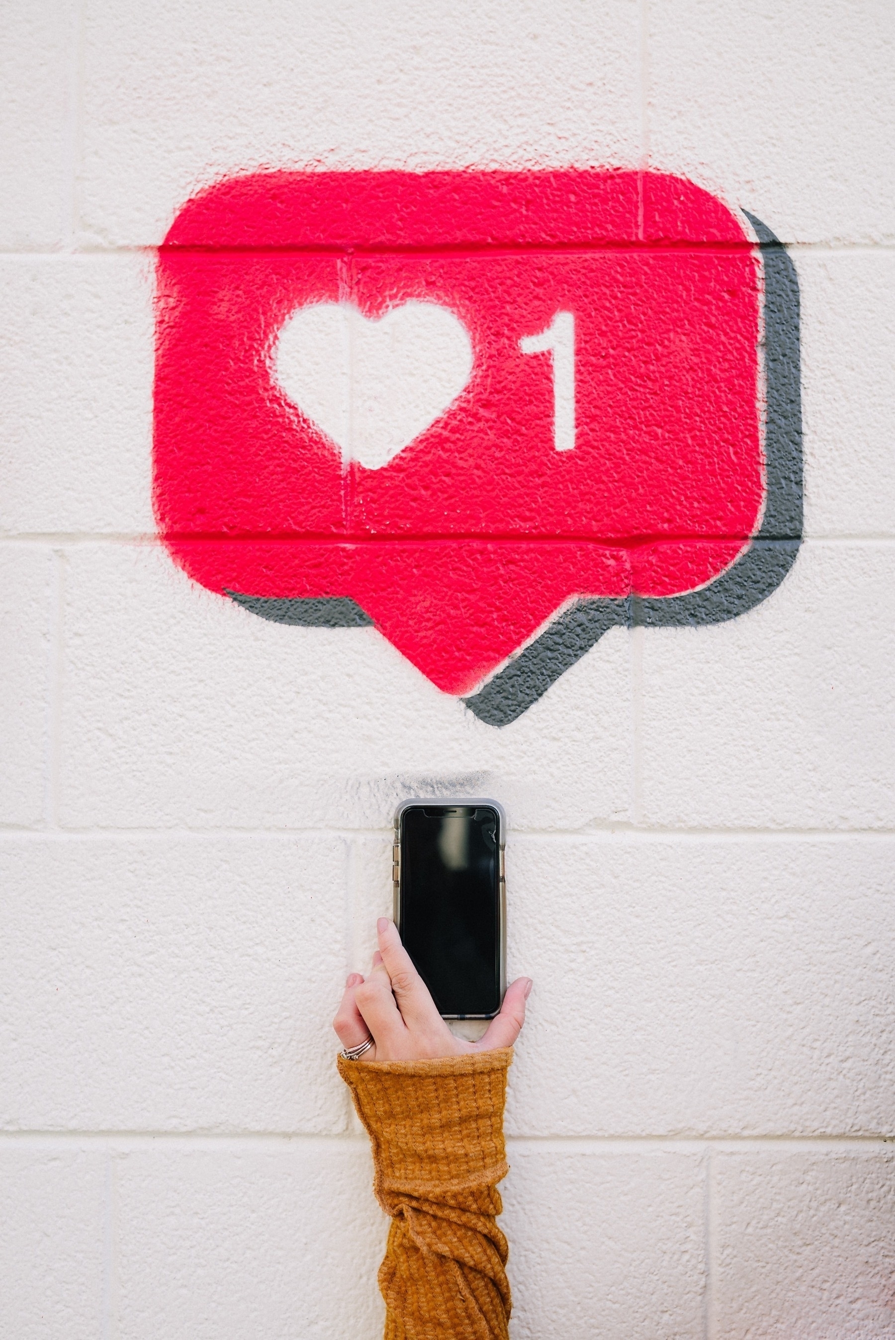
So, YouTube will remove the dislike button soon from its platform. In one of his recent video, the popular YouTuber, Marques Brownlee, expresses his dissatisfaction about Google’s decision. His view echos mine. I’m not a big consumer of YouTube content, but when I do spend time there, I want to spend it on good quality content. The like / dislike ratio is an important indicator for me, and I suspect it is for many people.
We heard during the experiment that some of you have used the public dislike count to help decide whether or not to watch a video. We know that you might not agree with this decision, but we believe that this is the right thing to do for the platform.
I think the content creators should play a bigger role in all this: let them decide. The same way a blogger can turn off the comment section at the end of each blog post, people’s reactions on each video could be turned off by the author’s decision. In fact, I would argue that the ultimate decision to allow likes and dislikes should be held by the content creators. Simple as that. Make it an opt-in or opt-out default, but put the decision in creator’s hands. I would go as far as saying that the counters could stay private to the author if he or she decides so.
To me, one of the best rewarding indicator is the one that shows how far users are watching videos. They may agree or disagree, but as soon as they watch most of it, anything else is irrelevant.
I wonder if this decision by YouTube better serves their interests. I mean, without any ratio indicator, users have no choice but to start to play the video to decide if it is worth the time. This simple change makes people spend more time on the platform. Or is it the other way around and users will instead look at the comments to get a better idea of the video quality? I doubt it, as reading takes too much time to decide. People are busy, their attention span is short, a quick glance at the like dislike ratio is the way to go.
Once the decision to let people react to a video is made, then the platform could finally make it available only if the user watch “most of” the video. That no rocket science. There are probably other tricks that could be played to better control what’s going on in user’s reactions. But at this stage, it seems closer to be only implementation details.
As for the creator’s mental health issue, again, I would argue that if they tend to rely too much on the likes to feel rewarded, they could turn off the option. That’s something that could help others in dealing with this.
Glass, a photo sharing service, didn’t provide a like button from day one and doesn’t plan to add one. Is it good? Well, it depends. One thing is clear, from the comments I’m seeing posted by others, I have to ask myself: what is the difference between getting dozens of “I love it” or hitting the “like” button? Not much.
Photo credit: Karsten Winegeart on Unsplash