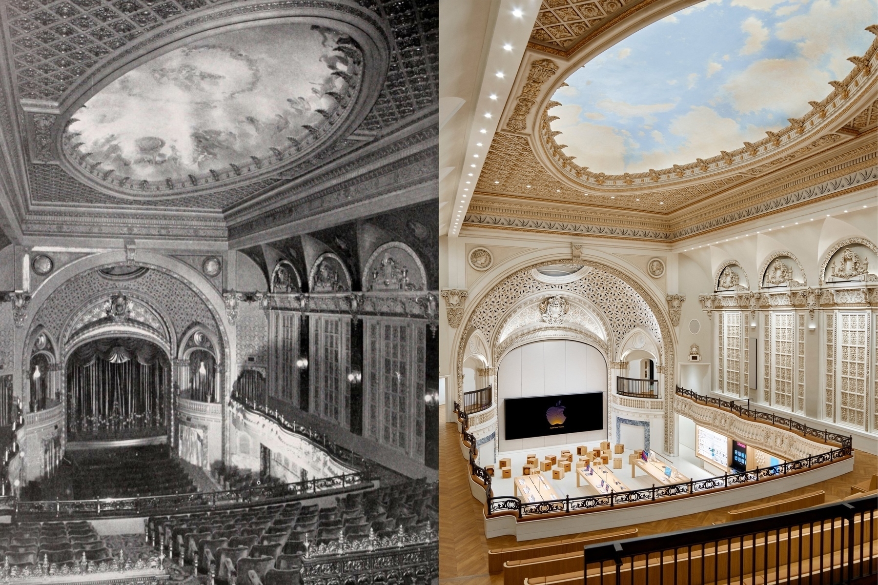
This is one of the many reasons why I love Apple. They put so much money into this building restoration, it is mind blowing. The amounf of efforts that went into renovating this historic site is beyond any public-founded projects could have done. This brings me to this interesting question by Basic Apple Guy:
(…) should corporations be allowed to get their hands on this historic architecture and turn them into private businesses? Rightly or wrongly, the fact of the matter is that many governments don’t prioritize or have the means to prioritize the extensive work required to take on this scale of restoration.
I tend to have a polarizing view on anything related to architecture. My father was an architect and so I’m profoundly sensitive on the subject. Yes corporation can take over abandoned historic buildings as long as they do it under the supervision of an urbanism council or something like it. Here, Apple transformed a building into a store but each time Apple chose to do it in a gentle way. I mean, it is barely noticeable from the outside that this is an Apple Store. It’s a very respectful way to do it.