On design trends — sadness
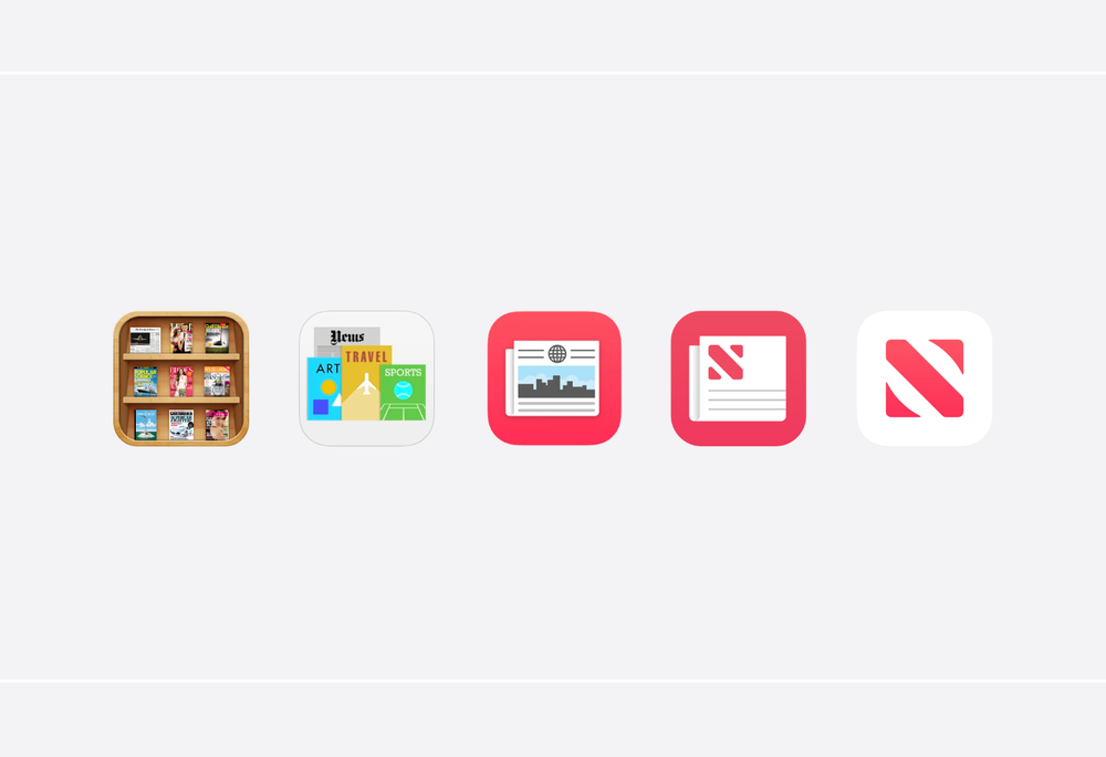
While reading a recent article from Basic Apple Guy about News+, there is this illustration that shows how far Apple News icon has come since its beginnings. I have included the illustration here. It shows how bad design has become in the last five to ten years. That is really depressing to see. As much as things like AR and LiDAR technology help bring real world and virtual world closer together, UI design seems to go the opposite direction. Why is that? When will that trend stop and maybe revert a bit? Why can’t we get visually joyful icons anymore? Is it a matter of design costs being too high?
