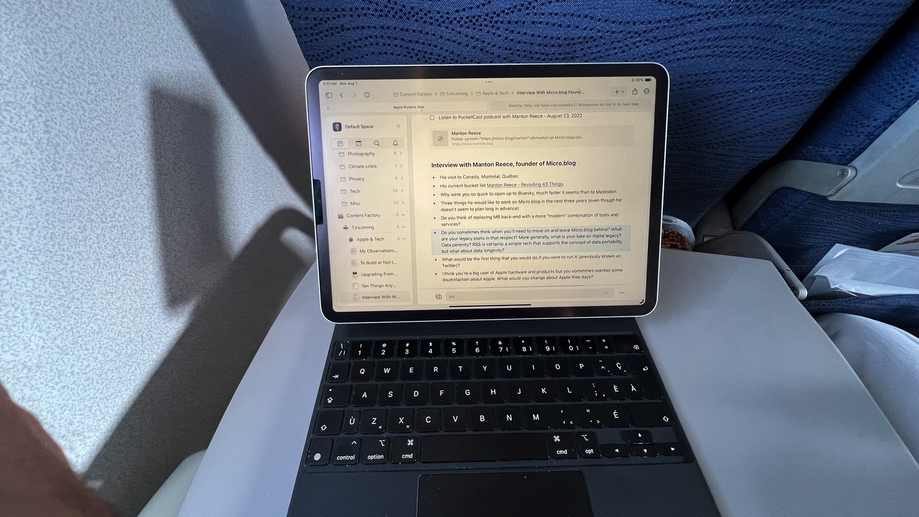
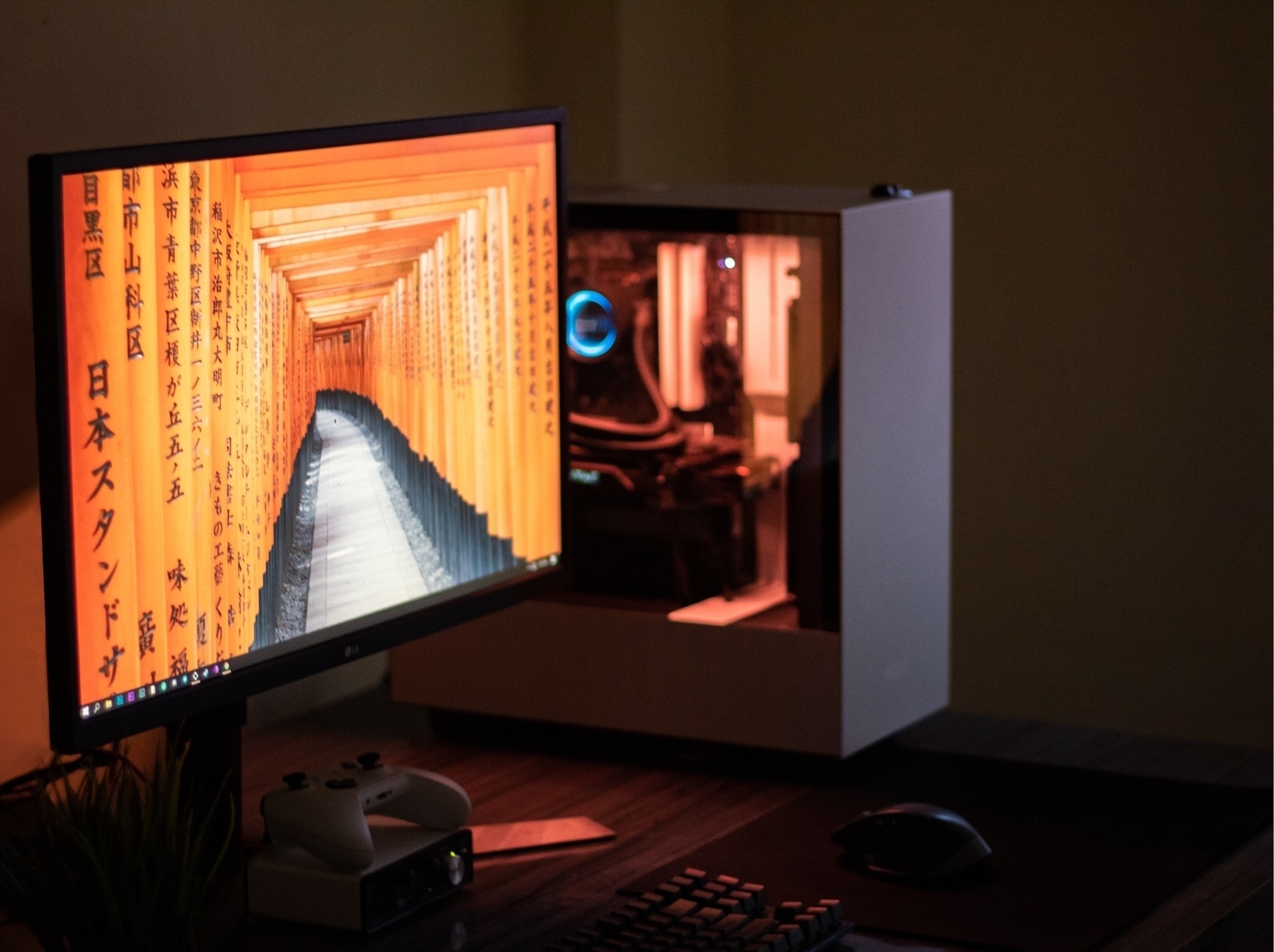
Using My M4 iPad Pro (iPadOS 26.1b1) With An External Display - Observation #5
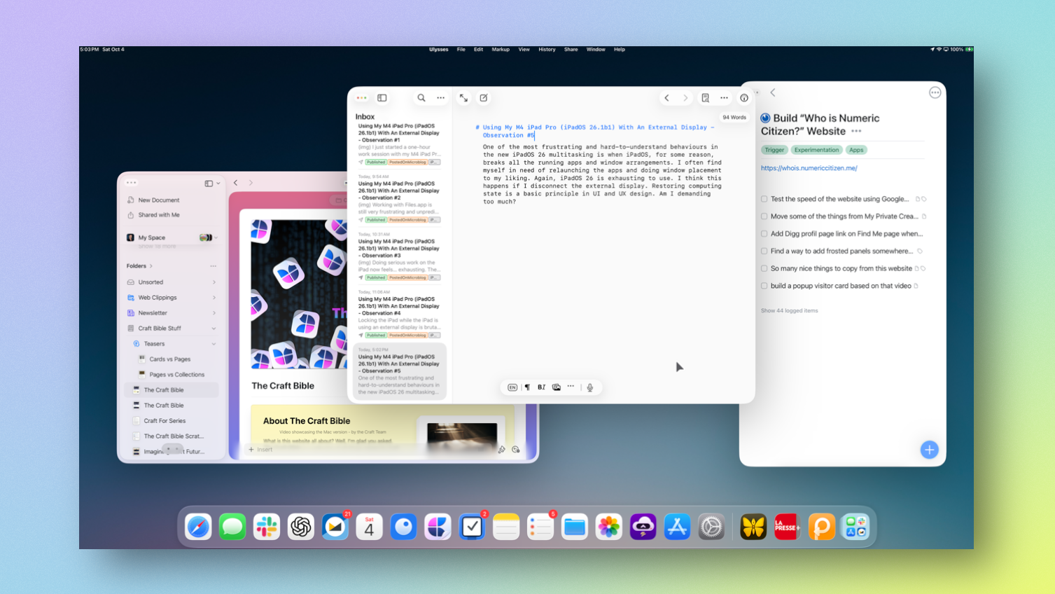
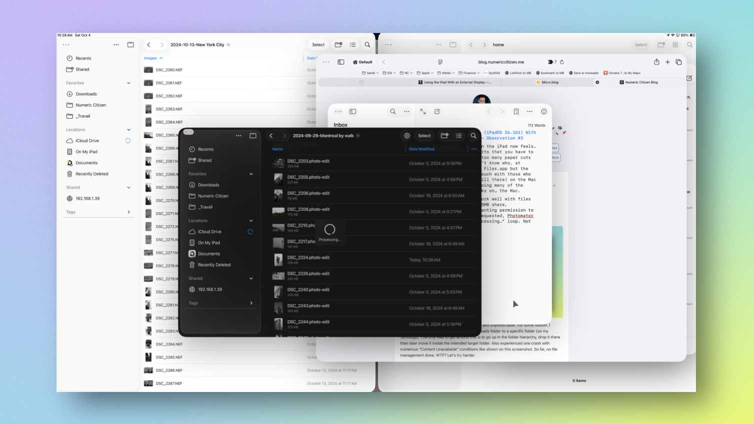
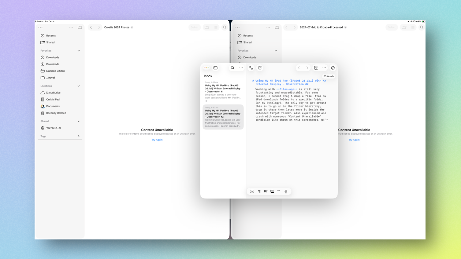
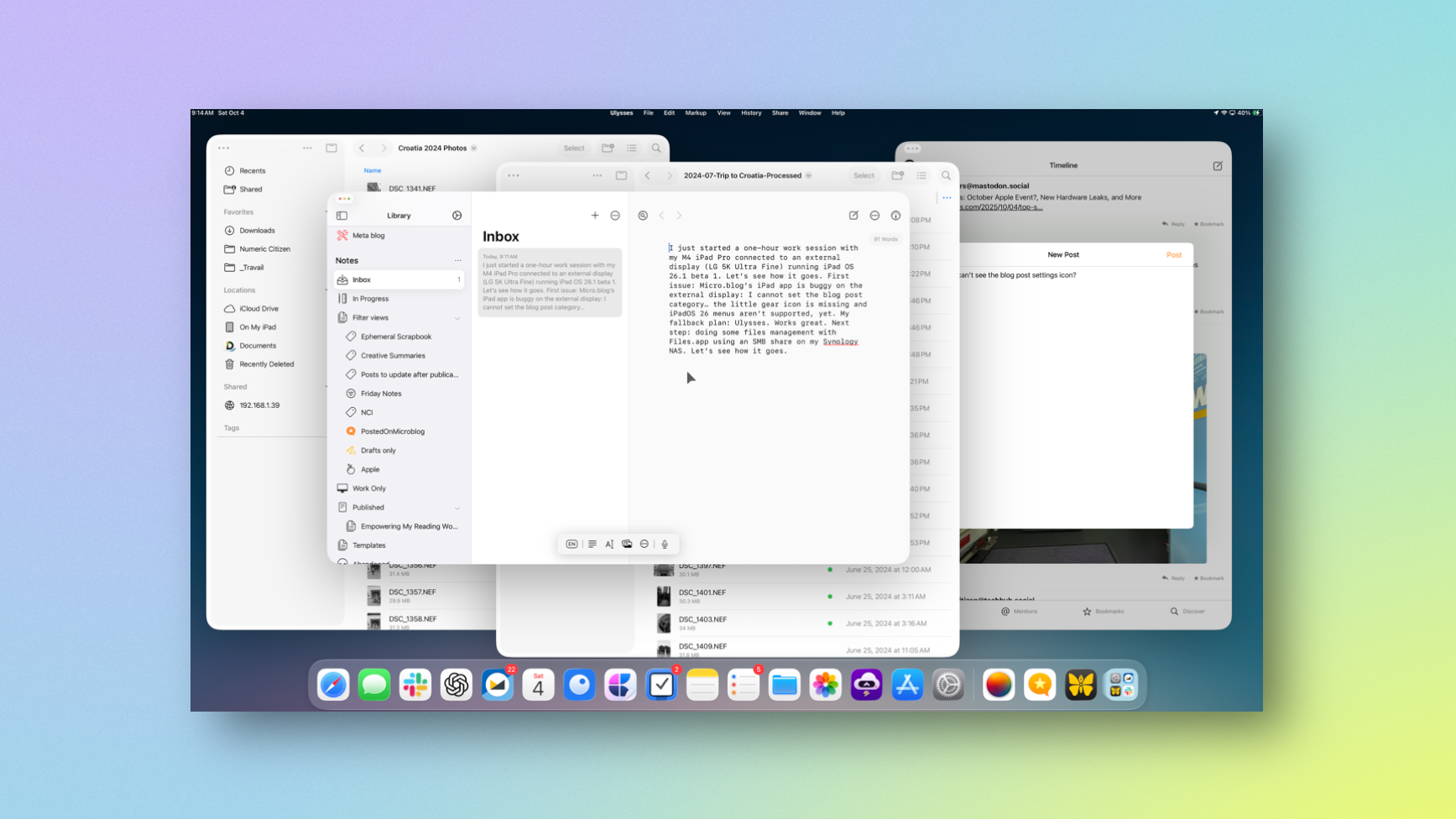
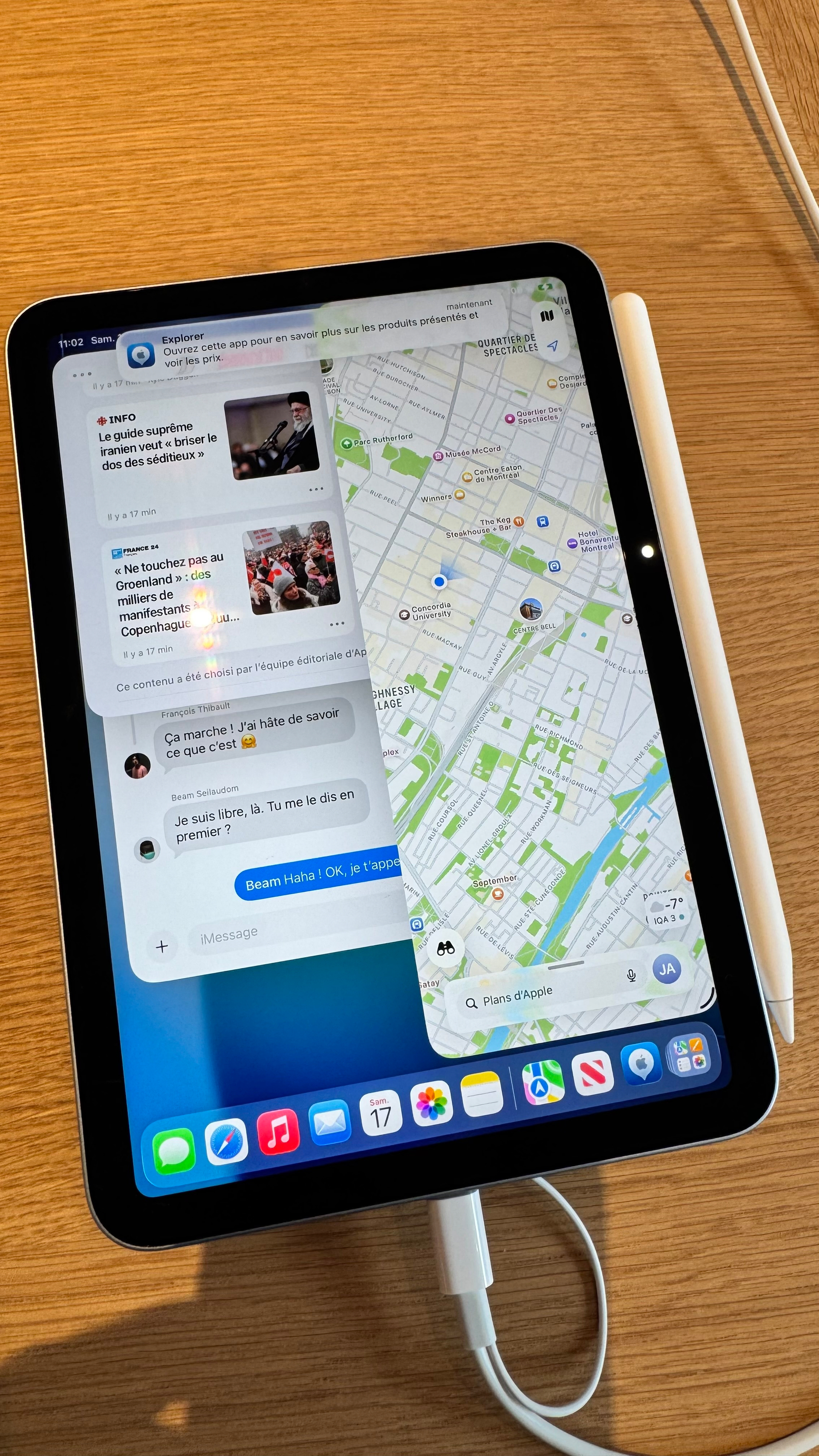
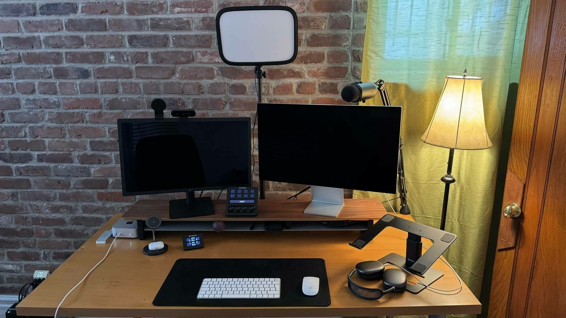
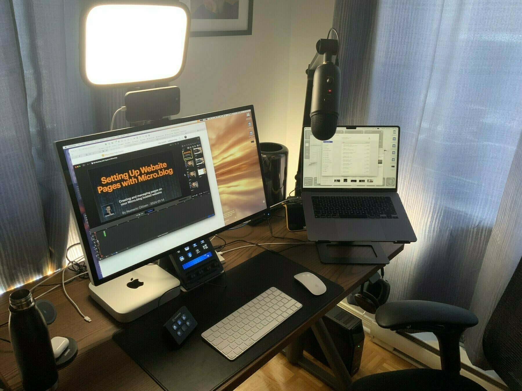
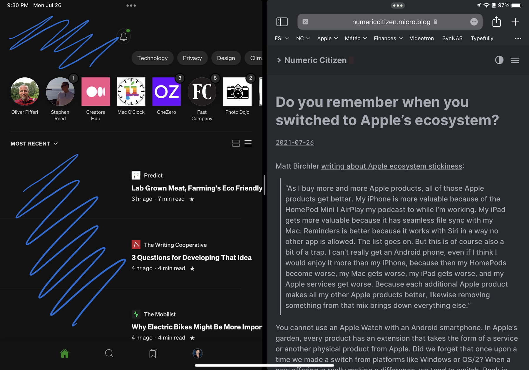
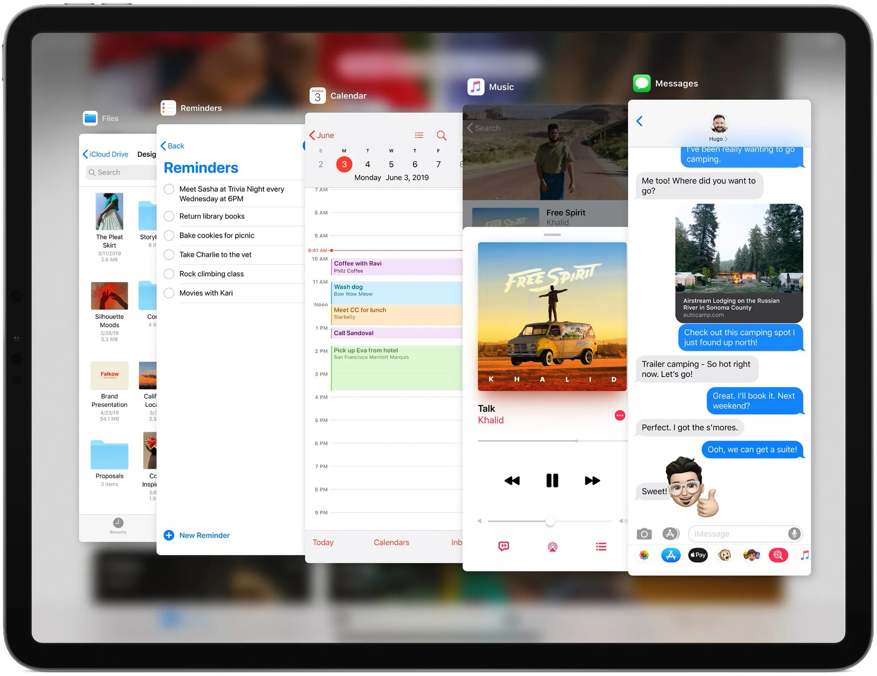
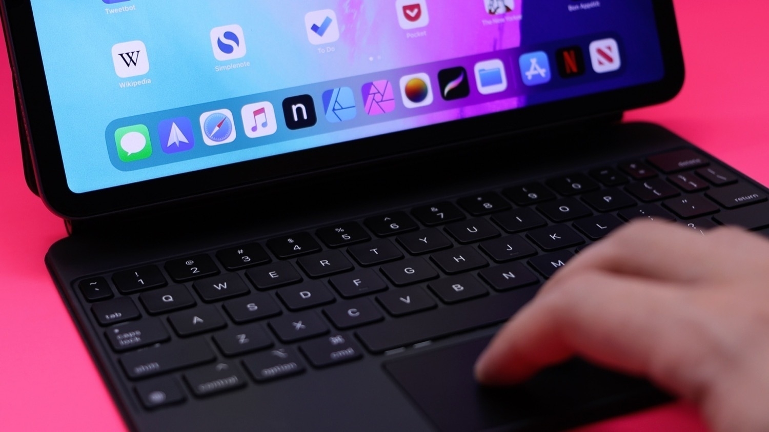
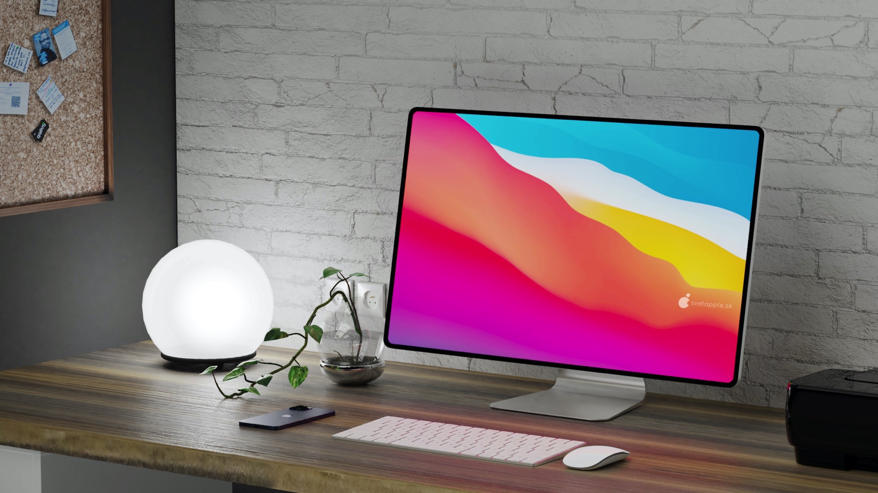
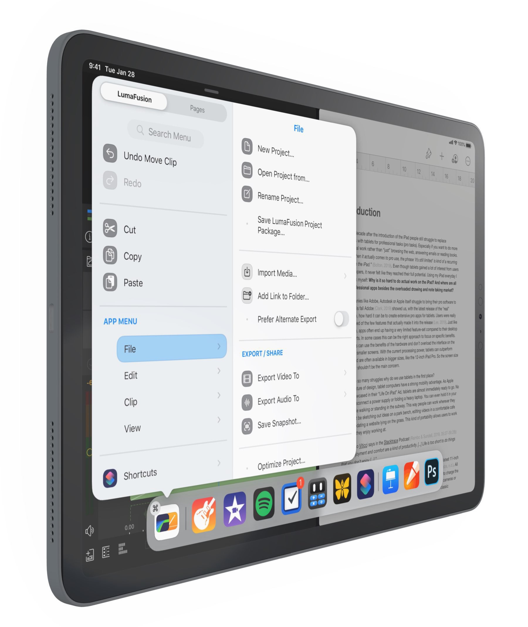
One of the most frustrating and hard-to-understand behaviours in the new iPadOS 26 multitasking is when iPadOS, for some reason, breaks all the running apps and window arrangements. I often find myself in need of relaunching the apps and doing window placement to my liking. Again, iPadOS 26 is exhausting to use. I think this happens if I disconnect the external display. Restoring computing state is a basic principle in UI and UX design. Am I demanding too much?