On Apple Music app feedbacks
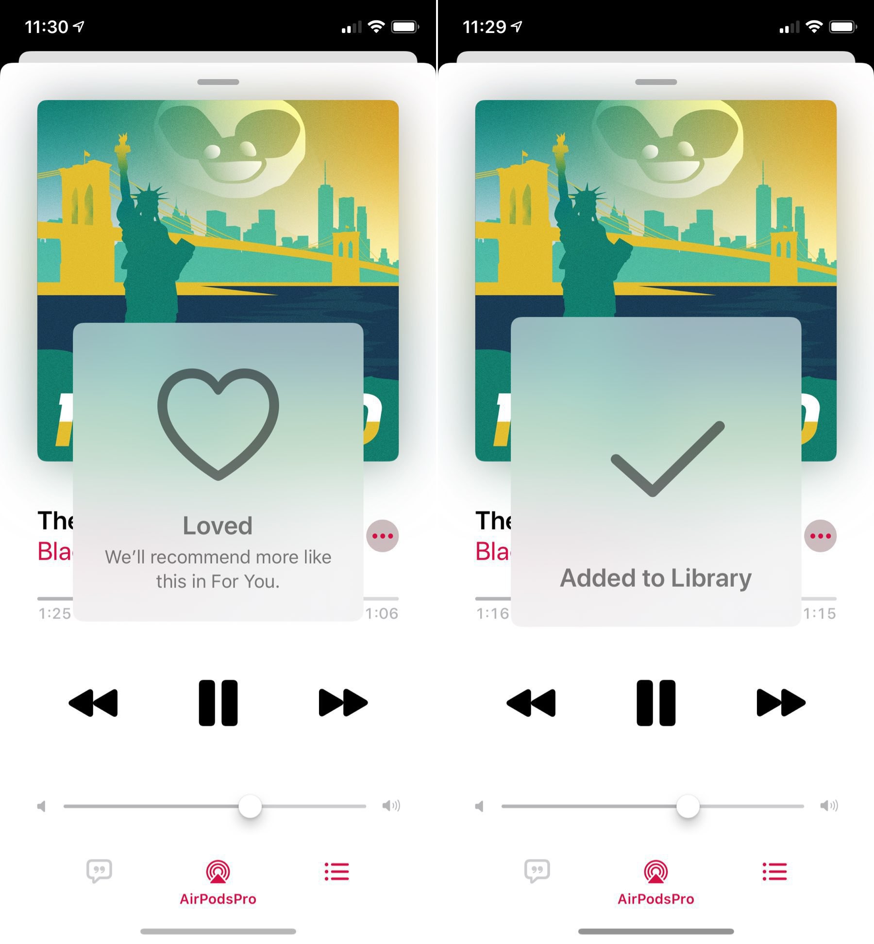
One of the things that I don’t like with Apple Music.app is this: the visual feedback that comes with adding or loving a song. Too obstructive, too slow. Reminds me of the volume hud… that Apple finally got rid of with iOS 13. Oh, and by the way, why burry Add and Love in a sub-menu? Agree? #applemusic #apple #ui #ux #design
