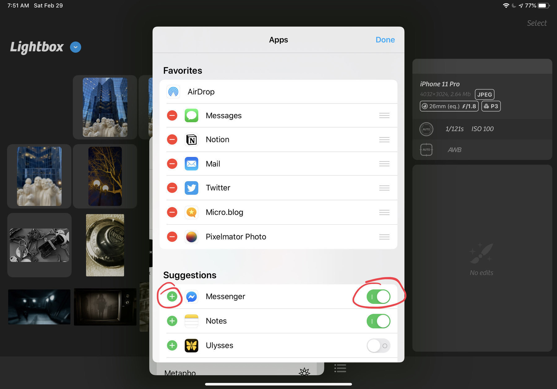
On iOS 13’s Share Sheet Design - Better? Worst?
The share sheet design in iOS 13: I find it confusing. 🤷🏻♂️ It is a step ahead of iOS 12 but yet I’m not satisfied and I don’t know why exactly. The inclusion of Shortcuts is ok but should they have been put in a separate section? Also missing in iOS 13: a way to maximize/minimize popover windows like this one. I understand the need to keep sight of context of invocation. Your take?
