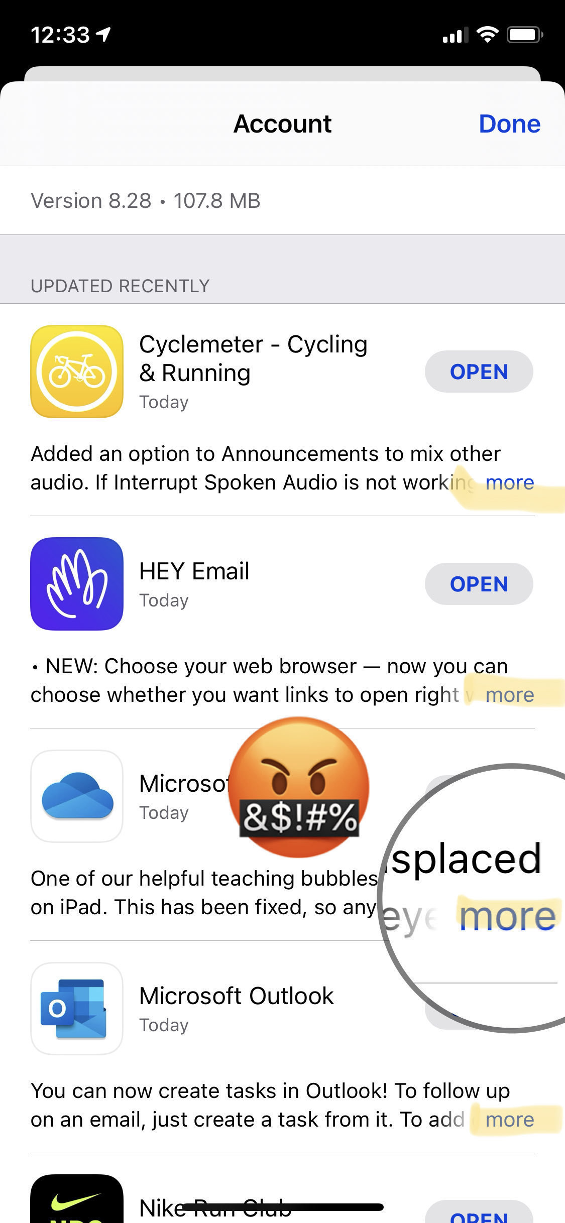
After 14 major iOS release... and yet...
Everybody is talking about Apple Music new icon since Beta 3 but, think about this: after 14 versions of iOS, and here we are: the “More” “button” lingering bad design. How many times I try to hit this and I bring the detail view of the app instead. Frustrating.
Let me be clear: wrong place, too small, text overlapping, not a real button.
Come on, Apple!
My suggestion: add a “Details” button accessible when sliding the table cell to the left (the same gesture that reveals a Delete button).
