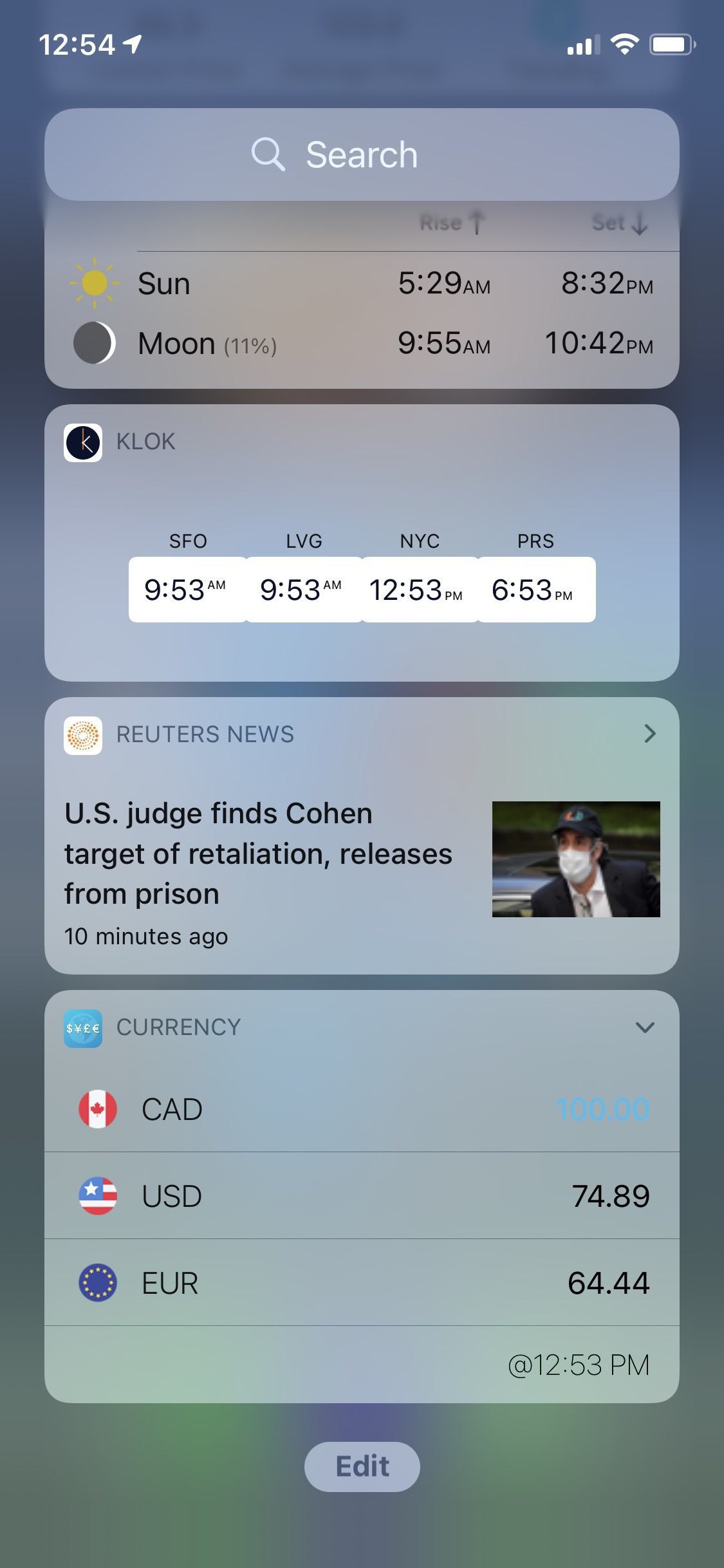
On Widgets Management Interfaces on iPhone
Very valid complaint from Dieter Bohn of The Verge on Apple’s implementation of widgets management on iPhone. Two different user interfaces for basically the same objective. I prefer the look of the new design, but I understand the previous one is still there for compability purposes.
iOS 14 Beta 3 brings back the « Edit » button at the (very inconvenient place) bottom of the list. Hitting the button brings you back unexpectedly to the top of the widgets list. Going back down the list and you’ll find a “Customize” button. Really? Also, tapping and holding on old widgets doesn’t invoke edit mode. Not very consistent. I should probably fill a feedback report and send it to Apple.
I do think this is a transitional design. Transitions are rarely pleasant.
