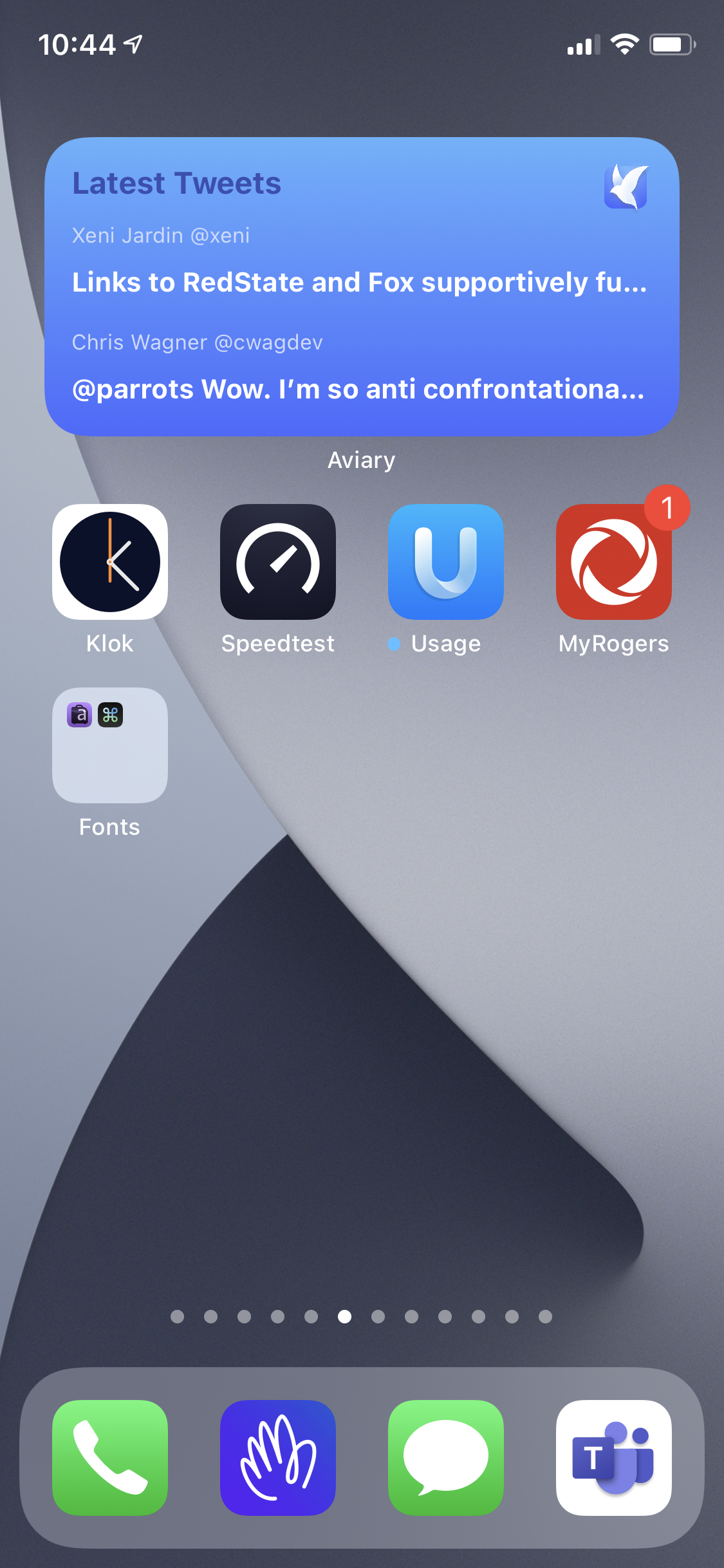
On iOS 14 Design Considerations
Dear iOS developers: be careful when considering widget design and content. Space on my iPhone screen is more constrained than ever with iOS 14. Here is a bad example: showing the three most recent tweets from my twitter timeline is useless as I’m following many hundreds persons. Be more creative than this. 