On Developer’s Questionable Choices with iOS 14 Widgets Design
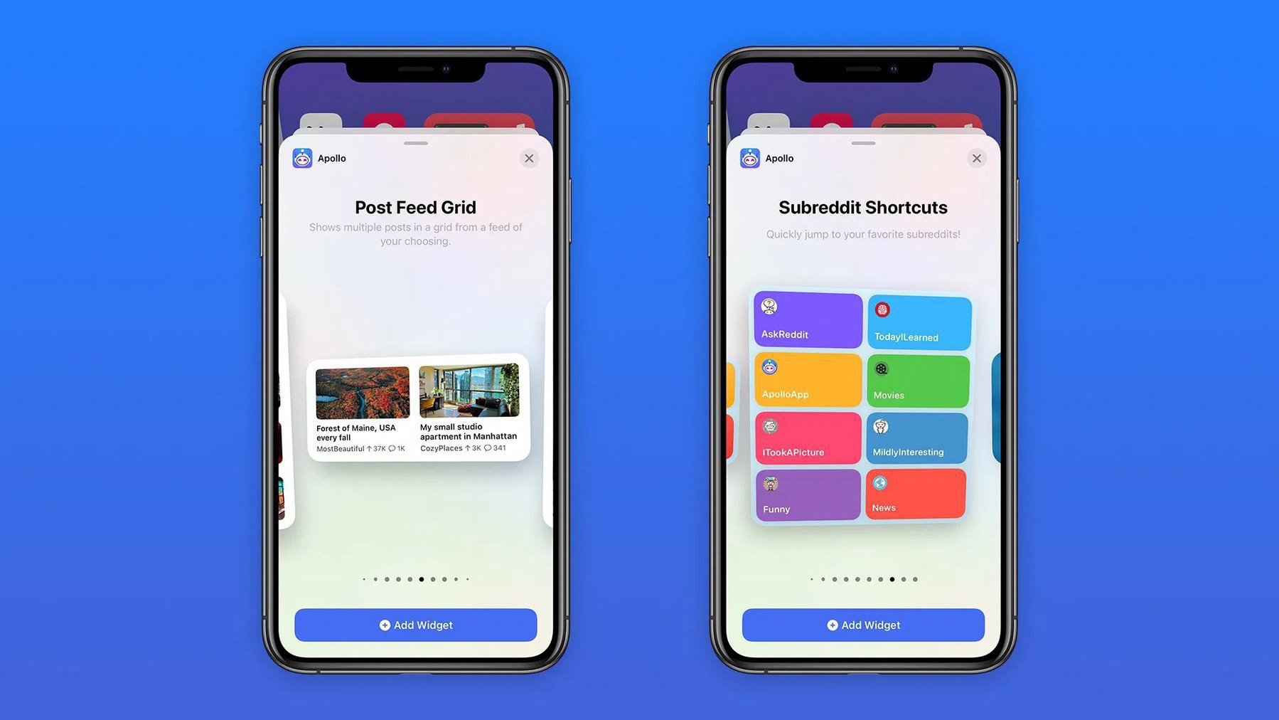
There is something fundamentally wrong with the way iOS 14 widgets are being implemented by many developers. Here is a simple example. The popular Reddit client, Apollo, introduced widgets support, see the following picture. Now, how can a widget with two posts can be useful if you are following many subreddits with dozens of new posts each day? What is the point in doing that?
