On iOS 14 Widgets - My Observations & Experience so far
2 min read
Carefully designed and thought out widgets are still scarce. Many developers show a lack of understanding of a widget’s purposes. Every single day, I’m baffled by the lack of flexibility on iPadOS. It’s a crime or a lack of courage, you tell me 🤦🏻♂️.
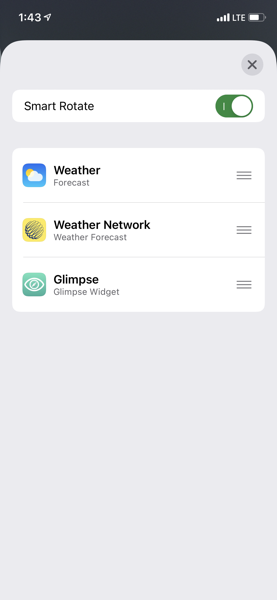
From an end-user perspective, managing widgets can be a frustrating experience. Apple can do better here. For example: in the screenshot below, users should be able to add a widget on an existing stack. Doing so on the home screen can mess your carefully designed arrangement pretty badly which will take careful manipulations to fix. Also, It’s hard to remember when there is a widgets stack instead of a single widget just looking at the home screen. On the iPad, scroll down the widgets will often trigger scrolling within the widgets stack instead which is frustrating.
I don’t miss the interactive version of widgets of pre-iOS 14. I have way too many home screen pages. What is the maximum, by the way? 🤔 I tend to forget about the old iOS Today View. It’s the best place to Four-by-four widgets like news. In general, this is a great version 2.0 of widgets implementation. Looking forward for improved behaviors.
I have found and adopted a few great widgets: Widgetsmith as a lot of potential, Lumy is really nice, Numerico (still in beta testing phase) is really useful Google analytics app, Pedometer is a nice one too, WaterMinder a must for me, Weather Line the best design in this category, Buddywatch a wonderful and useful app for watch face lovers like me, Streaks.