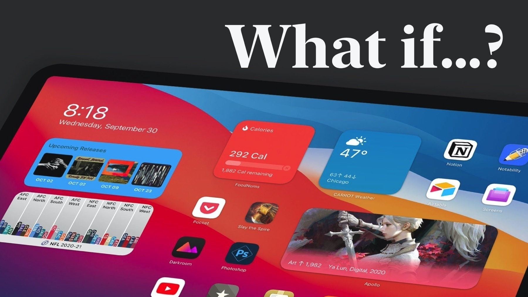
One major observation on @mattbirchler’s iPadOS full widgets experience
2 min read
I’m thinking way too much about widgets these days, thanks to iOS 14 most prominent new feature. I’m still reflecting on the possible reasons why the full widgets experience is not available on iPadOS 14. That being said, @mattbirchler this week came out with an interesting and informative video showing how Apple could possibly enable the full widgets experience. This morning, still thinking about this concept, I realized something: Apple doesn’t need to keep the today view support on the iPad in order to enable the full widgets experience.
I would argue that, in fact, Apple should get rid of the today view that came from the iPhone. One of the reason for this is how bad scrolling the today view works when you have a few widgets stacks; if you don’t pay attention on where you put your finger to scroll this view, you actually end up scrolling through the stack itself instead of scrolling the whole view. That’s not a good experience. The other reason is the iPad screen canvas makes it easy to rebuild the side view just by using the right widgets. No need to have scrolling.
I think Apple will eventually come up with an iPad-specific version of the widgets experience but not with the iPadOS 14 releases streak. And that’s too bad.
