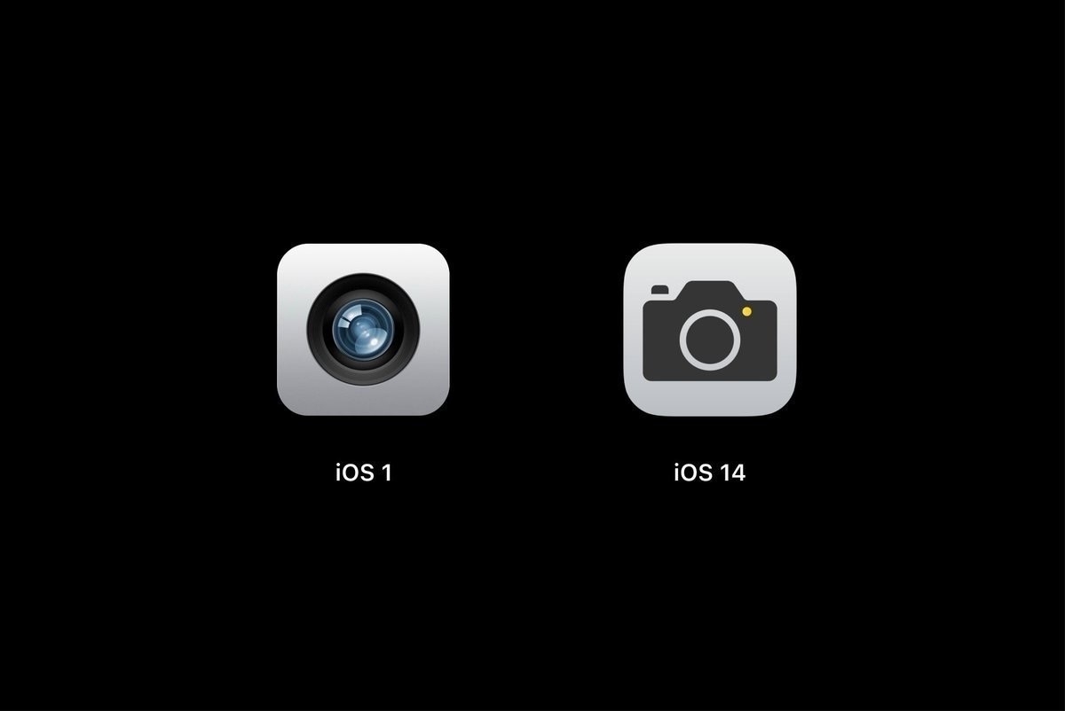
Is this called “Evolution” or “Modernism"? (#apple #ios7 #UI #design)
An image is worth a thousand words. We are still paying the price of this shift in design, every single day, for every single interaction we have with our iPhone… who asked for that? Why? Will we return to normalcy? I’ll never forget the “before” it was so shitty. Never.
