On Big Sur - Maybe I was wrong (#apple #macosbigsur #widgets #design)
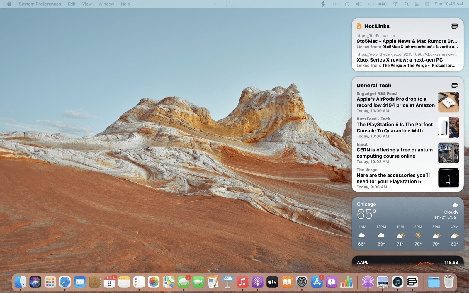
Maybe I’m wrong with my perception of the disaster Apple created with the introduction of widgets in combination with notifications center (read my comment here on micro.blog). After reading the excellent MacStories.net review of Big Sur, I finally saw the combination in action. Notifications are see big improvements and look closer to what we get on iOS.
Still, Apple lost the opportunity to make widgets available in their own space, something like what we used to have, the Dashboard. It’s ridiculous to confine widgets in such a small space, considering modern screen sizes. Oh, and I hope the interaction feels much more fluid on M1-based machines because the last time checked on a 2017 MacBook Pro, with Big Sur beta 10, it was super laggy
Picture credits: from MacStories’ review of Big Sur.
