About those iOS Apps screenshot on the App Store (#apple #appstore #iosdev)
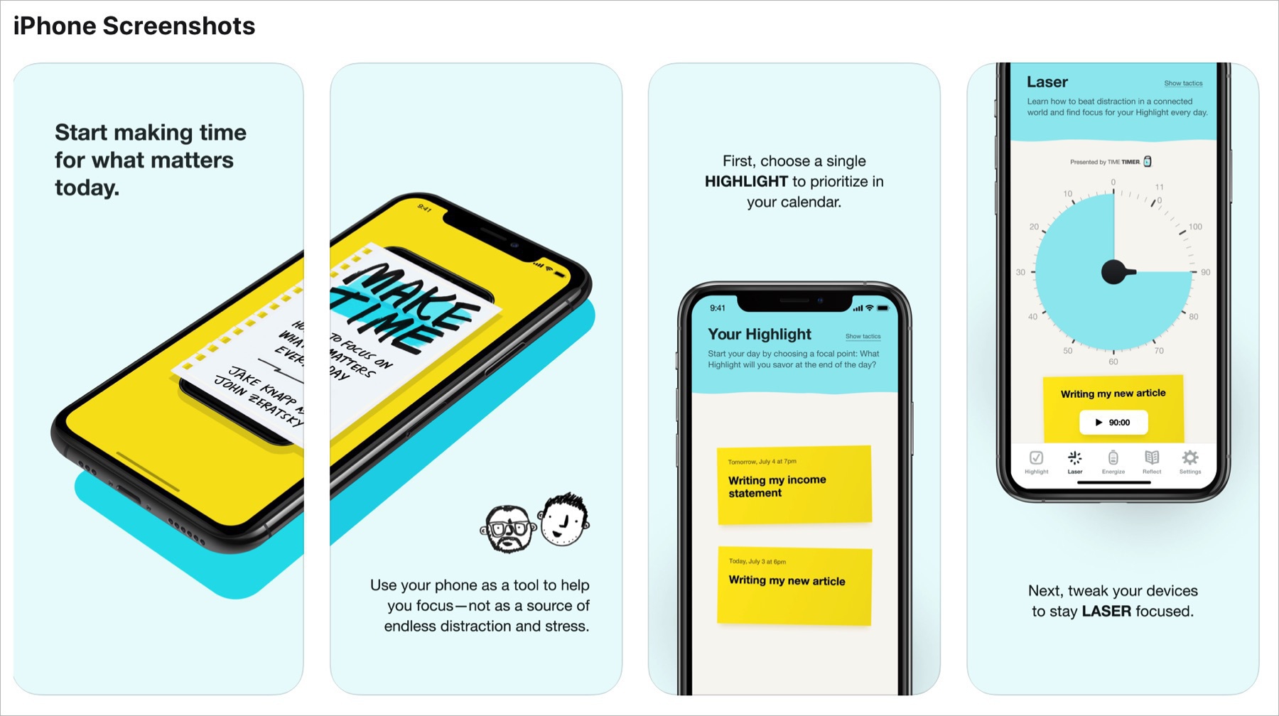
I hate those screenshots montage. They lack emphasis on the application itself, the product. They waste precious space. At the very least, why not put a video showing the application in action. People don’t like to read long application description page. Is it Apple’s fault. Probably. Not sure. Apple is not enforcing their own rules on these screenshots.
This post was triggered by another Matt Birchler post.