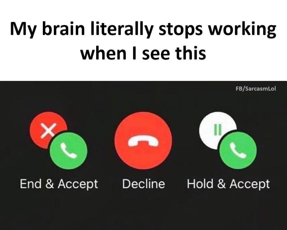
Here is a stressful user experience (#apple #iphone #ux #ui #design)
See that UI of the iPhone when you receive a call while being on another with someone else? Pretty confusing, right? You stress out to understand what to do while hoping you’ll have enough time to not miss the call. it is a stressful user experience. Why is Apple not giving any attention to this very specific UI is beyond me. They made notable change in iOS 14 with the notification-like interface for incoming calls, which was more than welcomed.
The way I came over this challenge is to concentrate on the icon labels instead of the icon itself. It does help a lot in my case.
