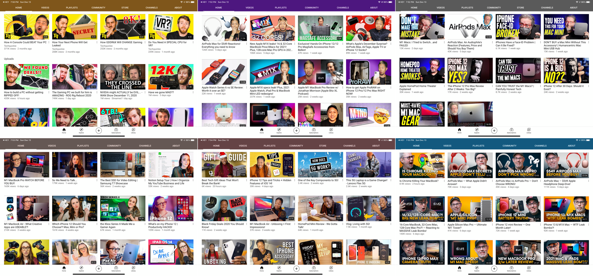
Uniformity across diversity (#youtubers #YouTube #design)

Recently I spent more time than usual on YouTube for different reasons: to look at AirPods Max first impressions, to learn more about Synology DSM 7.0 beta, etc. After a while, it’s easy to see a trend that bugs me: design uniformity across the board. See the previous image gathers a few popular YouTubers channel content pages. They all look about the same or at least designed by the same designer. On top of that, there seems to be a trend where the weider you look, the better. When did that trend start?