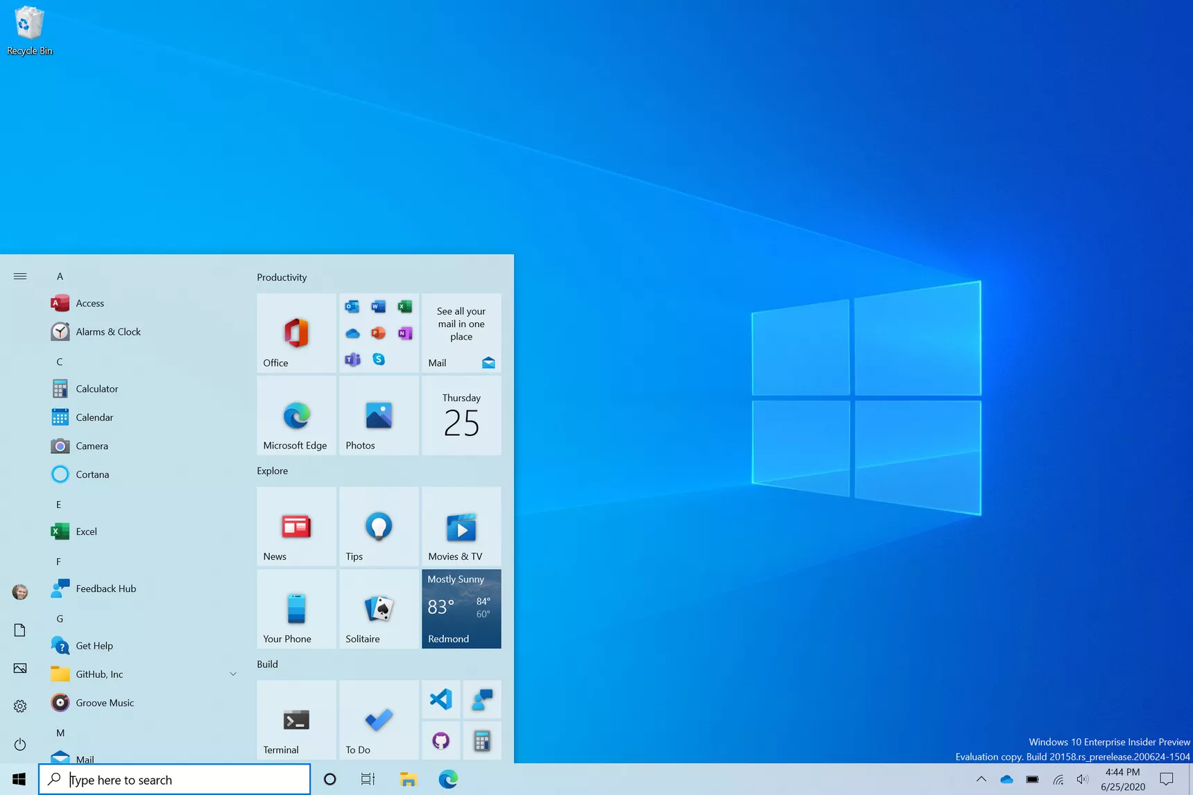
About this rumoured big Windows visual overhaul (#microsoft #windows)

If only Microsoft could finish the job started with Windows 7. Windows 10 user interface is a bunch of previously used visual elements that Microsoft doesn’t care to clean up. For example, consider the computer settings area. On the surface, the iconography speaks the recent visual langague defined by Microsoft. But, as you try to go deeper to change a less frequently used setting, you’re back to a pre-Windows 10 era. I don’t believe Microsoft will do this “major” refresh as recently reported by Windows Central, not in a way they refused to do in the last ten years, anyway.
As a side note, colour me Apple fanboy if you want, but many pundits will grumble when Apple is actually refreshing the user interface like they did with macOS Big Sur (or iOS 7, remember?). At least, it is either consistently clean or consistently ugly, depending of your aestheticism tastes. You won’t as easily find a macOS Yosemite visual asset in macOS Big Sur or even macOS Catalina. Inconsistencies do exist in macOS but they are usually limited to very specific visual tweaks (like to trafic lights placements).