Mailbrew is getter better and better (#mailbrew #newsletters)
2 min read

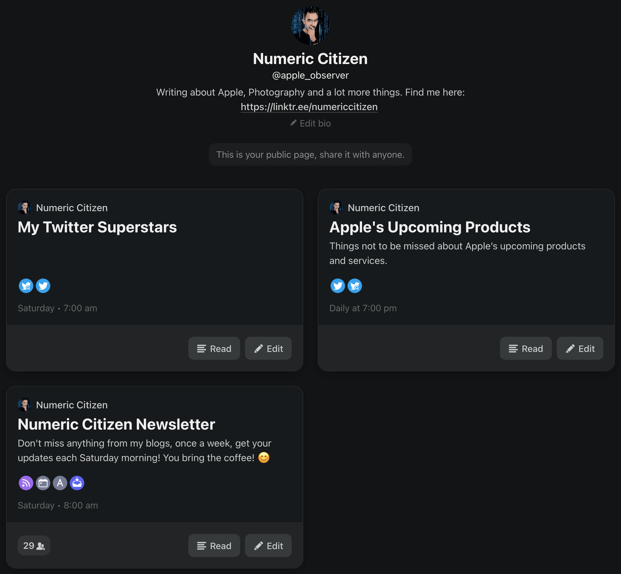
Mailbrew received a big update this week. The change log is pretty extensive. The most important change is that the home page and the whole user experience for that matter is now more about reading your digests than the brews edit view. I like this change a lot. Digests are presented in the order they were received. You can go from one issue to another easily for a specific brew. You can also select a specific brew to see associated digests. The reading experience is better overall compared to HEY’s Feed view. The only missing thing is a “save clip” option.
Beside links to external content, within a digest, when it is appropriate, there is a button for entering a reader view. In this view, a minimalist browser will let the reader immerse himself to limit distractions. It reminds me of the Safari reader view. There is always the save button available to put aside an article in case you don’t have time to read it at the moment. Mailbrew provides a separate list for those saved items.
There are a ton of other small change and improvements. Sharing our brews is easier. Sharing a digest also is closer at hand. All in all, this is a solid update to an already excellent service. You can read my initial review of Mailbrew here. If you want to subscribe, please do me a favour and use this link.