Design is how it works (#apple #design #ux #ui)
From John Gruber’s Apple report card:
“I’m reminded of all the UI and interaction designs and changes in iOS and MacOS that are just bad. There’s a real sense that _ Apple’s current HI team, under Alan Dye, is a “design is what it looks like” group, not a “design is how it works” group_. Exhibit A: What MacOS 11 Big Sur has done to document proxy icons. Arguably it looks better to hide them. (I disagree, but I can see the counterargument.) Inarguably, they work far worse now — harder to use for people who use them, and much harder to discover for people who don’t yet know about them.”
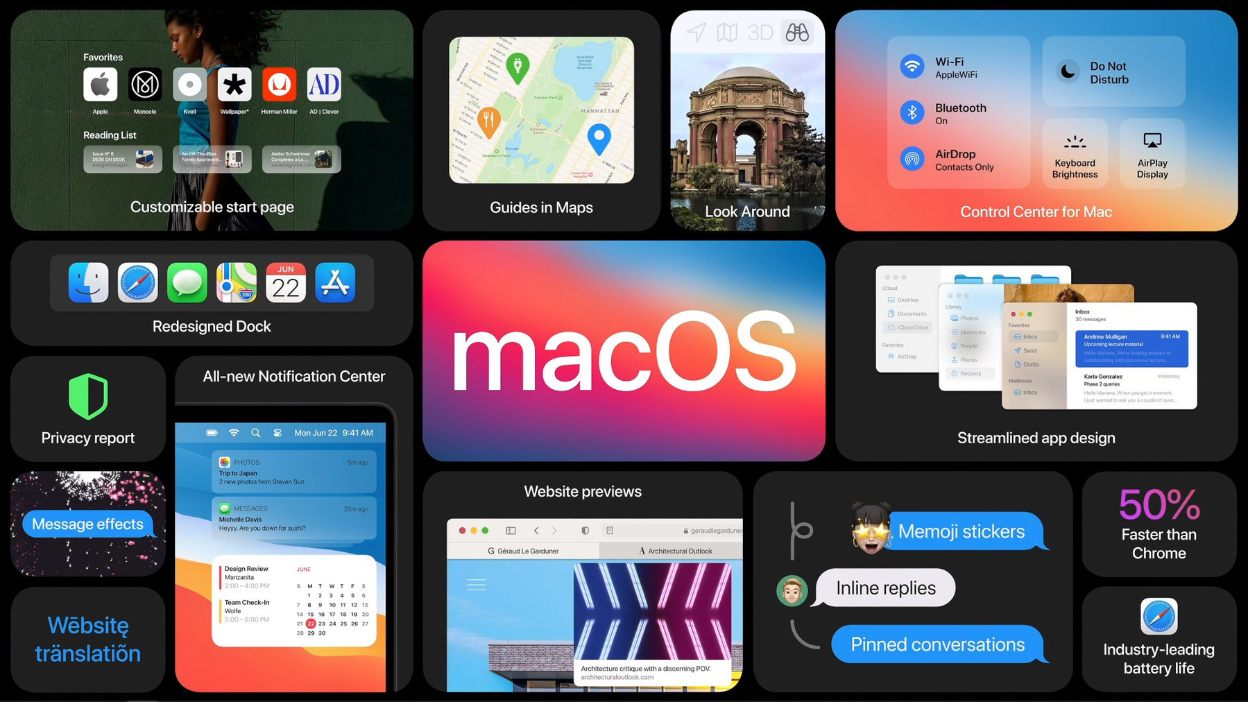
Gruber often has an effective way of putting out his take on Apple’s issues. If you look and use macOS Big Sur for a while, you should get a feel that only the visual parts were redesigned, not the way it works in response to the user behaviour. Big difference.