About those two icons (#apple #iOS15)

I rarely comment on rumours from highly speculative reports, but this report from MacRumors is different:
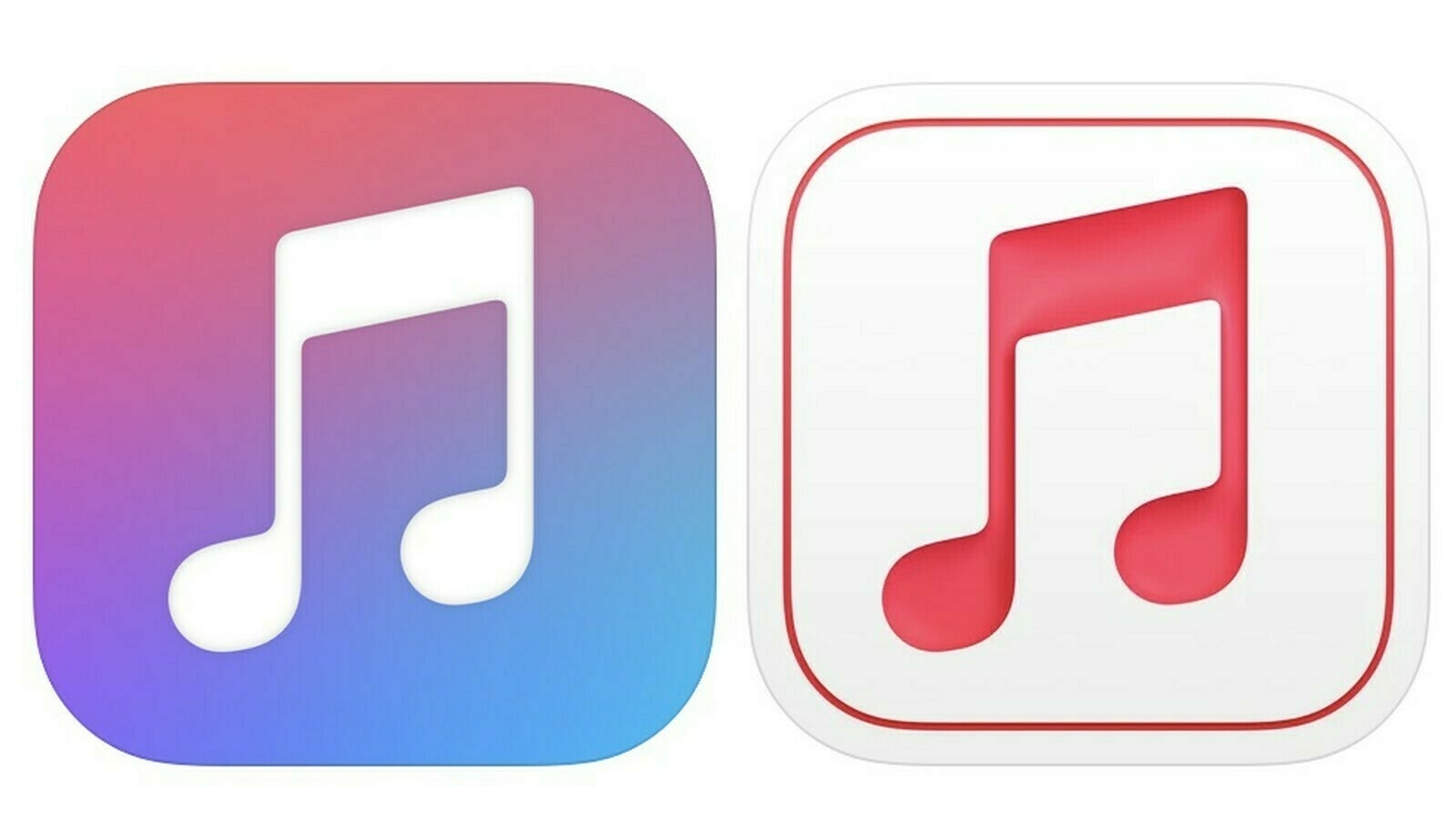
“The Apple Music for Artists app now features a simpler, streamlined icon with a pinkish red music logo rather than the multicolored logo that was used before. The icon also has an embossed look that makes it stand out from other Apple icons.”
and
“App Store Connect in October was updated with a refreshed icon that’s similar to the Apple Music for Artists icon, which means Apple has now updated two app icons with this new design.”
The simple fact that two icons got updated with similar look at several months interval could signal a trend leading to the upcoming design update with iOS 15. I much prefer the right version of these icons, particularly the embossed design. This 3D effect adds some depth and dynamism to the design, and yes I like the fine line marking the icon boundaries.
I wouldn’t be surprised if those two icons were part of an A/B testing program, within Apple. Second, what Apple has done with macOS Big Sur was only the beginning destined to encompass all platforms, in some form or another (icon design wise).