Popup Menus — Comments About This Relic of iOS 3 — Could There Be A Better Design? (#apple #wwdc21 #ipadOS15 #ios15)
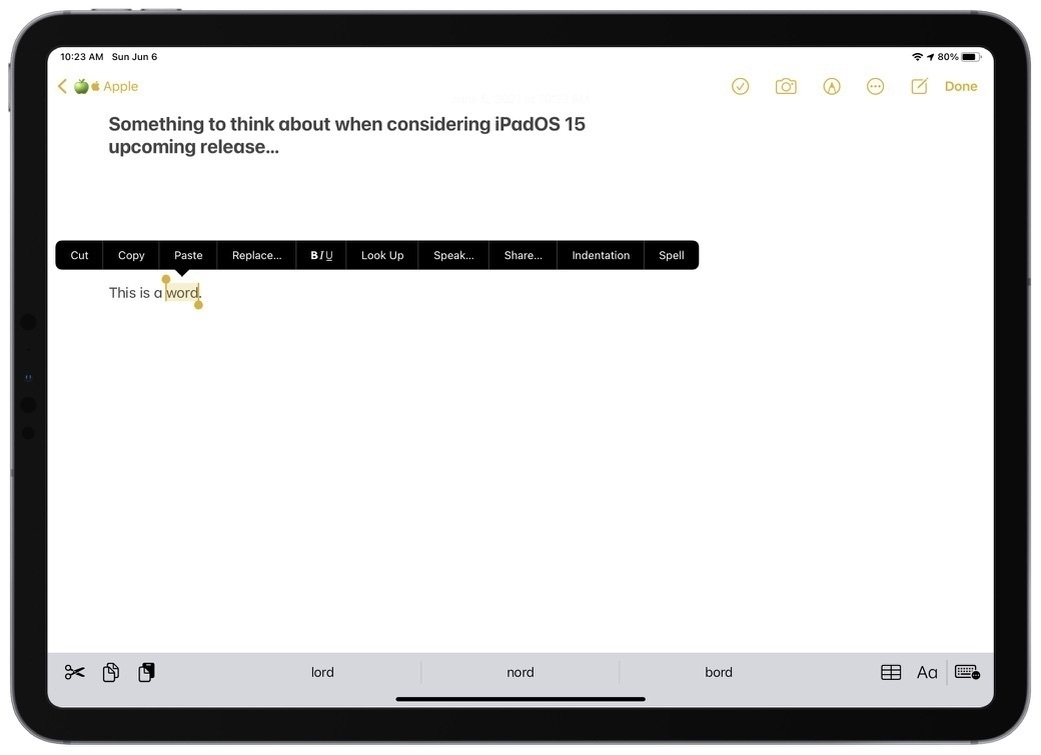
Consider the previous screenshot showing the popup menu when selecting a word in a document. This menu hasn’t been touched since iOS 3, if I remember correctly. Tomorrow, as we are about to get a peek at iPadOS 15 and iOS 15, I’m wondering if there are better ways to display such a menu. Consider a few design problems and possible improvements.
This menu doesn’t scale well; it isn’t exactly elegant. In some situations, we have to scroll through its options which is not always obvious and is tricky to do with the finger without selecting the option at touch and scroll time. Also, this design involves too much finder travel to my taste; I would prefer a more condensed version. The design is flat and doesn’t allow for hierarchical grouping of options which could help is situations where many options are available. The design is flat and is not as distinctive as it could be. Adding some depth, contour line would help.
Do you have any suggestions on how Apple could improve on this?