Apple’s cheap labour: concept creators

Parker Ortolani for 9to5Mac published a two-parts concept on a future version of macOS named Mammoth.
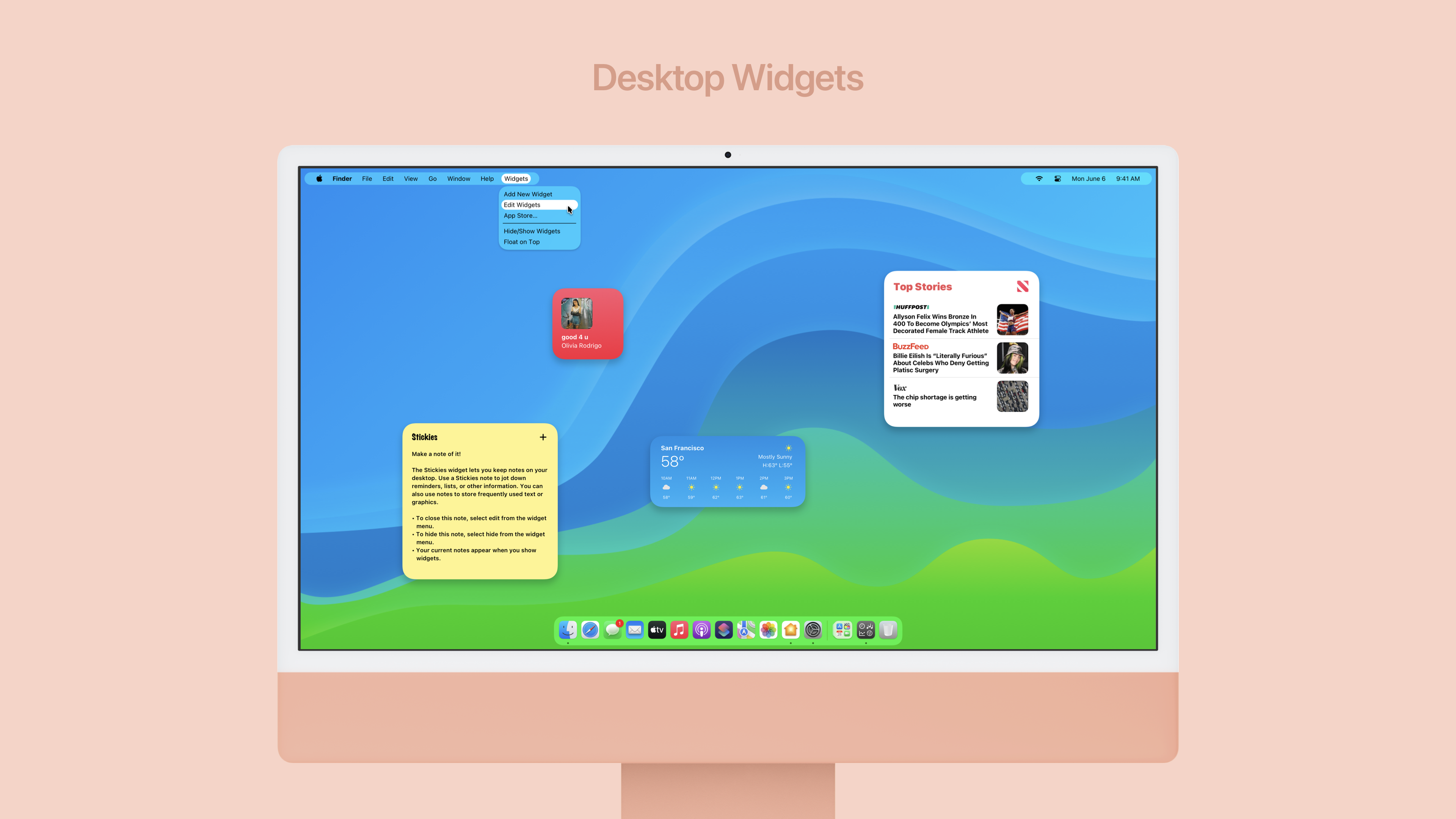
macOS Big Sur did a great job of refining the Mac desktop, but it didn’t fundamentally change any of its behavior. We’d like to see that change with the next version of macOS. With Monterey being mostly full of small refinements rather than big ideas, we’d expect Mammoth to be a monstrous release.
I’m using one of his screen design that pertains to widgets improvements. I recently wrote about those and Apple’s sad design decision to keep them in the notifications center for Big and Monterey. I think Ortolani’s design is interesting and plausible. Freedom of placement certainly makes the experience more satisfying. It’s so true they liberated widgets on iPad with iPadOS 15.
There is so much work going into these visual essays. I mean, there are release notes too! I often considered people doing these mockups has being Apple’s cheap labour. I wonder if Apple’s designers notice those.