Taking Advantage of the iPad Screen

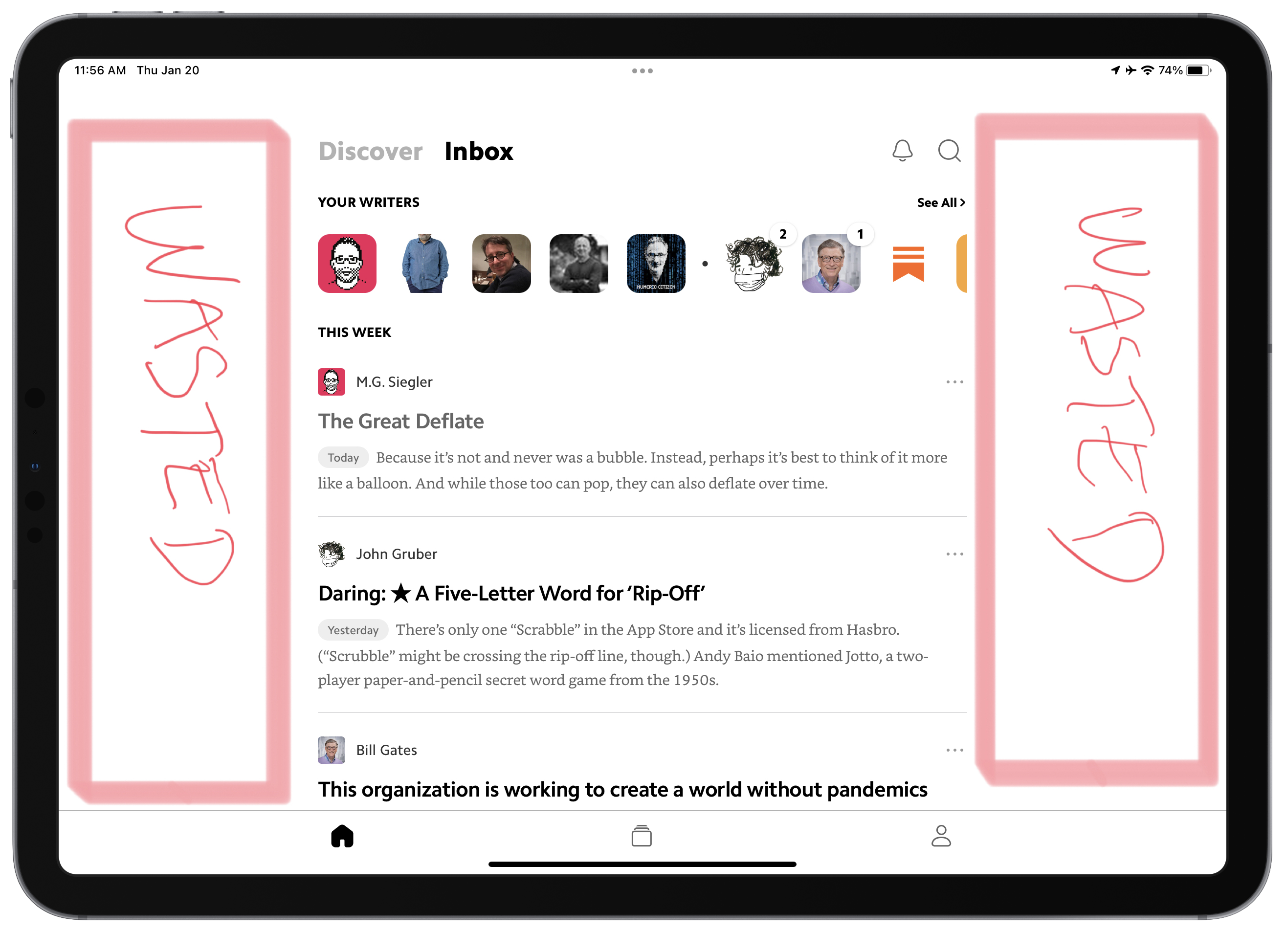
Consider the previous annotated screenshot from Matter. Way too many applications have the same design issue. Why, in 2022, developers cannot fix these wasted space? I see that the content is of the same width if the iPad is used in portrait or landscape orientation. Why not adjust width dynamically? Is it that hard?