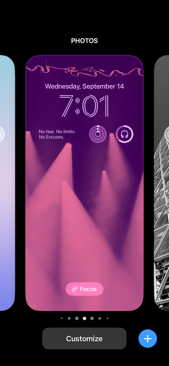
The Unexpected Pain That Comes With Lock Screen Customization

So, I’ve been testing iOS 16 since its early beta stage, and I love it so much. One of the best features is the customizable Lock Screen. But it also creates an issue, the same with Apple Watch watch faces: how to decide which widgets to use and place in those limited slots. There are more and more widgets available each day, but the space is so constrained. I cannot find a strategy to create a Lock Screen that I’m fully satisfied with. I end up creating many of them, but switching among them isn’t smooth, except if they are linked to a focus mode. It’s not a first-world problem, but it is annoying. I’m left with a sense of constant dissatisfaction.