Readwise.io Reader App — A Potential Game Changer?
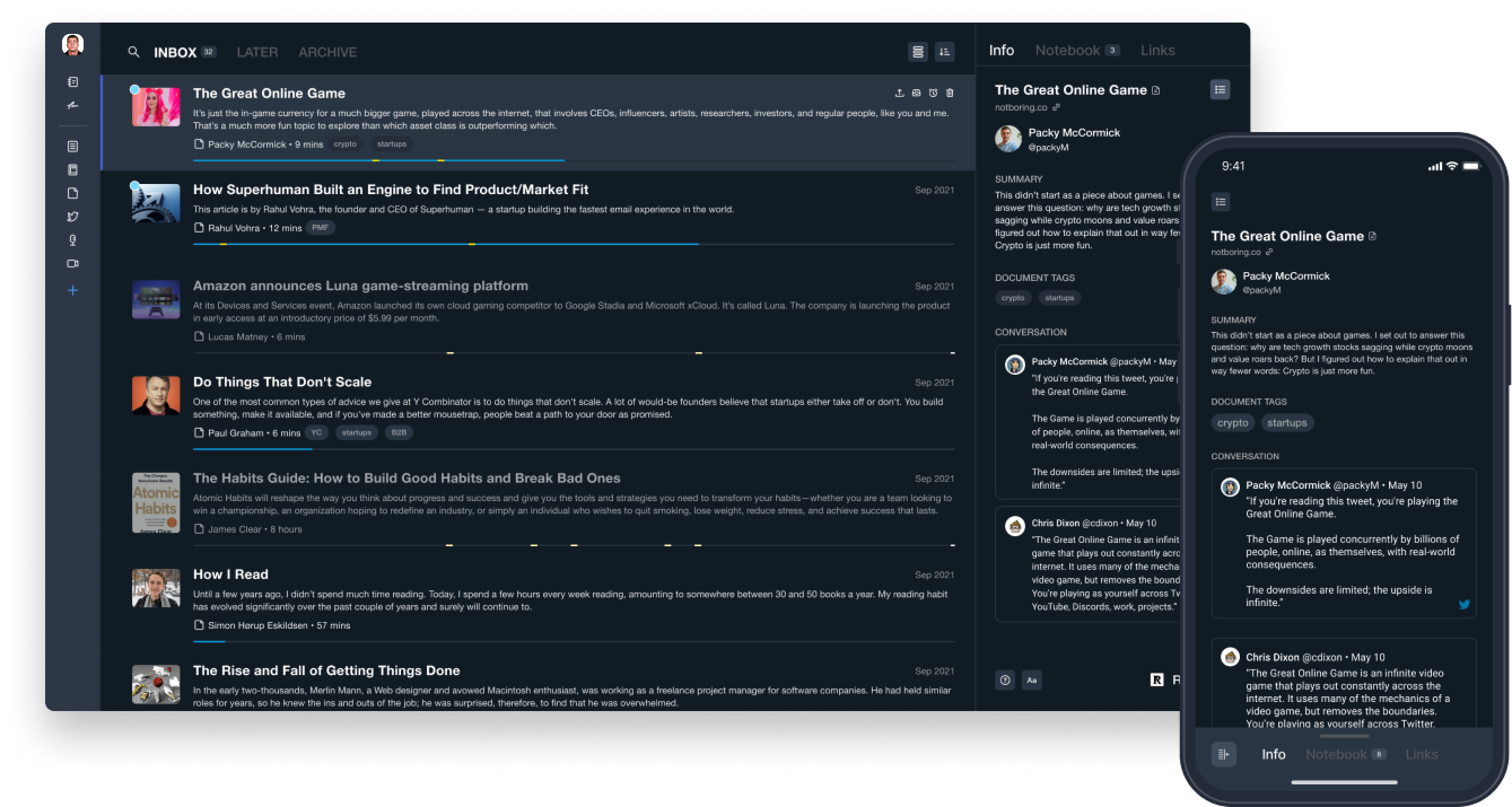
In a recent announcement by Readwise.io:
We’re now in position to reimagine aspects of the digital reading experience itself, from how you annotate a document, to how you navigate. Readwise as you know it today isn’t going anywhere, but this is our future.
And:
With the new Readwise reading app, not only will these resurfacing and syncing features not go away, they will be enhanced through tight integration into the reading experience.
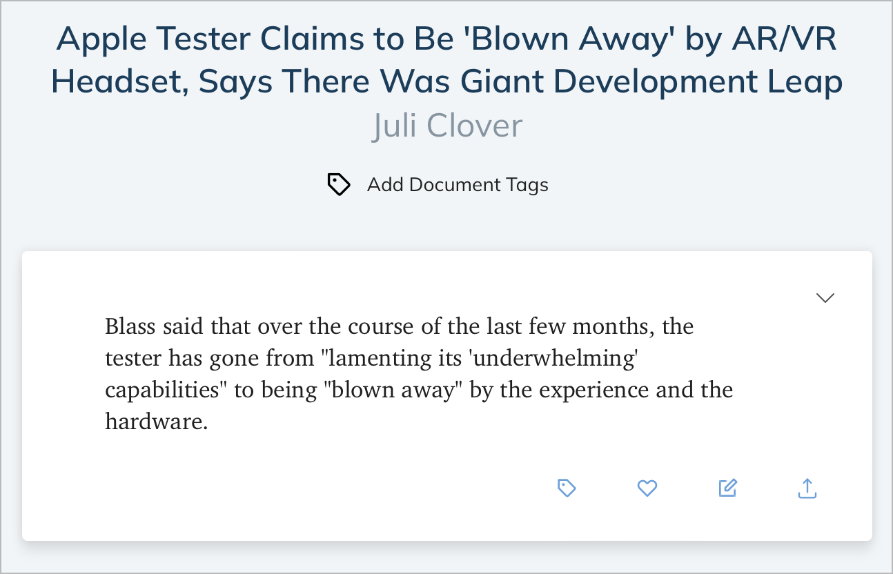
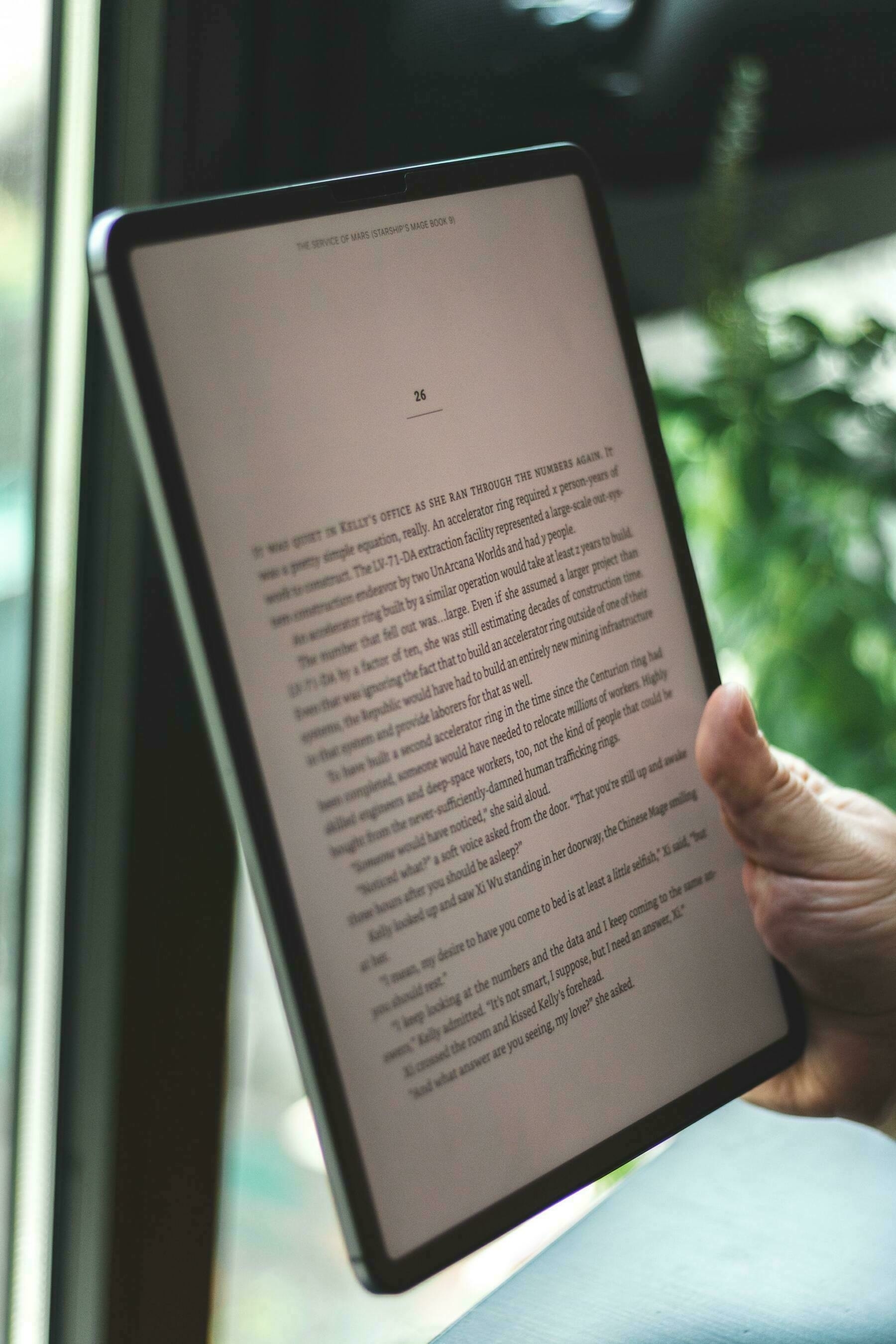
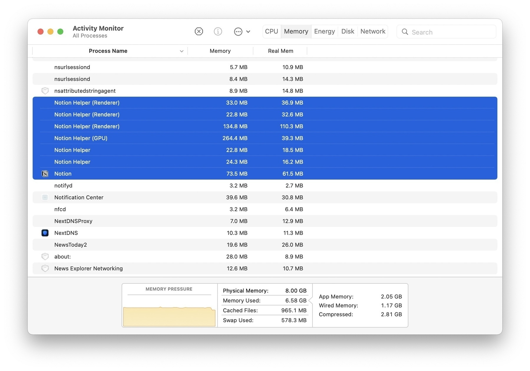
There is much more to digest on their published essay. They’ve been thinking about this for a while and judging from a few screenshots, their reading app seems compelling and well done. I’m hoping they will support Safari’s extensions. RSS feeds will be supported too. Sadly, it will probably be another Electron-based app. We’ll see if this doesn’t affect too much the experience.
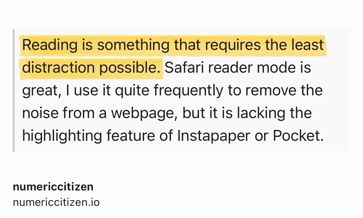
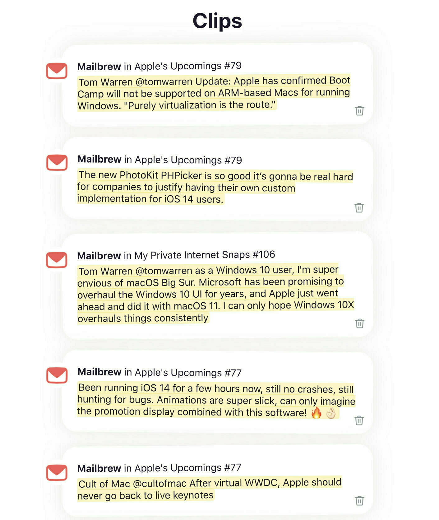
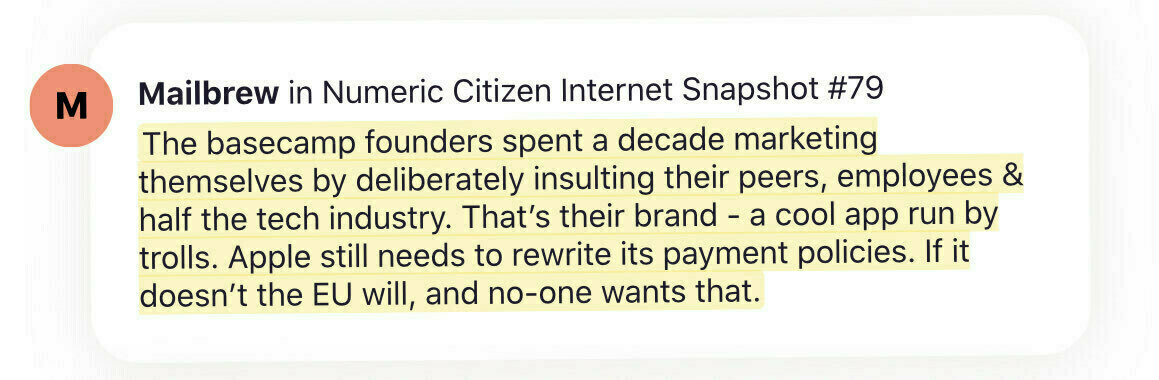
I’ve been a subscriber of Readwise.io for a while, but I must admit that I’m not taking advantage of it as much as I would have liked. It does get synced with my Pocket account, but that’s about it. Oh, and my saved quotes get resurfaced in my Mailbrew summary newsletter, which is cool.
I’ve subscribed to their private beta testers waiting list and I can’t wait to try it out. If all goes well and is up to what they say on their blog post, this could entirely replace Pocket for me.