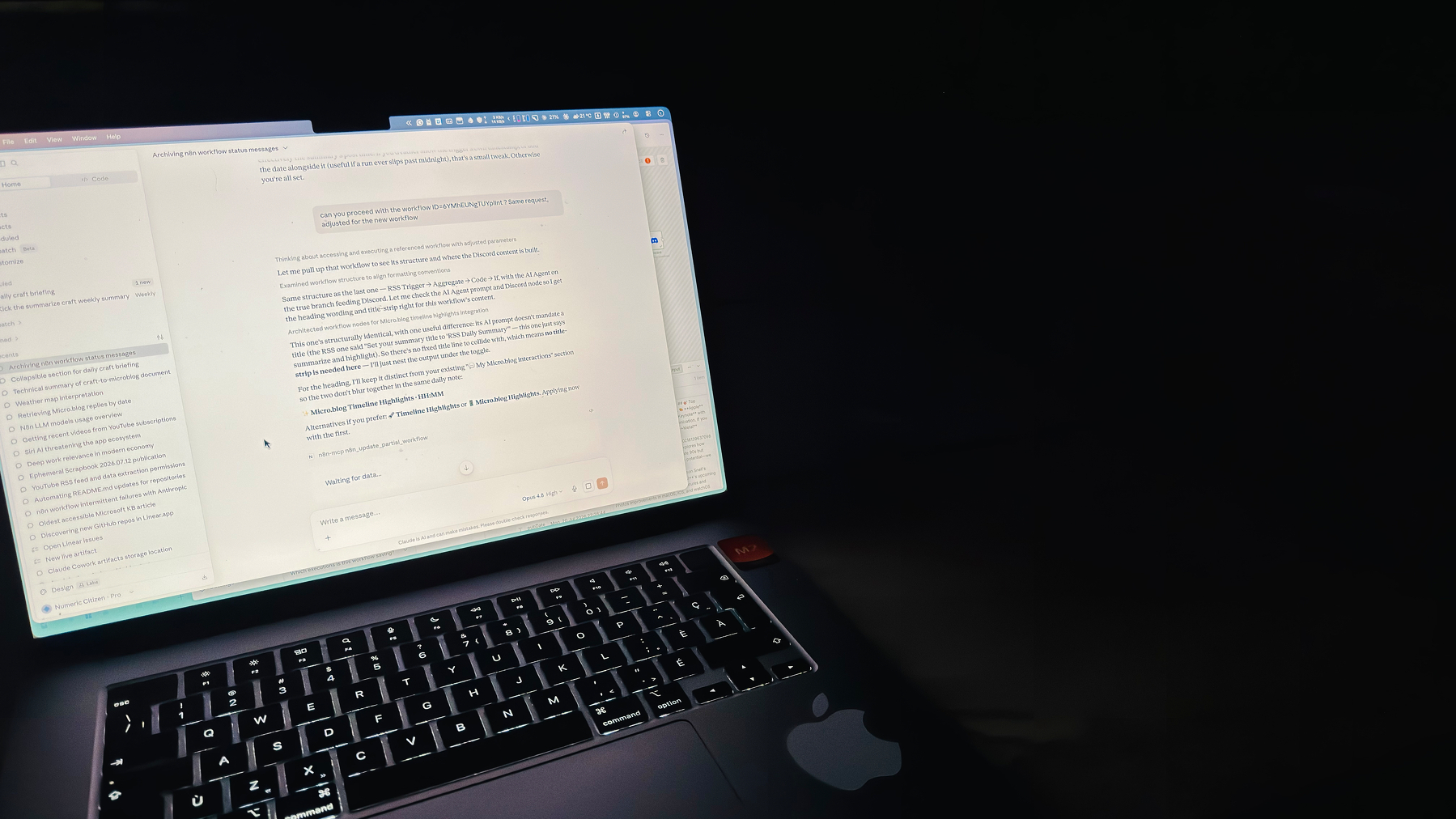
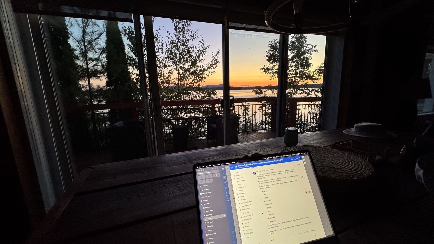
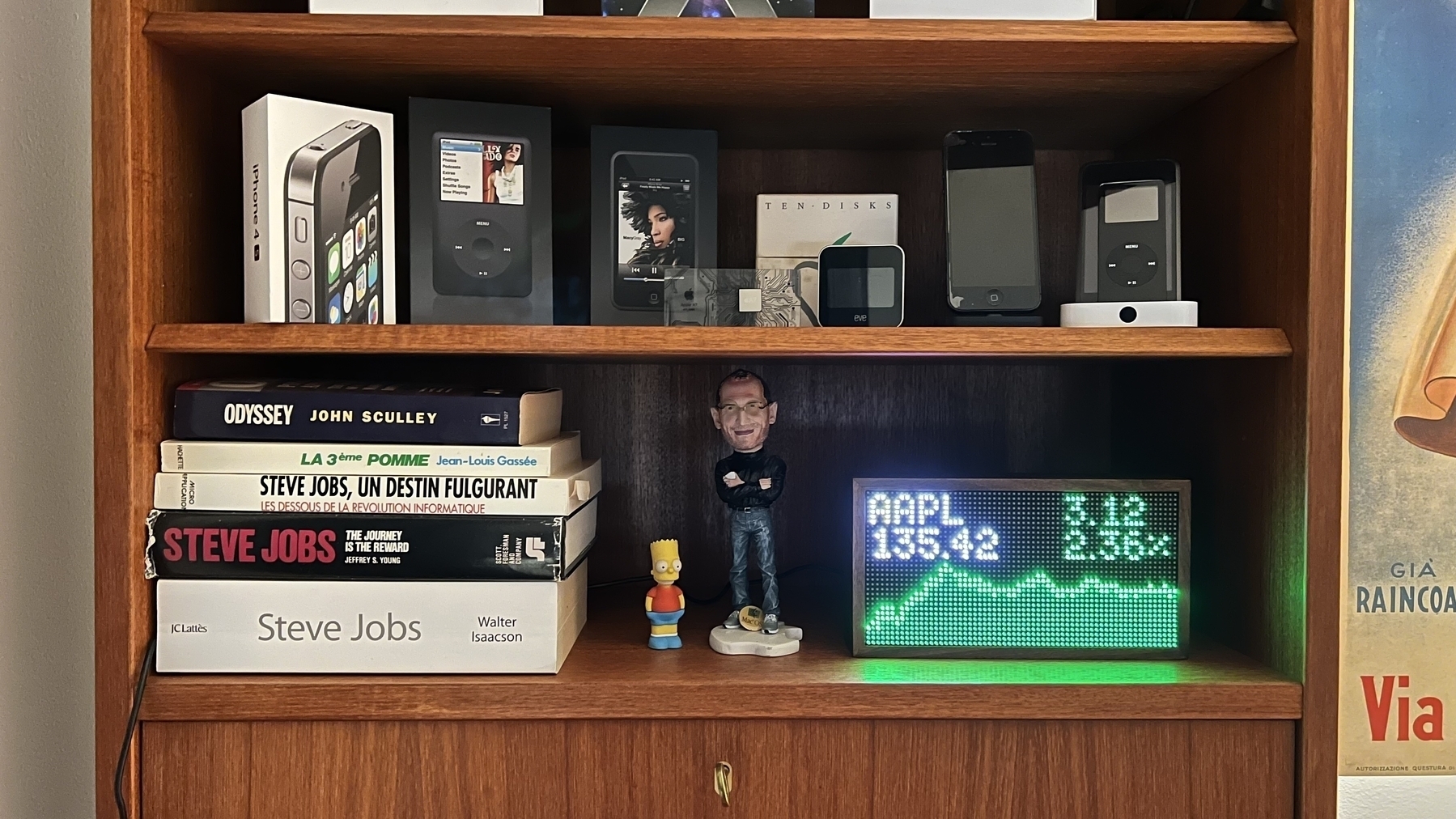
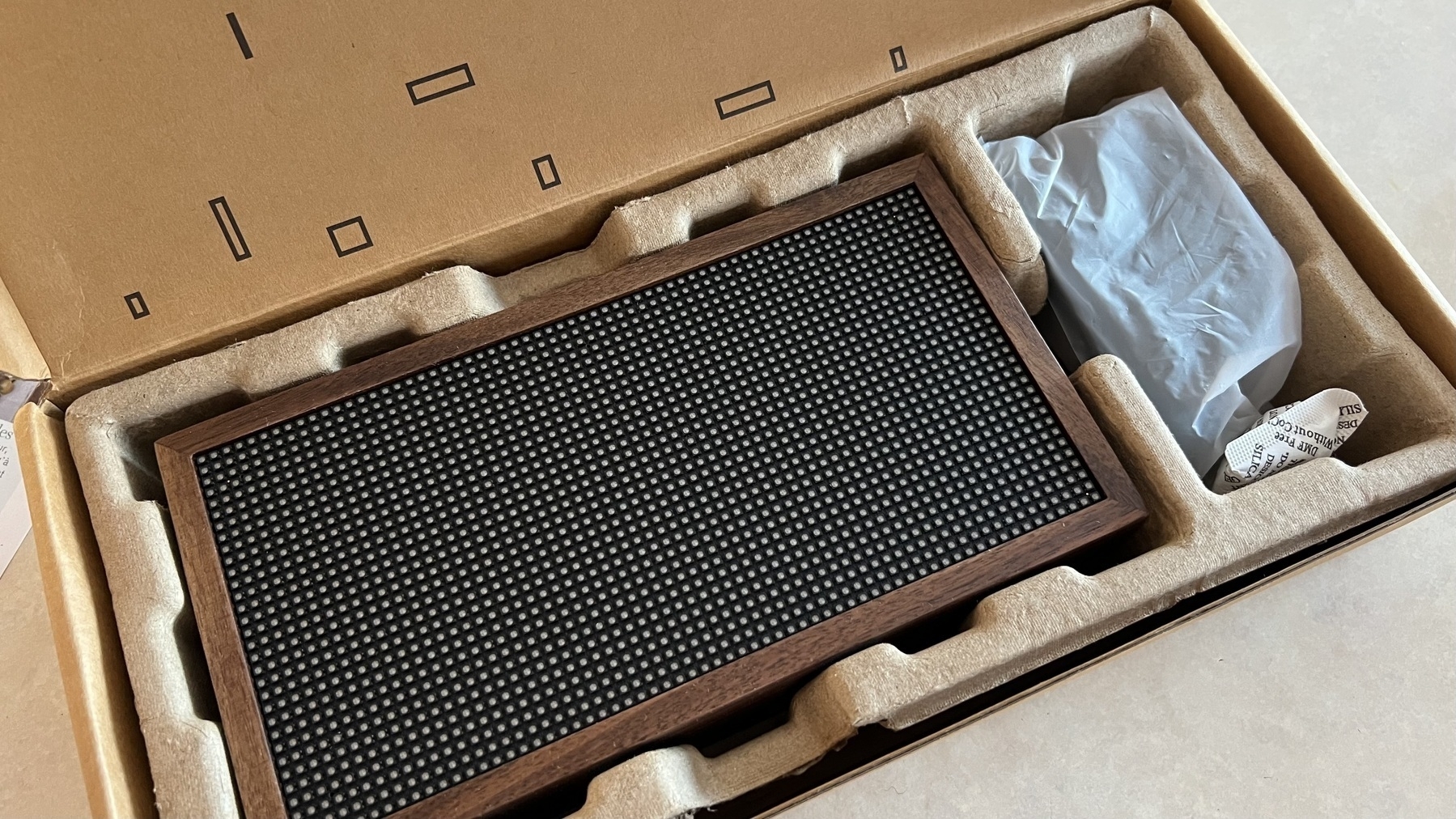
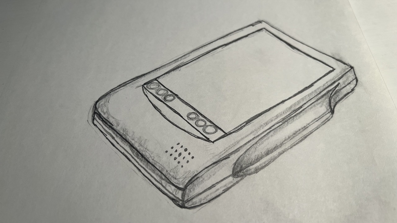
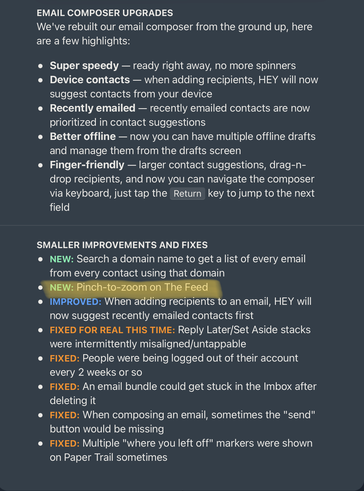
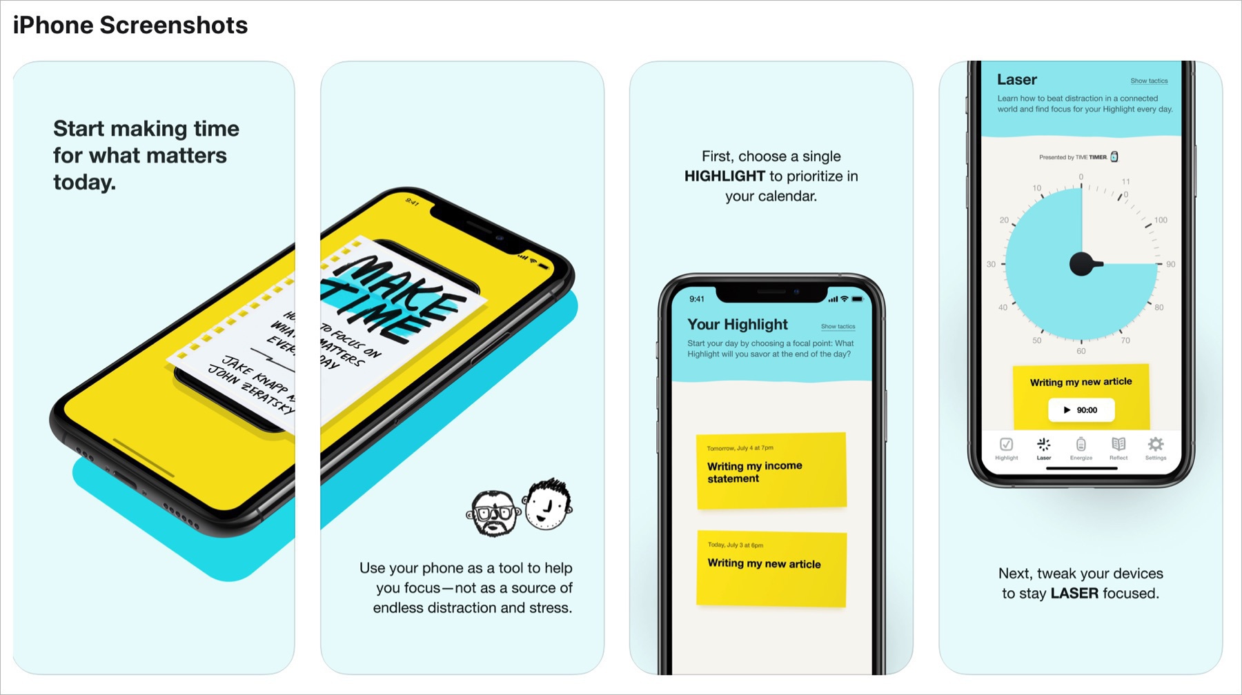
Spent the last few hours testing Basecamp. This thing is soooo cool.
Too many questions, not enough answers ...
Some questions that come up in my mind during this pandemic crisis:
- Is criminality going up or down?
- Is there less suicides?
- Where do we put used testing kits and used protective gear trash after use?
- From where does all the government money for stimulus programs come from?
- What if coronavirus mutates to a much more deadly virus?
- Will we ever return to “normality”?
- And many more…
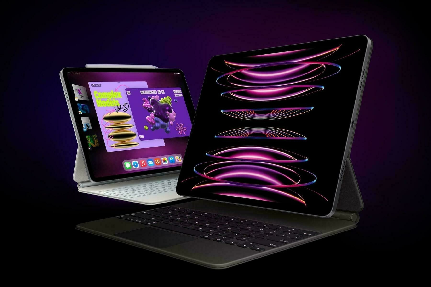
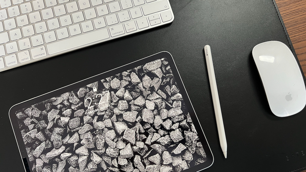
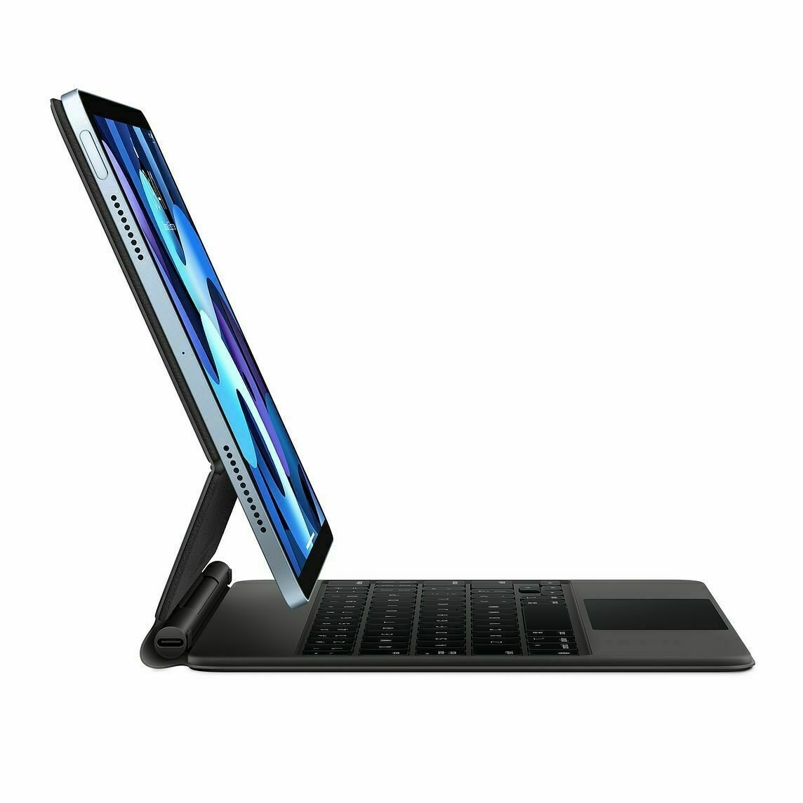
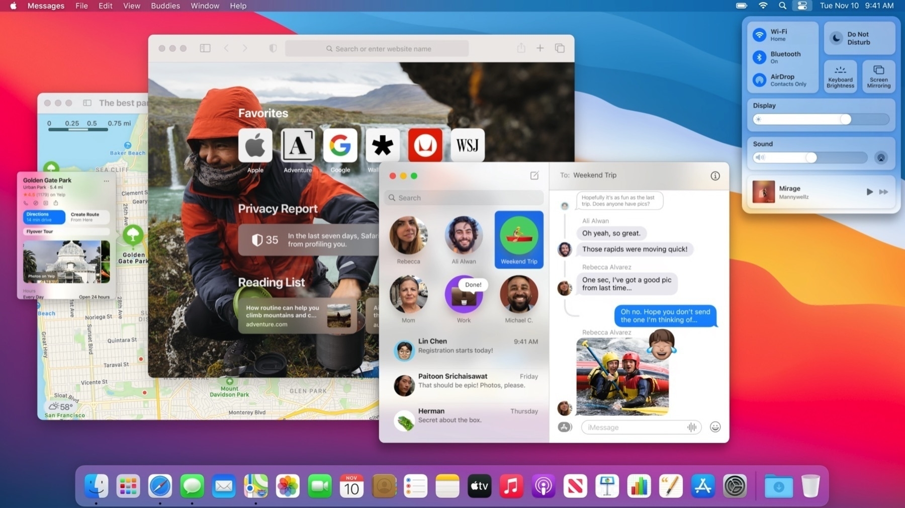
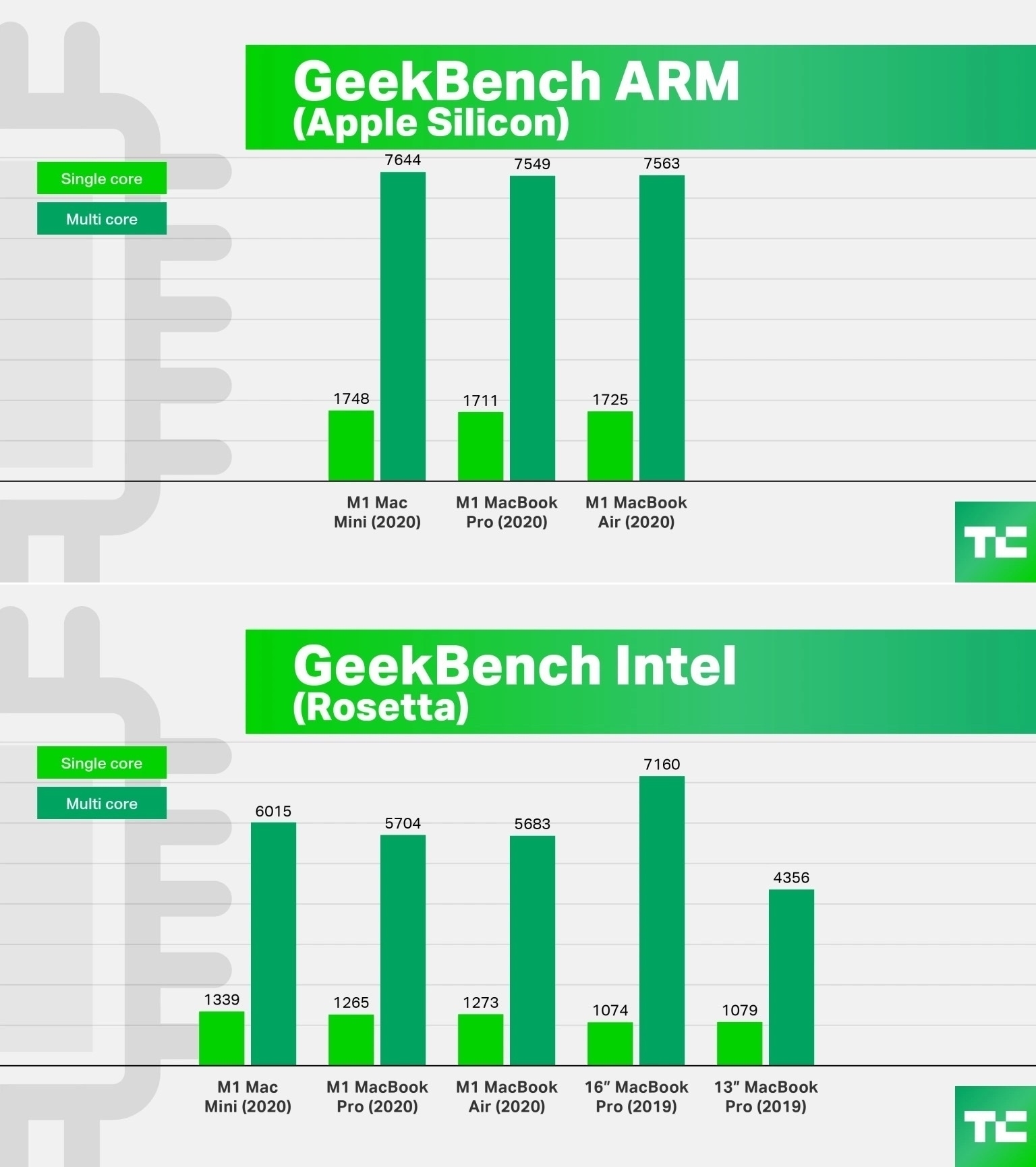
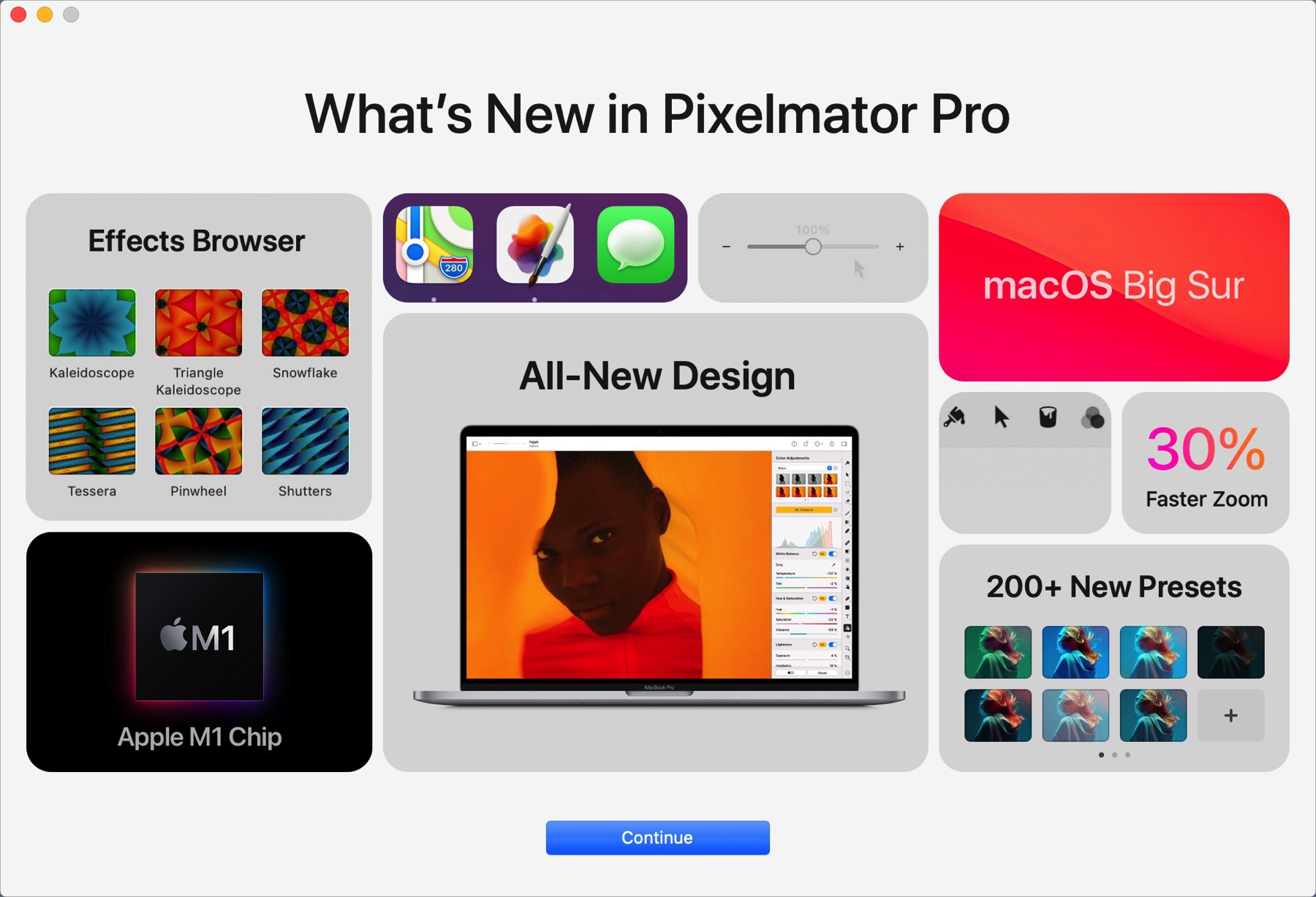
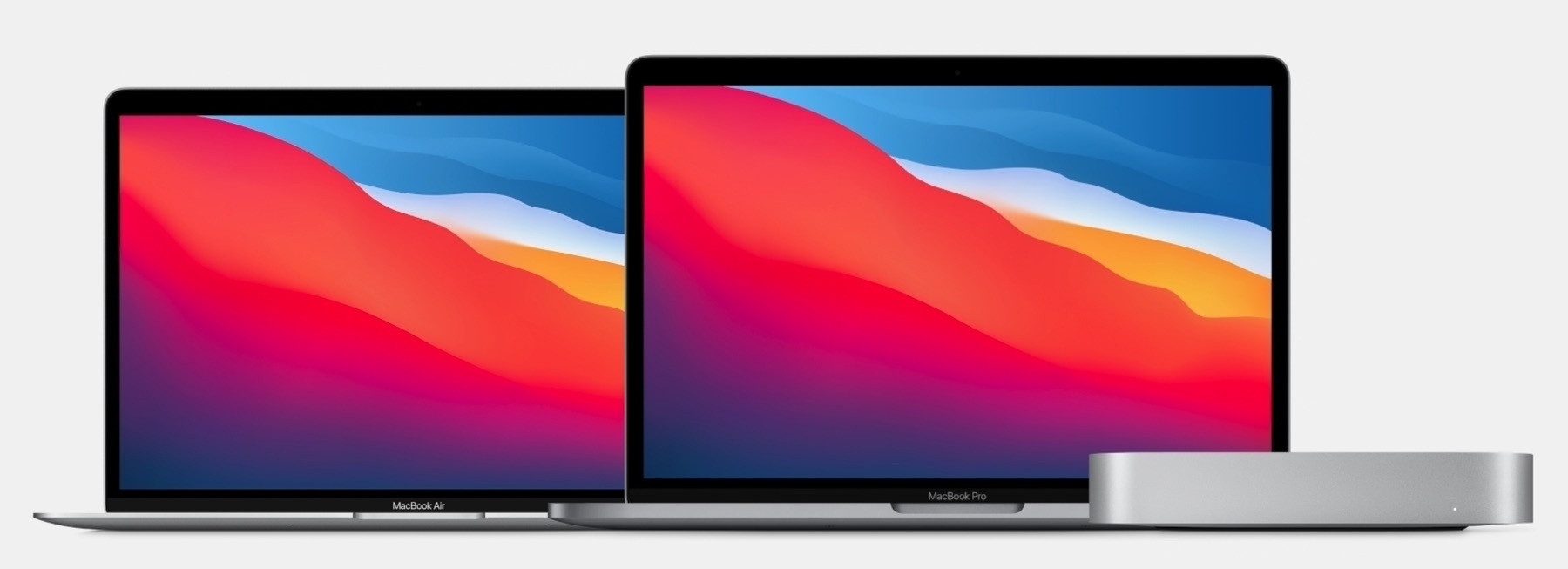
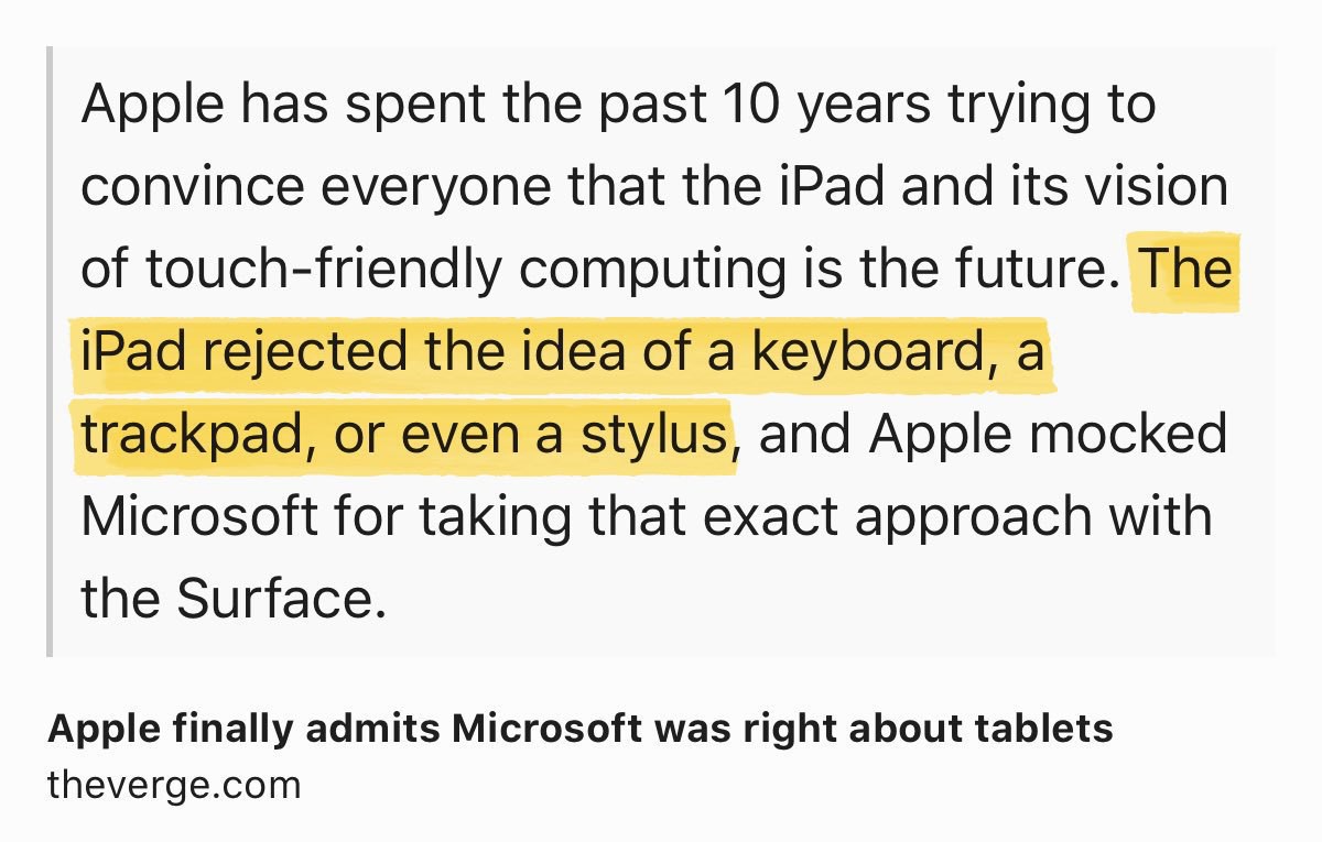
As the iPad Pro is gaining powerful CPU, input devices versatility, what’s left for the ARM-based Mac? #apple #ipad Kuo: Apple to Launch Several Macs With Arm-Based Processors in 2021, USB4 Support Coming to Macs in 2022 - MacRumors
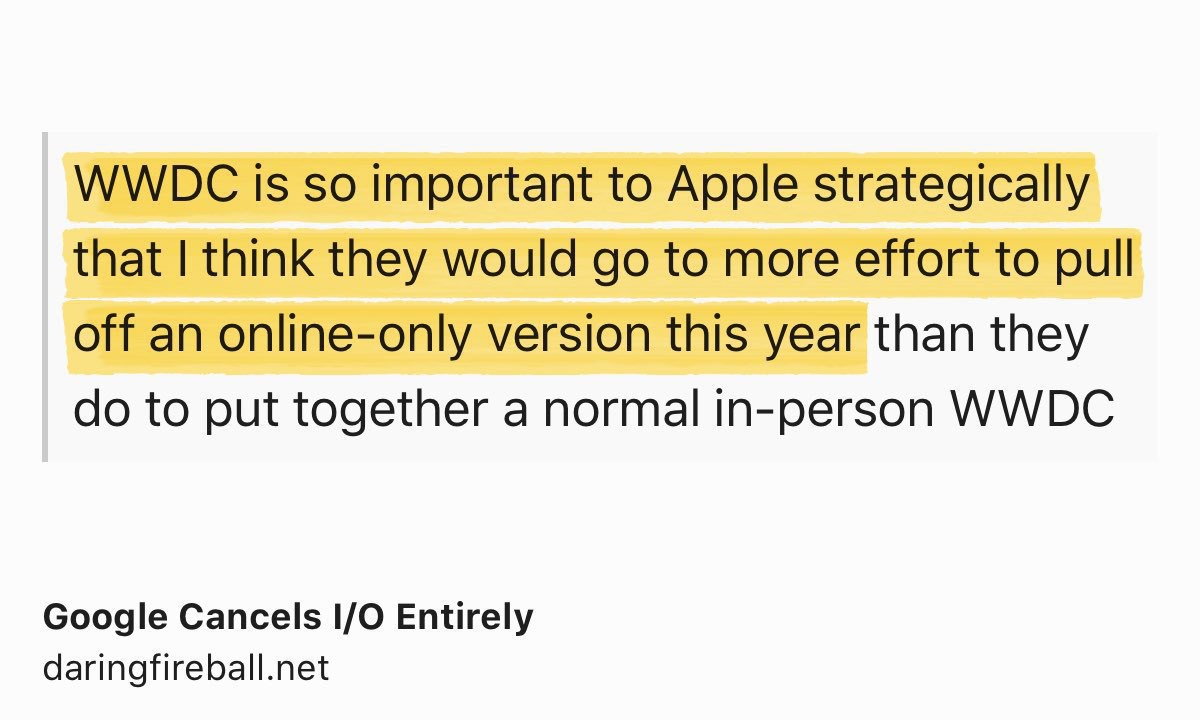
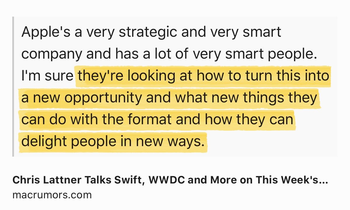
I have high hopes on Apple to re-invent the WWDC conference. #iosdev #apple
Chris Lattner Talks Swift, WWDC and More on This Week’s ATP Podcast www.macrumors.com/2020/03/2…
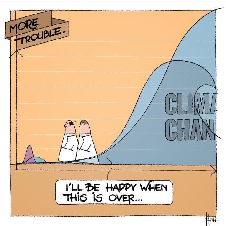
Imagine If We Responded To The Climate Emergency In The Same Way We Are Dealing With The Coronavirus Pandemic #coronavirus #covid19 apple.news
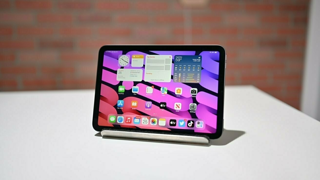
Hey #iosdev, here is a free idea for an app: Unsplash screensaver for the iPad displaying content from Unsplash as a slideshow. Boom.
I have an old iPad on a stand where this could be a great picture frame.
Should we believe numbers coming from Russia? #covid19 #coronavirus 🤔
One thing that I would like to do is go for a walk downtown Montreal to take pictures of an empty city. But I won’t because of the confinement rules. #coronavirus #covid19
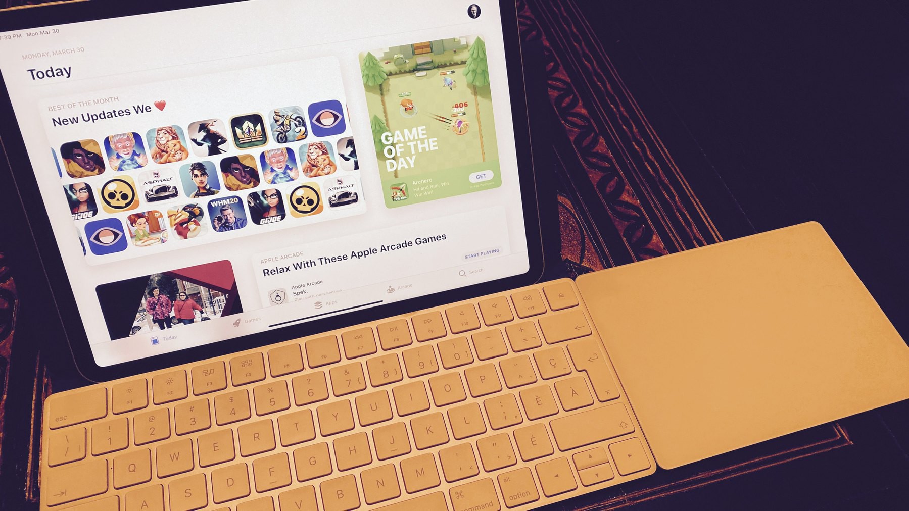
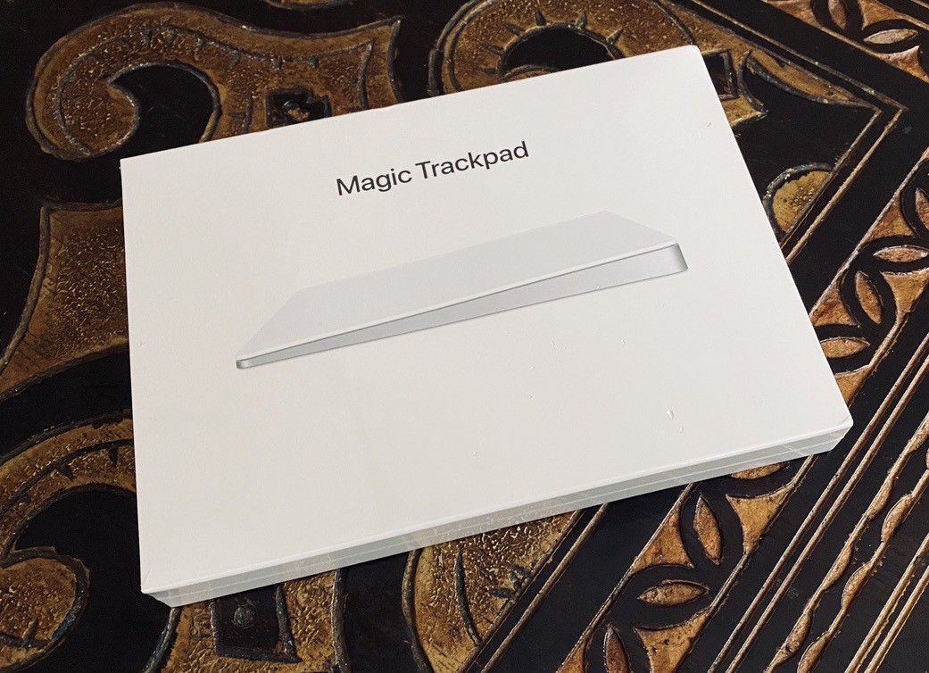
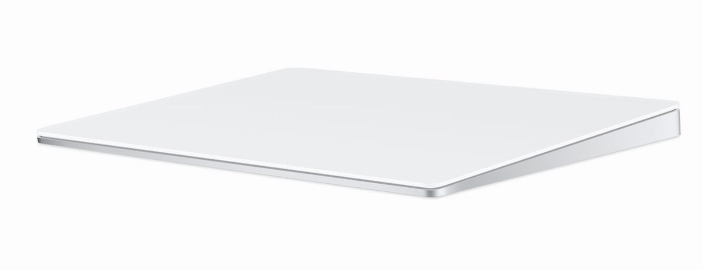
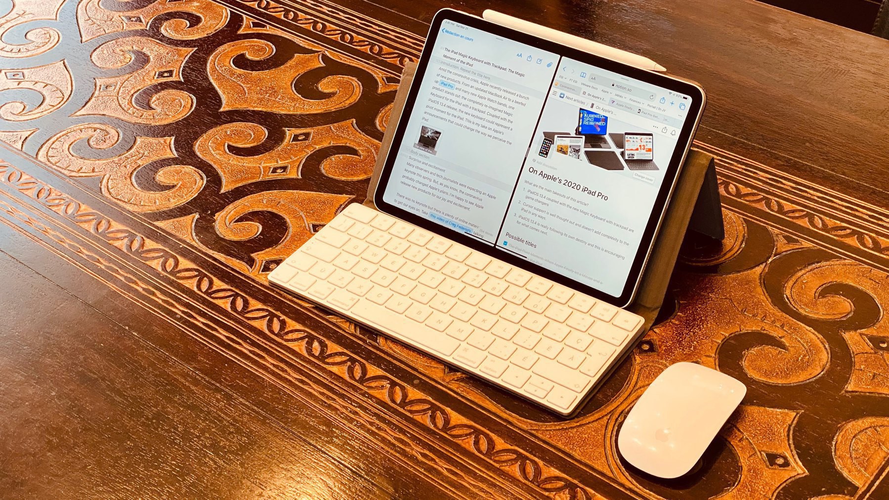
Ordered a Magic Trackpad 2 from Apple because… you know… iPadOS 13.4. Currently using the mouse but I do feel the trackpad experience will be even more delightful! #ipados134 #apple
This is what journalists should have done since this Clown in Chief has been elected. Shame on them. They are being lazy. Period. Daring Fireball: How to Turn Trump’s Daily Virus Misinformation Show Into a Vector for the Truth
I sometimes exceed my token usage limits within a session, and I’m willing to go over 100% if…
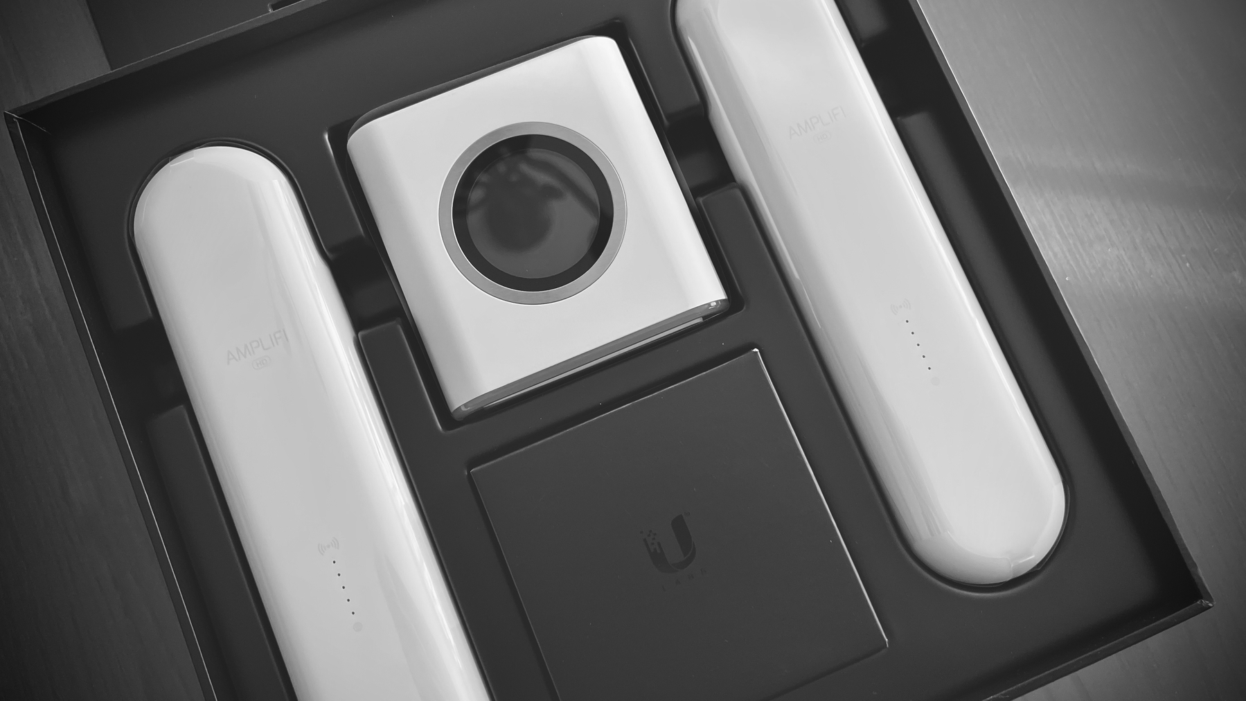
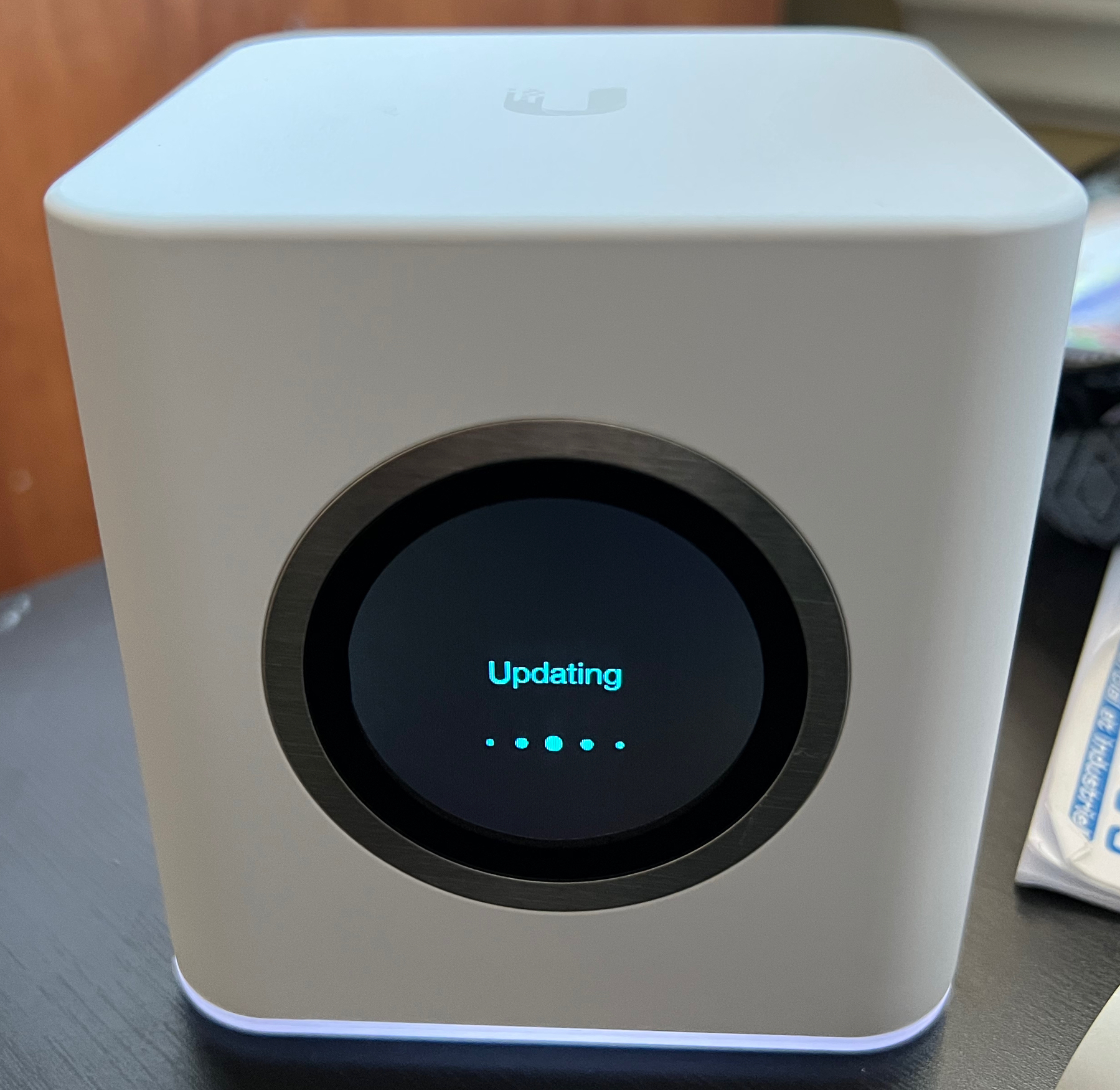
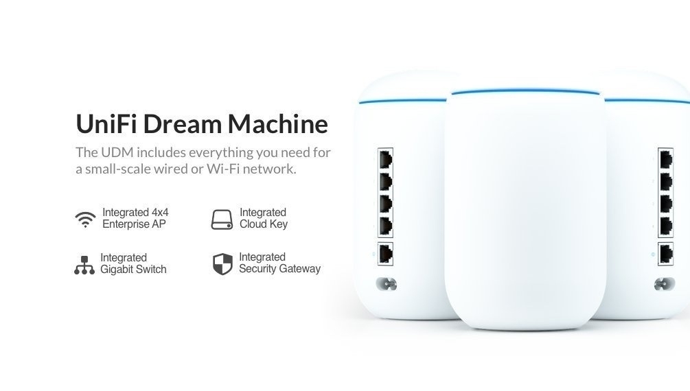
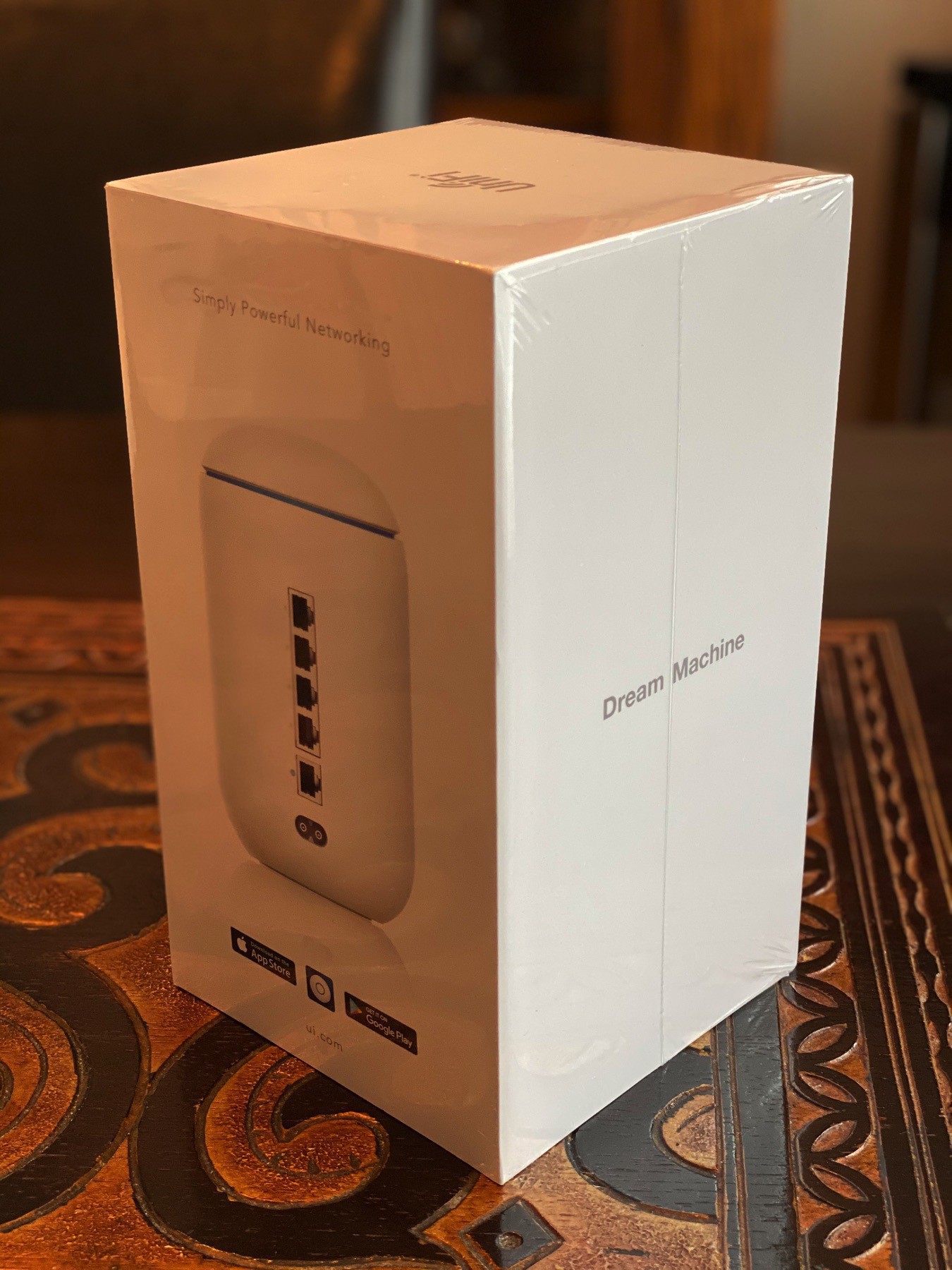
I decided to upgrade my Ubiquiti Dream Machine Router (acquired in 2020) and Beacon HD to a pair of…
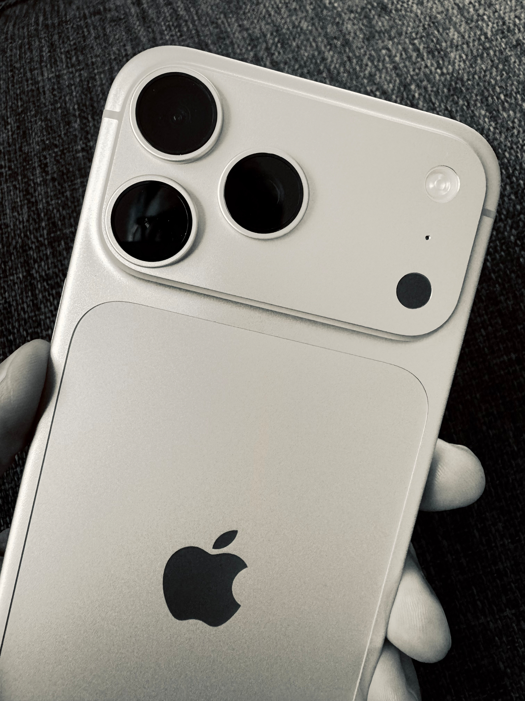
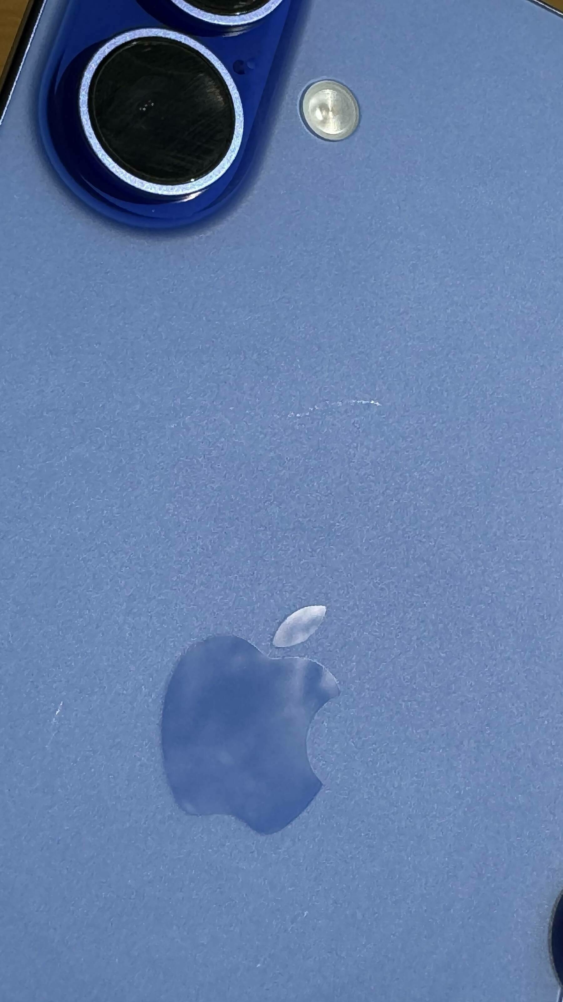
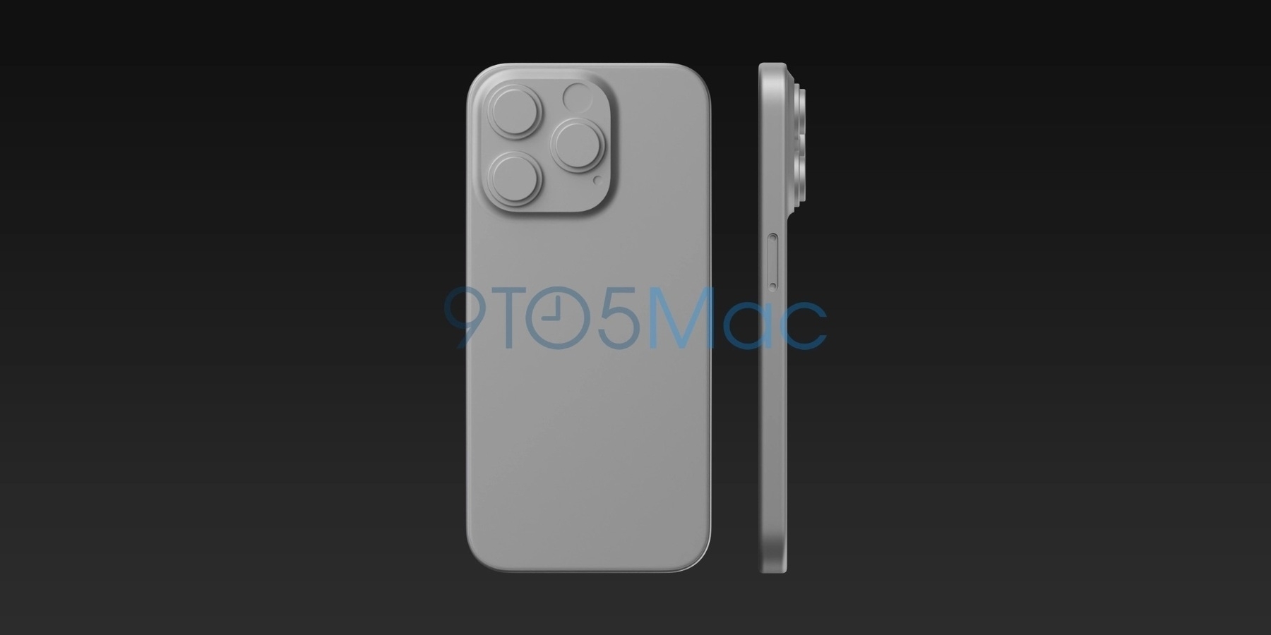
First photowalk today with my iPhone 18 Pro Max. The main camera produces new visual artifacts: the…
This is not only cool but also useful. Now, I can query content from both Ghost (numericcitizen.me)…
It’s fun to go back in time and look at content I’ve previously published. Here’s…
In the TV series “Silo” there is a woman who seems to be responsible for retrieving and…
Claude chats exposed in Google searches – another endorsement of Apple’s privacy approach — 9to5Mac…
Beta 2 on iPhone seems a regression. I do remember that we get a few steps back before jumping back…
As Tim Cook steps down, Apple hit record sales — but a chip shortage looms — TechCrunch
Cook warned…
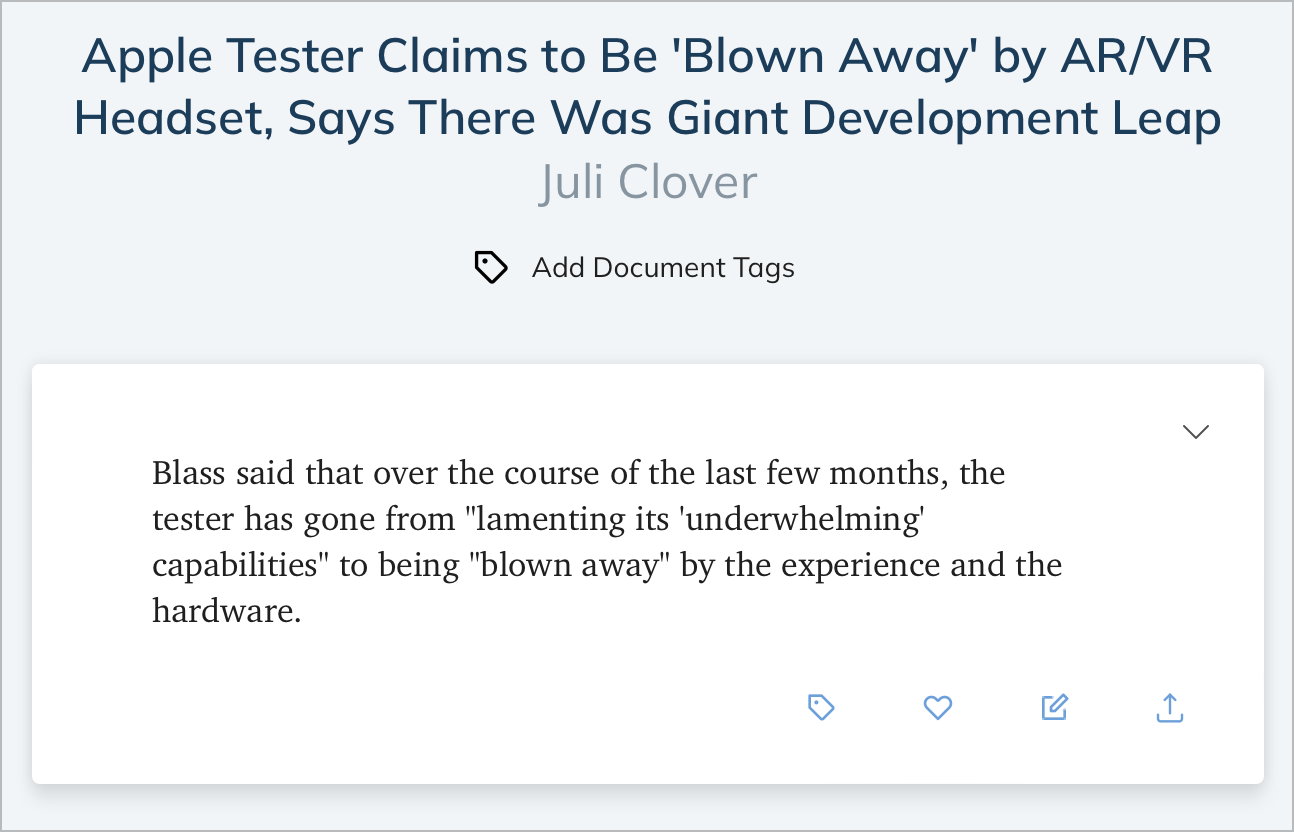
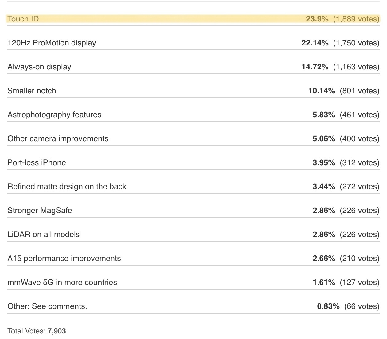
For me, this screenshot, taken from an article that appeared on my Ghost Reader timeline, perfectly…
I was doing some cleaning tonight in my old documents on Craft, including those that were initially…
Woah, what happened to Pinterest? Ads, videos, AI Modified / AU generated stuff… 😟😵💫 Come on! What…
If Google’s Gemini will be the core intelligence behind the “new Siri” this fall,…
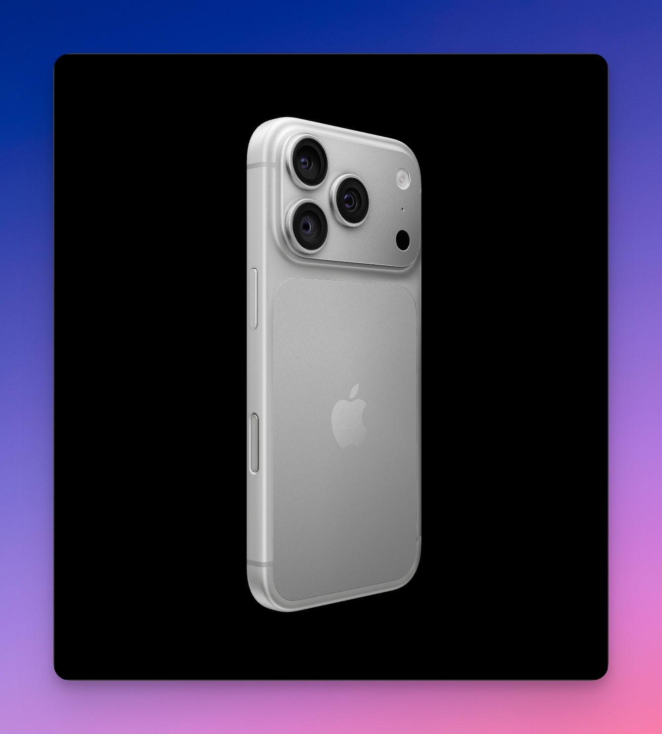
The latest Huawei folding phone kind of previews the iPhone Ultra — 9to5Mac
Apple is believed to be…
Now that my Mailbrew account is closed, I have moved many of my Brews1 to my RSS Flow web app. This…
For this fall’s iPhone and iOS 27 releases, I hope Apple will include new wallpapers from the…
I believe I decided to build my web apps at the right time1, because if I did it now, it would take…
Chris Espinosa from Apple sharing a job offer:
We’re hiring in the tvOS Engineering group at Apple.…
I’m currently on vacation but I keep an eye on the tech news and commentary landscape. With all the…
Slash AI:
Personally, I couldn’t care less what you write on your /ai page. The same way I couldn’t…
Started working on my next YouTube video. I consider myself not very good at this. It takes way too…
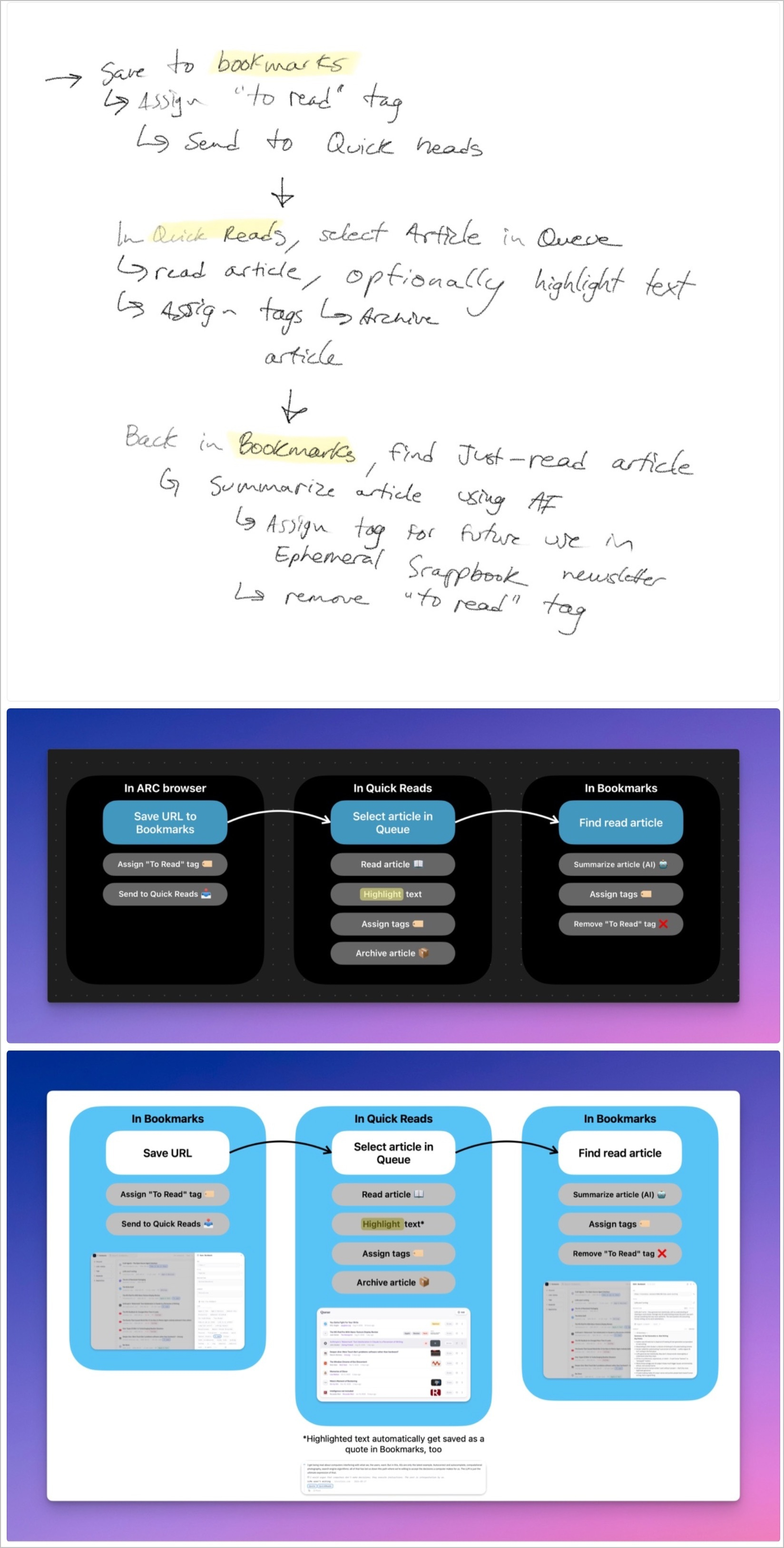
It seems I cannot finish this bookmark manager as I always find something to tweak, add or improve.…
Mark Gurman (@markgurman@mastodon.social)
Google is ramping up development of a dedicated Gemini AI…
Gruber’s reaction to Hacker News Discussion on Shubham Bose’s ‘The 49MB Web Page’:
One of the…
It’s Your Fault Really:
It fits the broader pattern of what Meta is becoming. AI slop in your feed,…
My personal and web-based bookmark manager was built mainly to support my workflow of creating each…
Apple’s new MacBooks have keyboard change you might notice instantly — 9to5Mac
Apple’s new M5…
I didn’t expect Inkwell to come with an API… I’m very curious about that because…
Apple Planning ‘MacBook Ultra’ With Touchscreen and Higher Price:
Instead of succeeding…
Neon Signs — Take
Let’s leave the software malaise aside for a moment, hard as that might be;…
Of course, I had to create my own… miniroll… nice mini webapp… still wondering…
Apple Reportedly Expects ‘Major Rush’ of Customers This Week:
The new product likely to…
Apple believes low-cost MacBook will be an ‘incredible value,’ tempting switchers: report — 9to5Mac…
Flickr’s URL Scheme:
Flickr deserves a lot of praise for a number of technical advances that I wish…
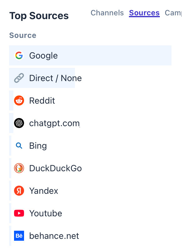
What is happening in Singapore? I get major spikes in visitors from this country from time to time.…
Samsung Launches Galaxy S26 Ultra With Built-In Privacy Display and New AI Features — MacRumors
New…
Microsoft finally makes OneDrive look like a Mac app as it gets an all-new UI — 9to5Mac
The all-new…
Apple is Testing These iPhone 18 Pro and Foldable iPhone Colors — MacRumors
While it was previously…
For each edition of my Ephemeral Scrapbook newsletter, I have to select a header image in landscape…
Early this morning, using Craft Agents, I created a new skill that enables me to save my Micro.blog…
9to5Mac’s article “Google launches Snapseed camera for iPhone with pro manual controls, retro…
How many new RSS readers can we get in a week? I’m counting two so far. Might be a third one coming…
Apple’s apparent inaction on fixing Liquid Glass is very reminiscent of the dreaded butterfly…
Manton Reece on Aeronaut
Trying out Aeronaut for Bluesky. Very nice. I don’t actually visit Bluesky…
Yesterday, I suscribed to Edovia’s Screens so that I could remote control my Mac mini upstair…
Miniroll: what a great idea, and a well-designed one above all. Is it for me? I don’t know. I…
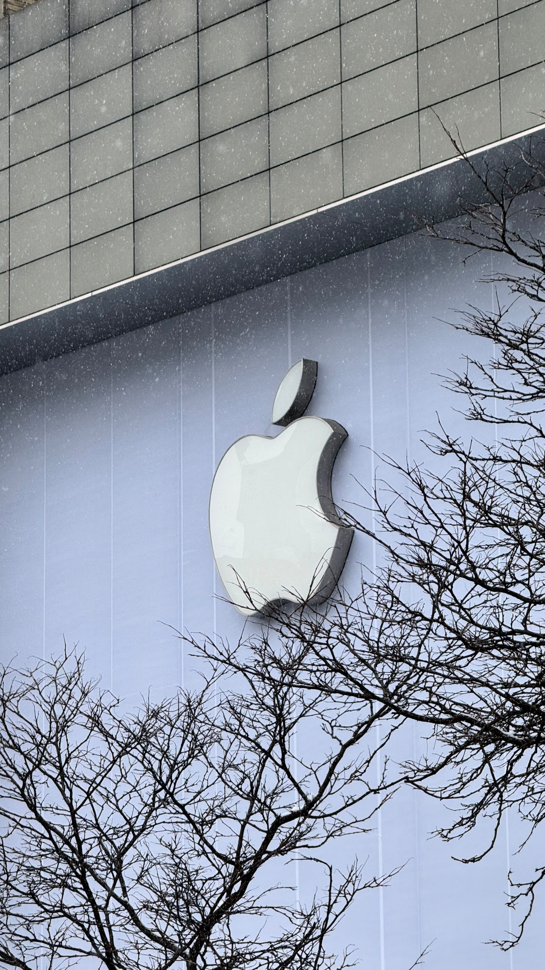
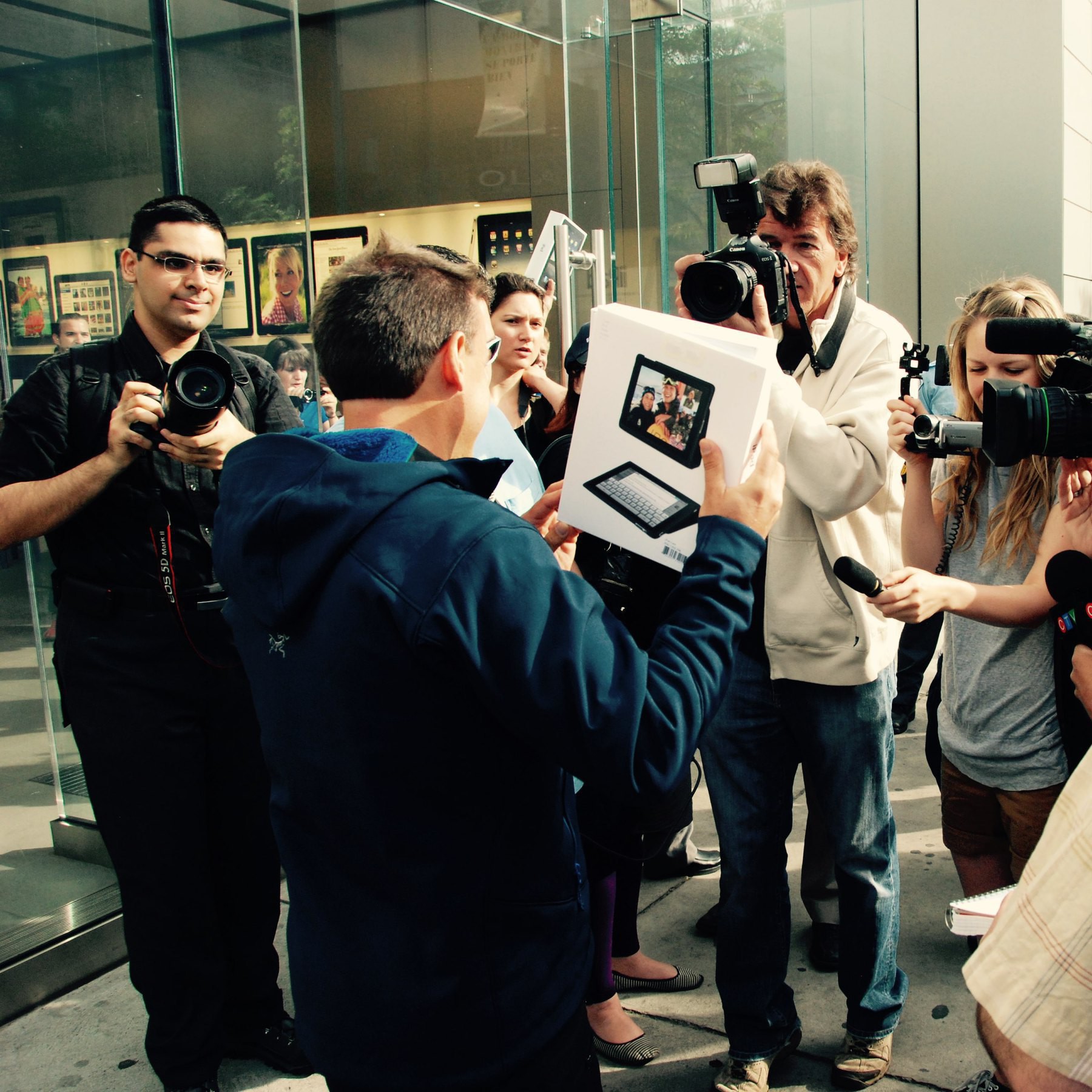
First visit to the new Ste-Catherine Apple Store in downtown Montreal. It’s quite a different…
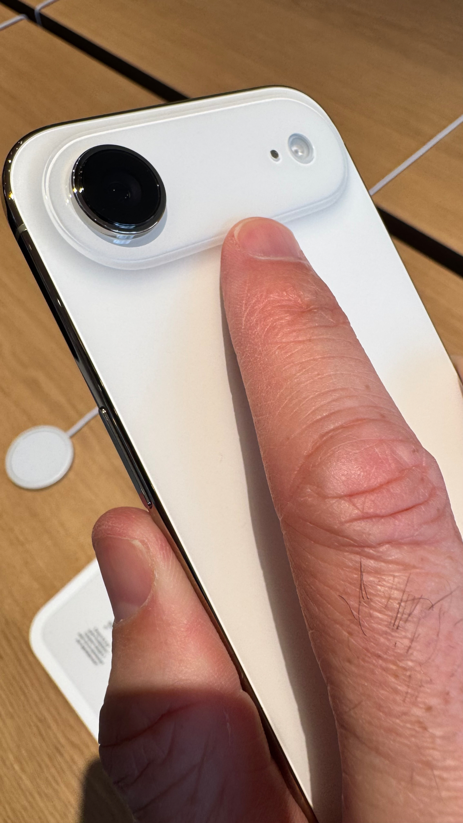
On the impossibly thin iPhone Air, the camera protuberant area acts like a place to help secure the…
Anthropic on Cowork:
“That said, there are still things to be aware of before you give Claude…
Updated my n8n instance from v2.0.3 to v2.2.4. Super easy to do (I’m using the Docker Compose…
I’m discovering this powerful n8n node this morning. This means I could trigger that workflow…
“We’re going to have our very large United States oil companies, the biggest anywhere in the world,…
My Microblog Poster web front end now supports Markdown files, drag-and-drop, and preview mode, all…
I got a lot of positive reactions about my Micro.blog front end for writing and publishing posts in…
I made my first Vercel app: a simple form for posting to Scribbles.page. Super lean, super clean. I…
Just completed a one-hour WordPress+Email issue-debugging session with my daughter-in-law. It was a…
Started learning more about Vercel. I see a lot of people using it for many different things. Seems…
What a night & day difference between Claude Sonnet 4.5 and Opus 4.5 models. The latter is much…
I’m trying something new this year for my year-in-review blog post. Using all my monthly post…
I don’t really believe in vibe coding, especially the scaling of it for complex systems, even…
The problem is that I have too many ideas, there is too many things that I’d like to work on,…
Blogging from Scribbles.page results in different post appearances on timelines, with the full post…
Personal experience is that frequent prompts to re-enter their Apple Account password whenever they…
Working on the next edition of “What’s Up With Micro.blog”. The last one was done…
Tweaks to iPadOS 26 b3 multitasking are so very much welcomed! Is Apple finally getting there where…
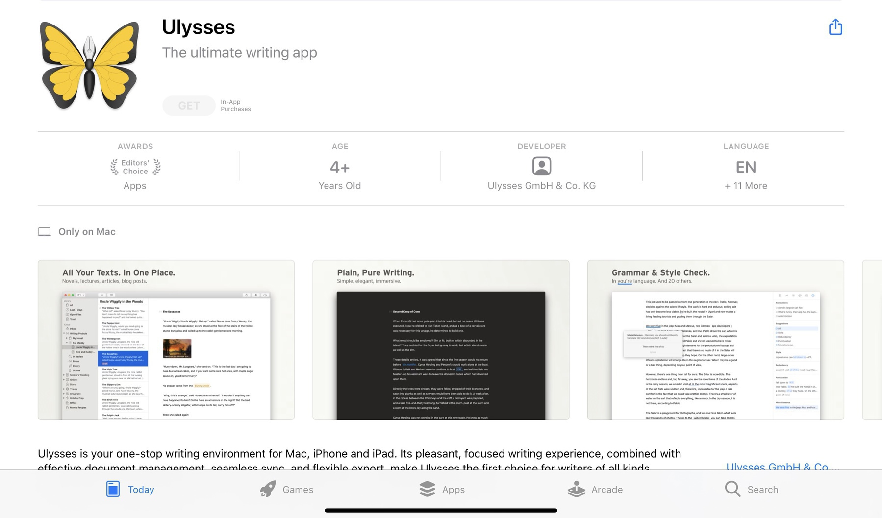
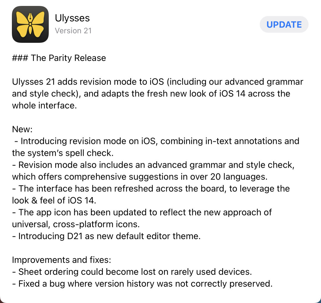
After Craft, Ulysses, still in beta, might be the second-best take on Liquid Glass adoption. I love…
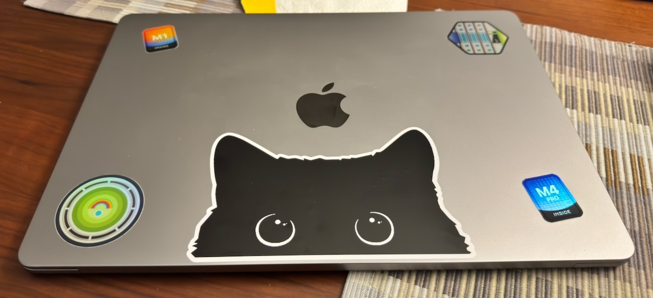
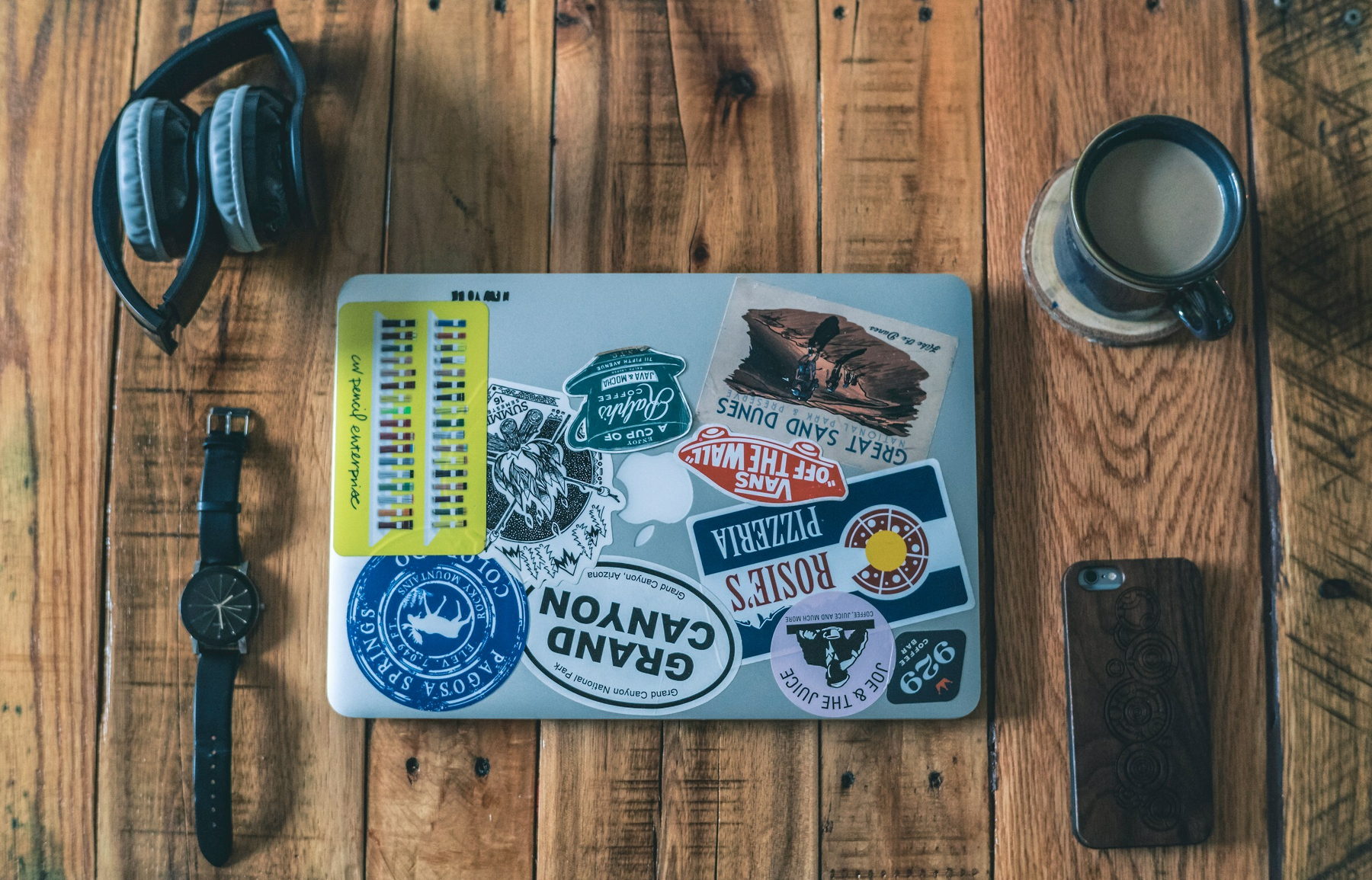
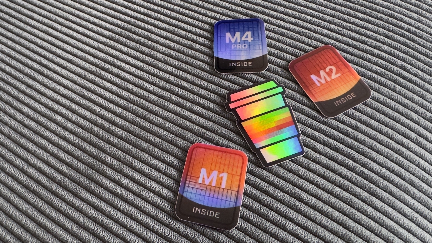
I’m tempted to start a sticker collection and put them on my M2 MacBook Air. I’ve never…
Why would an Android developer would use Apple’s Swift language now that it’s available…
**OpenAI acquired Software Applications Inc **— a startup building an AI-powered user interface for…
I can’t remember when the last time I visited an Apple Store. This means I didn’t go to…
Statistically, nobody cares about Liquid Glass. There has been no user revolt, no viral TikToks, no…
I’m done with the latest edition of The Ephemeral Scrapbook newsletter (Craft-based version).…
OpenAI unveiled some impressive developments today at their developer conference, including apps in…
Are there any Craft users here? I’m curious to see if sharing short videos1 about Craft would…
I have a one-day holiday vacation on Thursday, right in the middle of the week, and I still have no…
How many ways can you write that the iPhone 17 is an improvement compared to last year’s iPhone 16?…
I think that, from what I observed and experienced since Apple OS 26 releases, some apps inherently…
There is no clipboard manager on my office PeeCee… at least, nothing that I could install anyway if…
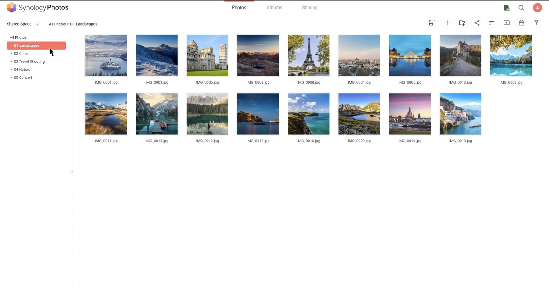
Watch out, Synology, you’ve got some serious competition. I like what Ubiquity is doing these…
I spent a few moments this morning reading user reactions to Apple Liquid Glass on r/ios on Reddit.…
It’s really fascinating how third-party apps adopt Apple’s Liquid Glass. For some apps,…
Home sweet home. I’m back and working from my M4 Mac mini running macOS 15.6.1. Feels good to…
At this point, with all the rumors and leaks, Apple should just call it off, cancel the infomercial…
It seems that the browser war is heating up with Atlassian buying the Browser Company and all other…
I just submitted one of my comments about Google and Apple deals to Techmeme, and it got picked up.…
Apple seems to be closer to repeating with Google what they do for search, but this time with AI. I…
To everyone who is afraid of losing their job because of generative artificial intelligence (or one…
When all apps look pretty much the same, there is no fun, no distinctiveness. Looking at you, Apple…
What are the mistakes Apple, under Tim Cook’s leadership, did since 2011? I’m working on something,…
Out of curiosity, are you considering getting more RAM with your next computer to run local LLMs in…
Fun fact: I keep a log (or a journal) of everything I do in a day at work. I’ve been doing this for…
The Kyiv Independent’s take on the “sickening,” “shameful,” and “useless” meeting in Alaska is spot…
If Liquid Glass is about unifying all Apple’s platforms, why is it so toned down on the Mac? Asking…
Frankly, my data processing and reading workflows are such a mess, I cannot figure an effective way…
I started documenting before-and-after comparisons of different betas of Apple Liquid Glass. Search…
Still no clear effects of Apple Intelligence delays on Apple’s bottom line, apparently. Apple…
Something I just learned this morning about Micro.blog:
Do cross the streams! Bluesky starter packs…
I’ve been trying Claude AI recently and beyond the answers I get to my prompts, I really like…
It appears that not only Liquid Glass breaks readability in many cases, but information density too…
I’ve Got Better Things To Do Than This, and Yet
At the point when you have to blur the content area…
Having to immerse myself in a different digital ecosystem, specifically Microsoft’s, helps me…
This article points to an interesting prospect about the future of the Mac menu bar usage: we could…
I’m happy that, in Canada, we don’t have Apple Pay (yet?) because otherwise we would be…
How many options and switches do we have today in Settings.app, on all platforms, because Apple had…
Is this a plain website? Is this a digital garden? Is this a landing page? No, it’s "Who…
I mentioned earlier this week that I began exploring alternatives to Mailbrew. Digest seems to be a…
It seems I overlooked that Inoreader can’t send email summaries of RSS feeds on the Pro plan;…
Invoking the notifications center with iPadOS 26 while using an external display will blank out the…
Since coming back from vacation, my morning routine is simple and is always the same: wake up, make…
Follow-up to my previous post: I’ll be returning the Ubiquiti G6 Instant camera. It’s a…
Ordered and received an Ubiquiti G6 Instant surveillance camera only to discover that UniFi Protect…
I’m getting ready to pack my things and offload 559 photos from my Nikon Zf to my MacBook Air…
I love those courtyards which are everywhere in Europe, especially in bigger and denser cities like…
Apple App Store rules are challenged in the US and so many other places around the world, except in…
Apple, Safari and AI: Eddy Cue is the guy who convinced Steve Jobs to do an iPad mini. AI replacing…
Astute comment by @mattbirchler on iPad multitasking. Having to keep an app open like Final Cut Pro…
How is it possible that the « new » Meta AI app already got reviews many of not most of them dating…
I don’t care who is managing Apple’s robotic team, but I do have one question: why does…
It’s now possible to change the default username provided by Ghost’s Fediverse support.…
There is a lot to like about some of the iOS 19 redesign mockups, but the “rounder” app…
Apple users looking to improve their security posture? Here’s a guide that I wrote and shared…
From my point of view, with recent security breach from the government members, more signs point to…
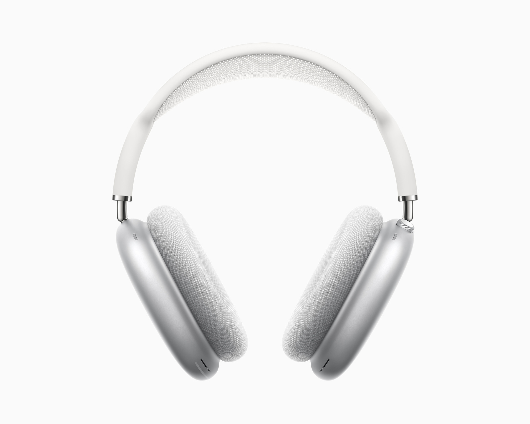
So AirPods Max will get new audio features. The fact that only the USB-C model will support this is…
Today, I’ve been to an Apple Store in Ottawa, Canada. My daughter in law bought a M4 MacBook Air. I…
My transition from HEY Mail to Fastmail is likely the best digital move I’ve ever made, and I…
Om Malik on Apple in today’s world:
Apple has become a complex entity that can’t seem to ever…
I logged into my Substack account today because I’m working on something and I couldn’t believe how…
More than ever, the USA is isolated. More than ever, I’m convinced that the US government is siding…
Fuck Trump, Fuck Vance and fuck their clique. Ukraine, we support you, you are not alone! The US is…
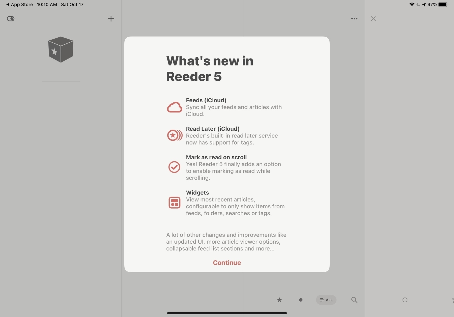
Using the new Reeder.app∗ to read content from some Bluesky users I follow is a rather surprisingly…
Negotiating the war’s end without Ukraine is as absurd as a husband discussing asset division…
I updated my blog theme to incorporate Micro.blog summaries, but I’m uncertain if this change…
I can’t count the number of times I wish I had maintained an archive of all my screenshots over the…
There is something that I wish was different with blogs hosted on WordPress: commenting and liking.…
I had a conversation with a friend yesterday about our respective hobbies as content creators. He’s…
Here is a funny one: the Get Info box for an exported image from Apple Photos. The image was indeed…
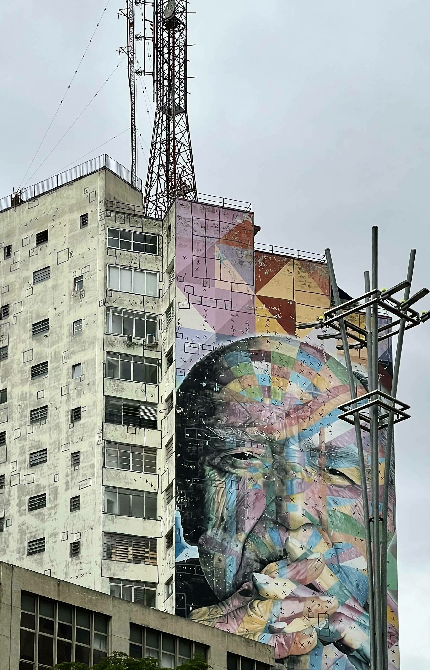
A famous building in São Paulo, circa December 2022. Taking a photo of someone else’s artwork makes…
I’m seeing more and more online stores using Shop.app for shipment tracking. It’s great…
I NEVER take and share pictures of cats… but this one living in the building where I’m…
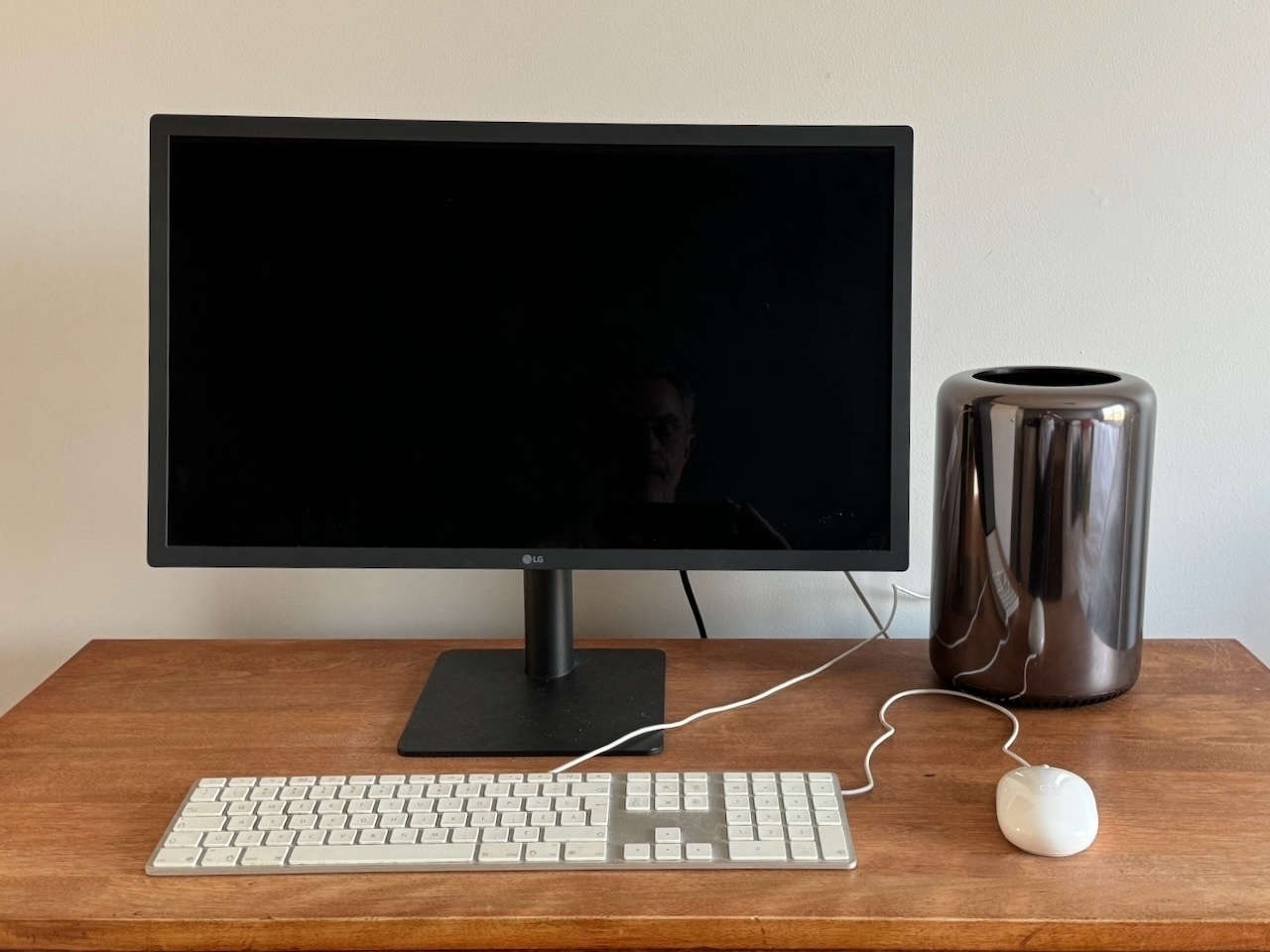
The LG UltraFine 6K: this is such a nice-looking monitor. Perfect for a M4 Mac mini. Look at me, no…
I still have three more articles to publish before the end of the year: one about Medium, the final…
COVID is still a thing: my sister and brother-in-law (69 & 71) got it. They got vaccinated five…
I’ve been playing with iA Presenter 1.4 again this morning. I like what I’m seeing with…
Microsoft Teams for iPad is probably the buggiest app of all when used with an external display. So…
Just bought Soulver 3 for iPad as a big fan of this app for the Mac. I cannot live without it on my…
I’m getting tired of hearing people invoke their ADHD syndrome for everything… I mean,…
I don’t know why I’m paying for Ivory, I’m not often on Mastodon, much more often…
My brother-in-law got a M4 Mac mini recently. The last time he used a Mac was with the Macintosh LC…
Those drone sightings stories in New Jersey are… troubling? How come authorities can’t…
For all Craft users out there looking or already using Craft Collections, I made a video about that…
Updating plugins on Micro.blog is as satisfying as updating apps on the Mac. I wish there were more…
Today, I submitted my resume for a new job out of curiosity. The submission form included a section…
It’s been a while since the last edition of The Ephemeral Scrapbook edition. Here’s the…
Even idle (10%-15% CPU usage), the new M4 Mac mini (with M4 Pro chip) runs much hotter than the old…
This is how he does it. Incredible the amount of BS being said in such a little crowd and so little…
Did anyone catch the pirate flag during the Mac mini announcement or on the mini website? 👀😉 I like…
You know how everyone’s all excited about the next iPhone announcement? Well, for me, it’s the Mac,…
I’m still on the waiting list for Image Playground… more than a day after installing and requesting…
This morning, I’ve been experimenting with Apple Intelligence writing tools using a beta version of…
Seeing people use their iPhone camera to take pictures and videos of a show and I think there is no…
I’ve been using my M4 iPad Pro hooked to an external display all day at the office (forgot to bring…
Currently curating my Bluesky home feed to my liking. If someone on Bluesky didn’t post since…
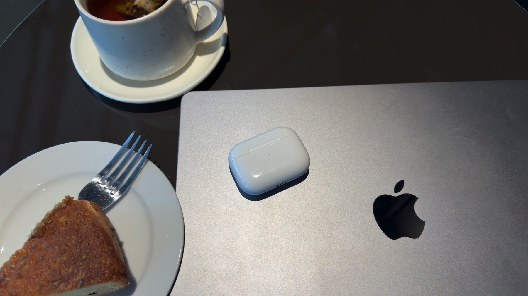
Working from home the coffee shop near my house… on Friday, something that I rarely do, but weather…
I knew it: Trump lacks courage. He wants us to believe he can talk and fix anything in 24 hours but…
I’m going to watch the whole debate tonight. Even as a Canadian, I think it’s important…
It just occurred to me that Apple (and other “gatekeepers”) are getting a bit of their own medicine…
My newest Craft video, this time for beginners: what should you do when you are just starting using…
Today I experimented Slack Lists to track messages for which I want to make sure to get a response.…
When I read the Threads app data privacy fact sheet on the App Store yesterday night and read a few…
What the “can’t do real work on an iPad” narrative is really about
people like me…
So iOS 18.1 is a thing, after all. Well, as I live in Canada, I’m not going to set the region…
Jeff Perry on Reddit deal with Google for content access exclusivity in indexing their content: The…
Today’s CrowdStrike update is probably the most expensive update of all time in IT history. Will we…
In a meeting this morning at the office, I was quick to point out that those running Macs were just…
You can’t make that shit up, right? WTF is wrong with them? 🫣🤮 sorry about this negative post right…
Best new feature of iOS 18 / iPadOS 18? We can hide app names on the home screen! This post is part…
People are so quick to say “I don’t want him to win but I also don’t want him to die” as if there’s…
Finally booked my Apple Vision Pro demo session for this coming week. I’m not buying this thing but…
Location check in 🗺 — Leaving tomorrow morning for the Korcula island, Croatia. Now shilling on the…
Biden is losing much more by staying than by leaving. His career legacy will be: he lost because he…
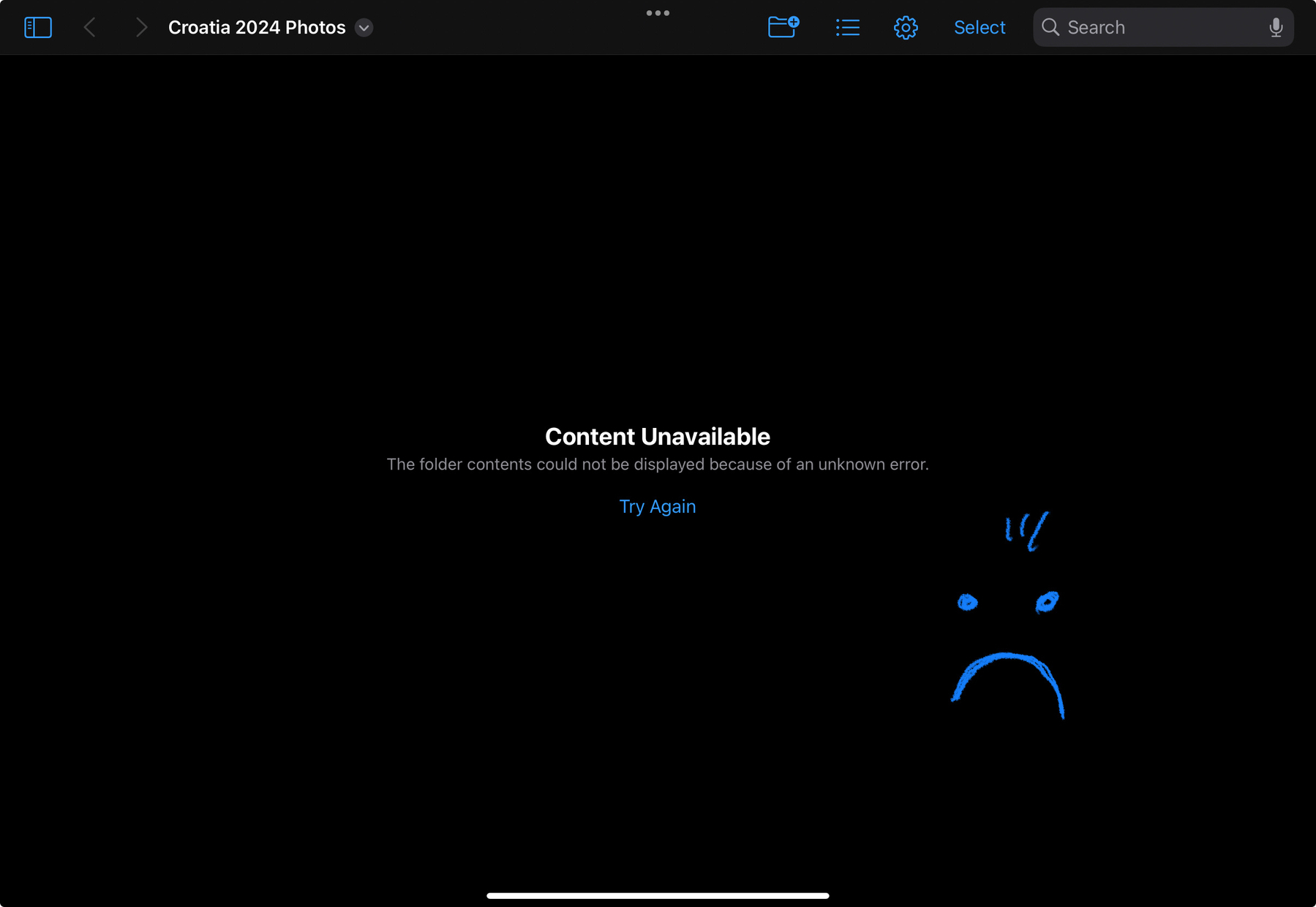
The “joy” of trying to be iPad-only while traveling. Hitting “try again” fixes the issue but it’s a…
If democrats are really eager to govern the next five years, they will replace Biden. If Biden is a…
Is it me, or Automattic is missing a big opportunity by not enabling users to publish their journal…
Last minutes adjustments before traveling: revisited the “on vacation” focus mode on my…
I wish I had an embedded “recent photos” feed on this blog, something along the line of…
On iPadOS, you can hit CMD-Q on your keyboard to « quit » an app… in fact, only the icon is removed…
Referring to this post from MacStories’ Viticci, I might be living or coming from a different…
Mind blown. That’s all for now. More thoughts to come soon. 🤯 #wwdc #apple #appleevent #wwdc24
Apple may be overhauling Spotlight in macOS 15, and potentially on other operating systems as well.…
I’m getting really tired of the West being afraid of conflict escalation and of Russia. The more we…
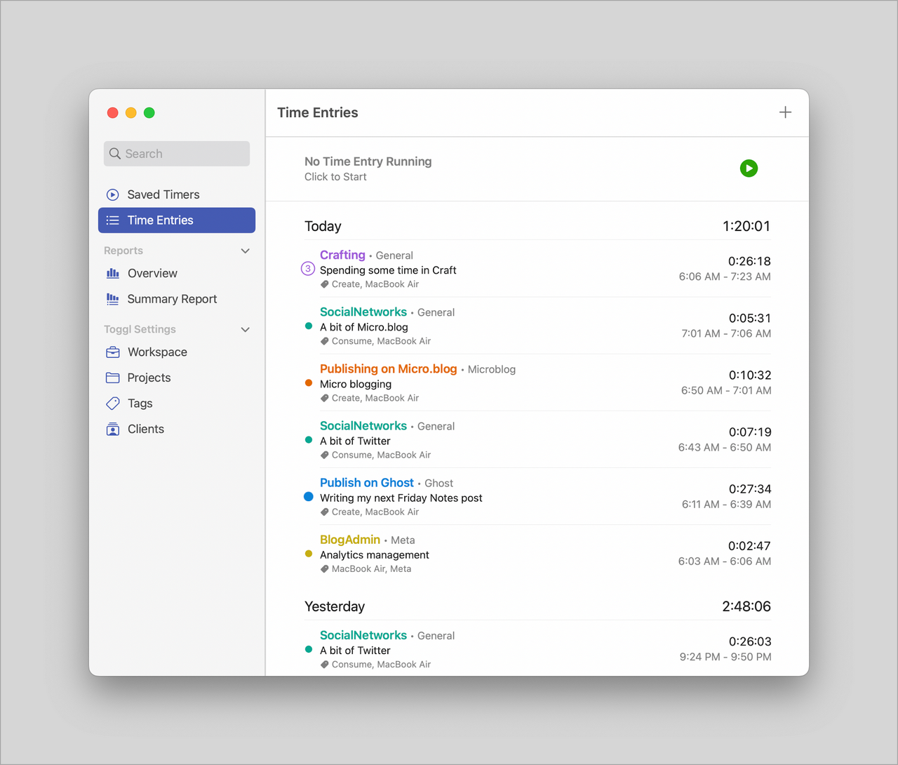
Today I decided to cancel my subscription to Toggl time tracking service and to Timery, a wonderful…
Finally sold my Nikon D750 with the kit lens on the second try on eBay and shipped today! The buyer…
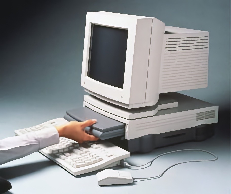
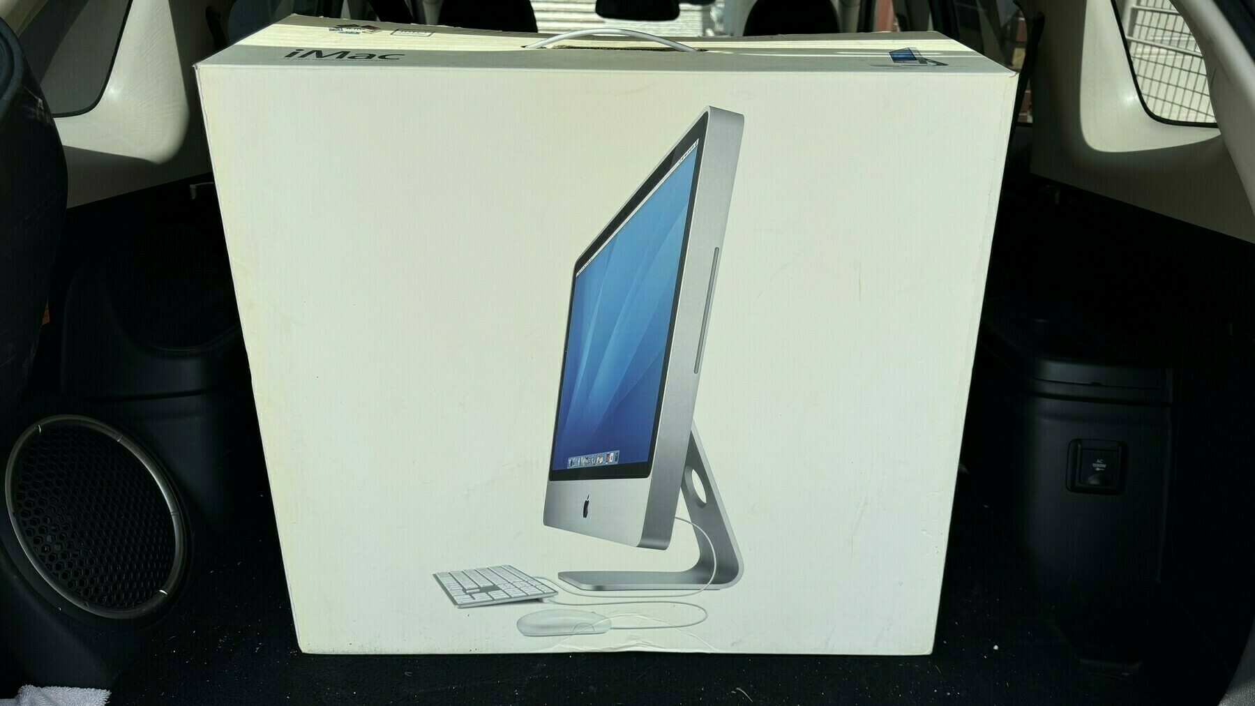
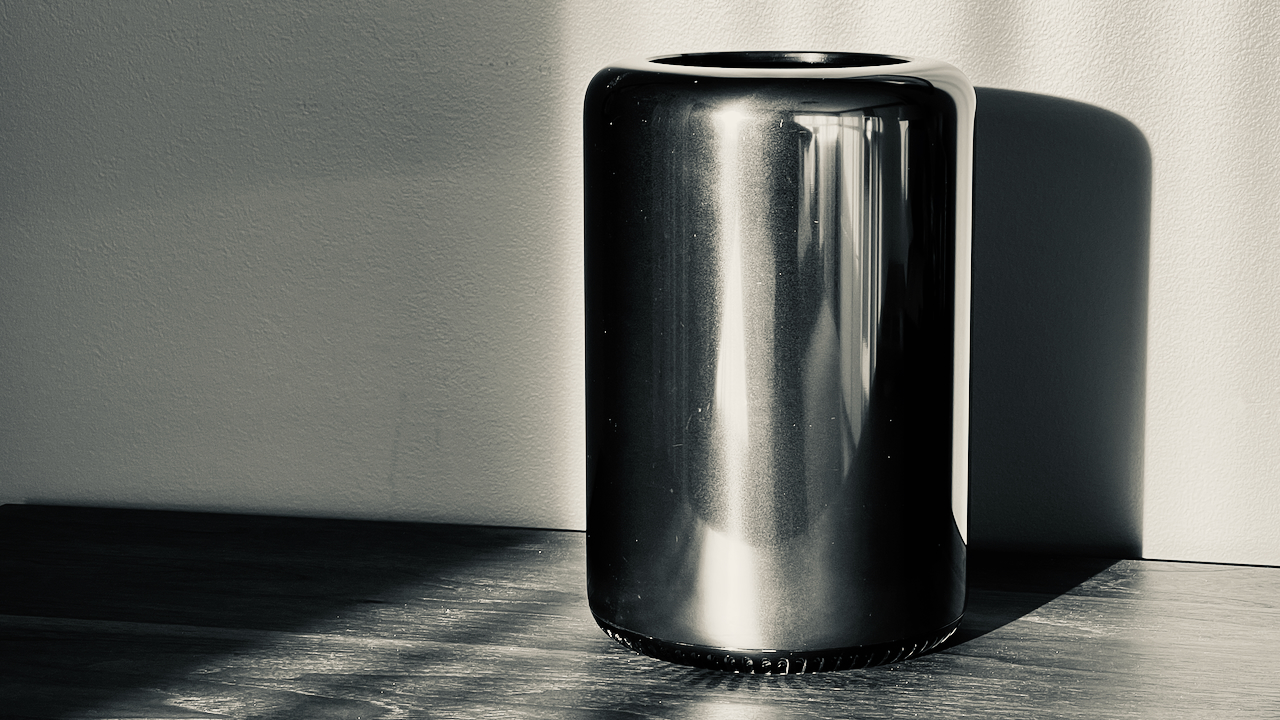
Today was the day when I got rid of this little baby. It was a great looking computer. I gave it to…
I wonder if a good way to learn about Final Cut Pro is to start with the iPad version. I’ve started…
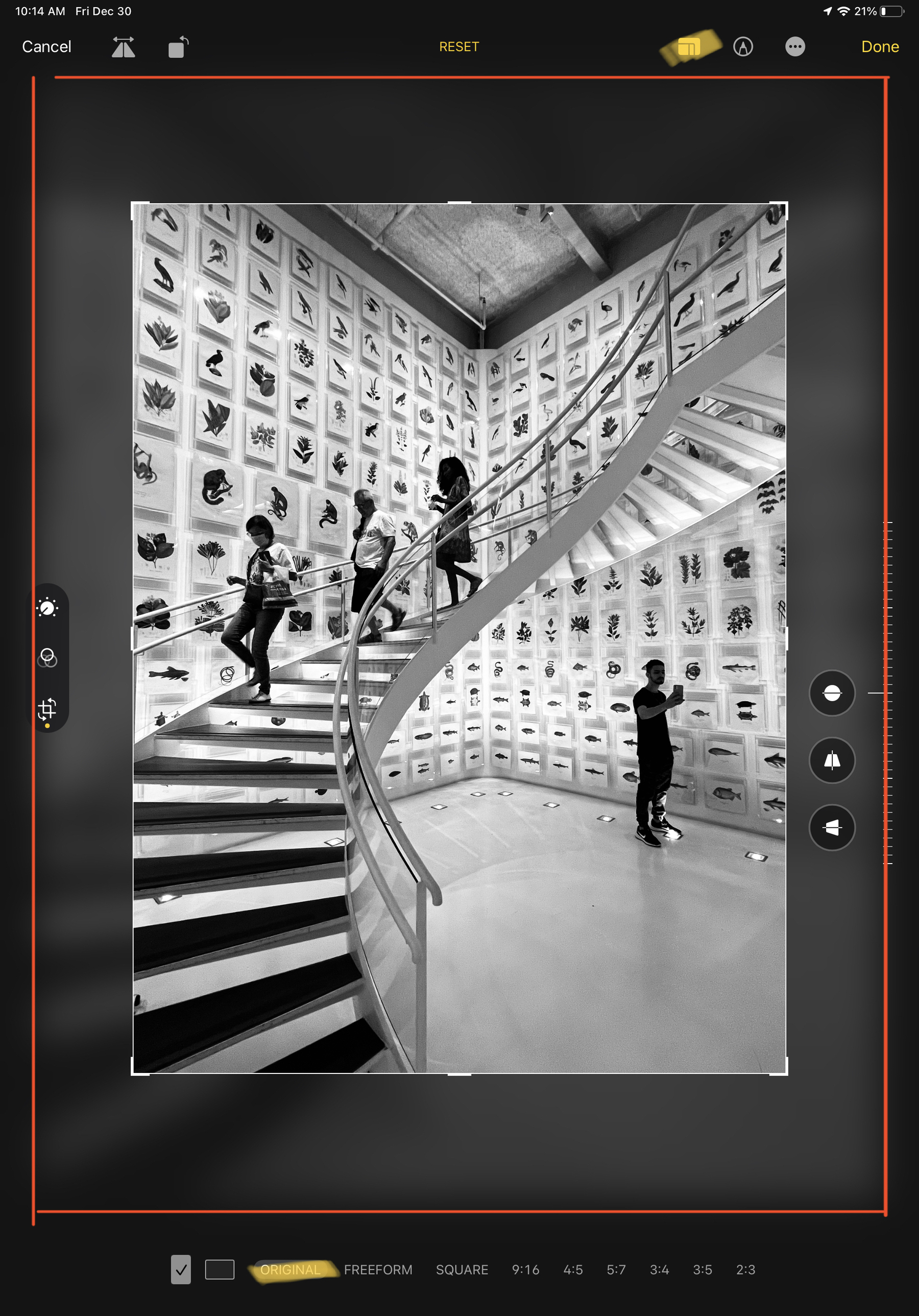
I generally prefer high-contrast images when doing black & white photography. What do you think?
I’ve been baited into writing about touch screen Macs once more
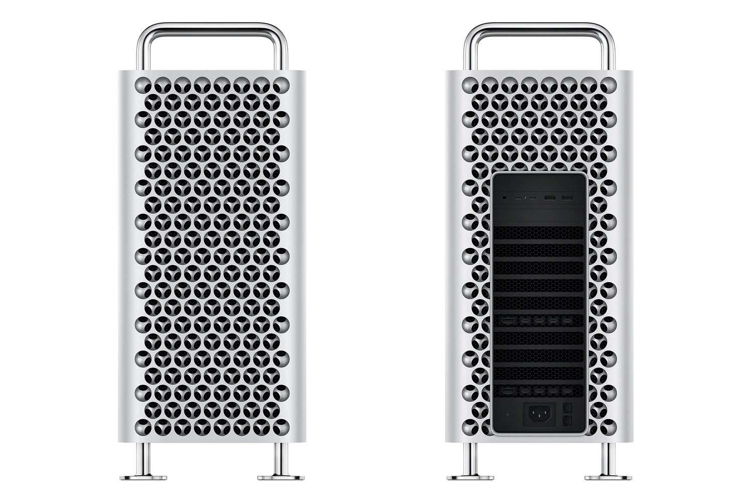
I don’t think these Macs would look…
When you think about it, not being able to mount an iPad as a USB drive on the Mac to do some files…
I find it hard to save time for blogging while traveling. There is always so much to do that I kind…
Three years later and it’s funny to remember where I came from and why I’ve migrated to…
For some reason, tonight, I miss Medium. I used to love writing for it and reading from it. I still…
It’s funny how my subscribers count can vary after I share a new video on my YouTube channel.…
I’m currently recording the next edition of the “What’s Up with Micro.blog”…
If Ukraine has been outgunned 5 to 1 or 10 to 1 is some parts of the front for weeks, why is Russia…
Taking photos of decorative materials with the iPhone is really tricky. The automatic white balance…
For the first time since its release1, I’m using iCloud Shared Photo Library with my wife for…
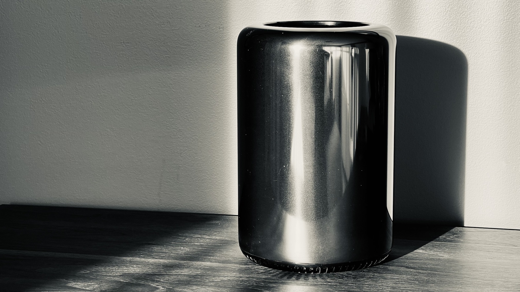
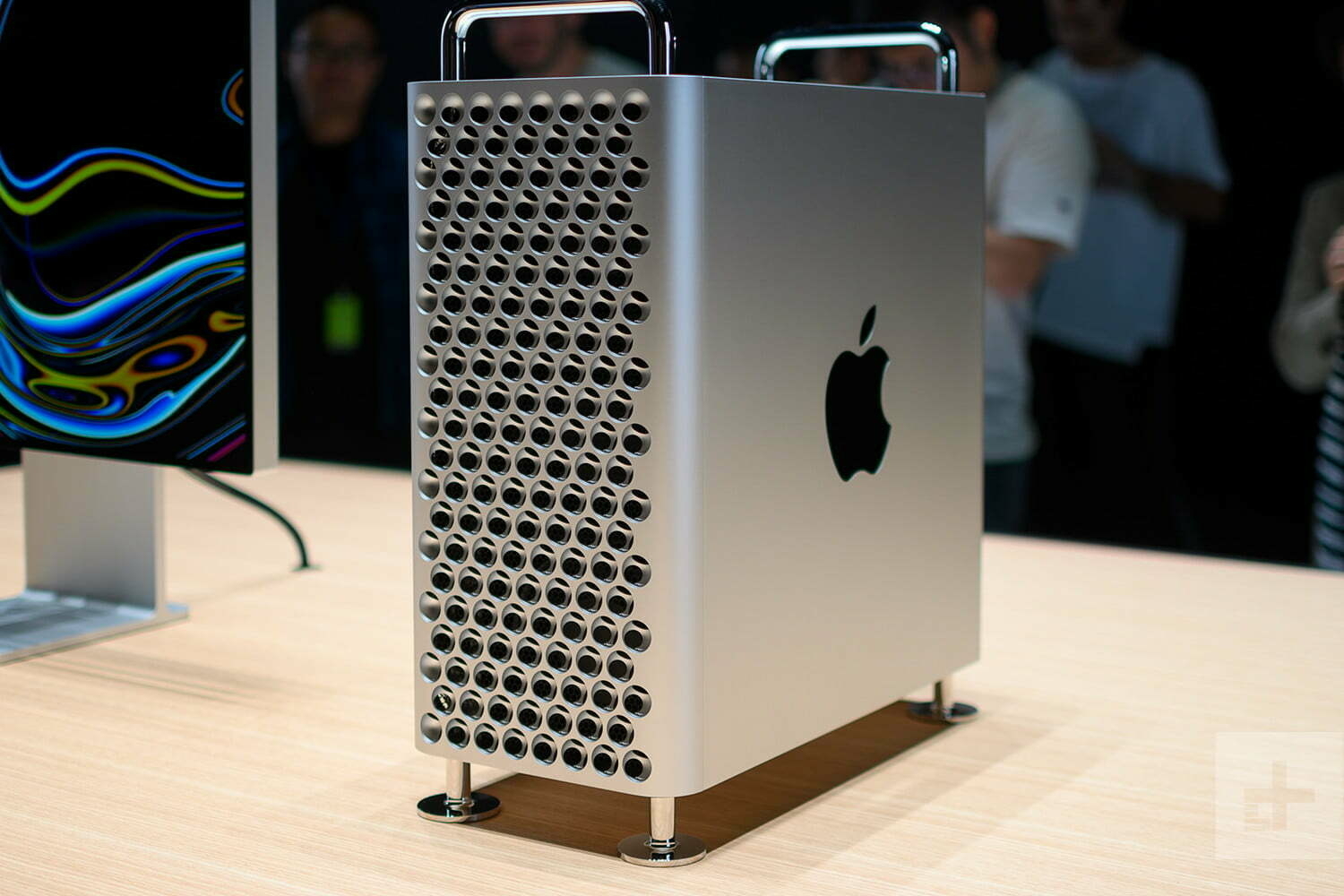
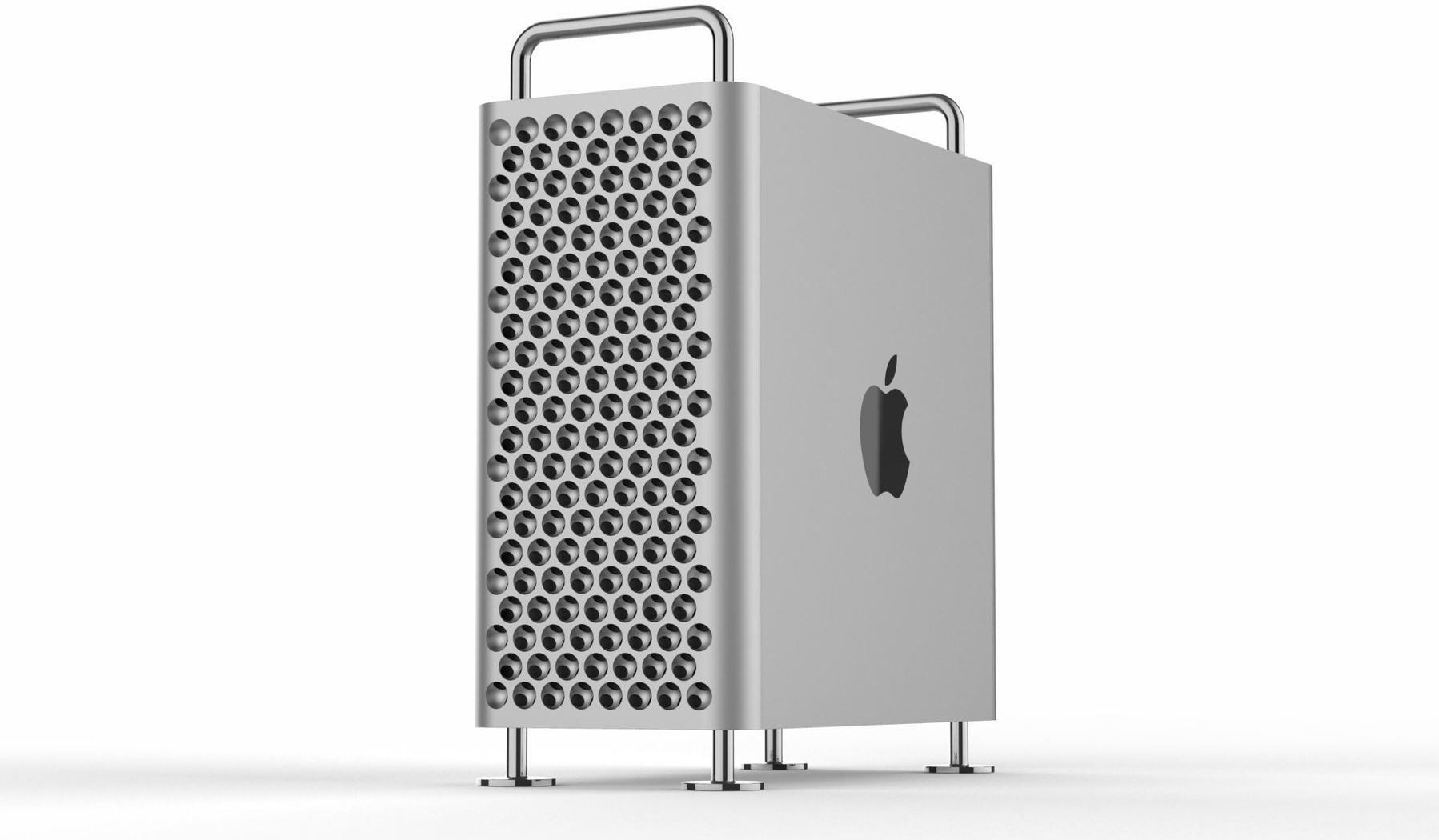
Sold my little Mac Pro trash can for $600 CAN1. Not bad for a 1TB SDD, 128GB of RAM and the 12-core…
Testing Micro.blog macOS app version 3.2. I should use it more often when I’m on a Mac, which…
Using Arc Search on iPhone to get a summary of an issue affecting a specific tech setup (hardware +…
For your information: Nikon Zf RAW files aren’t yet supported with macOS and Photomator1. You…
I just finished a quick Facebook session to see what’s new for my Mac Pro that I put for sale…
I really wish there was a way to save a thread from my Micro.blog timeline because right now, there…
Reading product reviews through Kagi’s summarize page feature is rather cool and a great time…
It’s Sunday, It’s time for the weekly creative summary, edition 2024-10! Enjoy! Please,…
Still not clear if it will only rain or if we will get heavy and abundant snow. Weather forecast is…
I wanted to push my iPad Pro article today, to beat Apple, in case they decided to release new iPad…
Photo-editing on the iPad using Photomator is such a joy. I can’t wait to go with the upcoming iPad…
🔗 Source: Apple to Announce New Products This Week - MacRumors
Apple plans to announce new products…
I’m still looking into new use cases for using Micro.blog’s new blog limits1. Porting a…
🔗 On digital relationships – Manu
Digital relationships are powerful but don’t take my word for it.…
🔗 Blogging Struggles | Darren’s Notes
I love the design process but never reach a point where…
🔗 My co-worker’s first impressions of the Vision Pro
Ultimately, he said he’s not going…
One paid subscription cancellation1 and two new free subscriptions2. That is the life of a hobbyist…
I’ve been granted a Microsoft Copilot license at work for testing purposes. I have a love and…
I discovered the “Copy URL as Quote” in Arc Browser, this morning. I love this feature.…
A satisfying exercise for me is to open Glass on my iPad and start to glance at photos and members.…
Let me guess again the upcoming “big” new feature for Micro.blog: a fully-featured Read…
Is the Apple Vision Pro good for photo editing? I would love to see Photomator for the Vision Pro1.…
Message to me📌: don’t subscribe to Scribbles. don’t subscribe to Scribbles. don’t…
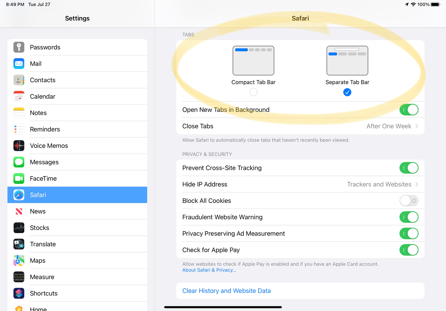
Just spent 15 minutes trying to figure out Safari Profiles, tab groups, etc. Am I alone in thinking…
I’m excited for Tapestry, so I’m supporting it. Mastodon, RSS feeds, and Bluesky can be…
Apple’s insistence on retaining control of the iPhone and the way it’s used is not about protecting…
Following my request to close my Adobe Stock account, I finally got my money for selling some of my…
Microsoft Office apps for the Apple Vision Pro? Really? Color me surprised. I’m not convinced…
Here’s a possible Apple Vision Pro use case: virtually walking in the street using Apple Maps…
I’m spending my Friday afternoon writing documents for a big project at work. Even at work, I…
Steve Jobs was incredible in bringing partners on board when launching a new platform. I wonder how…
One more yearly subscription to my website1 and one more subscriber to The Craft Bible2. It’s…
Scrolling through my LinkedIn timeline today. It always gives me weird feelings when I see people I…
I can’t wait to share my first weekly creative summary of the year tomorrow. So much stuff in…
It’s the type of work day where I get to meet hyper-brilliant and knowledgeable people, which…
Introspection time: I chose to be in IT because I thought it was much easier to deal with computers…
My complete toolset page was updated to start the new year. Make sure to pay a visit if you want to…
Dan Moyen, writing for MacWorld
The Vision Pro is a brand new platform with a brand new interaction…
I still struggle with the idea of writing posts directly on Mastodon or Bluesky. Replying to others…
It’s the time of the year where the page is white, everything feels possible and in its place. It’s…
I wish you all a happy new year! May 2024 be a better one than what 2023 was. It shouldn’t be…
If I post a photo on Pixelfed that is marked as an NSFW image 1, the image is still cross-posted on…
LLM on my iPhone? That sounds like a super interesting development. Suddenly, an iPhone with 1TB of…
It’s Sunday; it’s time for the next weekly creative summary! Edition 2023-50 will be my…
I went to the Micro.blog’s Discovery section and set the category to Podcasts. I didn’t…
Just two hours in the work day and I have already used ChatGPT three times to better understand two…
And here we go for the week: the weekly creative summary for 2023/49 is out! The newsletter version…
I created the Craft Feature Request Board on Canny.io, because the Craft team doesn’t want to…
If you don’t know me, but especially the places where I’m sharing and for what purpose,…
I should visit the Micro.blog Discover section more often… there are some gems over there from time…
Getting vaccinated today for flu and Covid. Hopefully not too many symptoms in the nextt 24 hours. 😑
The more testing and experimenting I do with ChatGPT, the more I feel we are at an inflection point…
Musing of the day: Which is worse from an environmental point of view, burning the planet with NFTs…
I started subscribing to ChatGPT today so that I could experiment with Dall-E and GPT-4. I’ll…
My theory about what happened at Humane…
Founders pitch investors on a hand laser thing when it’s a…
👉🏻 One quick question for my followers or readers: for those using AI (often or not), did you think…
👉🏻 I’m thinking about parking my “numericcitizen” name on Threads. Just in case1.…
Touch down. I’m back from Las Vegas! What a ride. What a city! I’m not loving everything about this…
Today is a reminder that the internet is probably the worst place to have a debate. You would think…
Apple’s use of Swift and SwiftUI in iOS 17 by Timac:
Objective-C is still at the core of iOS and is…
My 2018 iPad Pro is starting to show its age. iPadOS 17 might be the last enjoyable version on this…
If Apple is indeed close to releasing the third-generation Apple Pencil with a magnetic pencil tip,…
I’m getting an issue with Short.io where domain name cloaking is no longer available. It used to be…
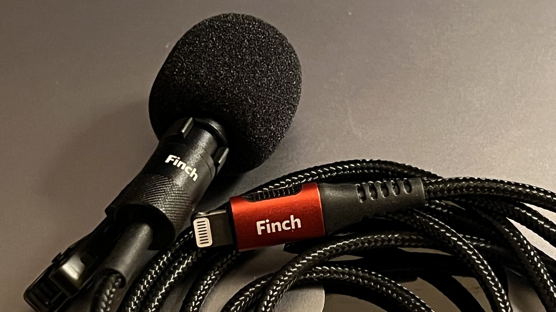
Discovery of the day: I can use Audio Hijack with ScreenFlow to record the Mac audio from the Finch…
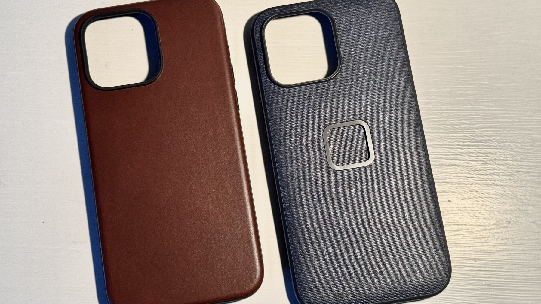
I just received my Nomad leather case for my iPhone 15 Pro Max. Best case I ever used on an iPhone.…
Sometimes, a website doesn’t work well (or at all), and the problem is that my NextDNS client…
Another creative week is mostly completed, it’s time for a new edition of the Weekly Creative…
I made discoveries today while doing some much-needed cleanup in my home office. Here, this is what…
It’s Sunday, and it’s time for the new edition of my weekly creative summary, available…
Testing a post from Micro.blog as a web app 1 running on macOS Sonoma.
Is this how we should call a…
I finally found THE use case for the Action Button: running a shortcut1 to 1) take a screen capture…
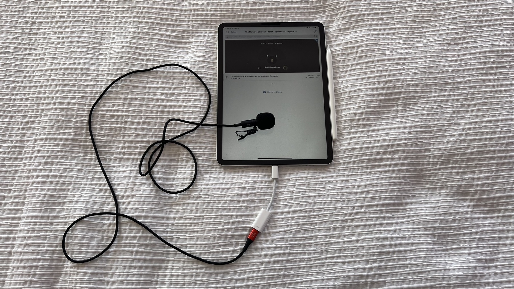
Now it’s confirmed: my Finch Lavalier microphone1 doesn’t work with Apple’s USB-C…
My iPhone 15 Pro Max is still in “Preparing to ship” state. Delivery is scheduled for tomorrow. I’m…
How I Automatically Include a Blog Description in My RSS Feed
I’ve been asked a couple of times how…
How do you get out of Adobe Lightroom? What if I want to focus on Photomator and Pixelmator instead?
Today is a caseless day with my iPhone 13 Pro. Best way to experience the device design and flaws1.…
Feeling sad this morning 😥 about the consequences of the earthquake in Morroco. I’m trying to…
I wish there was a way to subscribe to a RSS feed within Day One. This way, I could delete my IFTTT…
I wanted to increase my podcasts listening time. I decided to put Overcast on the first home screen…
I got an Ember coffee mug1 for my birthday, yesterday. The first thing the Ember app detected after…
Glass is sending out emails to let us know that we can share and spread the word to our friends and…
I played with Apple’s Maps Places feature, as shown in the following video. It’s nice, but it’s not…
I’m a big fan of AnyBox (YouTube video) and in the latest update (v1.27), information density…
As a subscriber to Pocket Cast, I would love to be able to use the iPad version on my Apple Silicon…
Powerful hurricane Hilary headed toward the US southwest. Always impressive to see this from space.…
Every single day, I read a new post by Pixelfed about upcoming features, additions or redesign. The…
Two used, two more to go. I accidentally dropped my Apple Pencil on the floor while getting my iPad…
Just finished glancing at my Micro.blog posts for the month of July, thanks to my newsletter. Man I…
Killing some time while waiting for diner time by processing and posting my photos on Pixelfed. Too…
Woah. Bad weather northern US causes inbound flight postponed. We won’t make it to the next flight.…
Pixelfed is way more interactive and busier than Glass. My feeling is that the federative nature of…
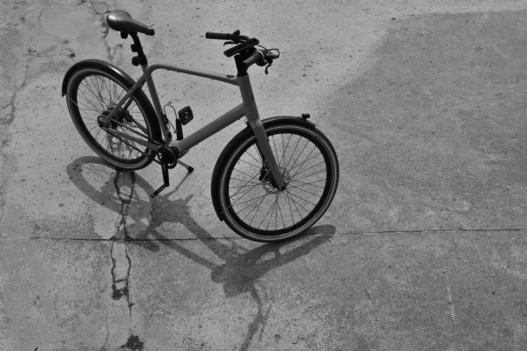
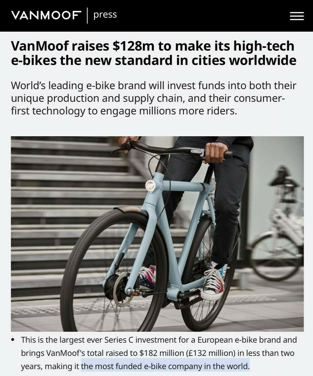
With the future demise of Vanmoof, I decided to look elsewhere for my ebike. I found it. And bought…
No Friday Notes post this week. I have a few ideas but didn’t have time to expand on them and…
A new ad by Apple. I never share this but this one made me smile many times. Very entertaining too.…
Apparently, Russian officials are now banning iPhone because they believe there is an espionage ops…
Wow, we are just in the last moments of a “three-wave” storm with heavy rain, winds and…
What is the motivation for Google to maintain this rather excellent photo processing app (Snapseed).
Apple is now on Threads? Really? It didn’t take long. There is something profoundly ironic to…
Thought of the day: blog readers might not like negativity-tinted post or being told the truth they…
Wondering something this morning: if Threads was to offer “free” APIs, would developers…
Does Apple know that, with the Apple Vision Pro, they have a unique opportunity to reinvent weather…
We are staying at La Maison Arabe, a well-known Riad in Marrakesh. This hotel is full of corridors,…
This time of the year where I fill my iPhone with podcast episodes. Using PocketCast. Getting ready…
Still working from the coffee shop. 😅 While reading a technical document, I wish I could take notes…
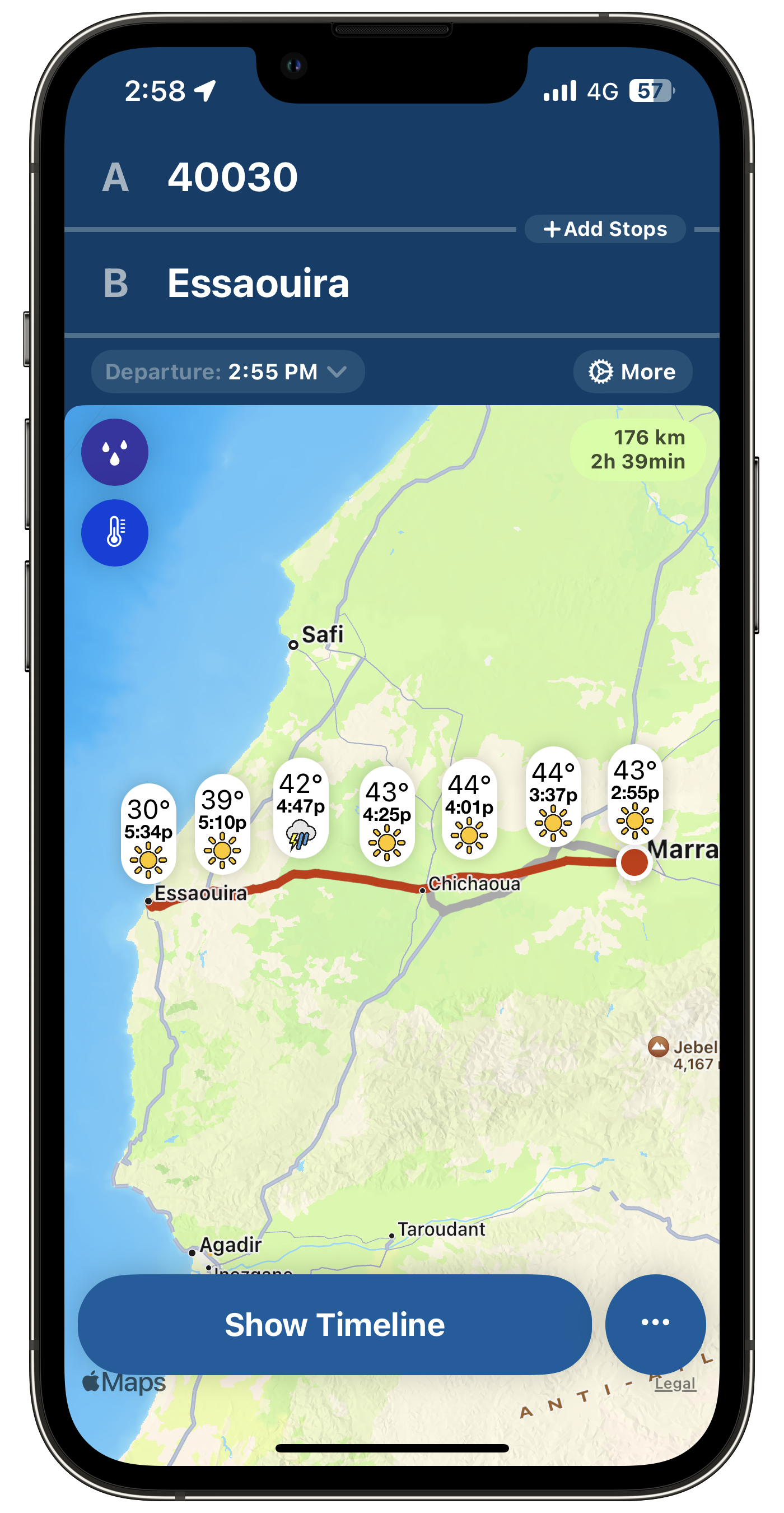
There is one thing that I’m really looking forward to on our trip to Morocco🇲🇦. For the first…
Use Ghost Bookmarker to easily add links and notes to a post, straight from your browser. Links are…
I forgot so many things to talk about in my WWDC 2023 expectations YouTube video… 🤦🏻♂️ like…
How many tech sites like MacRumors will switch to Mastondon to live-toot their comments during WWDC…
If they are serious about supporting the federated web, @ivory@tapbots.social could add support for…
I bought a Hookmark license recently, thinking it would play a big role in my creative workflow. It…
The next little challenge related to FeedPress will be deciding if I want to share individual feeds…
Played with FeedPress this evening. The one thing that I like about it is the ability to merge many…
Thought: Read-later services or applications are a consequence of too much content availability and…
For the first time in a long time, I’m starting to think I’m finally catching up to 90%…
Fun and interesting fact: I have four times more followers on Bluesky than on Mastodon, even though…
Wait what? Even millennials don’t like algorithms I don’t fight the future — we need all the help —…
So that sales pitch of “it’s just a coffee per month” really doesn’t hold water when you think that…
I am currently learning to use Hookmark. This thing is so, how I could say that, powerful? It’s the…
I had such a busy creative weekend, to the point where I wonder if I did too much. I mean, I didn’t…
While spending some time in the Anybox bookmarks manager this morning, I was thinking of restarting…
For each video about Micro.blog that I make and share, I lose subscribers.😔 People don’t like…
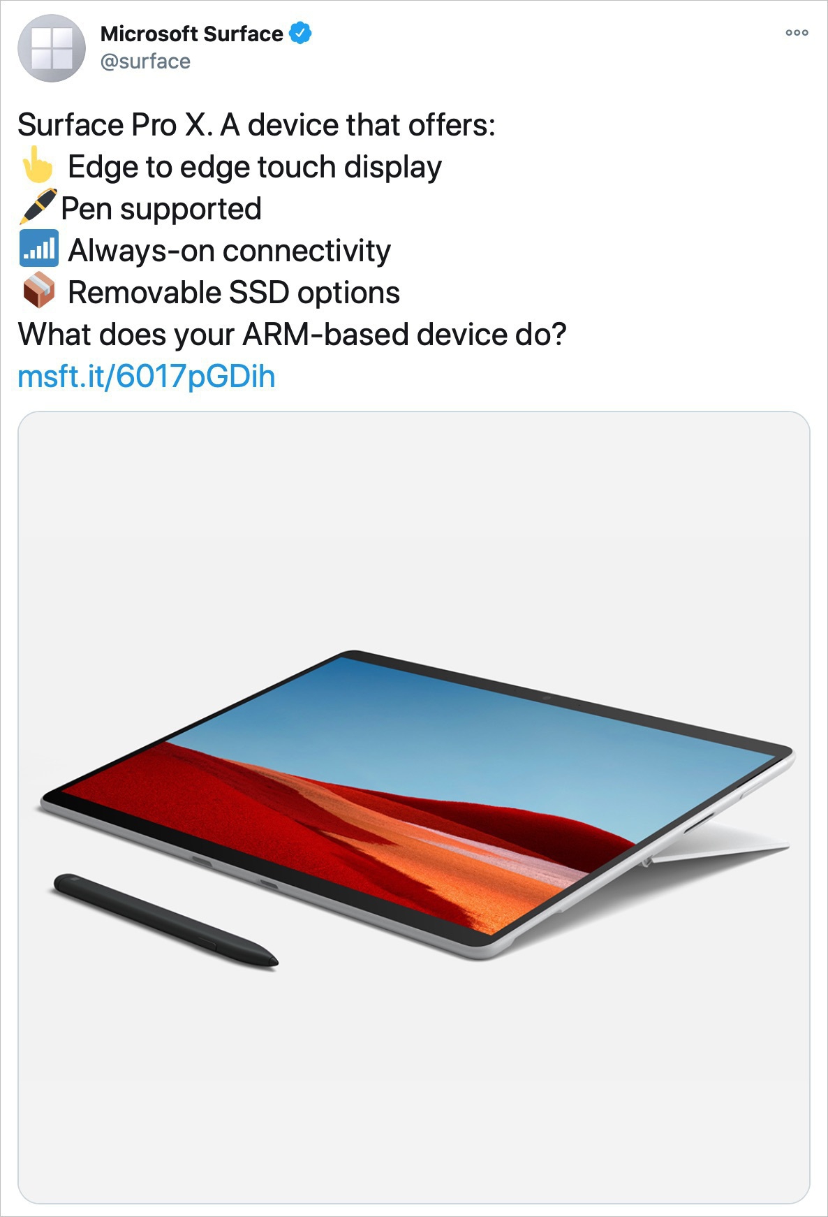
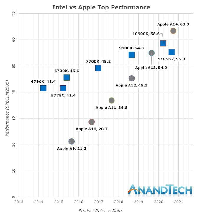
Arm-based notebooks will gain share over Intel and AMD, almost doubling their shipment share to 25%…
iPhone 15 Pro ‘Action’ Button to Replace Role of Volume Buttons When Performing a Power…
If the Beta switch is OFF, why do I get offered the latest beta of iOS 16.5? 🤔 Bug? Nope, because I…
The maker behind ToolBox Pro has passed away, as reported here and there. It’s very sad. I recently…
Testing the latest Micro.blog beta with picture upload. This is a screenshot of the current list of…
Earlier in March, Alisabeth Hayden, from Washington state in the US, was separated from her AirPods…
Yesterday, I got my first ever paid subscriber to Ghost website, even though it is basically a free…
Spent most of the day working on something that I hope will have some meaningful impact. Expect the…
Any Capacities users here? Is it me, or it looks more and more like another Notion? This small team…
Another big update to my complete toolset website: a new dedicated section for my current projects.…
@numericcitizen@me.dm is my new Mastodon address on Medium’s newly launched Mastodon instance. It’s…
“Social networks can be a great way to connect with friends and family, but they can also be toxic.…
🎦 Smile, guys; you’re on camera! 😃 I’m getting myself ready to record th first video in…
Will be spending the rest if the weekend trying to advance my (many) projects. One being to produce…
Tonight, following one of my year’s goals of focusing on and reducing my digital footprint, I…
👉🏻 Day One, now available on the web. Woah! This is cool.
I’m a big fan of Day One. I use it 99% of…
And here we go again with the new Mac Pro “problem”. Jason Snell writing about the challenges Apple…
Dear Apple, I’m done. It took me a long time, but I get it. Today, I turned off Stage Manager on my…
A mockup of a possible iPhone 15 Ultra No. Great mockup design but no, I don’t want to get an Apple…
Benjamin Mayo commenting on laptops with touch screen:
All the time, I see people swipe up and down…
DHH’s concluding words about testing an Android phone:
I’m no fan of Google in general.…
It is so slow to recharge an Apple Magic Mouse. Considering how we need to connect this thing for a…
Well, expect a change of mood for the next couple of days. It’s seems that my mother, 89, is at the…
I’m super happy to see Ivory going out to light and all. I was on the beta, downloaded the official…
OK, I’m mind blown. I went to see the latest Avatar movie today. I was blown away. It’s…
I’ve been watching a few beginner videos about Final Cut Pro just because I’m searching for ways to…
So, I started the cleanup of numericcitizen.me. Each day, on WordPress.com, I look at my past posts…
Here is something that I always find funny. On any photo-sharing platform, let’s say you like…
I was searching for something in one of my past posts here on Micro.blog, using the built-in search…
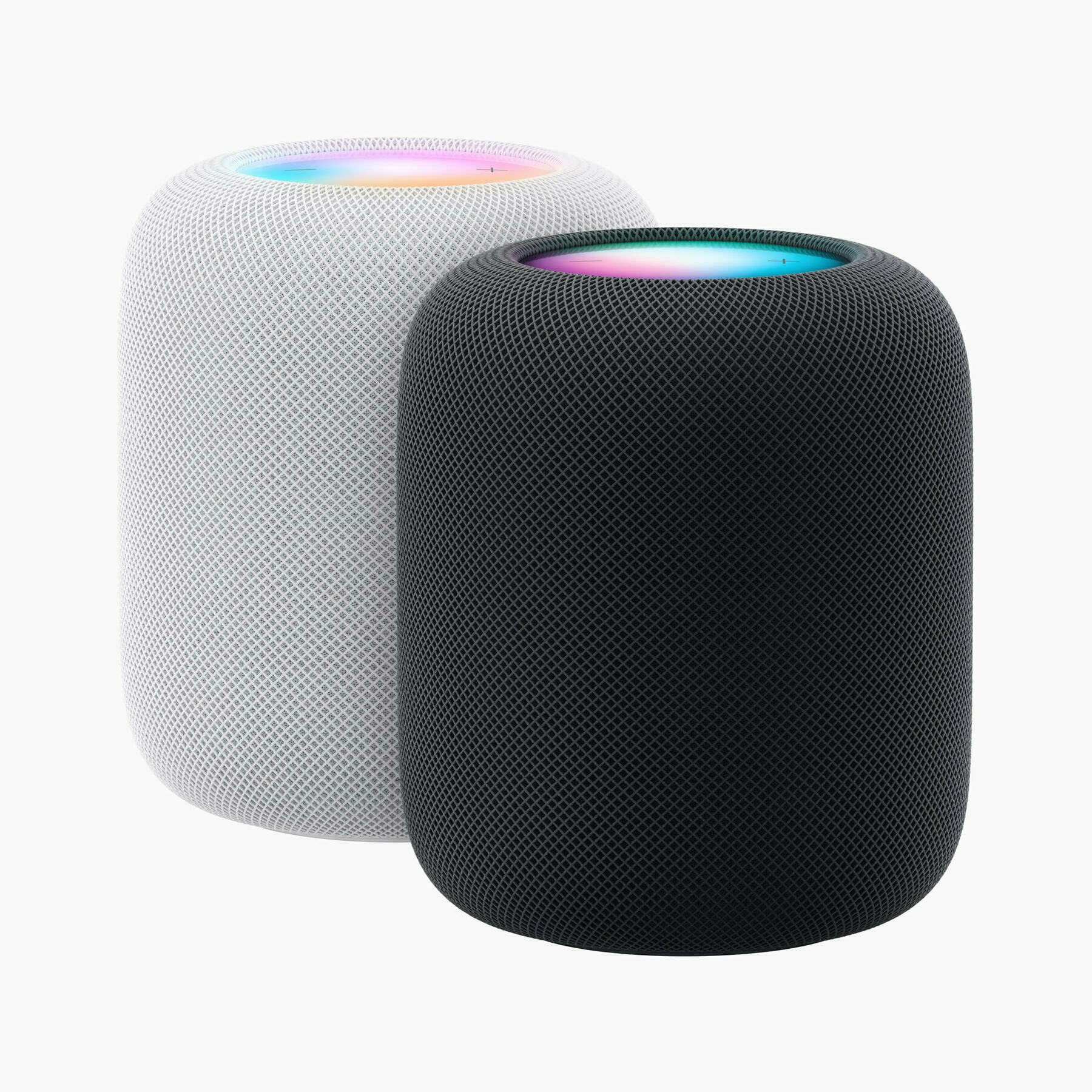
The new HomePod, as well as the mini, can measure room temperature and humidity. I don’t want…
Krugman said that Musk’s behaviour had shown that he’s nothing like Apple cofounder and…
Arstechnica’s Jackqui Cheng:
“One way to look at the MacBook Air is as the largest and most capable…
Why is it so slow to read content in Apple News in general? Opening an article in News takes 2 to 3…
Today, you can choose not to drive a Tesla if you don’t want Elon Musk, Inc. knowing everywhere you…
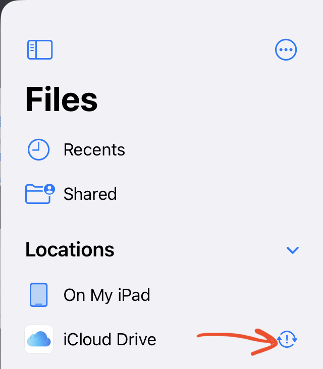
Can someone tell me what this iCloud Drive status means? I don’t appear to have any synchronization…
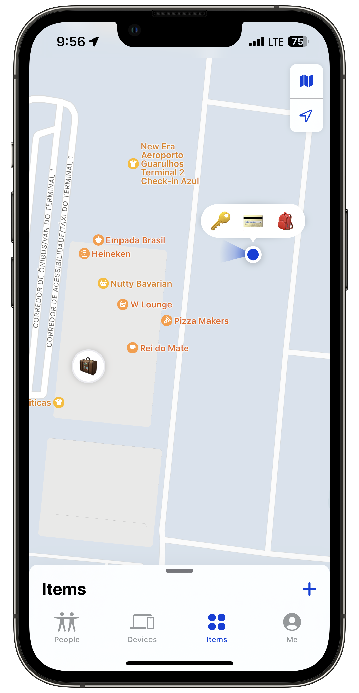
AirTags can be quite useful and… stressful to track. Here we are in the plane quite ready to depart…
Digital cleanup night. Medium Partner Program: Cancelled. Buffer: Cancelled. WP for Buffer Plug-in:…
Isn’t that weird that we need to jump to an external website to enjoy the 2022 Replay? Why not have…
Notes of interest from Apple’s Q2 2022 earnings report and conference call | AppleInsider
The…
Now more than ever, it seems it is the perfect time for @manton to welcome people on Micro.blog who…
Please, don’t think that because I’m now subscribing to write.as that I’m leaving…
I’ve been experimenting with something in recent weeks. Each Sunday, I open Craft and switch to the…
The waiting combo. It’s the story of a lonely couple waiting for something to happen. Tomorrow they…
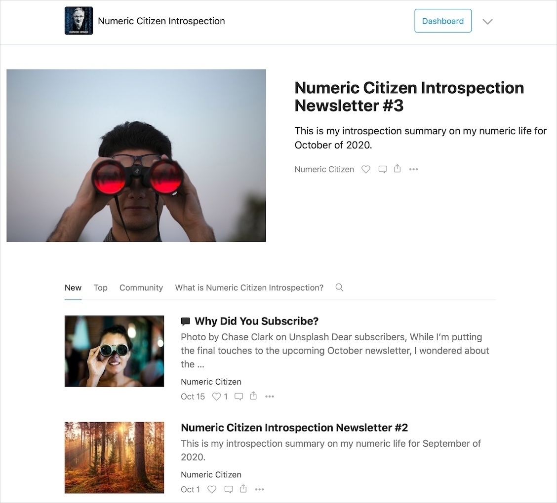
I spend between 4 to 5 hours each month to put together my Numeric Citizen Introspection newsletter.
I’m mostly done with my next issue of The Numeric Citizen Introspection newsletter. Get ready…
It’s always saddening me a bit when, on the day of a new issue of my newsletter is being published,…
I’ve been experimenting with time tracking. I’ve been doing it as an experiment at first, but…
The more we wait for beta 4, the more chance we will get a step back for Safari redesign. That’s my…
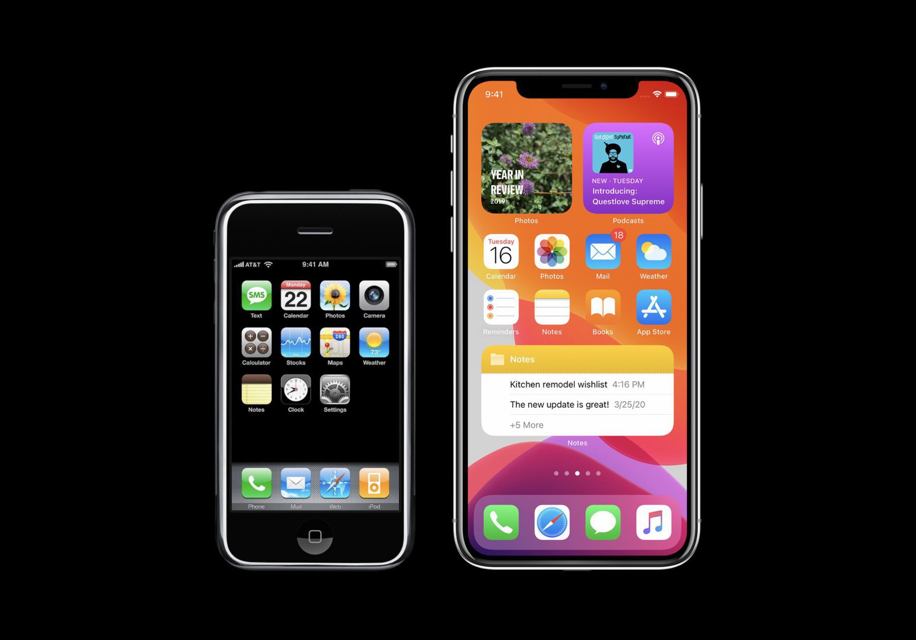
Reading this story of the original iPhone demo Steve Jobs did, 14 years ago, using a barely working…
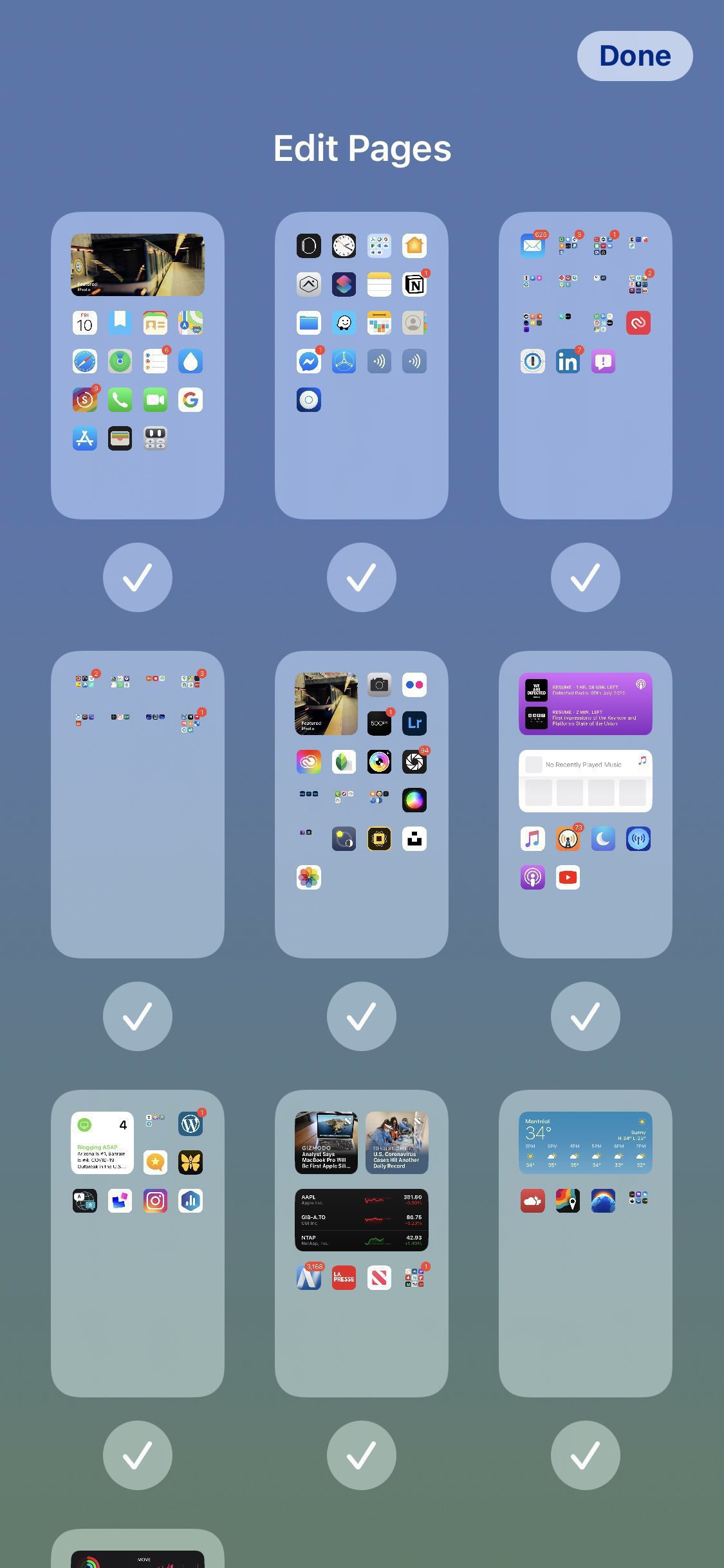
With iPadOS 15, the more home pages you create on the iPad, the more you’ll wish Apple made a “home…
Another exciting update coming this fall is Apple’s Maps data. This site carefully documents what’s…
macOS Monterey looks more and more exciting each day. Can’t wait for this update from the makers of…
Better reading experience of Twitter Threads, via Twitter Blue, will encourage people to write more…
It was a reminder that technology can play unexpected roles in our lives. Source: Seeing Death From…
That could prove to be quite useful! Link posts are always a pain to prepare. Thanks to @cdevroe 🙏🏻…
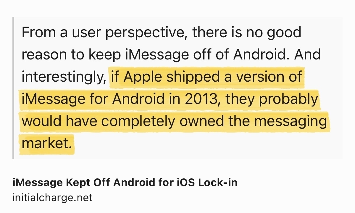
Well, if that was the case, this would add fuel to any anti-trust initiative. No?
iMessage Kept Off…
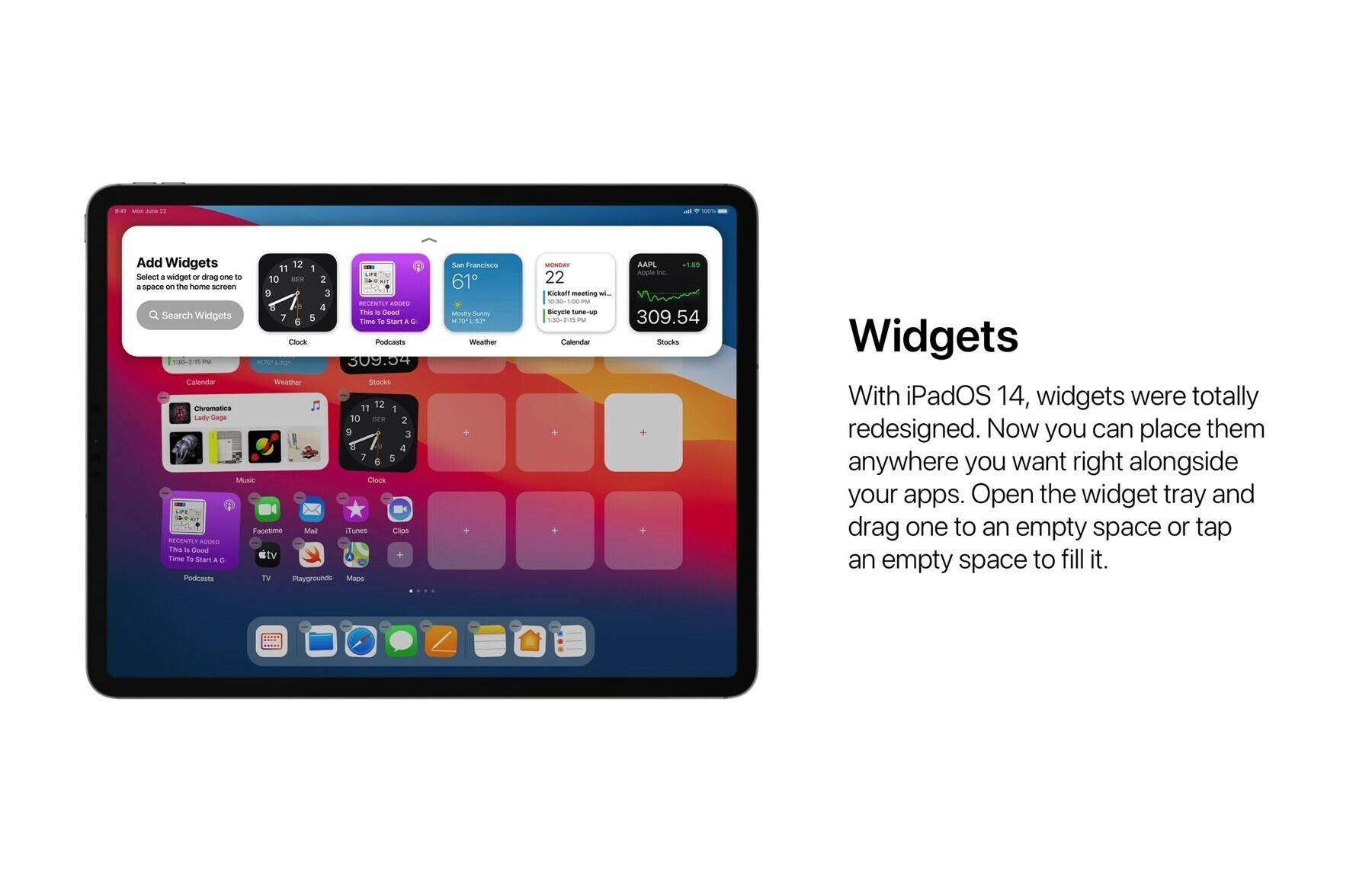
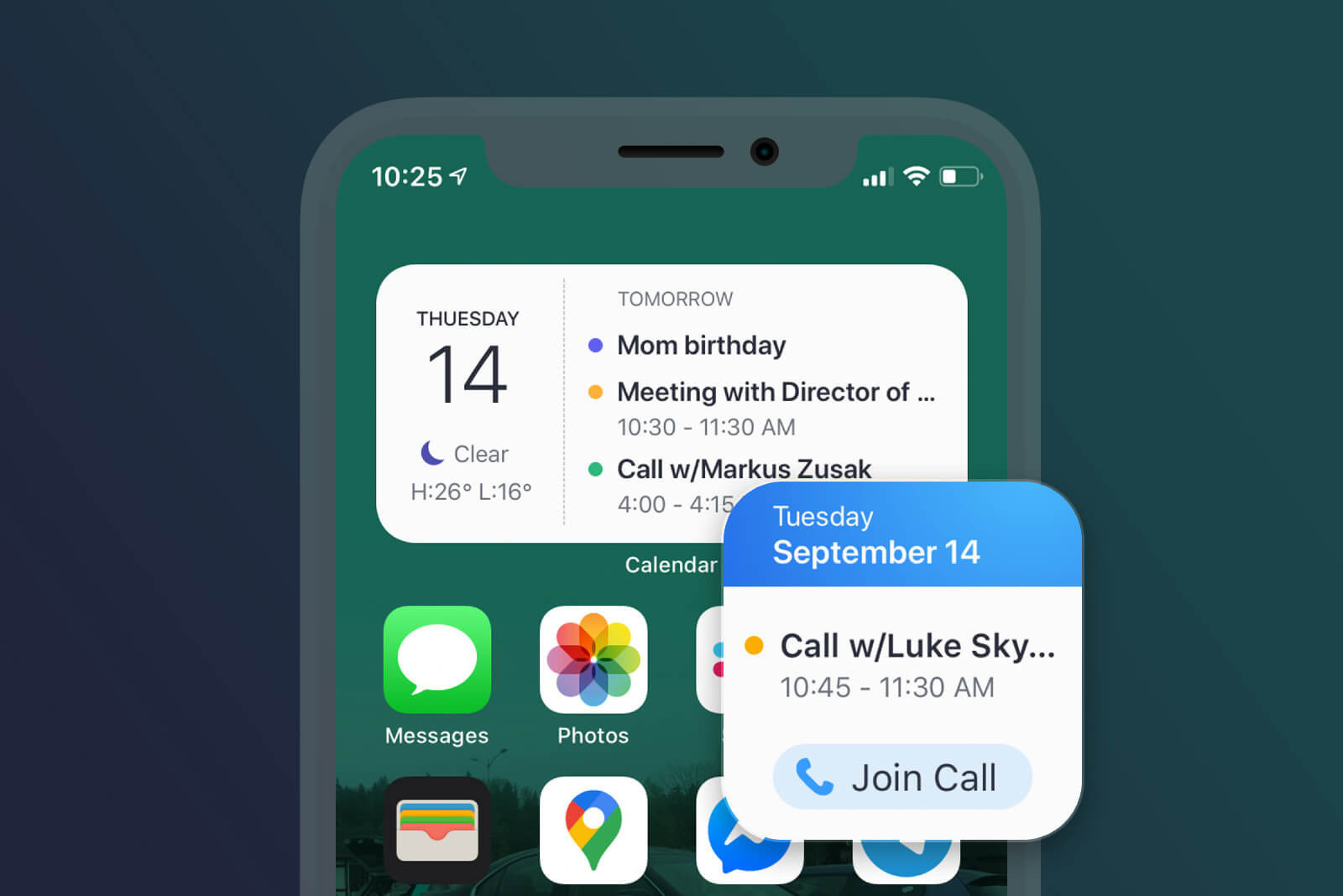
Here is a free tip to those developers thinking of adding widget support in their apps: widgets are…
And we’re ready for launch, tomorrow! All systems are ready! Weather is a go too! Don’t…
I’m close to finishing up my first newsletter on Substack. I’m quite happy of the end results…
A few words about my online presence and how it is related to finding my upcoming newsletter niche.…
An image is worth a thousand words. I find it surprising that UI simplification came to this simple…
Remember Apple inviting professionals to learn about their workflow so they could use that input to…
Wow. Supposedly photos of cancelled AirPower internals leak online. I didn’t know this device…
I want to be paid or get credits on my account to answer questions of potential buyers about things…
If Epic doesn’t play the same game with Sony and all the other online stores, they are making fools…
Here is an app idea: how about an app allowing bloggers to easily create « link posts » which would…
Dear Apple, you are (again) painting yourself in another form of thermal cornor. Back off while you…
To me, it is becoming clear every day that, it’s the virus who will bring down this clown in chief,…
If anyone had doubts on why Apple is transitioning to its own silicon for the Mac: Intel is (again)…
More than 1500 words to talk about going all in with Apple’s latest betas on my main devices.…
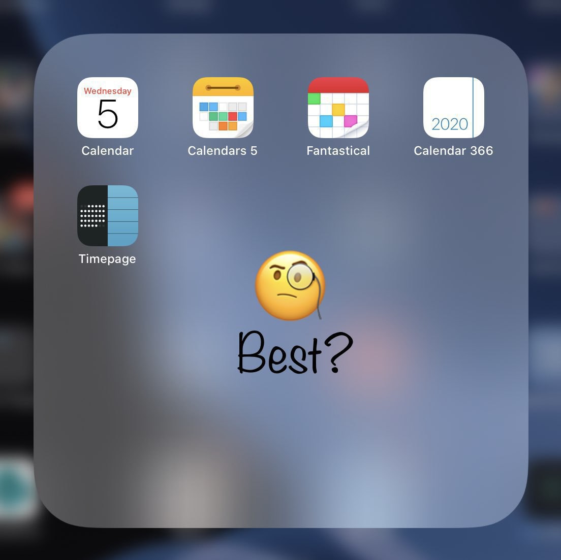
With iPadOS 14, Apple mades a lot of improvements to the Calendar app which makes me reconsider the…
When I talk about this virus to my kids, my recurring message is the fact that this is not like the…
Woah, that was fast. iOS 14 now entering public beta phase. Apple must feel really confident. So am…
Does this mean that we won’t get the top-of-the-window alerts anymore? That’s kind of sad actually,…
Fascinating move by The NewYork Times leaving Apple News. They want to control their customers, get…
No more Microsoft physical stores. End of an (short, insignificant) era. #microsoft #microsoftstores
If Apple starts the transition from Intel to ARM with lowest volume Mac, I would have expected they…
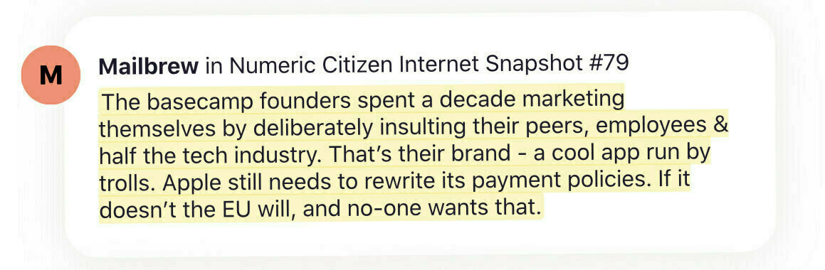
The previous tweeted quote about Basecamp/HEY founders attitude was a clip from a newsletter that I…
“30% is way too high!!!”. Why? On what basis this is too high? What is “not too high”? And on what…
First day with Hey. Love it so far. A bit disorienting at first. Old habits don’t die easily.…
I think hey.com could work wonderfully with Mailbrew… If only I had an Invite for Hey…
If @Mailbrew can fix the newsletters, If people and the company behind Basecamp can fix emails with…
Oh this is so cool… for photography beginners who want to learn how to use Lightroom……
I hope the redesign of the iMac will be ugly as hell so I don’t get tempted to replace my 2017 21.5…
Been playing with this guy for 12 hours now… I’m… ecstatic. Expect a full review soon. @ubnt…
As iPad is getting more and more powerful (in hardware and software), I wonder if I will ever buy a…
On smartphones sales numbers declining because of COVID-19: everyone were hit. Apple much less than…
Is it me of Trump is getting worse and worse by the day… trying to bring the country in fire…
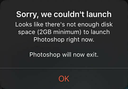
While working within Adobe Photoshop for iPad. 😩😳Lost part of my work session. After restarting the…
My gosh: Instagram is such a massive mess in UX/UI. It is a great story on how numeric entropy took…
When leakers gain at the expense and lost of others…. and presents this as being as proud as…
If rumored iPhone 12 Pro specs are real, this year could mark a change for me: upgrading even after…
In case you didn’t know, I’m on Telegram: t.me/numericci… Get all the latest updates from my…
Went on the AppleInsider this morning. First time I see the updated design. I'm not sure I like the…
I never made it to the WWDC conference. This year, being a virtual-only event, I wonder what a paid…
Just finished consolidating all my blogger workflow updates on a single page. You can find it here:…
Contemplating Ghost as an alternative to what I’m currently using and … this critical vulnerability…
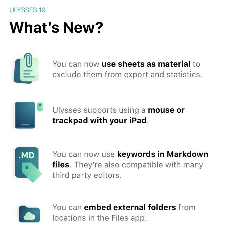
Speaking of iPadOS 13.4 with pointer support… my favourite writing app Ulysses just received…
This is why I chose “transformative accessory” in my blog post reviewing the Magic Keyboard for the…
Interesting “study” posted on BirchTree blog. From my personal experience, since iPadOS 13.4: using…
I’m working on a very special blog post. Not ready yet to share any details except this: I’m slowly…
Five years. Already. I’m still delighted by this product. Currently on Series 4 and looking forward…
Woah, I love this iPad Pro + Magic Keyboard ad. Surprisingly, for a Pro setup, there is nothing Pro…
The satisfying moment where you hit “Publish” after so many hours of hard work.😊
Hoping…
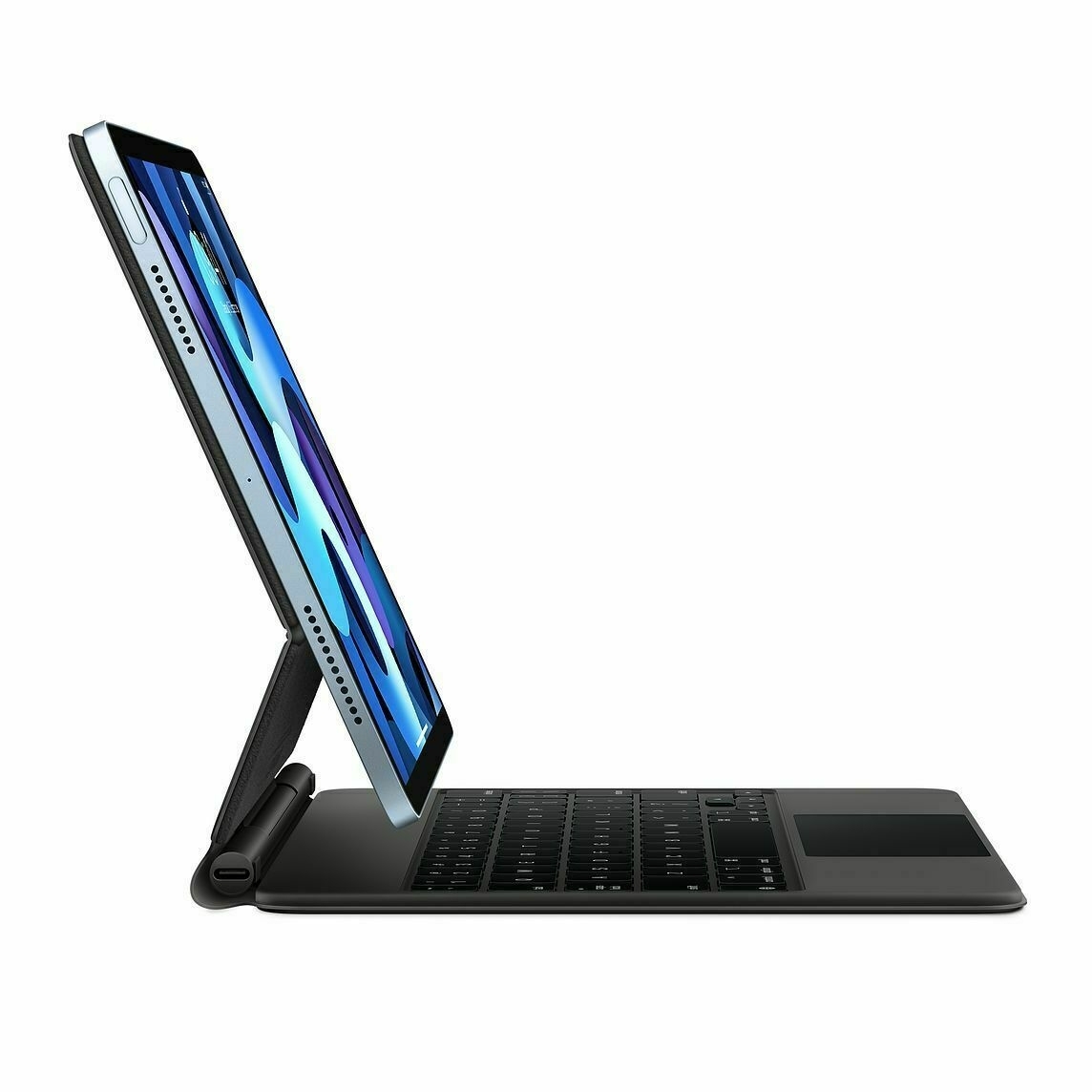
If you pay attention, there are already a few quick iPad Pro Magic Keyboard reviews floating around…
Can’t wait to write the sequel to this blog post. Magic Keyboard for iPad Pro ordered today. Should…
Super interesting article on “forced experiments” because of COVID19. Can’t wait to see…
Economy is crashing because people are buying only essentiel things. 😳
Mmmm. 🤔
Think about it for a…
Exactly my feelings with my own blog. 🤷🏻♂️#blogger #blogging #blog aows.co
Never be satisfied with…
Fun to read past post… knowing a complete re-write is coming up. Very soon. numericcitizen.me
This is not the iPhone 9 launch nor the AirTags announcement. But this is important, relevant, at a…
iPhone SE, again, really? I never liked this name. It reminds me of the Mac SE/30. #apple #iphonese…
Ordered a Magic Trackpad 2 from Apple because… you know… iPadOS 13.4. Currently using…
Working from home, because I do a lot less “socializing” (no surrounding colleagues) is…
Finally got an article submission accepted by Medium after the last try. Three previous submissions…
The amount and variety of ads on TV that feel « out of place » or « no longer relevant » because of…
This is the pure beauty of the iPad. #apple #ipad #ipados
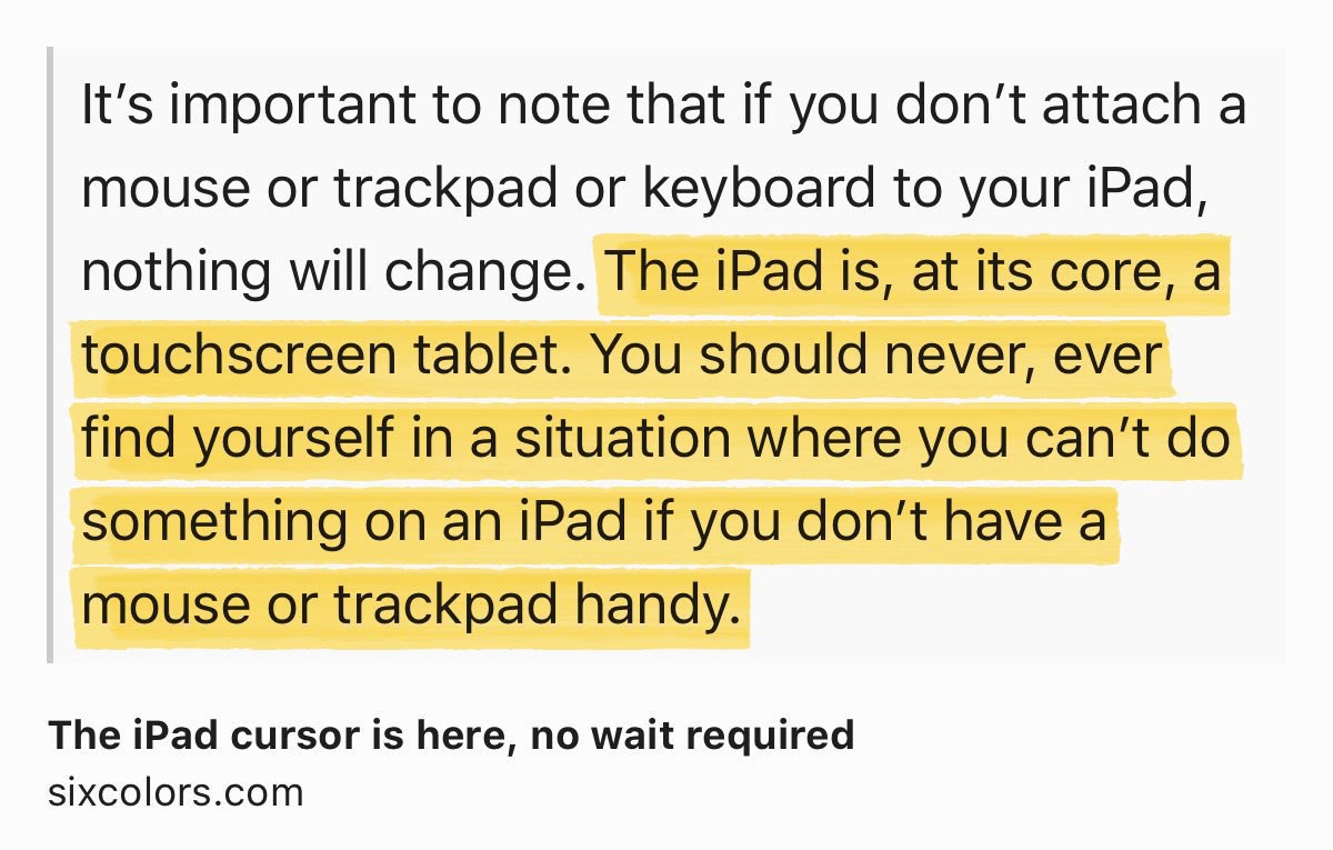
The iPad cursor is here, no wait required…
Mail.app in iPadOS 13.4 doesn’t have the redesigned toolbar like on the iOS version? Really? #apple…
Still to come this week (friday?): updated Apple TV with redesigned Apple TV remote? #apple #appletv
Apple could decide to only release software for the rest of the year as it could be easier to build…
This COVID-19 crisis will change many many things in our life for a long time. Daring Fireball: Use…
That one is not a short read but I feel obligated to share it. Highly recommended read. The outlook…
Here is a very personal one: getting older is accepting things that are profoundly irritating about…
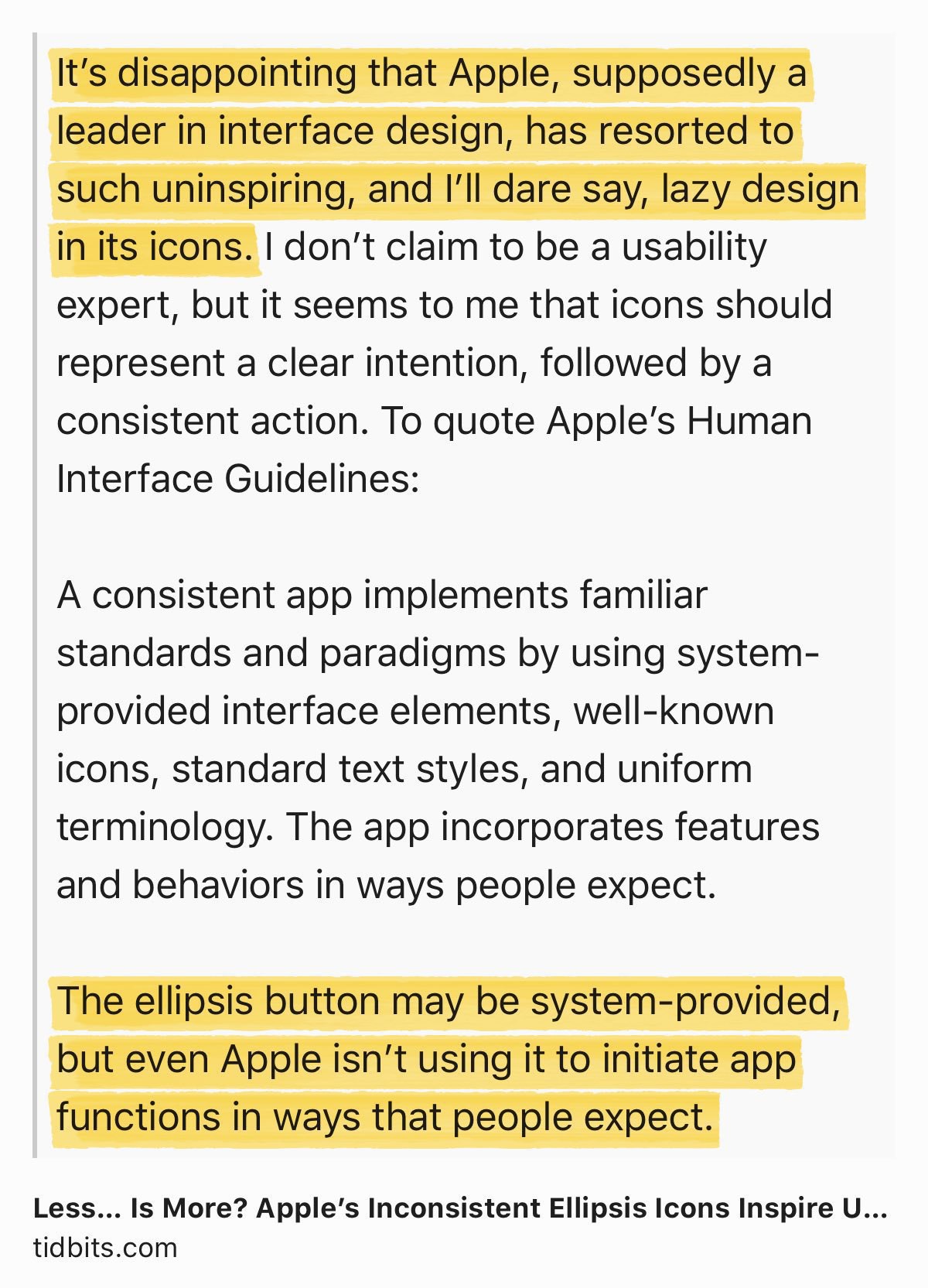
A bit hold but still relevant. On the pervasive use by Apple of the ellipsis in iOS.
Less… Is More?…
I’m not on beta this time for iOS / iPadOS. I can’t remember when was the last time my devices were…
Another tool that I’m learning to fully take advantage for my blogger workflow: Linky. Wow. More to…
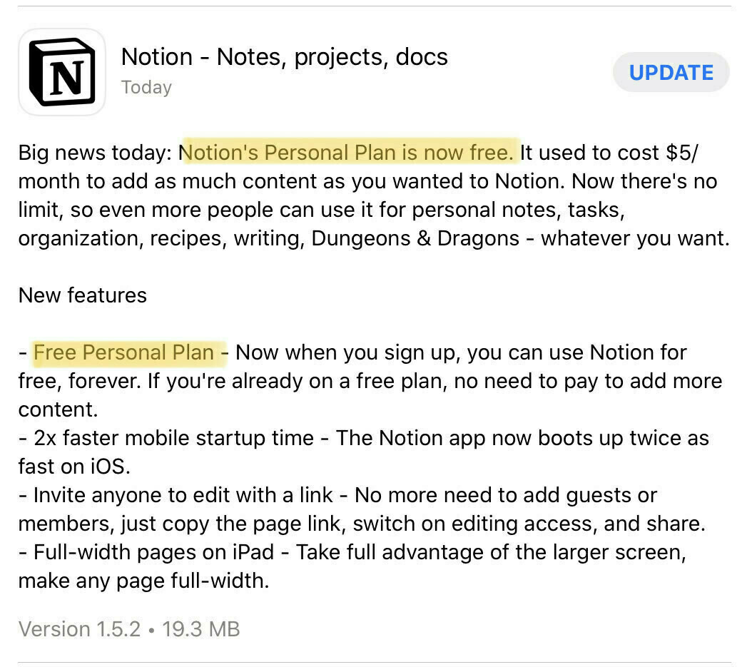
I’ve always been fascinated by the web service called “Notion”. Anyone here using…
Yeah, Steve Jobs would have been 65 today. I’m kind of always asking myself: would Steve like…
Just (re)discovered Camera+ during my urban exploration session today. How come I didn’t spend more…
I don’t know if I’m alone with this behaviour… are you one of these guys who keep unused (or…
Why, oh why? If I was blogging for fame, I would close all this shit right away! So, why am I doing…
This Lightroom CC update seems a bit uninteresting on the surface but I’ll give it a close look, we…
Another day, another 15cm of snow here downtown in Montreal, Canada. We have a very well known song…
I’m not a film critic but I really enjoyed One upon a time in Hollywood. Why? Because it remindedme…
I think I need some help understanding these. #1: posting new content on my micro.blog can be cross…
Here is an insider note, from a blogger. Each and every single morning, I spend about 45-60 minutes…
How is that possible in 2020: an app that looks good, useful, available for both the iPhone and the…
On the lost of visual richness of software. Super interesting thread by Louie Mantia. Apple fell in…
Not knowing how many followers I’ve got on Micro.blog is killing me. May be I’m talking…
One cannot compare the Mac, 20 years ago to the iPad today for building businesses around software.…
Storm days are always a great moment for me for writing, photo processing, reading, etc. Love these.
Let me tell you something: the worst part of using both Adobe Lightroom CC and Lightroom Classic on…
Please, enjoy this moment of the year where we’re done with Christmas holidays and have not started…
Don’t look back except if it is to learn from your mistakes. Happy new year and please welcome 2020…
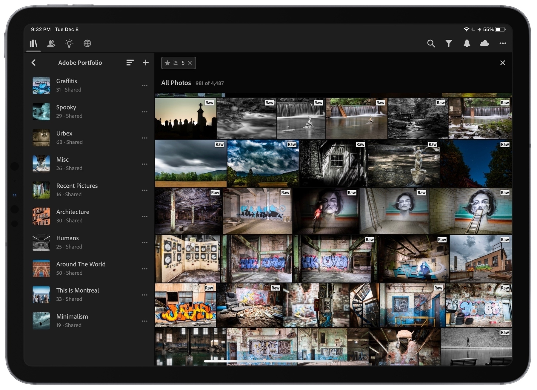
Just finished giving much love and attention to my Adobe Portfolio, a possible future home (instead…
I’m contemplating the idea of updating my iMac to macOS Catalina just because of this lack of…
Would be nice to see Tangerine online-only bank team up with Apple to bring Apple Card to Canada 🇨🇦…
I don’t get much traffic to my main blog from here, micro.blog. Why? Are you reading new posts from…
Very important article about the risks related to installing beta software even on a single device.…
One of my biggest blog post is coming later today…. subject: Apple and Marzipan. Who’s…
I don’t know how many people are following me on Micro.blog… but to them, I want to say that…
Photos