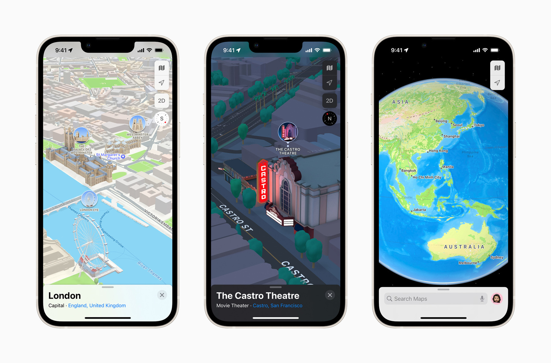
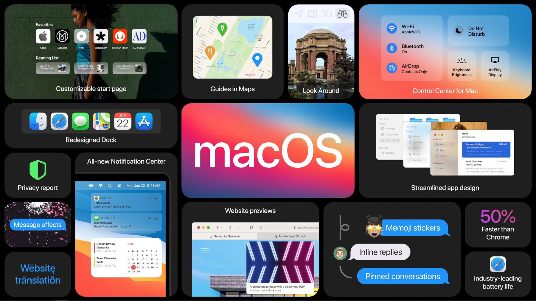
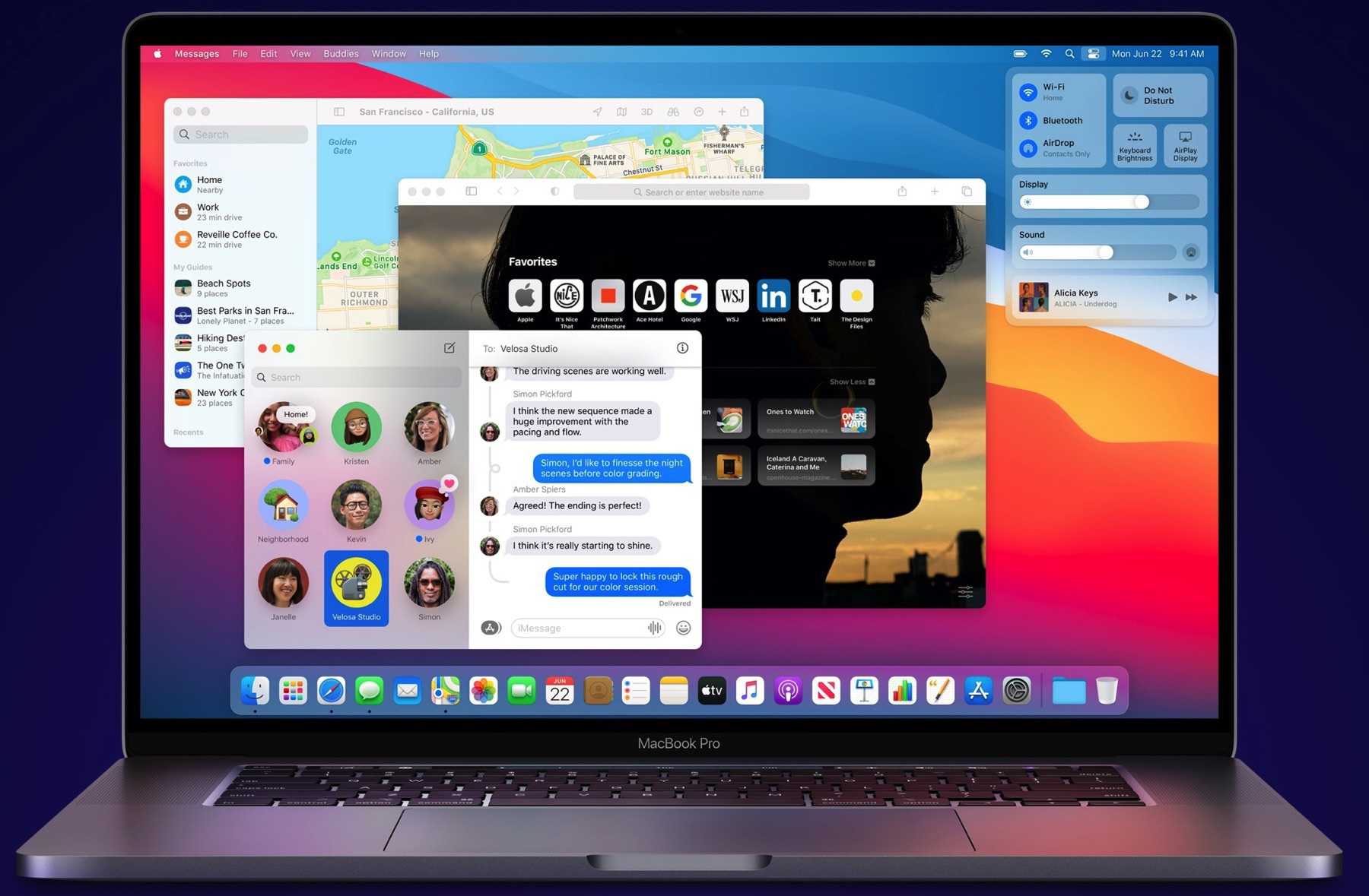
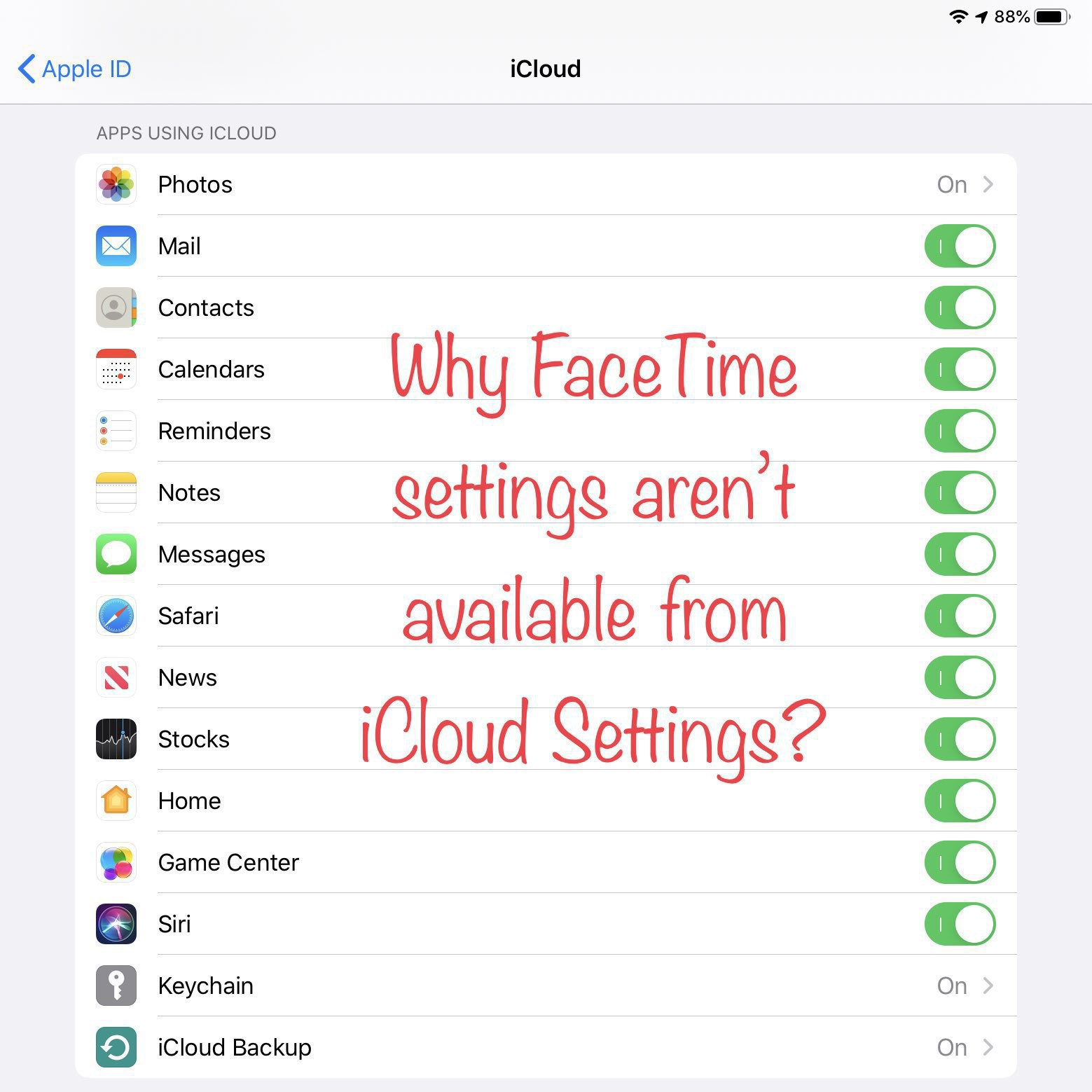
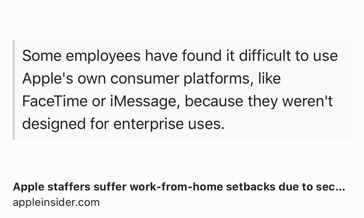
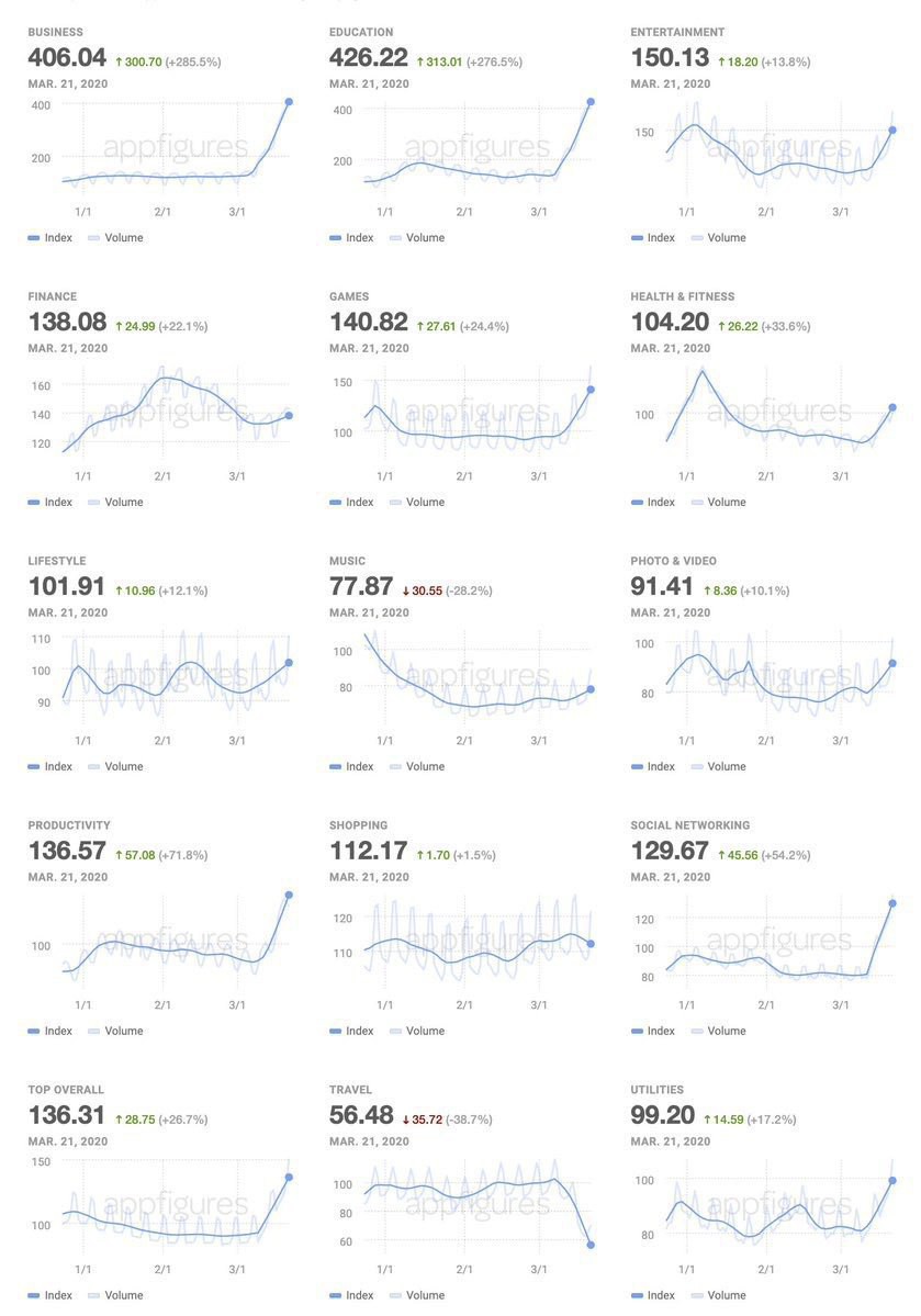
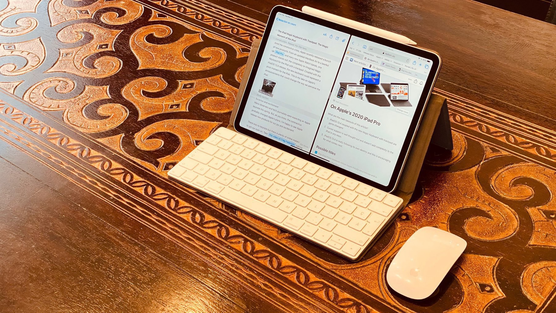
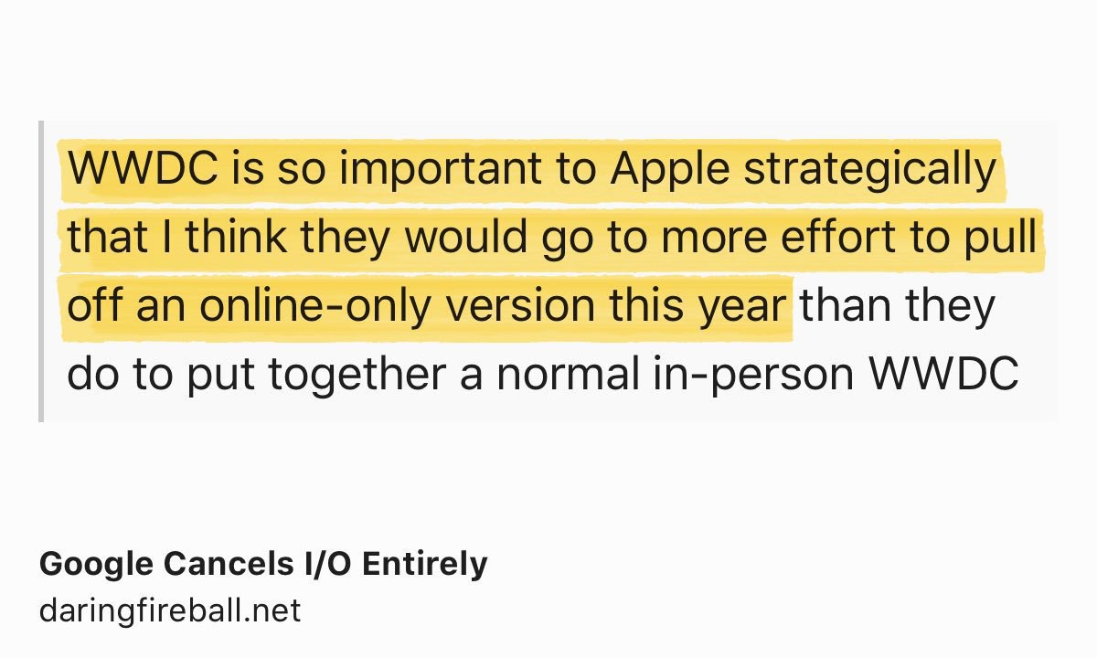
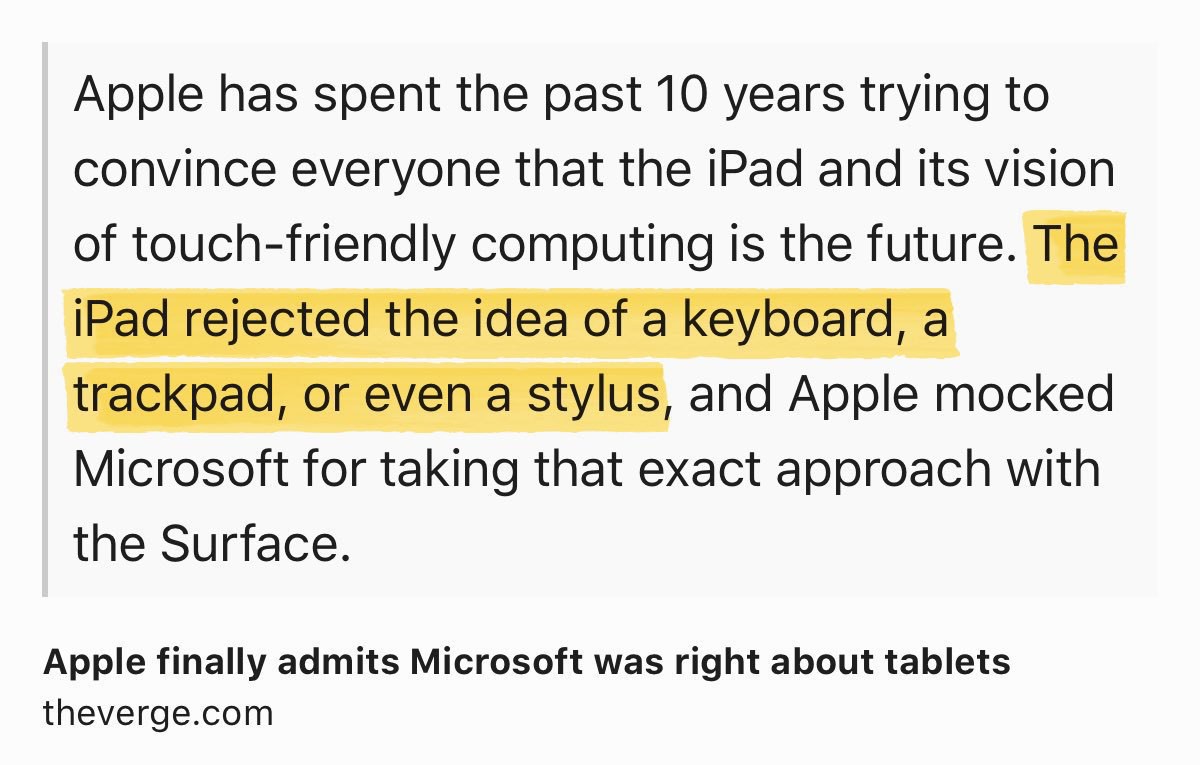
FaceTime in iOS 15: too little too late? Maybe. At least, FaceTime is better positioned as a videoconference platform for the next pandemic. Because, you know, one day, there will be another one.
This take from Gruber “App Store: The Schiller Cut” has a sour taste following the WWDC keynote and Platforms state of the union. Did Apple announce something this week to appease developers relations? Nope. Will they announce something in the coming weeks in regard to App Store commissions? Who knows. If they do, they will do it in a position of weakness:
If someday down the road we will be changing 70/30, then I think the question moves from “if” to “when” and “how”. I’m not suggesting we do anything differently today, only that whenever we make a change we do it from a position of strength rather than weakness. That we use any such change to our advantage if possible. And thinking about this long in advance can only help to look at an eventual change as an opportunity (with developers, press, customers, etc). — Phil Schiller in 2011
They missed the opportunity this year. Apple is in a weak position and I don’t see how this could change anytime soon.
To run an internal version of iOS, each employee must first install a special profile on the device — just as we do for downloading beta versions. However, each profile sent to employees determines which of these features will be enabled for each person working on new versions of iOS and possibly other Apple operating systems as well.
Source: Apple doubles down on secrecy with a new way to hide iOS 15 features from engineers - 9to5Mac
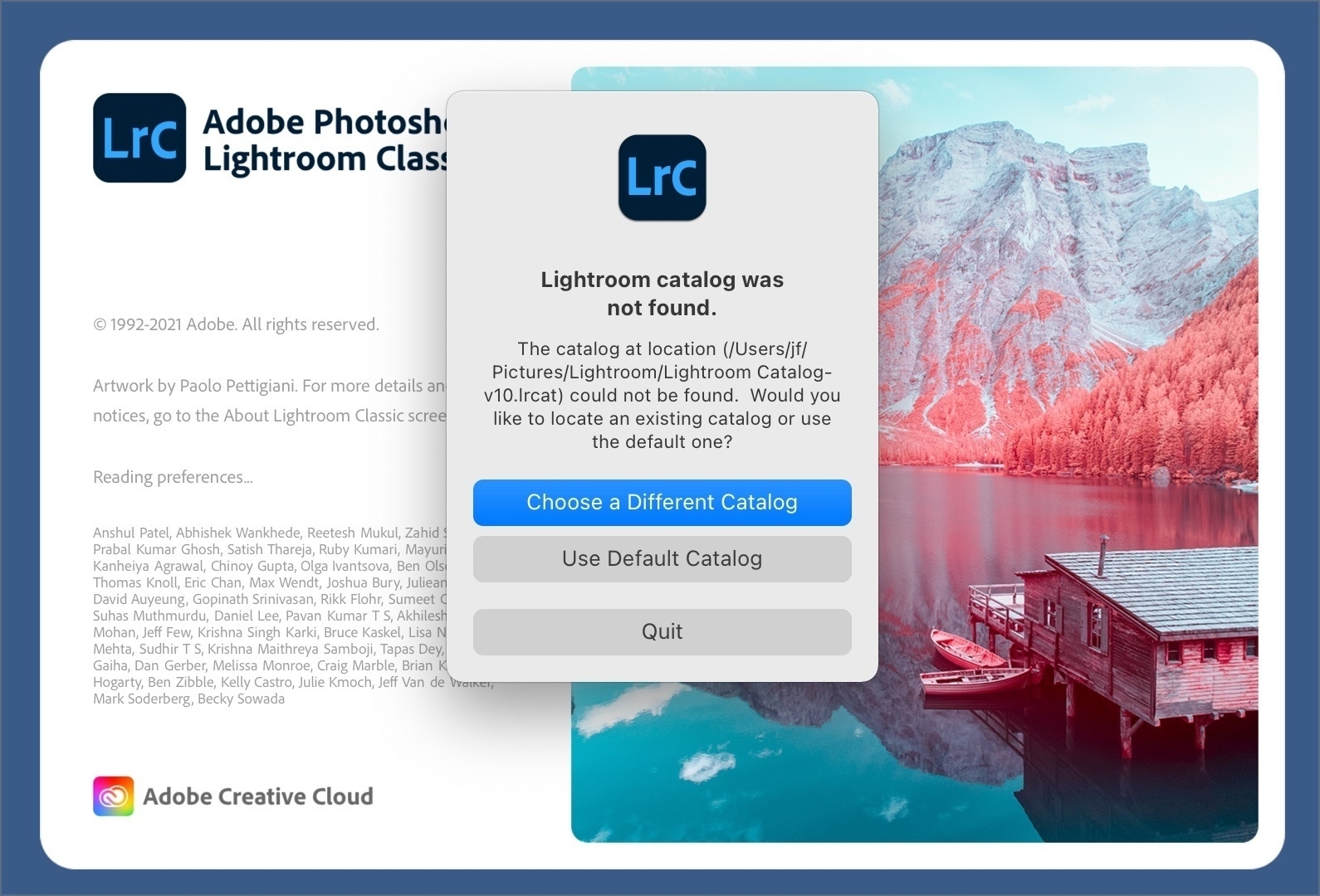
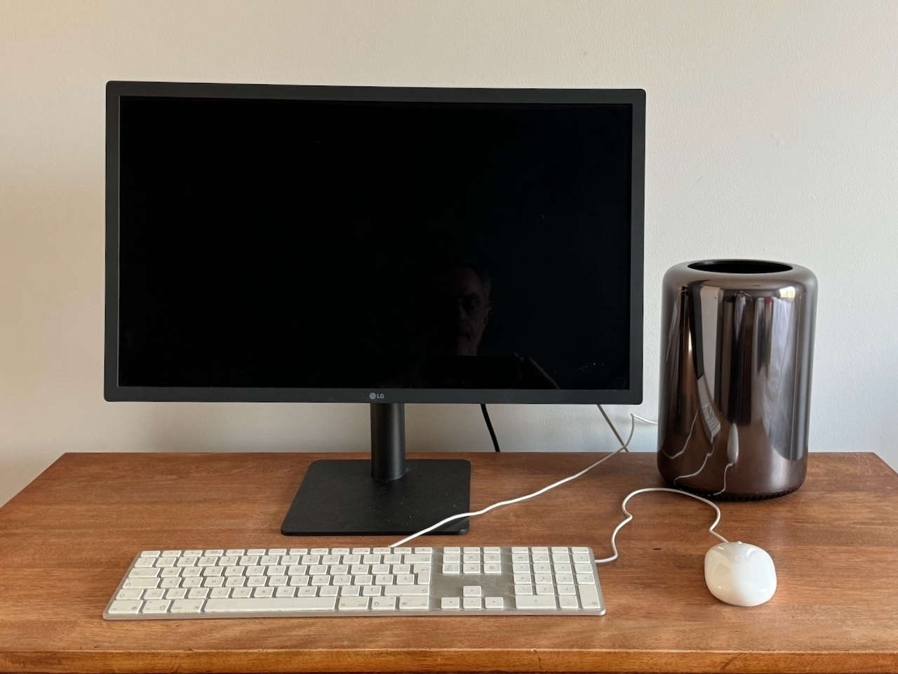
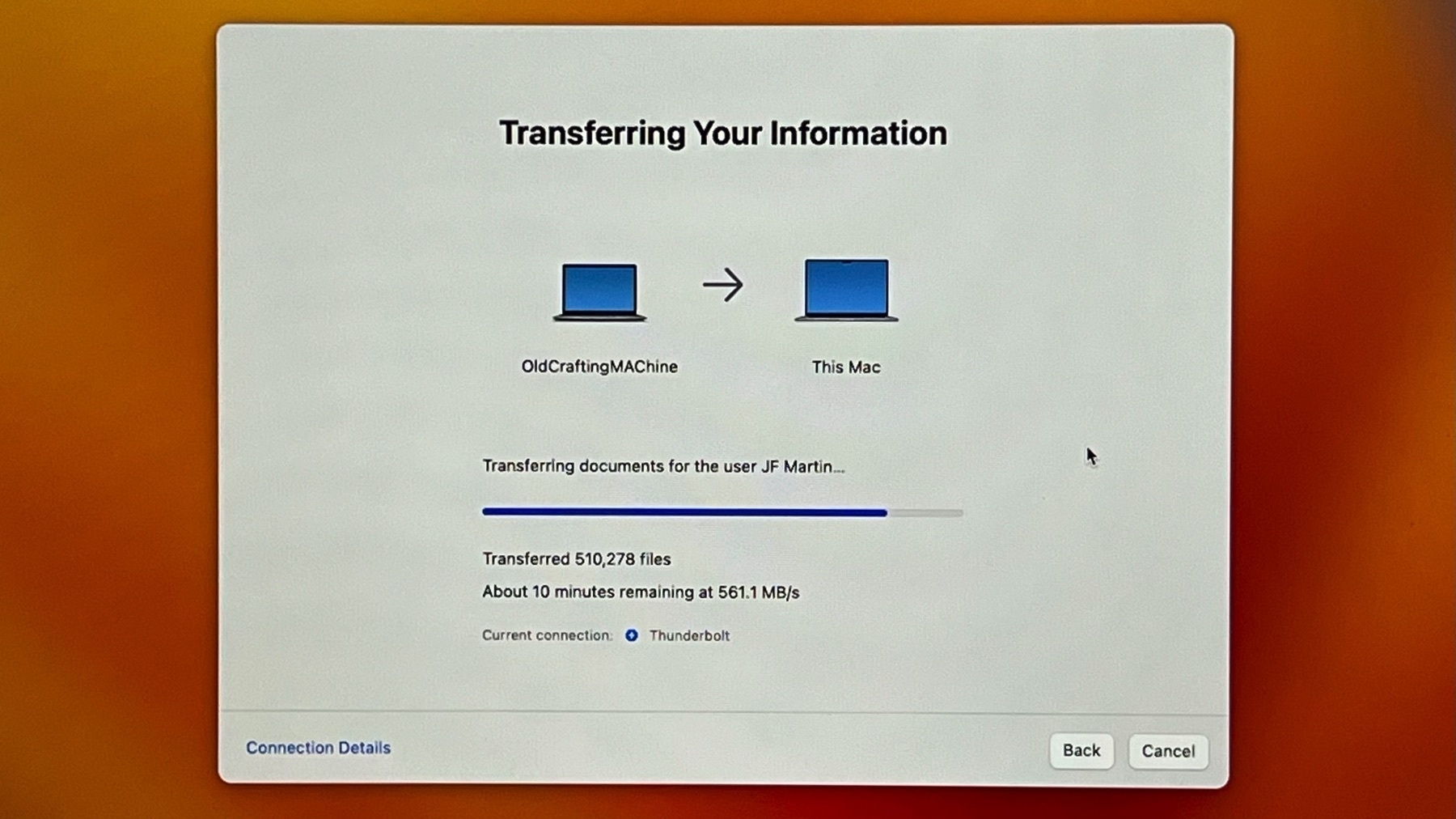
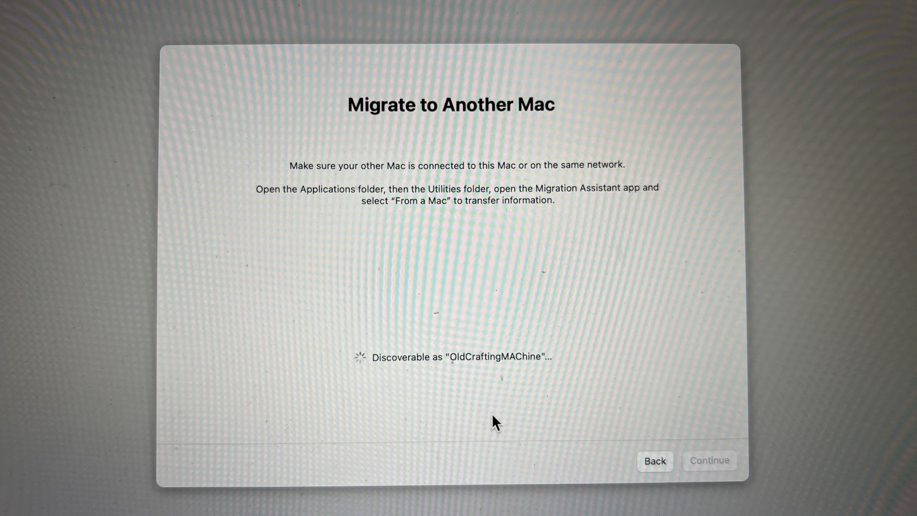
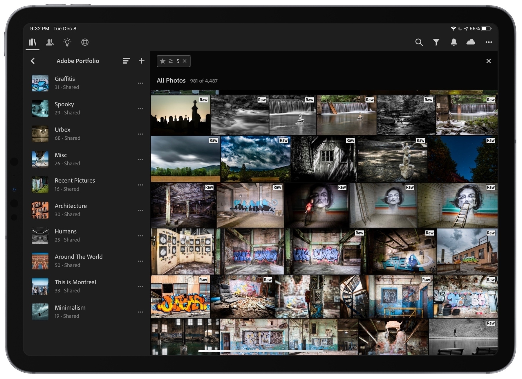
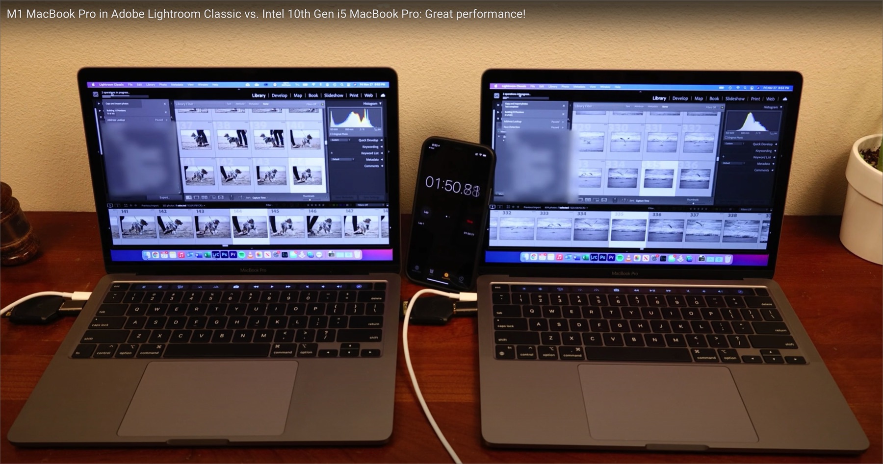
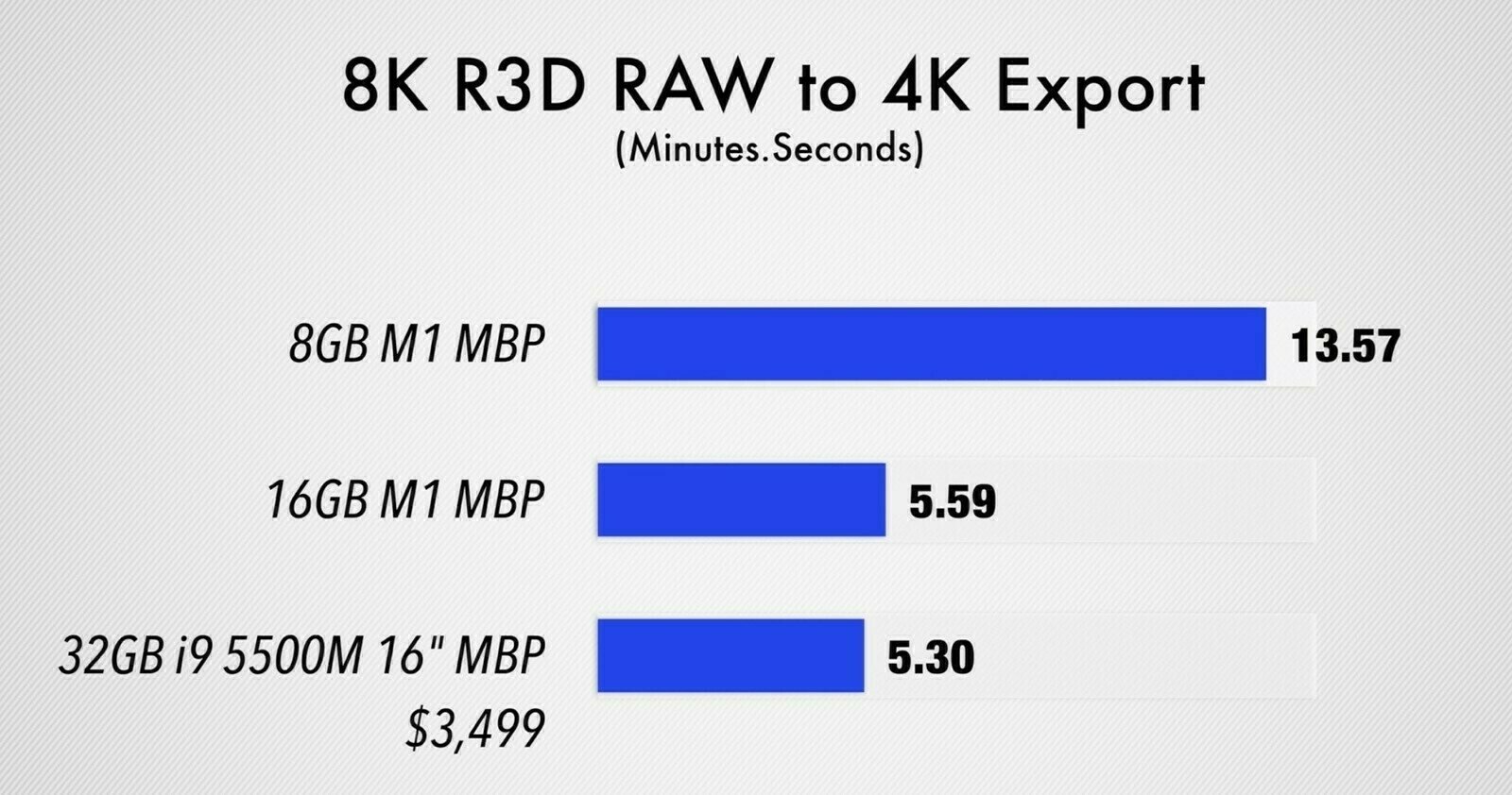
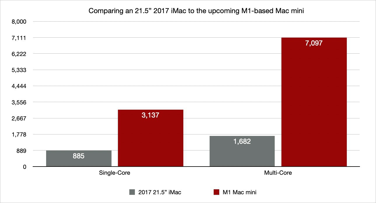
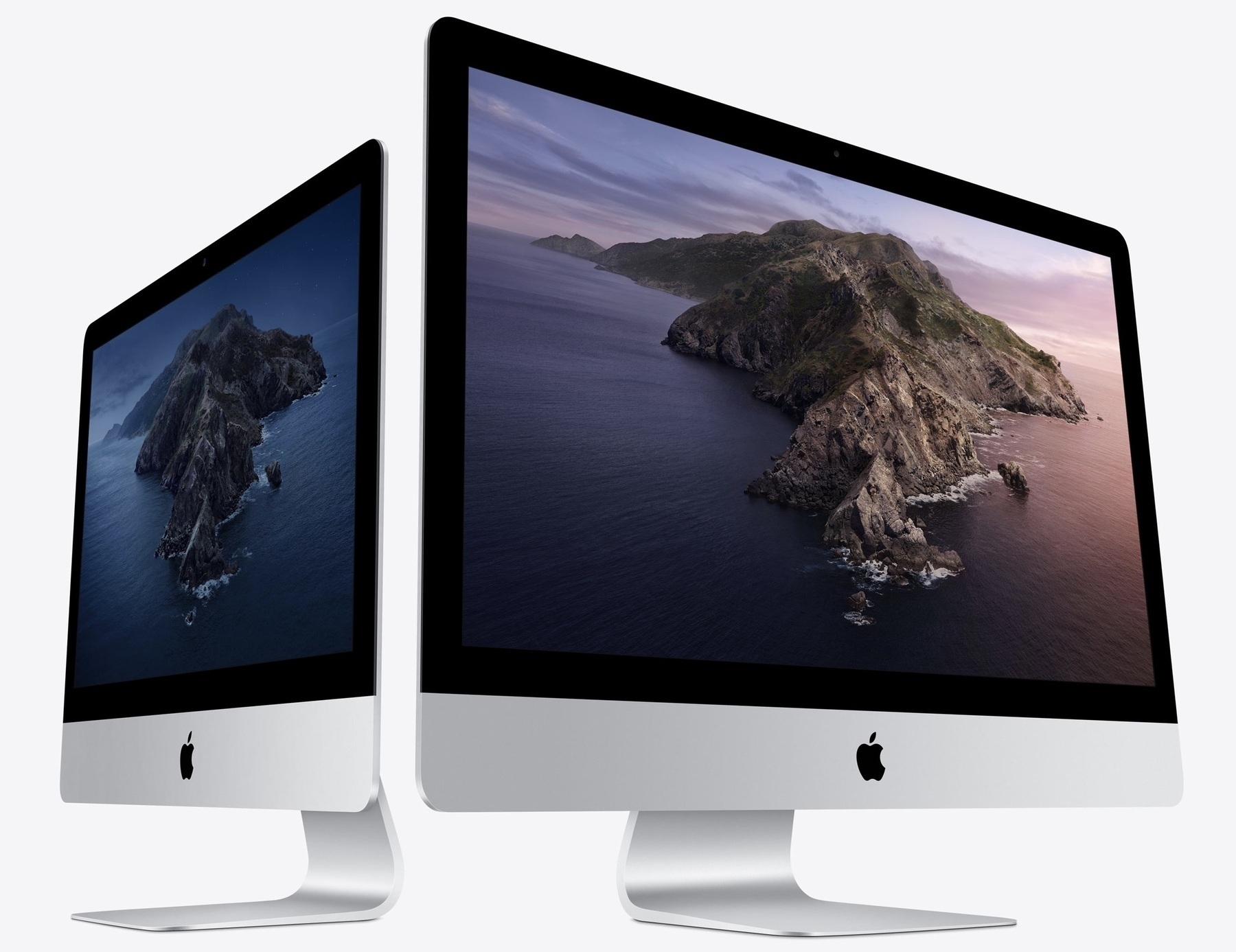
With Adobe finally releasing Lightroom Classic for Apple Silicon Macs, This could enable me to move off my 2017 21.5” Intel Mac for once. The prospect of Lightroom catalogs and data migration is not enchanting though. There the issues of plugins migration too. Is it time for me to go all-in cloud with Lightroom CC only? Not sure it is the right time either.

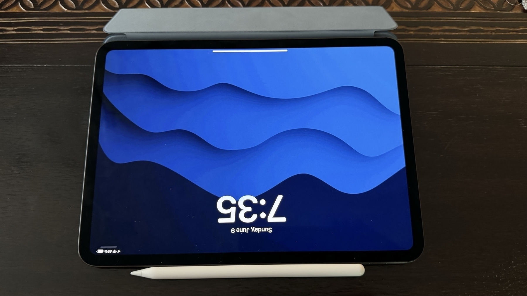
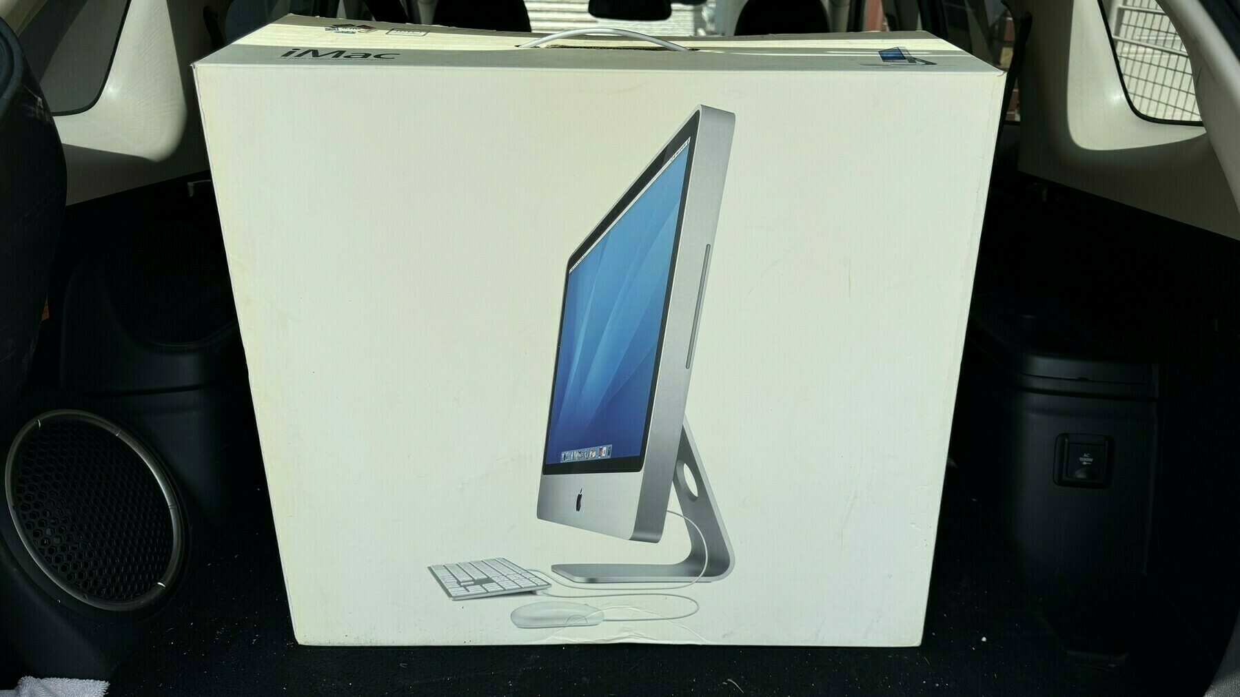
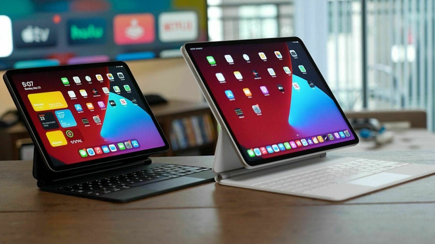
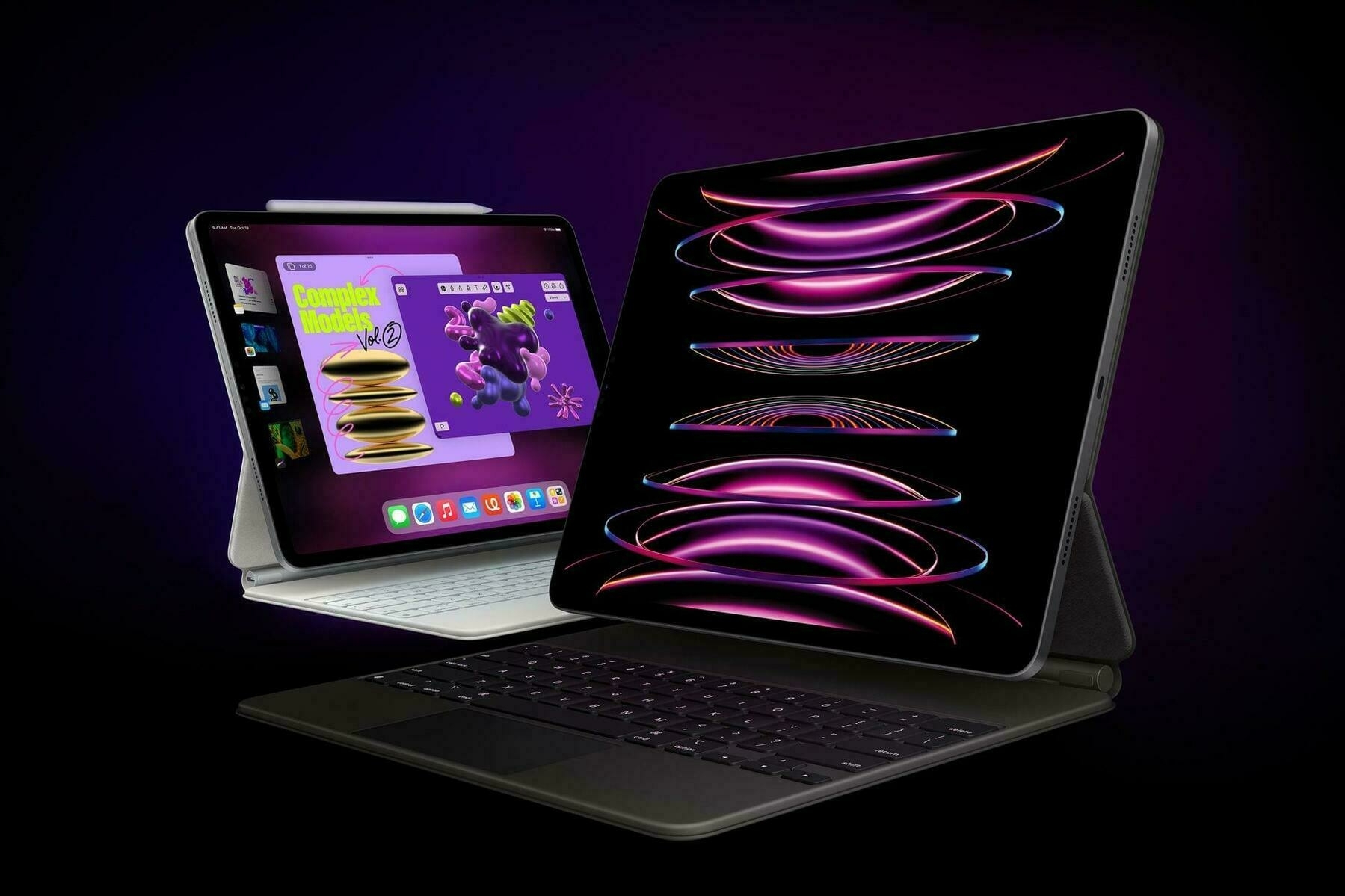
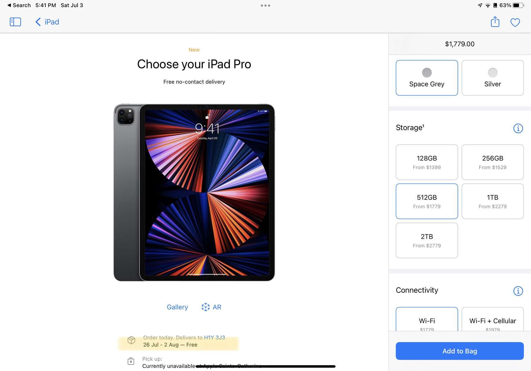
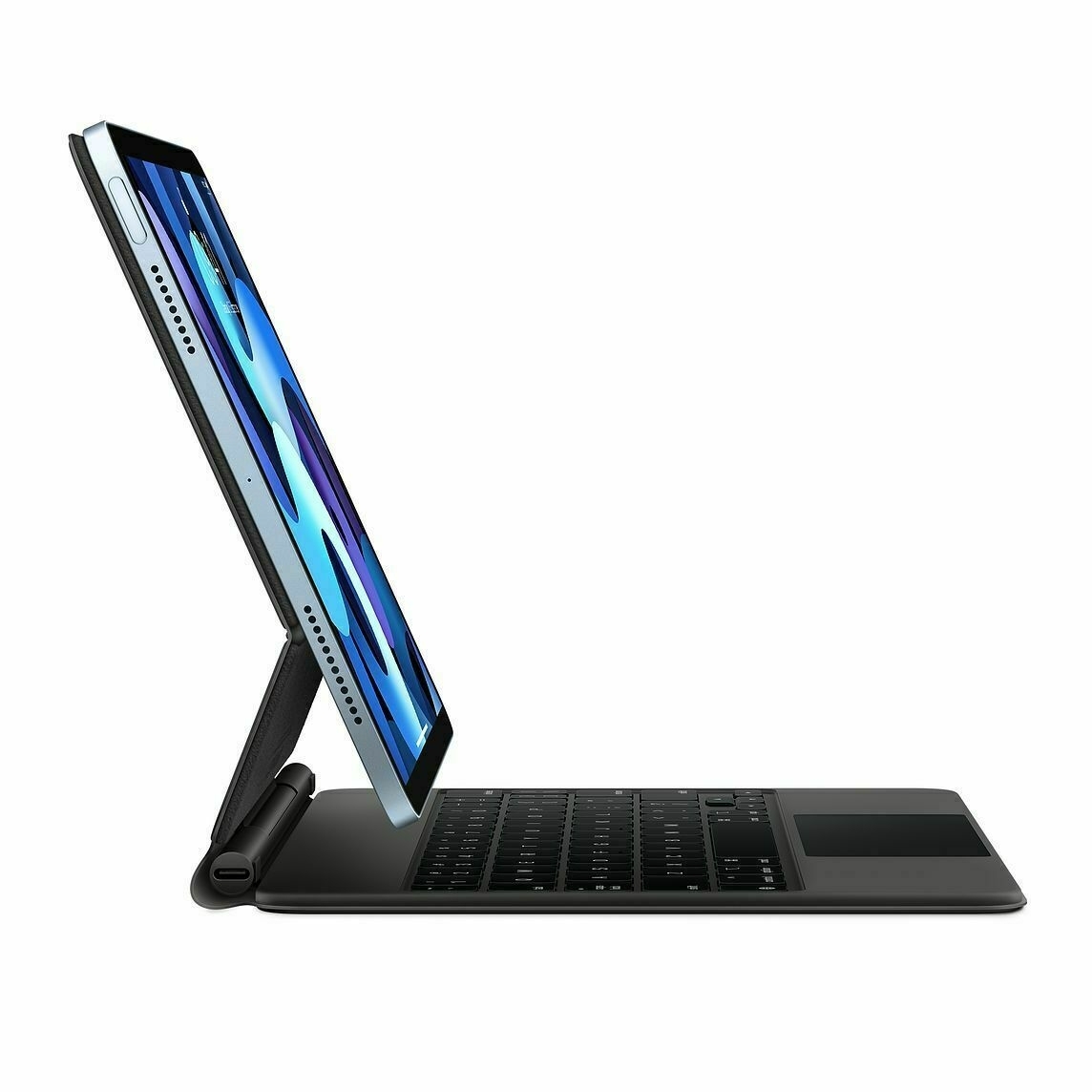
I have a few incentives for selling my iMac: one being to help me finance a shiny new 2021 12.9” iPad Pro with 1 TB of RAM. This could serve as my iPadOS 15 test bed for the second half of summer. I still have quite some time to think about all this as these devices are back-ordered for at least the second half of July.
You thoughts?
After publishing my essay on what I was hoping Apple would do in response to the developers community, Matt Birchler wrote a small response regarding my assertion about payments processing platform being a limited feature in the grand scheme of things. It appears I was wrong. Thanks to Matt blog post, I have a better view of what goes behind the scene here.
That being said, Apple’s payment processing service within the App Store serves Apple’s purposes and is the one that is very narrow, very focused. It’s a good thing. I’m not sure Apple has to compete against this industry. Allowing third-party payment processing services would need to focus on the minimum in order to protect privacy or help guarantee that privacy is in good hands. It’s an attainable goal.
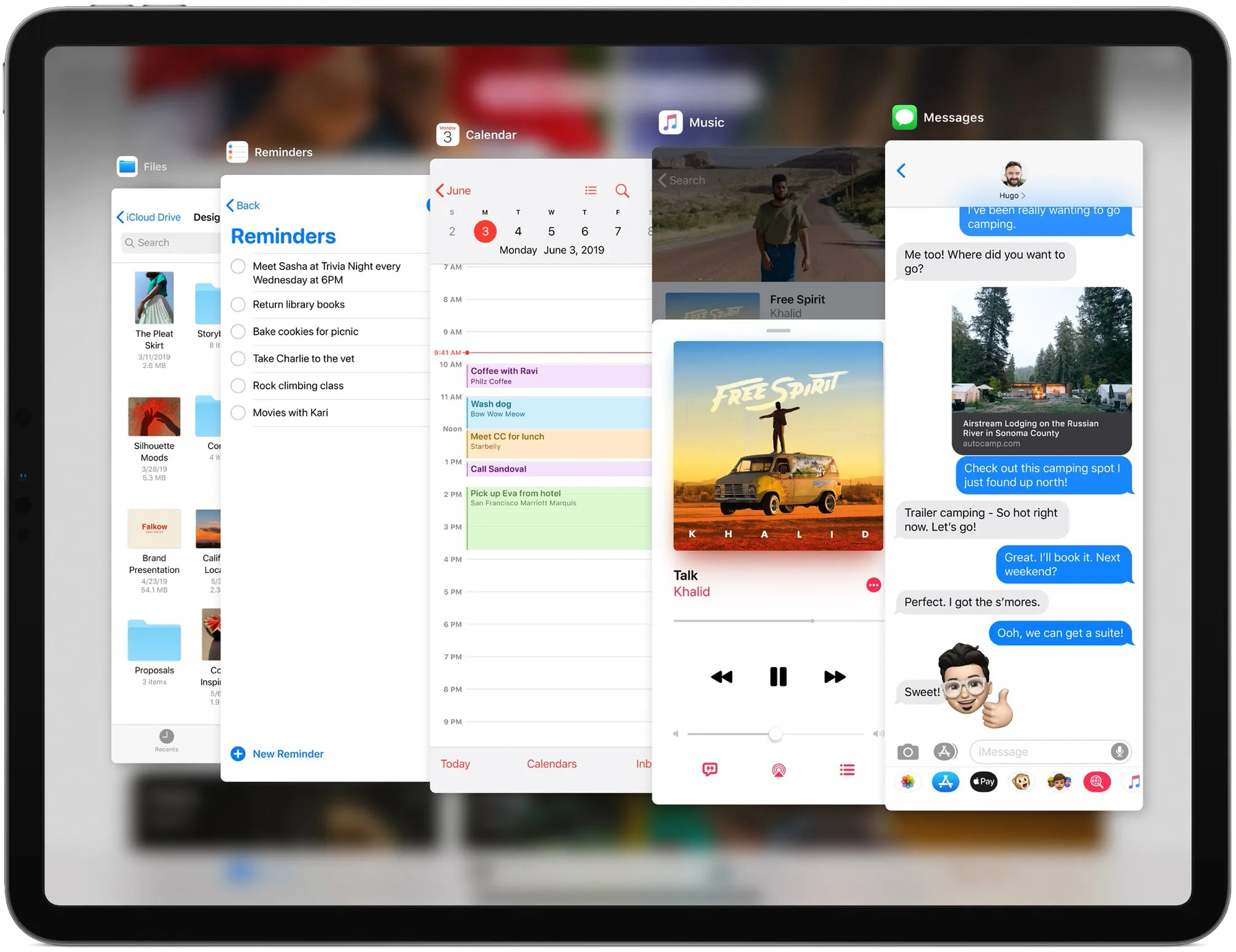
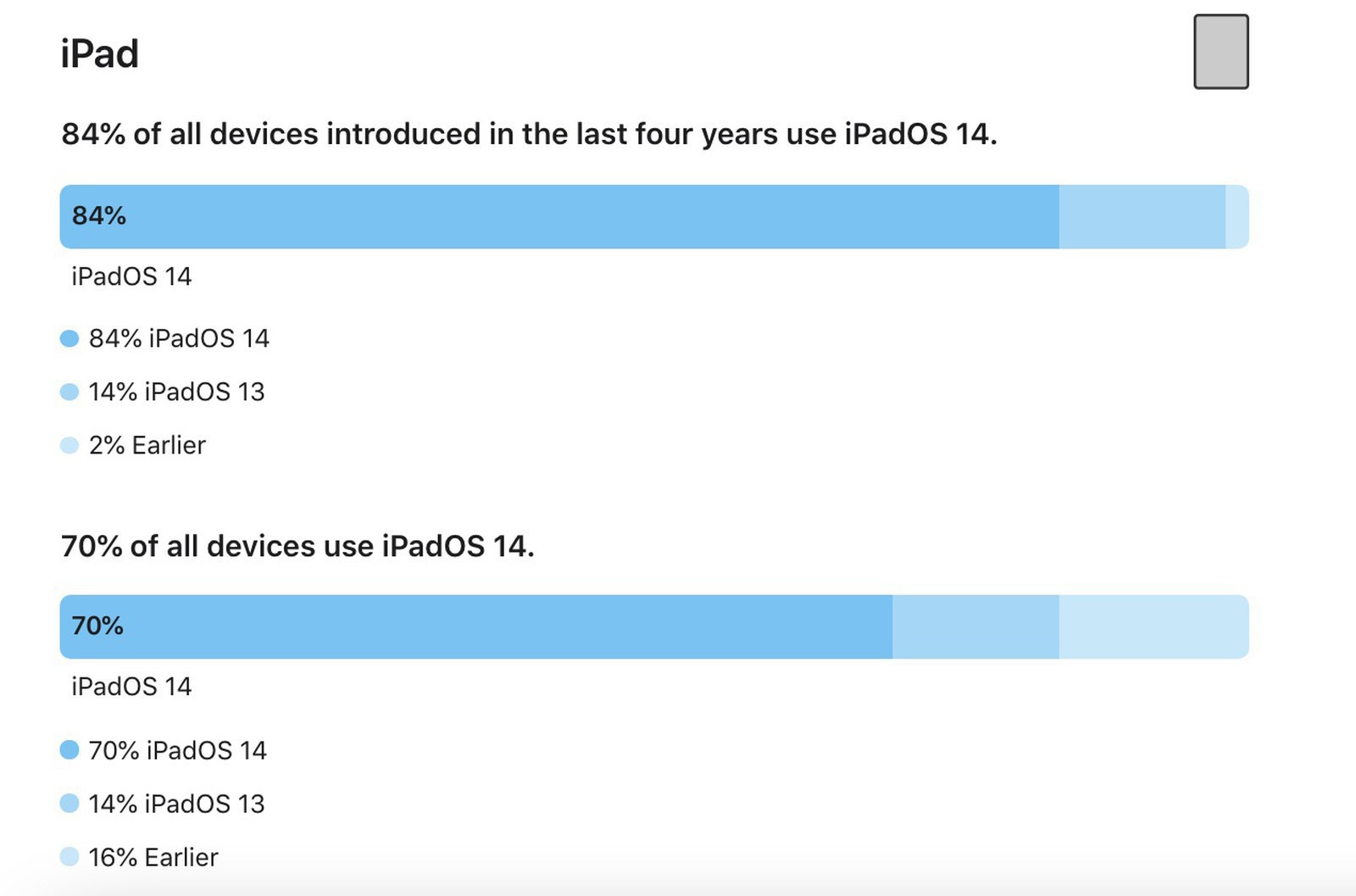
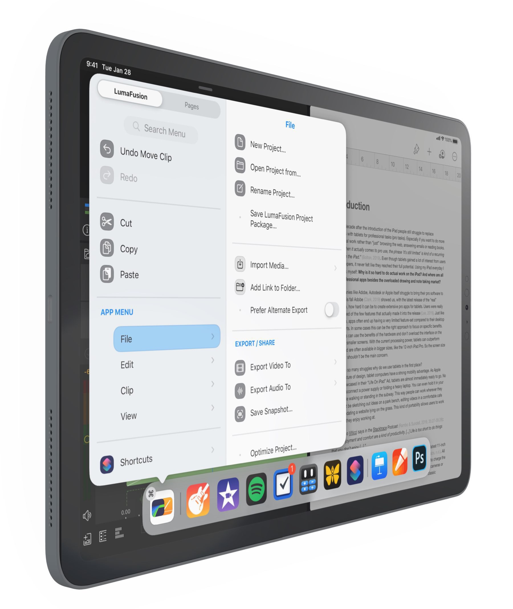
If Apple ups the game with iPadOS 15 (background tasks, better multitasking, external monitor support, etc.), we could see a situation where iPadOS crawls on lower or mid-range iPad while working like a breeze on the iPad Pro. Could Apple limit certain features to the high end only? Quite possibly. Your thoughts?
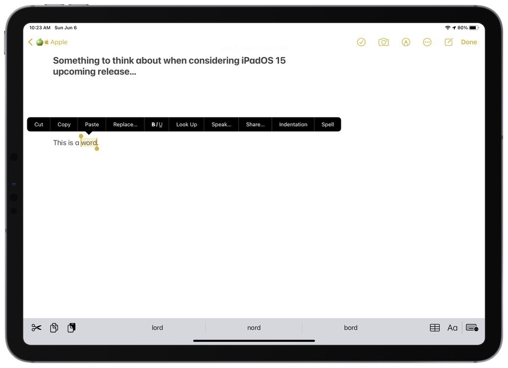
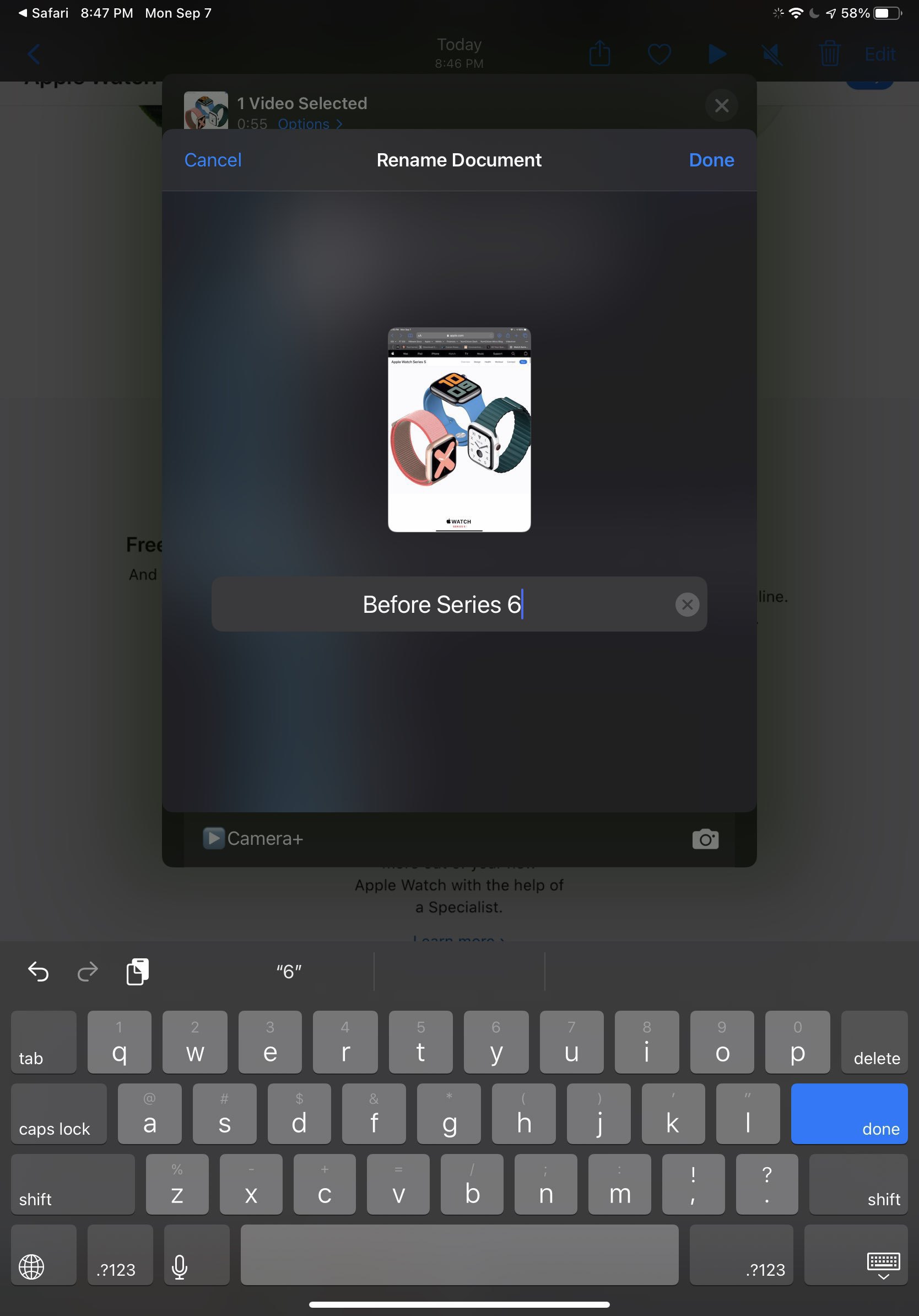
Consider the previous screenshot showing the popup menu when selecting a word in a document. This menu hasn’t been touched since iOS 3, if I remember correctly. Tomorrow, as we are about to get a peek at iPadOS 15 and iOS 15, I’m wondering if there are better ways to display such a menu. Consider a few design problems and possible improvements.
This menu doesn’t scale well; it isn’t exactly elegant. In some situations, we have to scroll through its options which is not always obvious and is tricky to do with the finger without selecting the option at touch and scroll time. Also, this design involves too much finder travel to my taste; I would prefer a more condensed version. The design is flat and doesn’t allow for hierarchical grouping of options which could help is situations where many options are available. The design is flat and is not as distinctive as it could be. Adding some depth, contour line would help.


Do you have any suggestions on how Apple could improve on this?
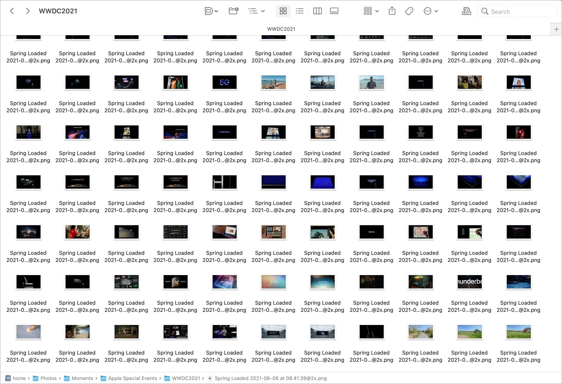
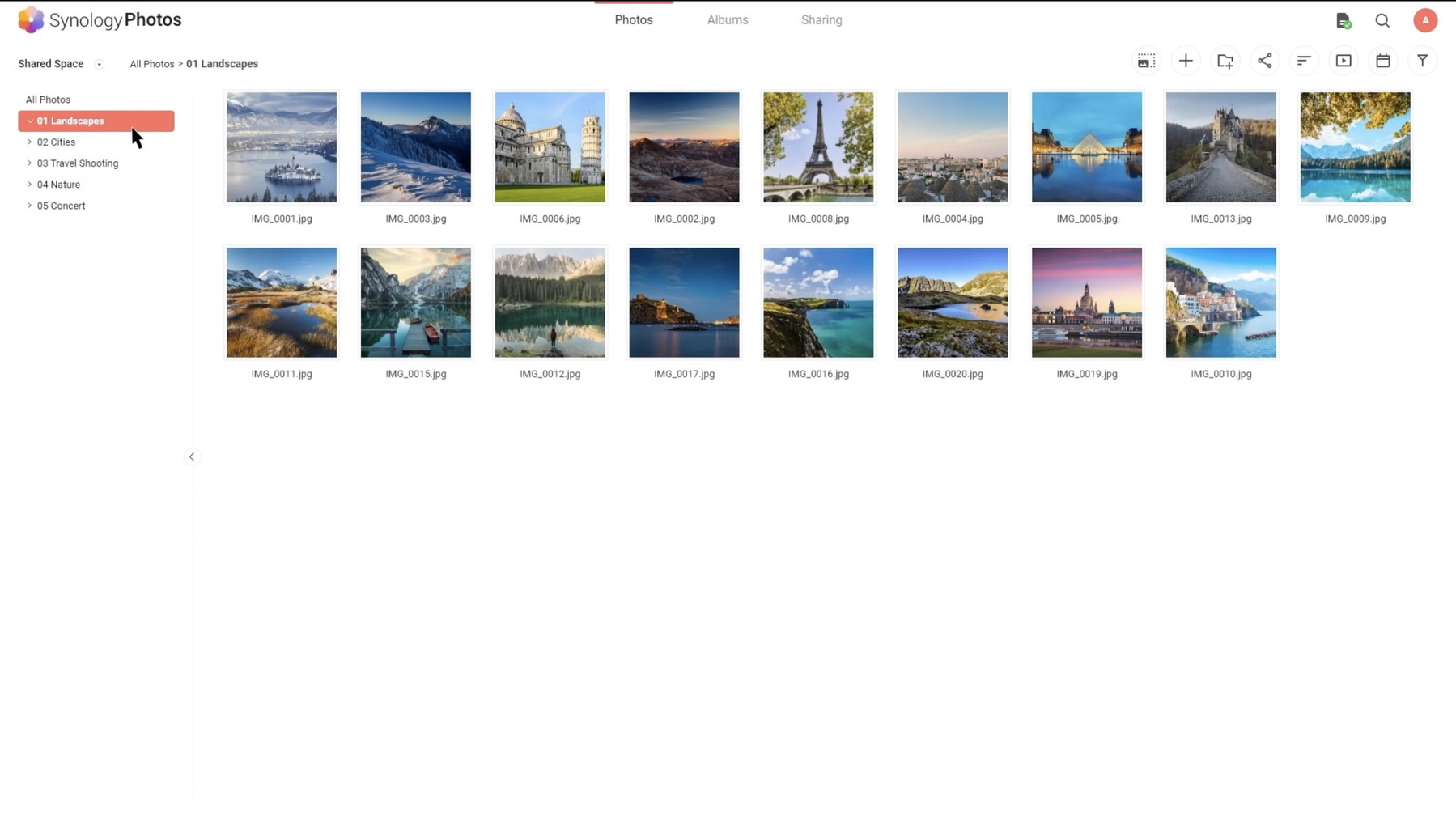
It’s always fun to re-watch a previous Apple Event. Just did the Spring Loaded one and used CleanShot to capture the best moments creating a library of 260 shots, all stored in Synology Photos, ready to be used, just in case. Tech is fun.
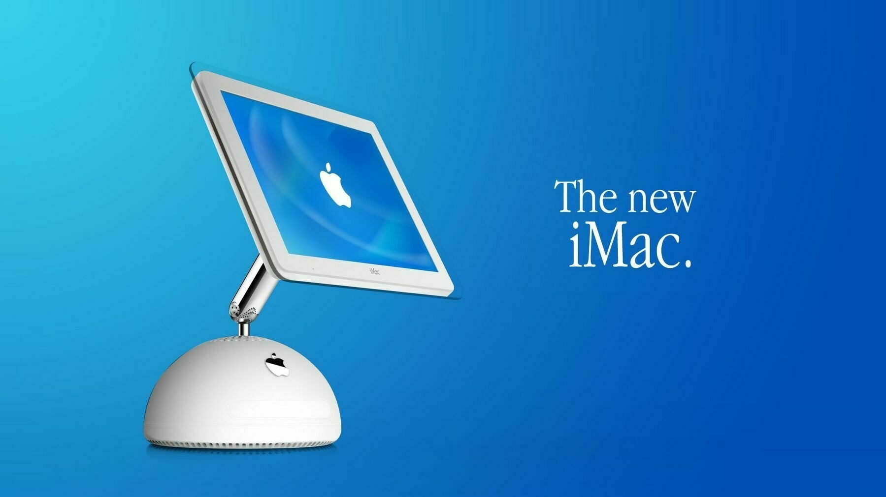
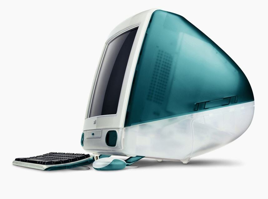
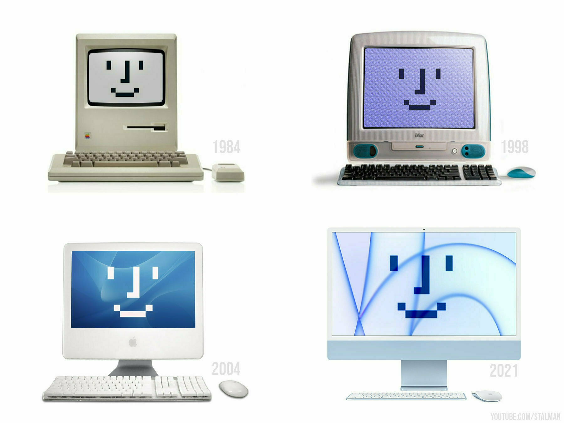
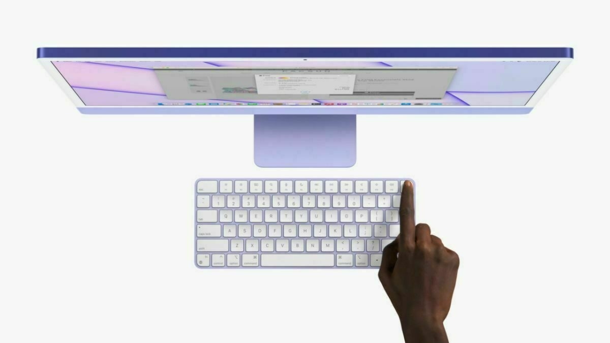
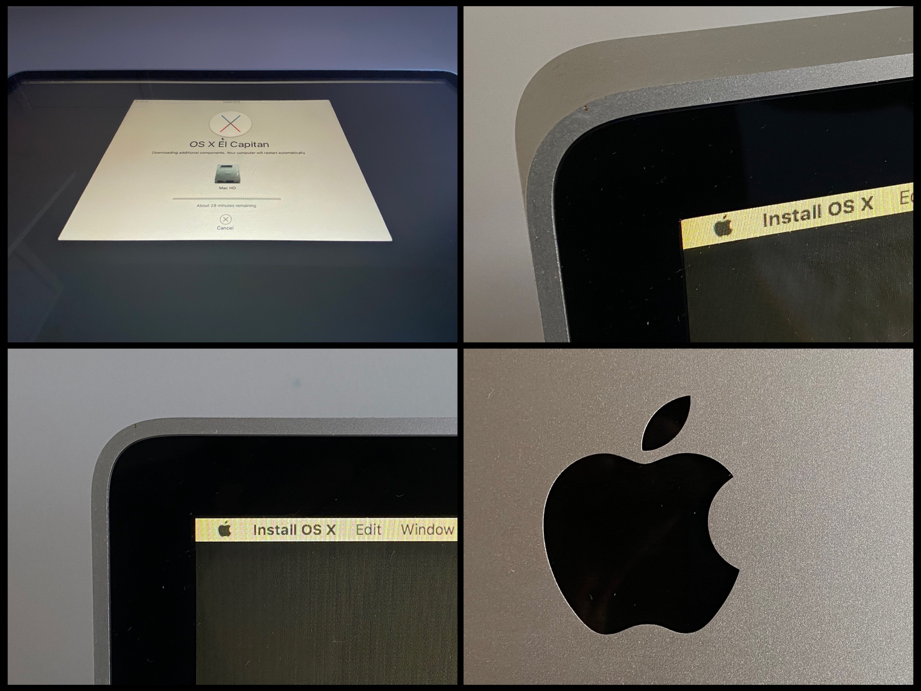
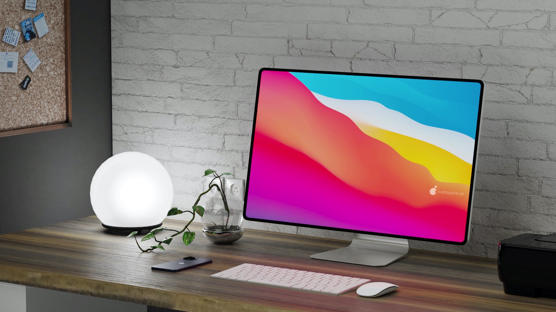
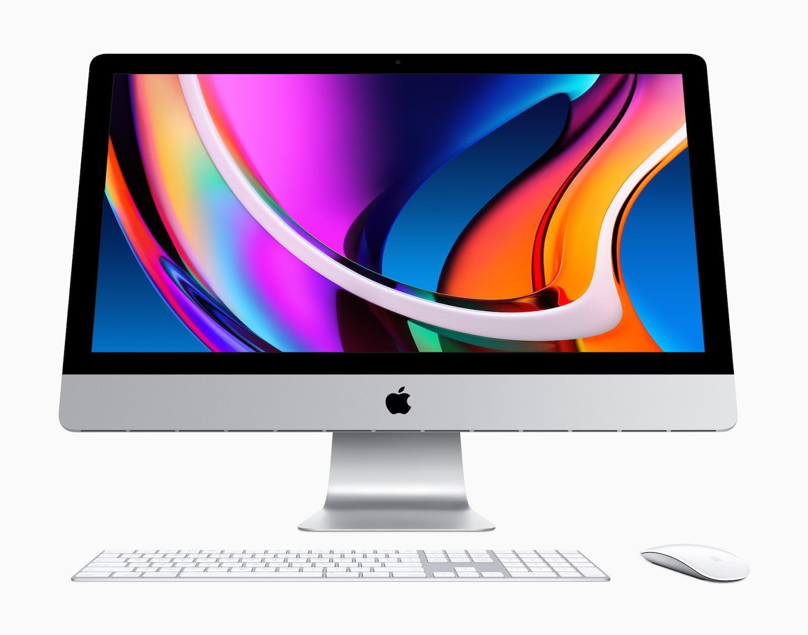
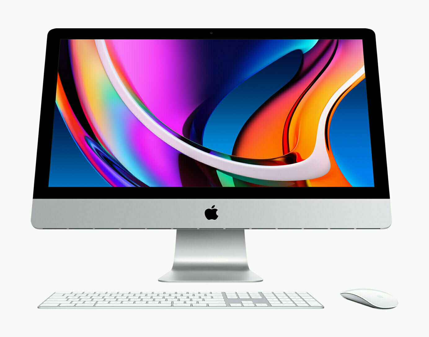
The Thunderbolt display is now a vintage product for Apple. When I look at this beautiful monitor, I’m thinking about the recently introduced redesigned iMac. Many people would have preferred to see the iMac chin disappear. We should know better and see this is a distinctive design attribute of the iMac which make it look different than from a simple monitor. It’s an important visual differentiation factor in my opinion. The iMac is not a simple monitor.
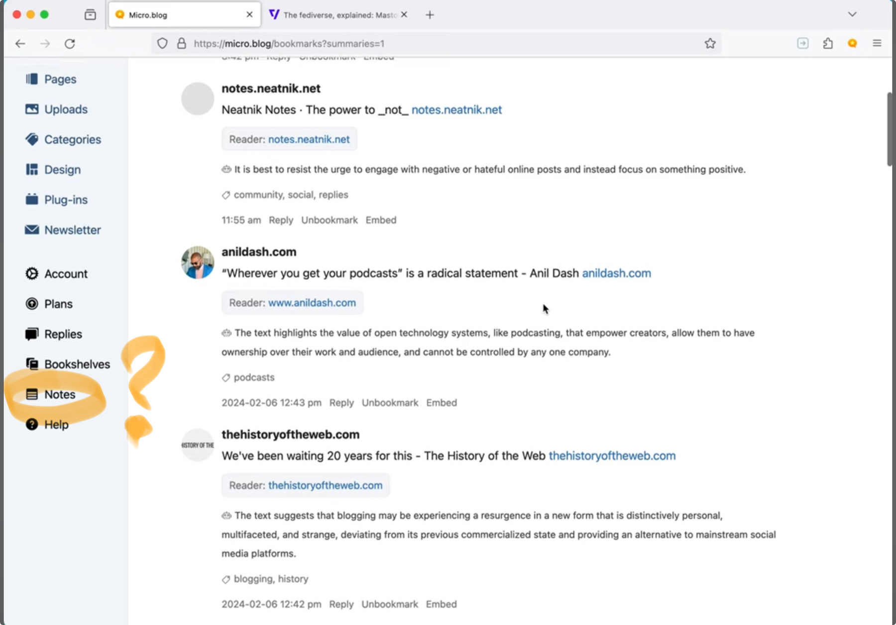
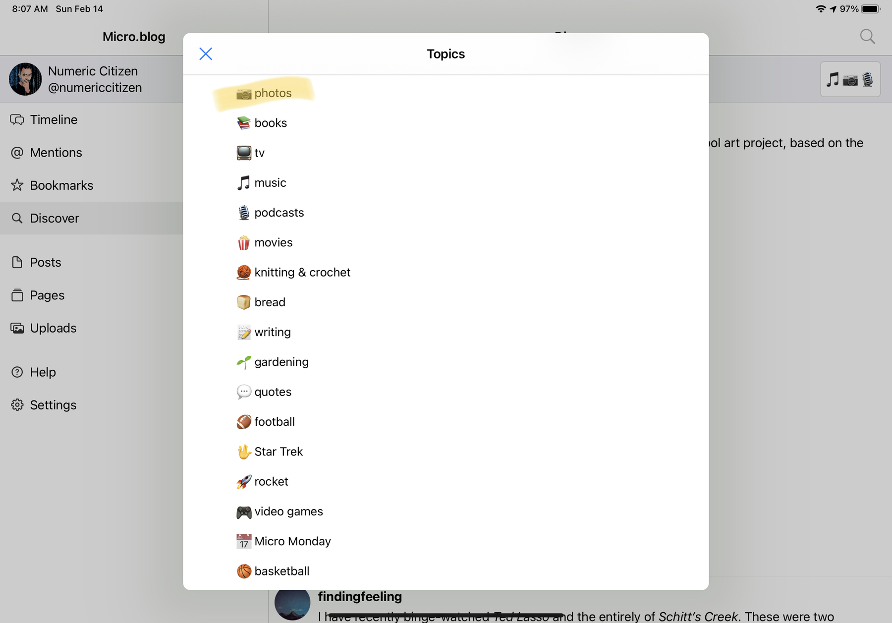
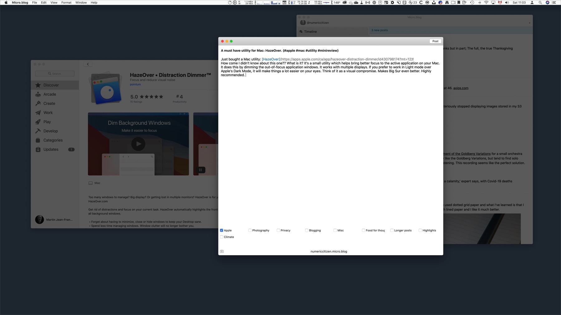
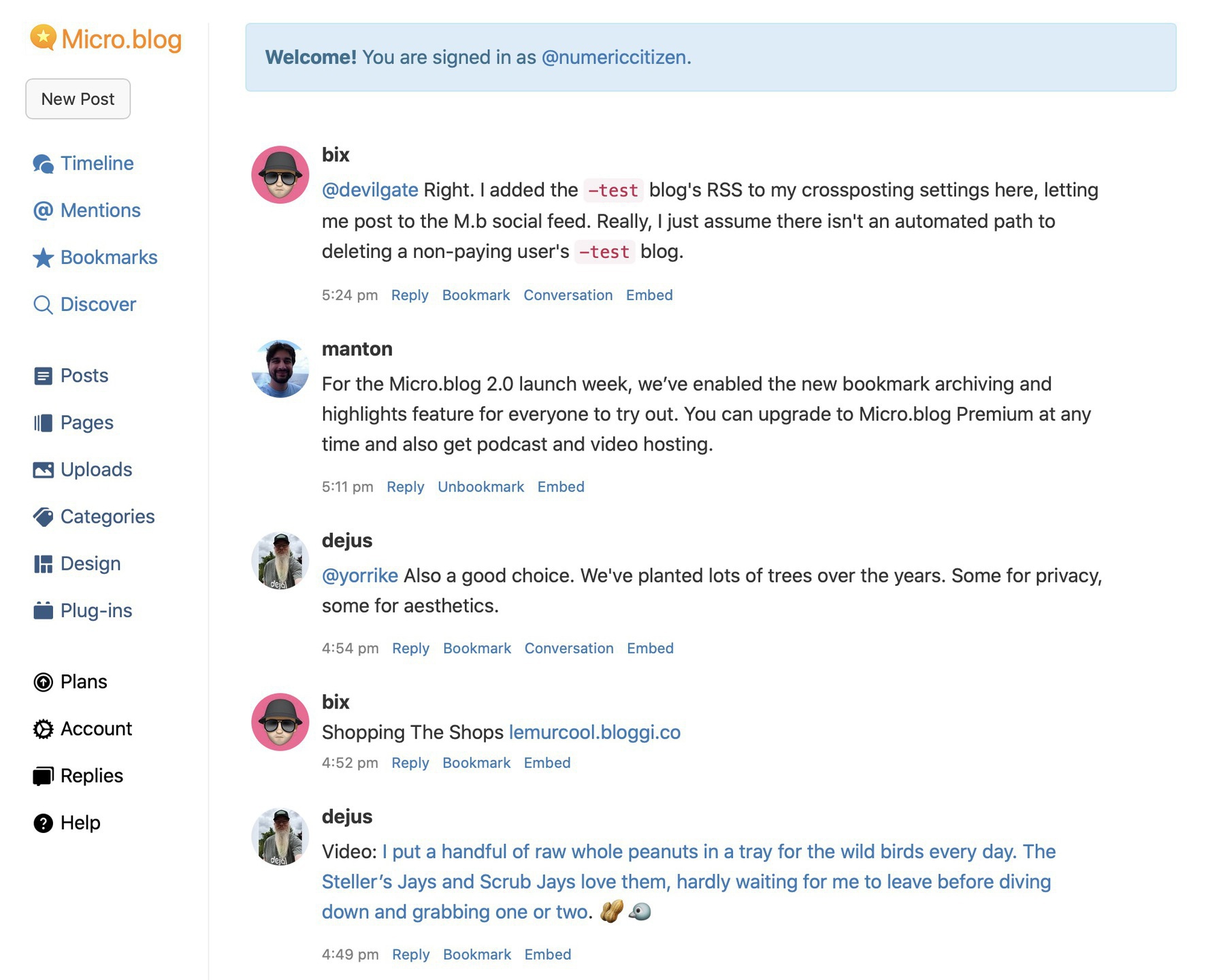
I like how Micro.blog stacks up against Twitter’s subscription. $5: Micro.blog hosting, photos, use your own domain name, categories, bookmarks, themes, CSS, plug-ins, bookshelves, standalone pages, native apps, open APIs. $3: undo tweet, thread viewer, free Twitter features.
Indeed.