On Talent Retention Challenges

I’ve been working in information technologies for nearly three decades. Finding competent people has always been a challenge. Keeping them too. But, in recent years, the situation has become simply critical, to the point where businesses are deeply impacted: delayed projects, abandoned initiatives, high pressures on other people, stress, etc. Businesses’ bottom line if at stake here.
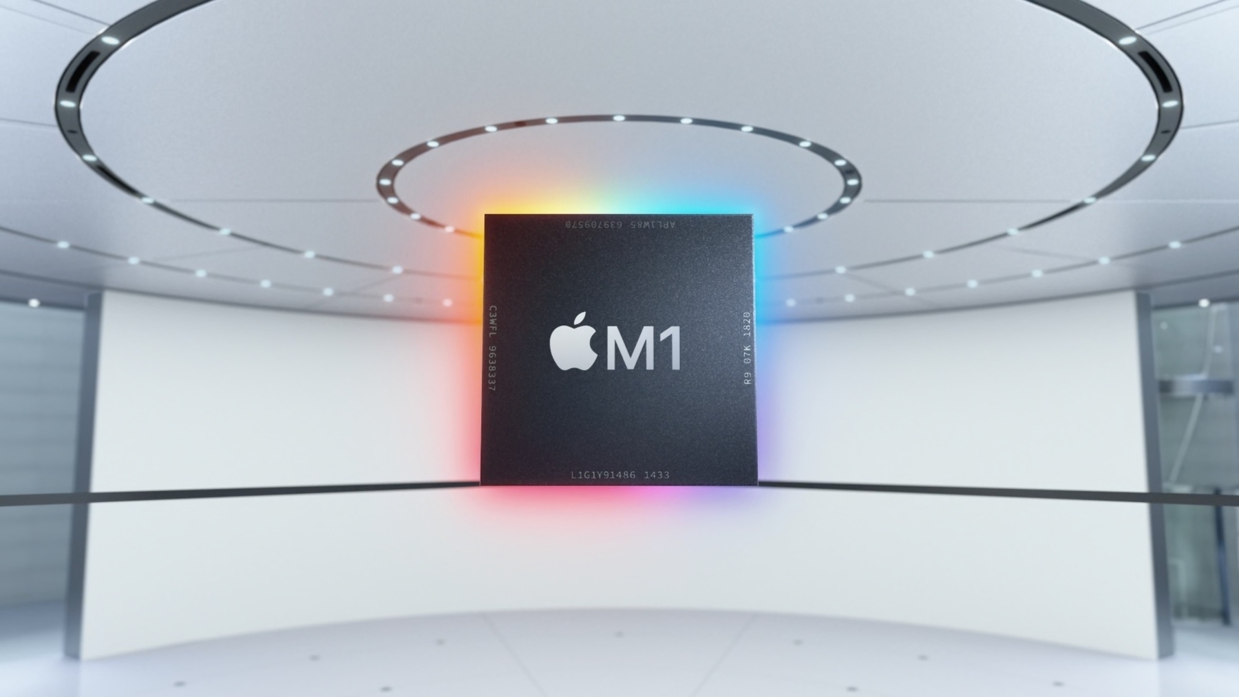
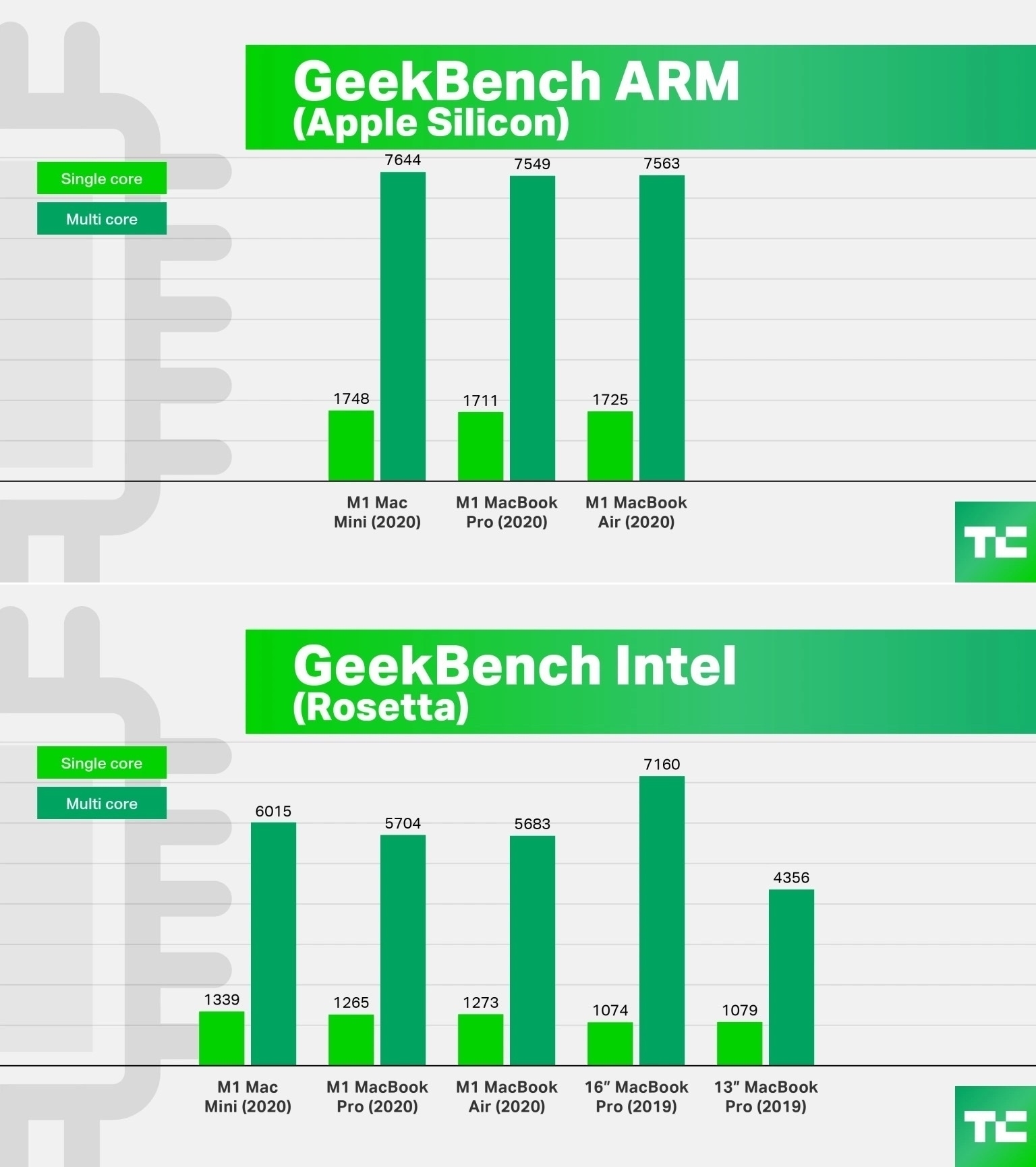
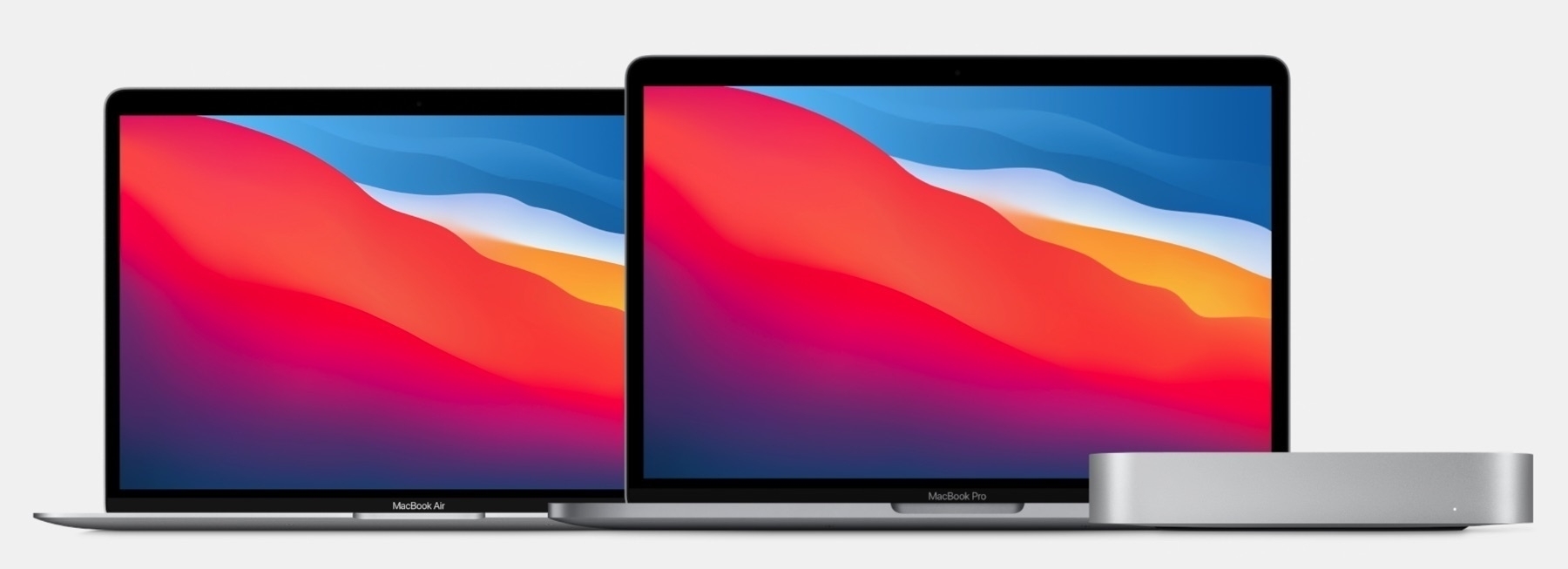
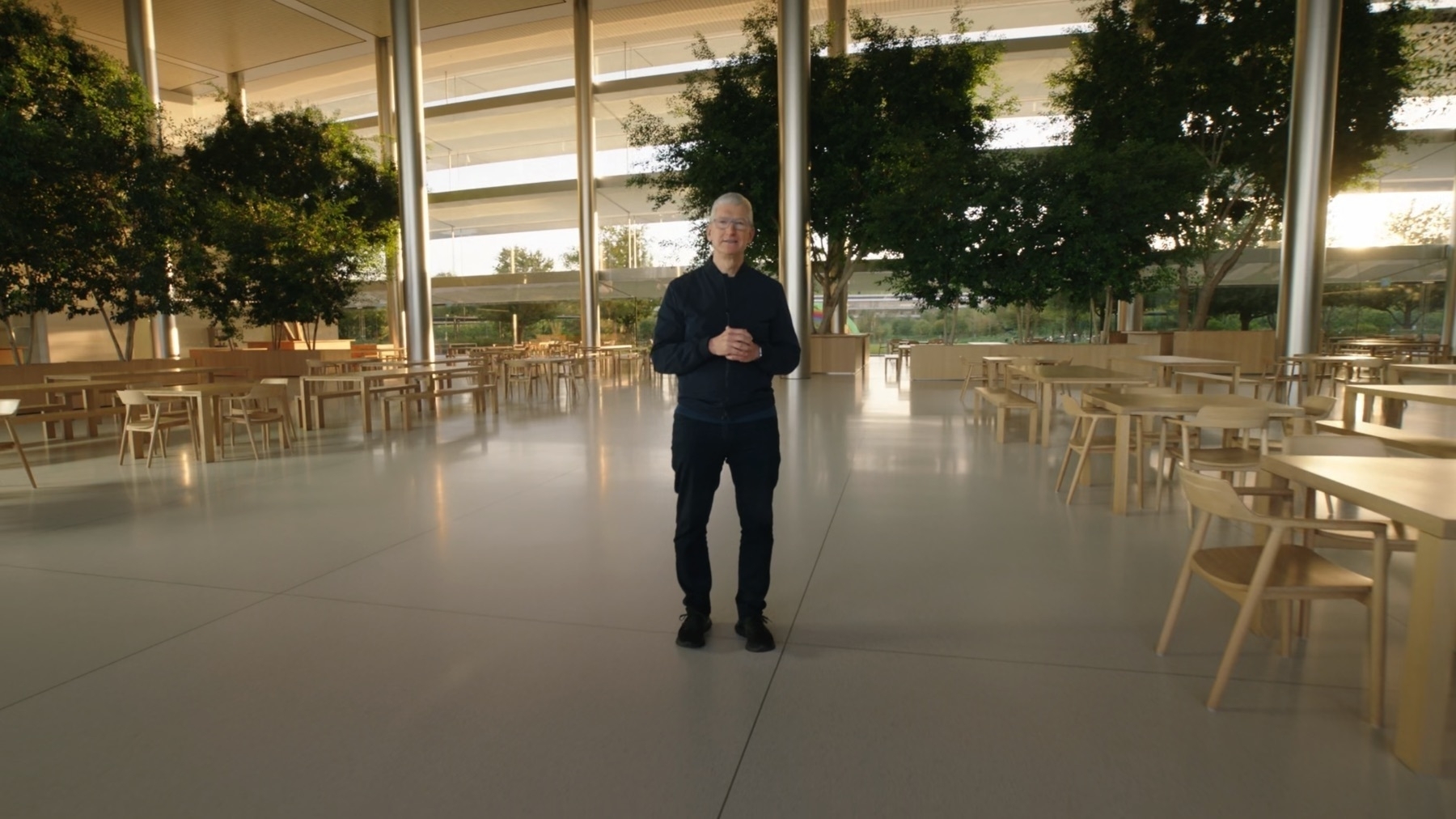
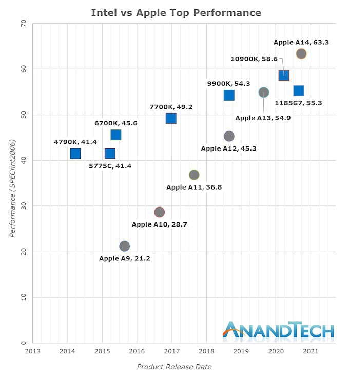
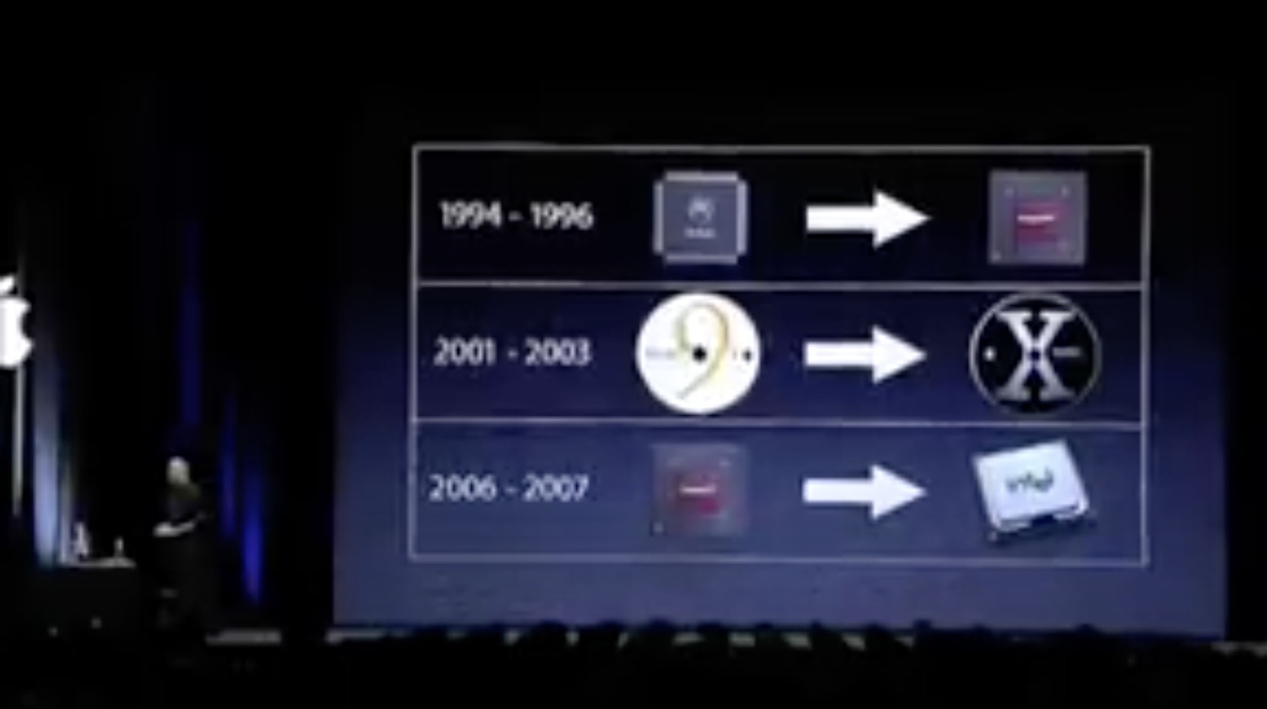
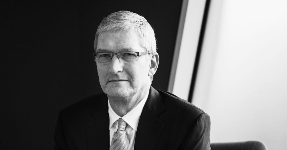
The news of the departure of one of the directors behind Apple’s transition from Intel to Apple’s own silicon, Mr. Jeff Wilcox, for its Mac product line is sad but probably just the tip of the iceberg. I wouldn’t read too much into this. I can imagine a team of many hundred engineers working on this program. People come, people go. Apple must cope with this. One could argue that when there are empty seats to fill, it becomes an opportunity for others to move in and try to be their best.
There are an infinite number of reasons why people leave a company. For Apple, the challenge is probably to stay attractive in a sea of opportunities for engineers. Apple cannot please everyone, all the time. I guess salaries is one of many other factors that come into play here. Apple is a legendary company where countless people would like to work there, me included. Pressure most be high in many key positions. Yet, the reward must be satisfying. I guess Mr. Wilcox has done what he thought could be done and succeeded. It’s often the good time to move on, and try something else while being at the top of their game.
2022-01-08
Blue vs Green Bubbles — Blue is In, Green is Out?
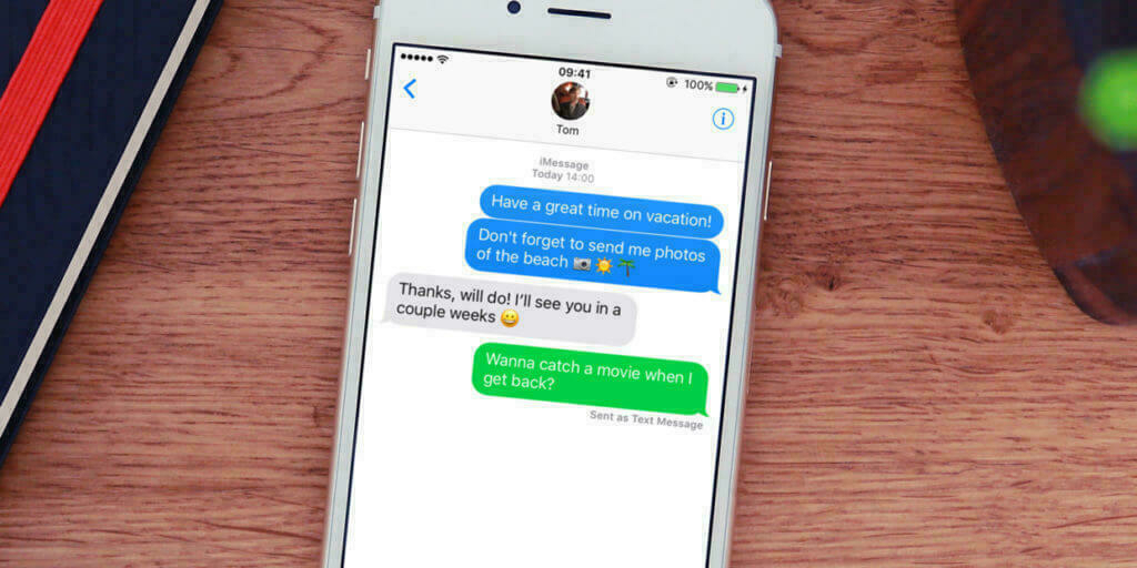
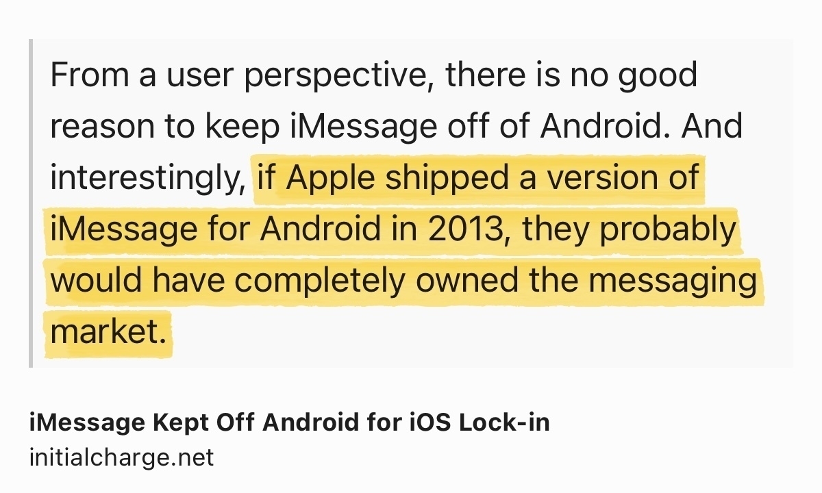
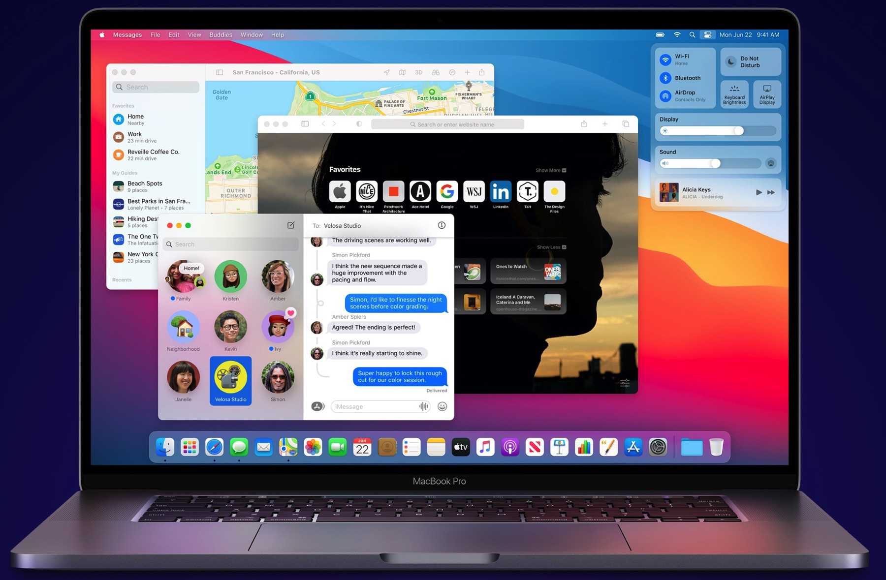
A recent article in the Wall Street Journal created a concerted reactions chain from news sites and people on Twitter. In “Why Apple’s iMessage Is Winning: Teens Dread the Green Text Bubble”, the WSJ article paints Apple as using highly questionable tactics to keep its users locked in iMessage messaging service. I want to share my thoughts on this.
Peer pressure among teens isn’t a new phenomenon, far from it. Way before the Internet became accessible, when I was a teen myself, I vividly remember the feeling of not wearing the same brand of clothes as my friends. The problem here is teen’s social behaviour, not the technology. They are the one to blame if they reject people using non iMessage messaging service. I would argue that Apple as nothing to do with this. Sure, they like the stickiness of their platform, but I wouldn’t say it’s the defining goal when they add features to it.
Of course, Apple can’t provide the dot-dot-dot feedback showing people who are actually writing a response to a text message because the SMS standard doesn’t provide that. Duh.
When Mr. Hiroshi Lockheimer from Google refers to “standards” in one of his tweets to fix the interoperability issues of messaging platforms like iMessage, I wonder what standards he is referring to, Google’s RCS. And if this standard is actually a standard, why is it so hard to take off? Why are messaging services like Discord, Telegram, WhatsApp, WeChat, Facebook Messenger, etc.?
I would also argue that, for a company like Apple, the ecosystem stickiness is part of their differentiating factor. Of course, iMessage plays a major role here. For a company like Google, where massively providing free services with ads, the more people who get to use your services, the more revenues you get. It’s their differentiating factor. It’s easy to say: Apple should open up their messaging service.
My anecdotal experience is to the effect that when something breaks in the conversation between an iPhone user and an Android users, they usually go with Messenger or WhatsApp. People still have access to many alternatives.
WSJ’s article is a prime example that finding the right angle to portray Apple as the devil in the room attracts numerous clicks.
2022-01-09
One More Gripe Against Apple’s Photos Memory Feature
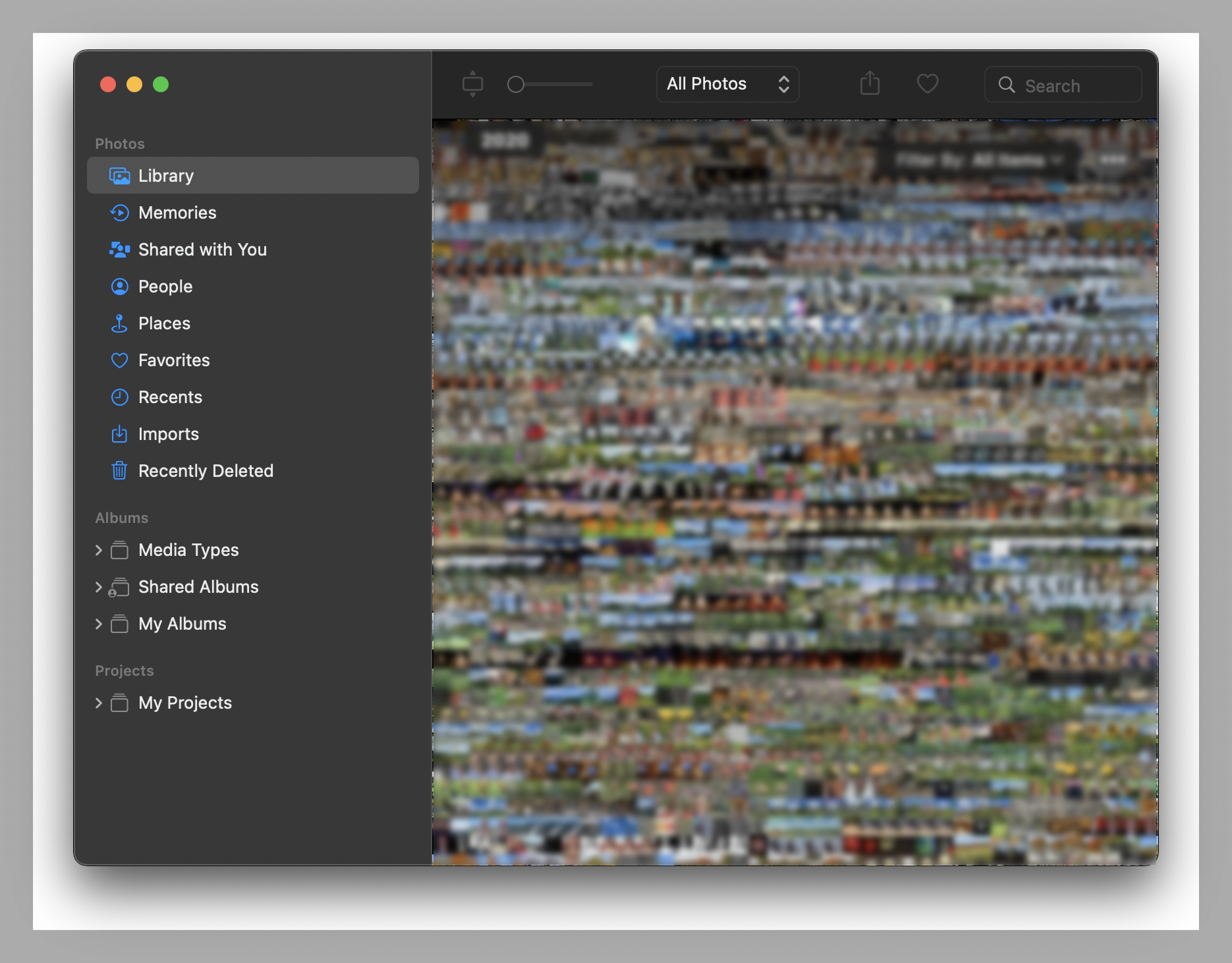
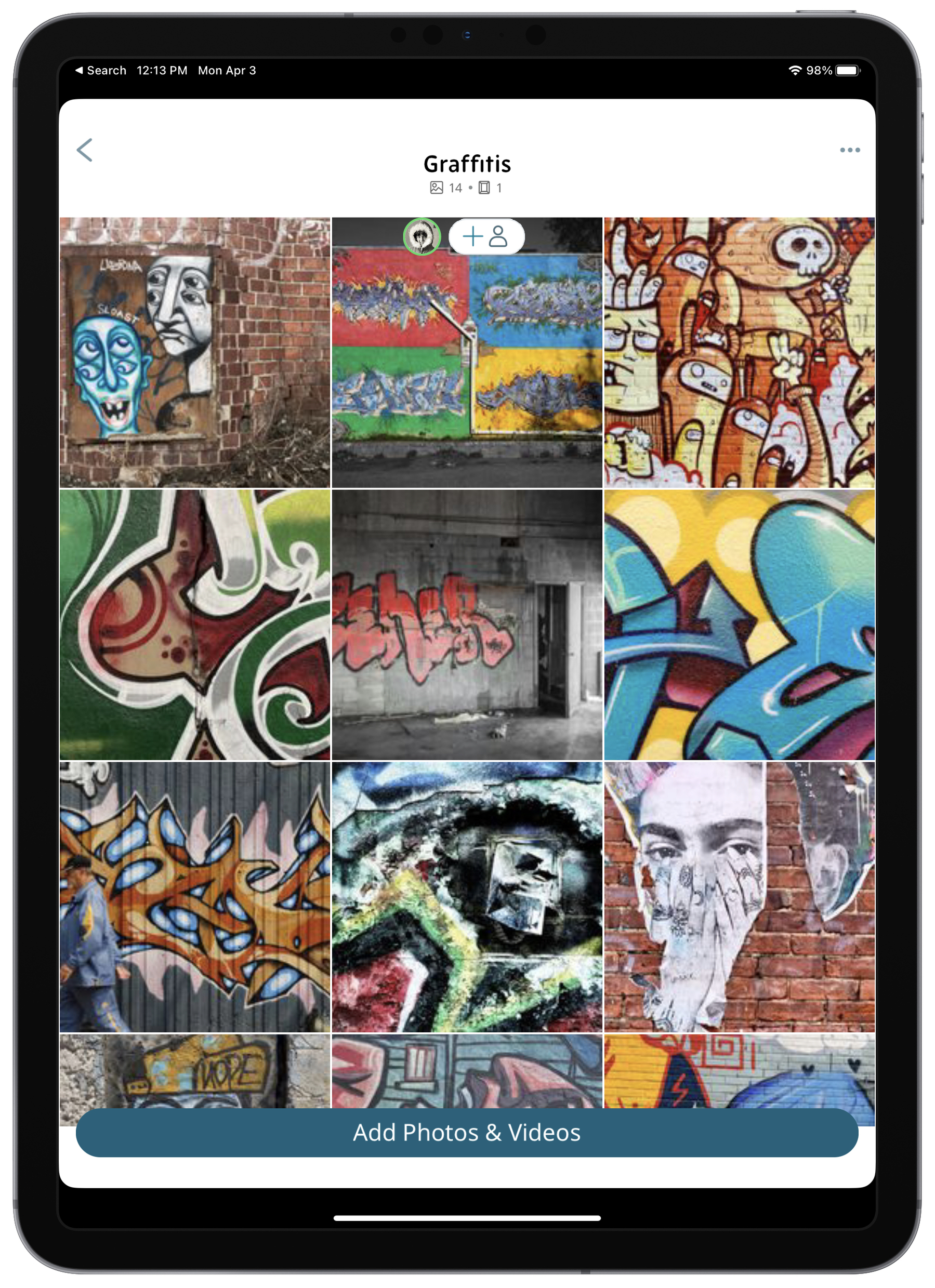
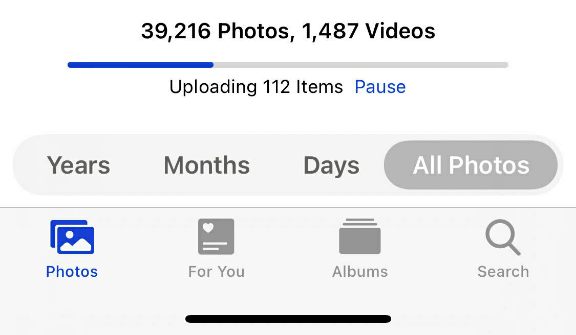
Jim Novell & Stephen Hackett both have valid points against Apple’s Photos Memory feature. I would another one: memories are created on a very aggressive schedule. There are way too many; I miss most of them. I don’t know if this is related to the fact that my library contains more than 42K images or if other factors come into play here. There should be a way to reduce the frequency.
2022-01-09
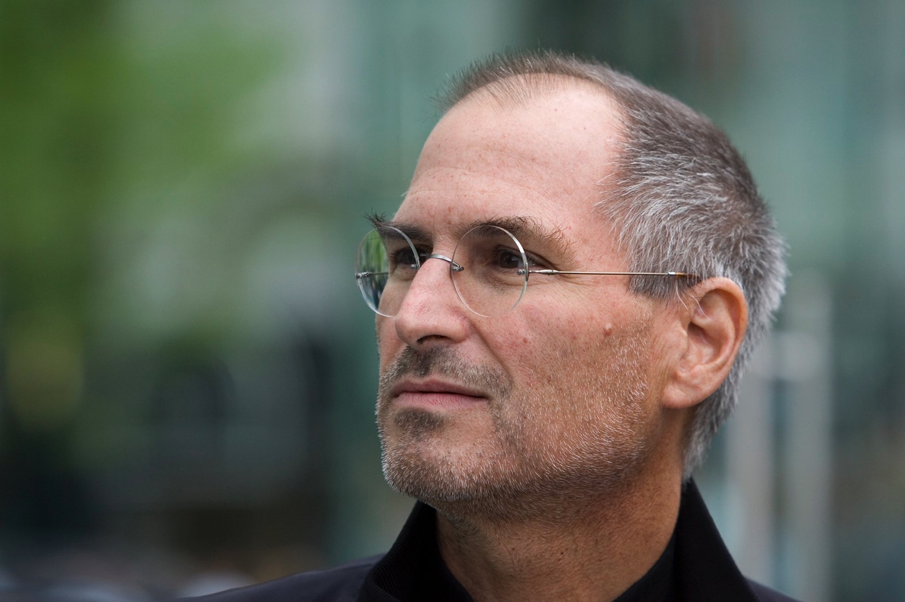
“It’s not just how things look, it’s about how things work.”
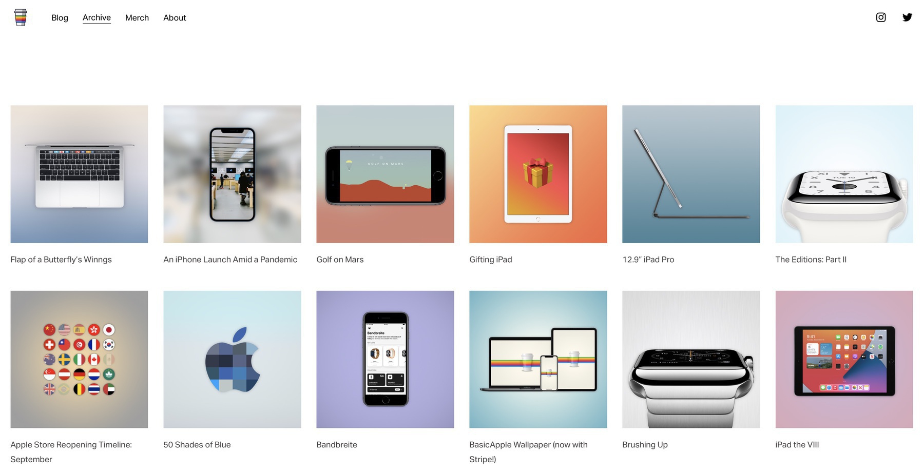
Somehow, I missed David Sparks’ observations regarding the Wallpaper feature of Apple’s Design Team (emphasis is mine):
Instead of quoting Steve Jobs, I would have preferred an explanation from Alan Dye about his philosophy of user interface design and what his north star is when he does his work. I’d like him to make his case. If he explained the thinking behind this minimal approach, it might make more sense. Maybe this article was never meant to be that kind of deep dive on design philosophy, but it feels like a missed opportunity.
Indeed. I’m not fond of Alan Dye’s work.
Source: The Wallpaper* Feature on the Apple Design Team and a Missed Opportunity - MacSparky
2022-01-10
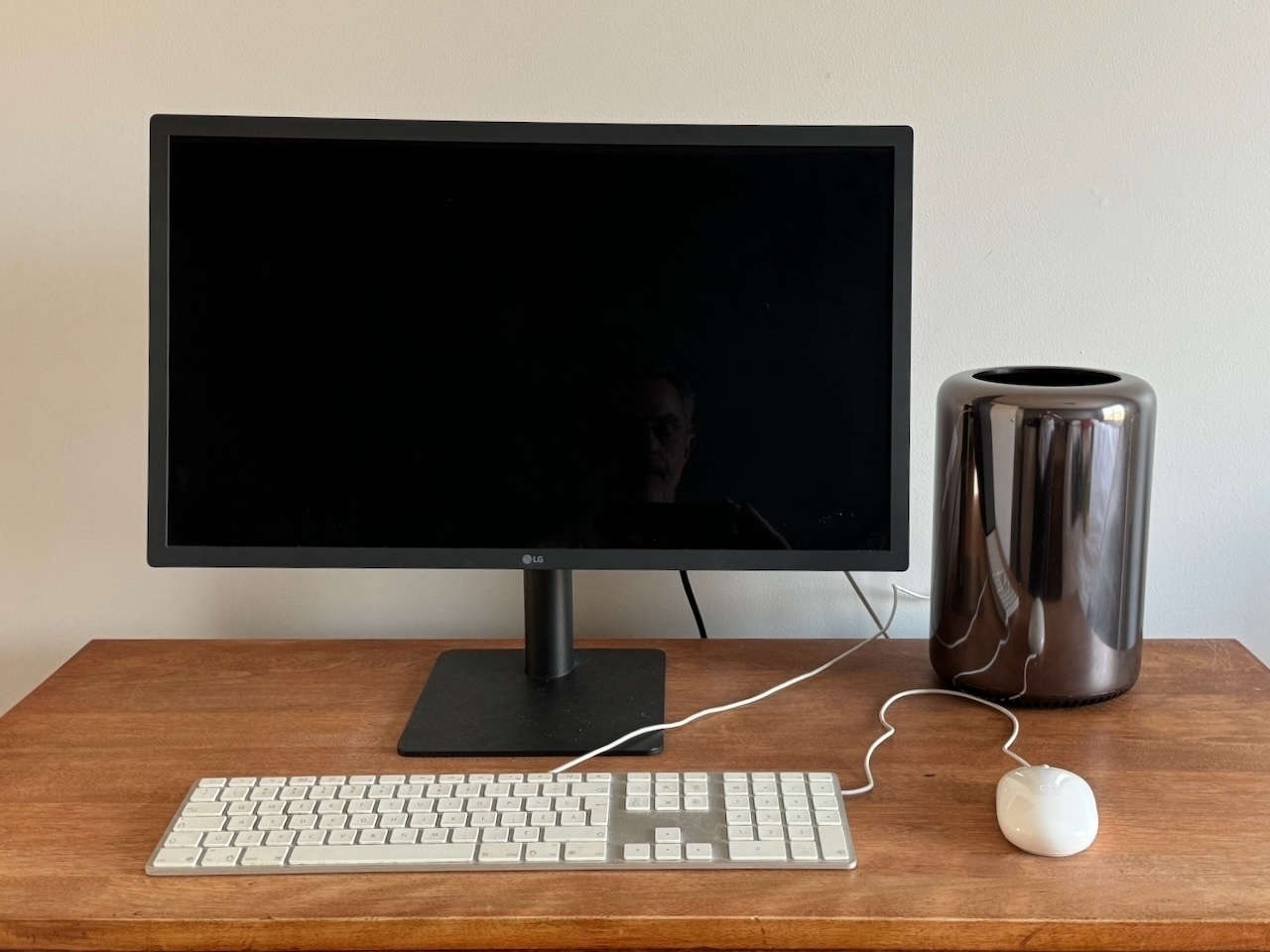
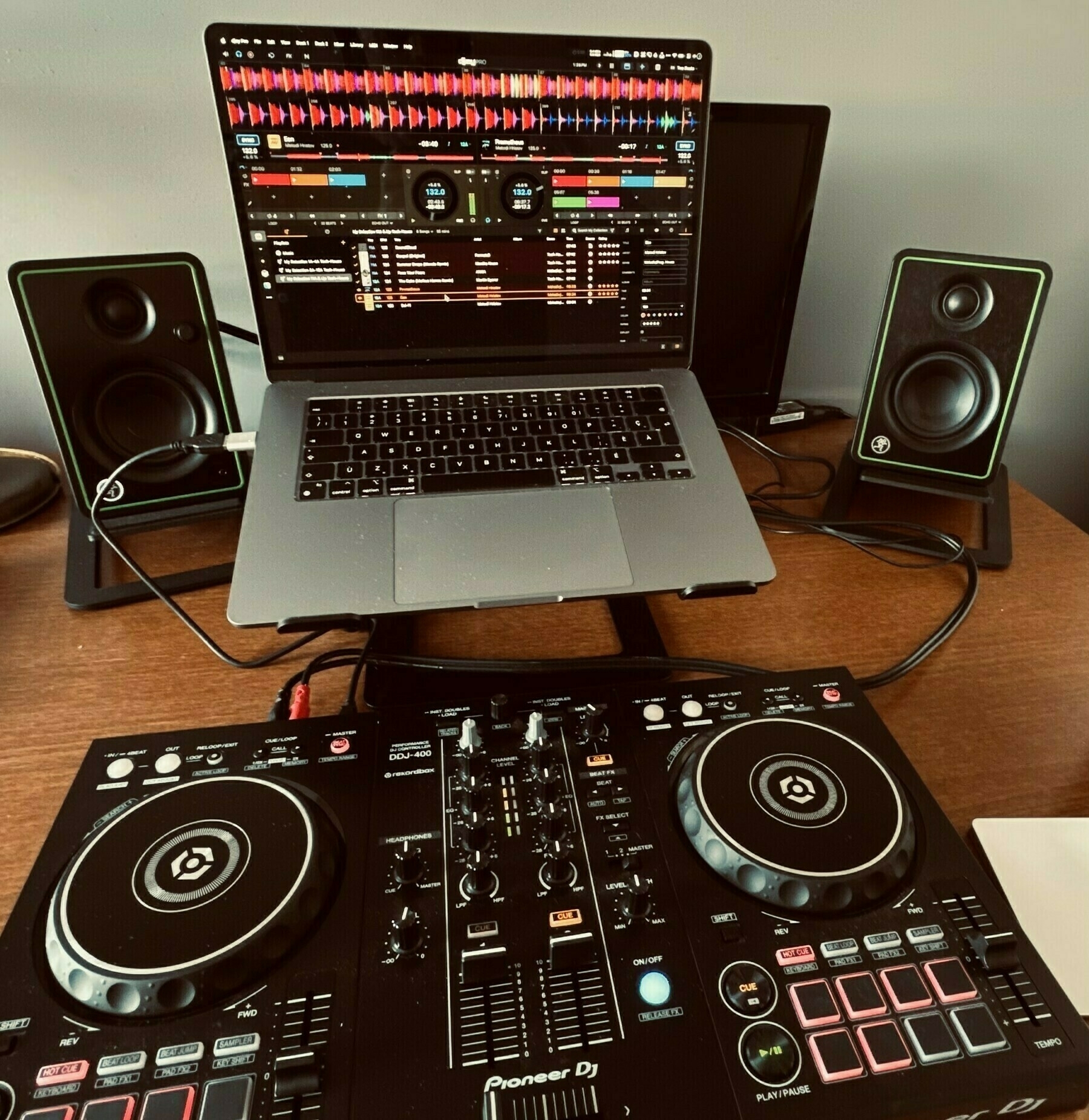
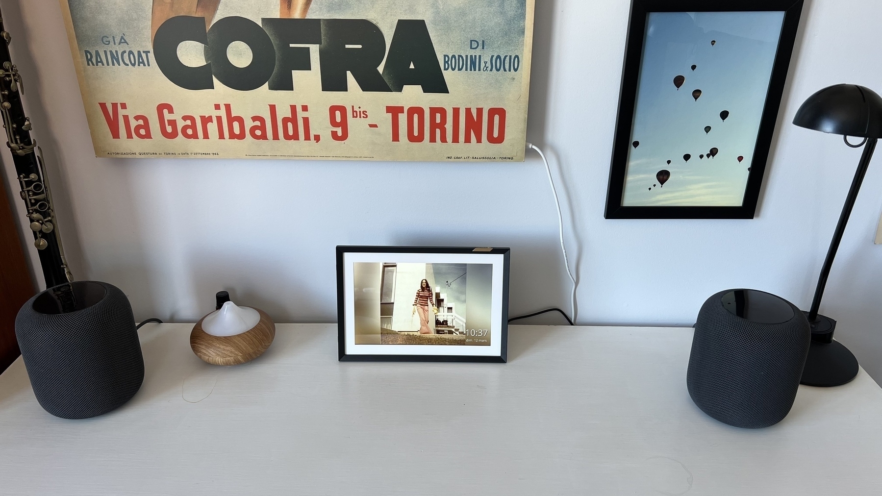
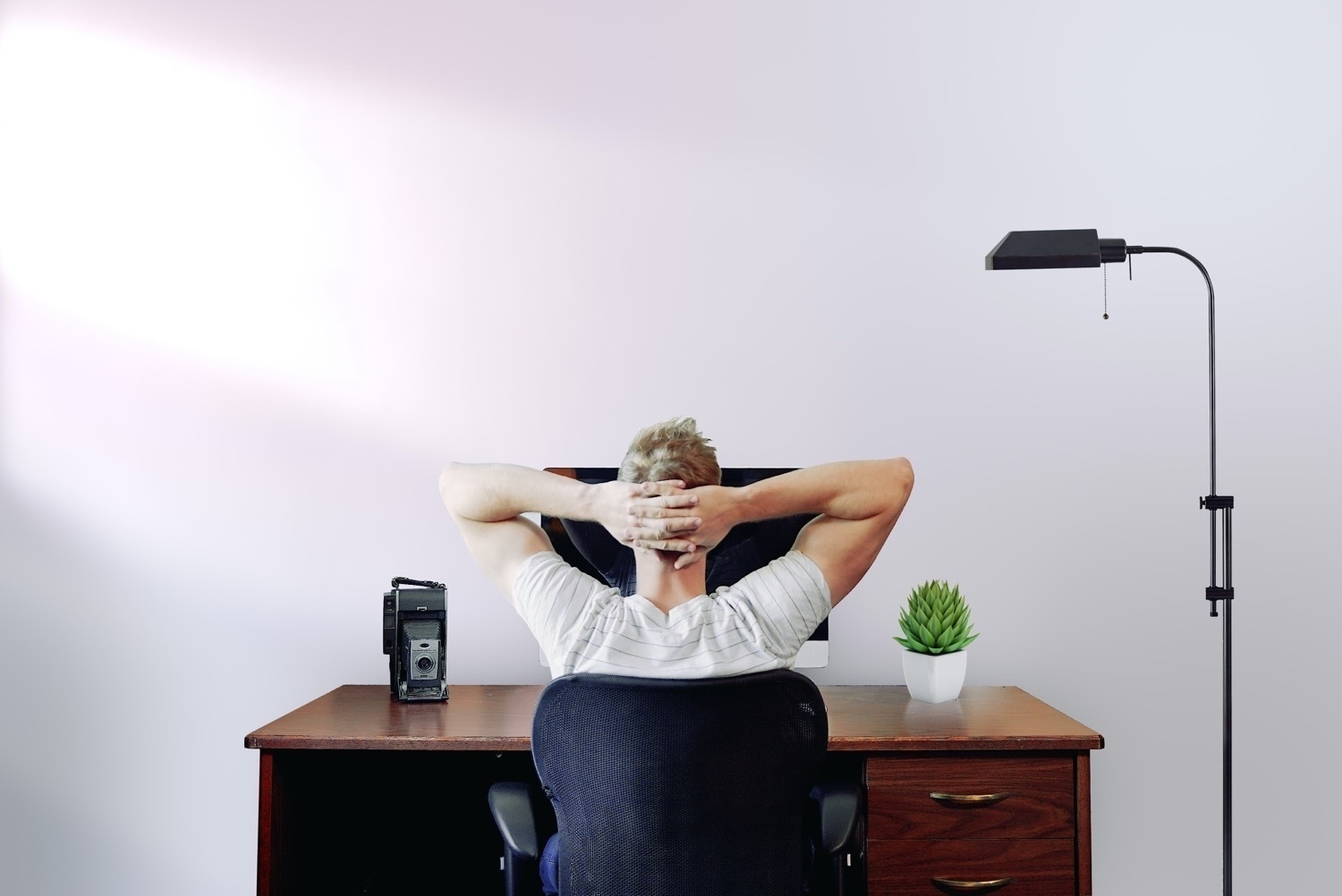
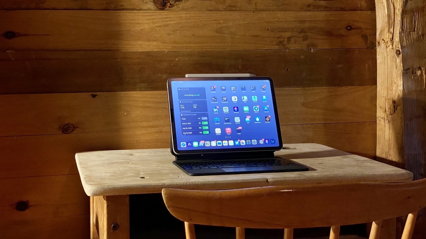
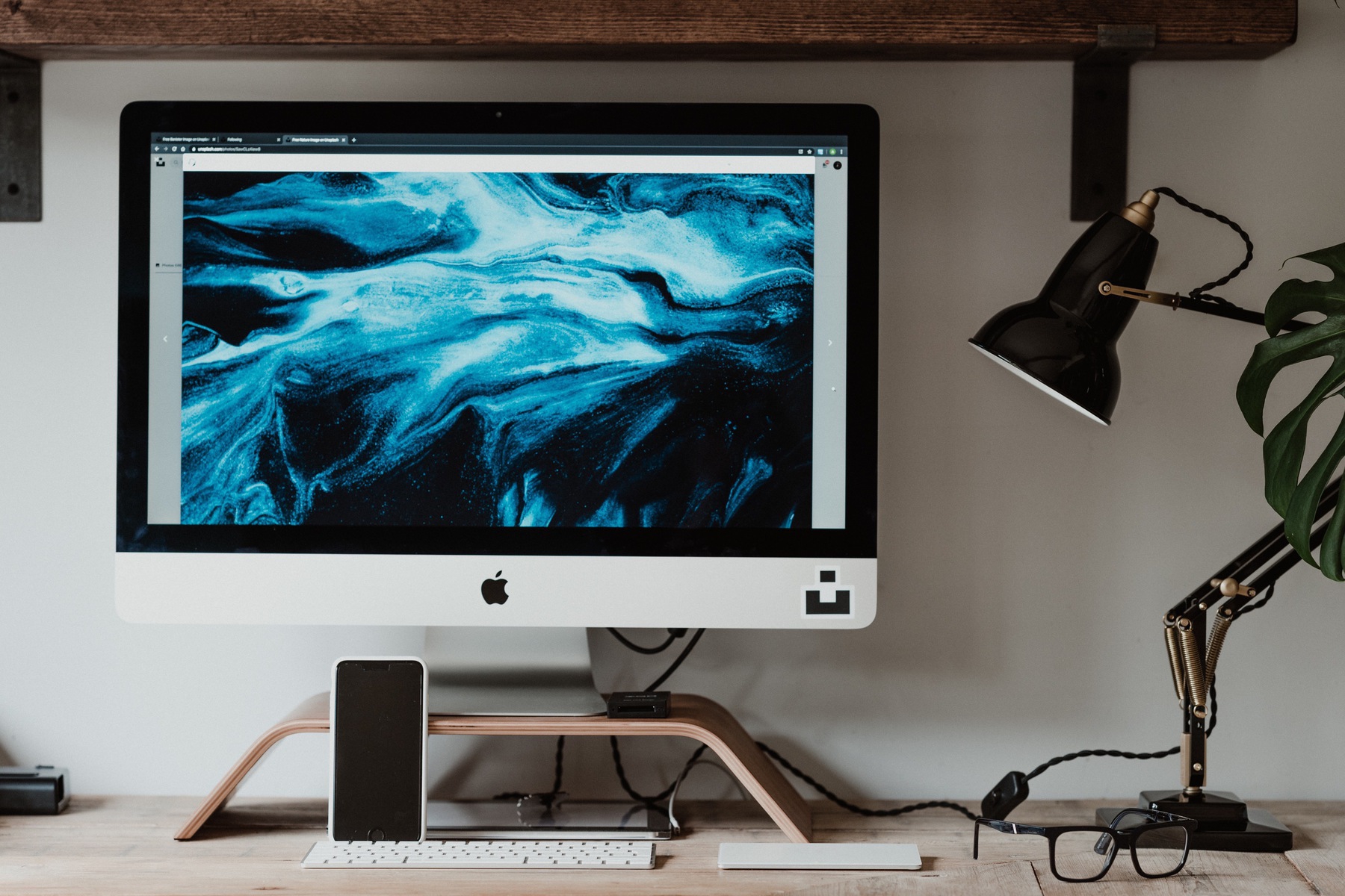
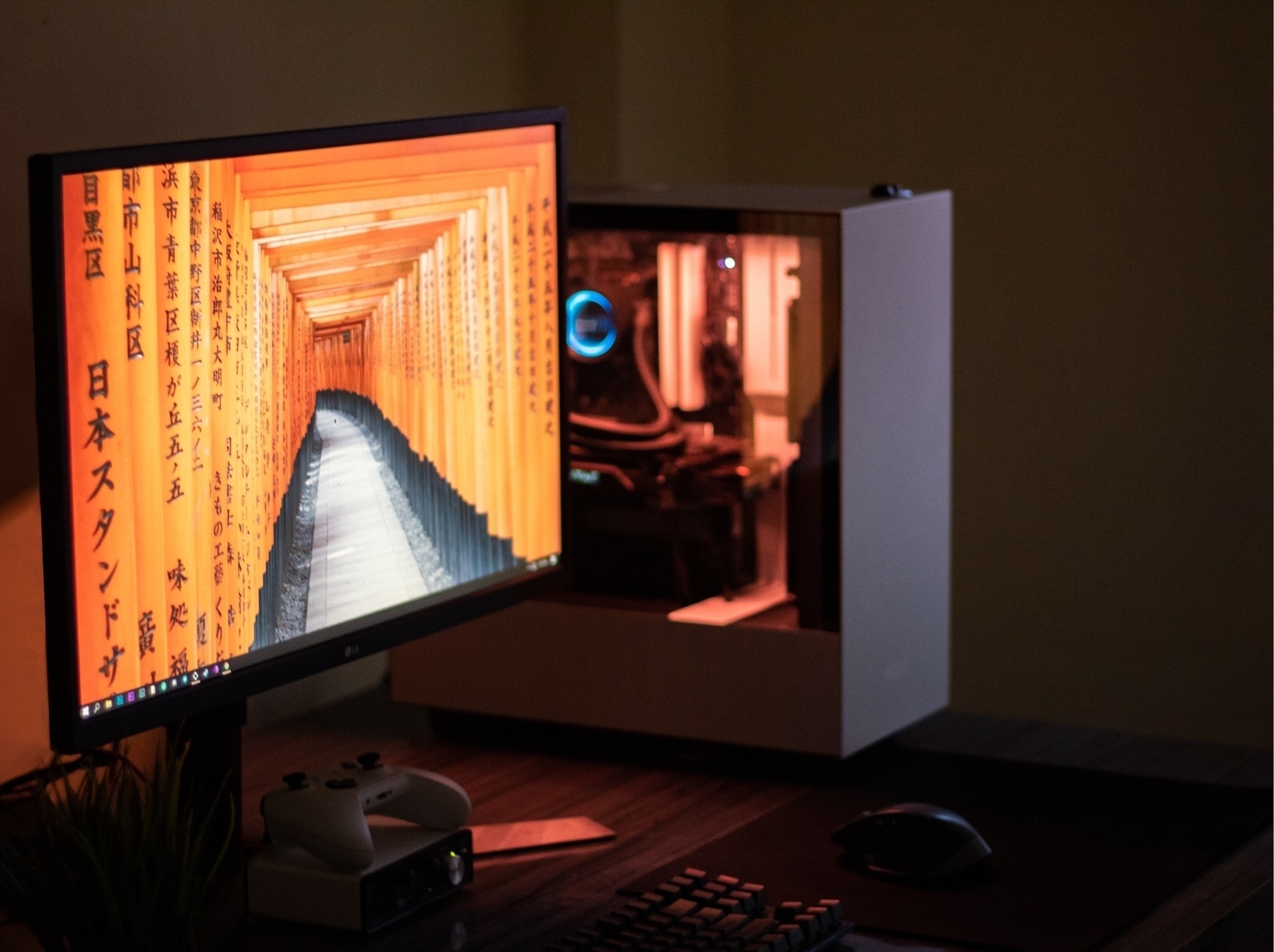
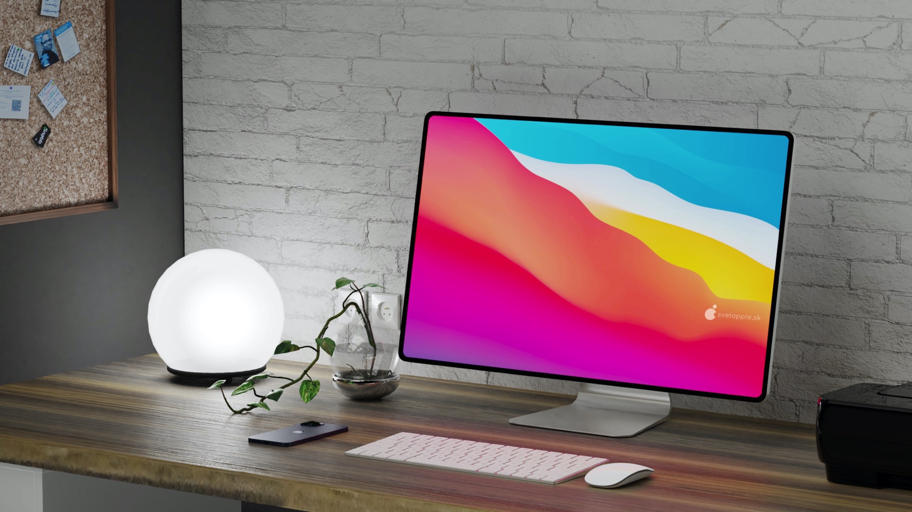
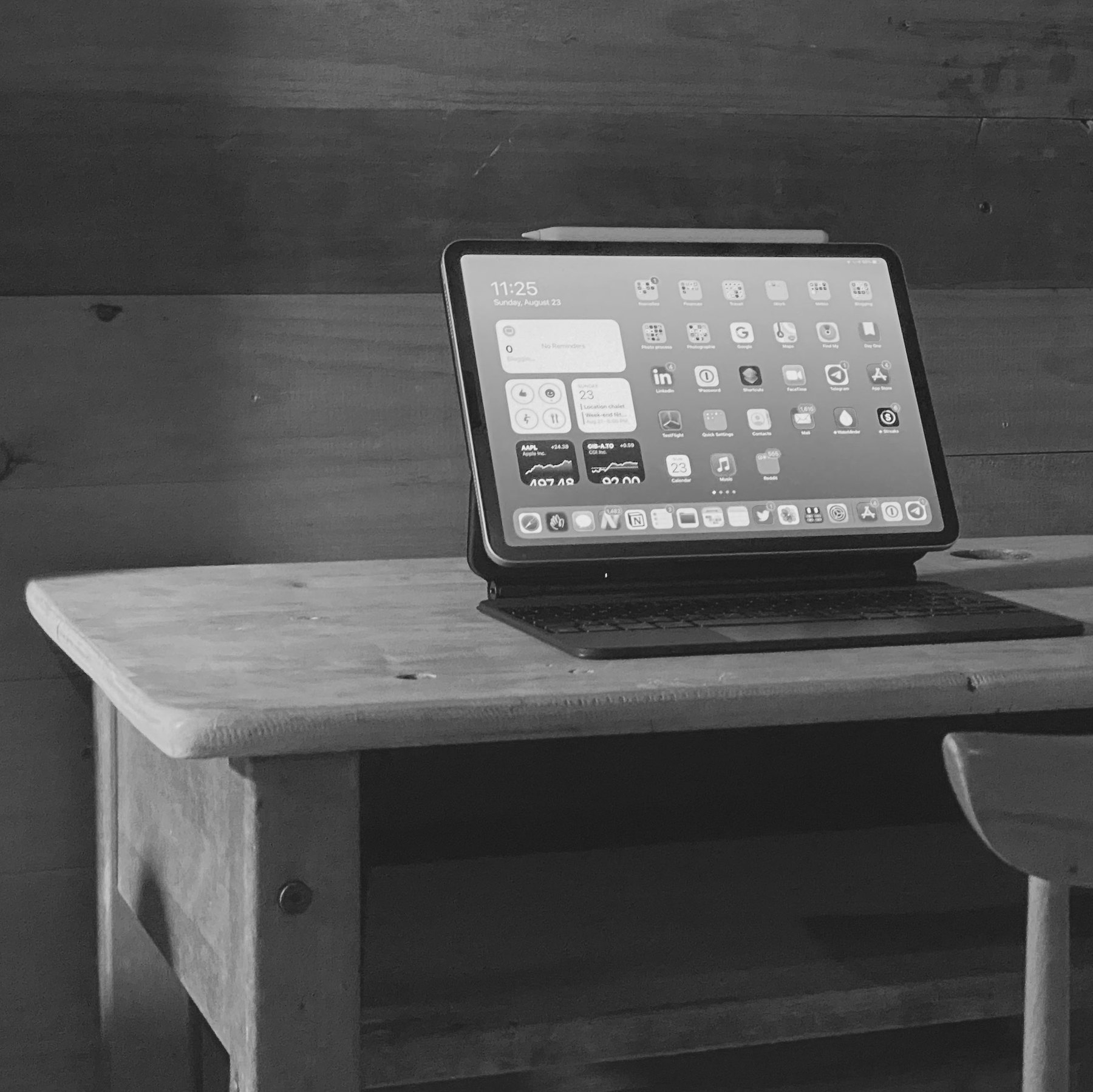
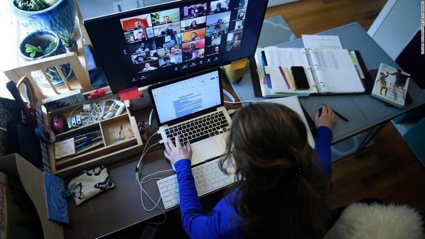
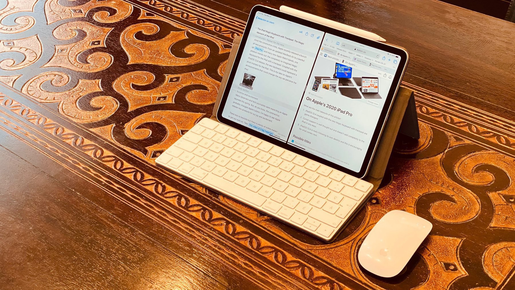
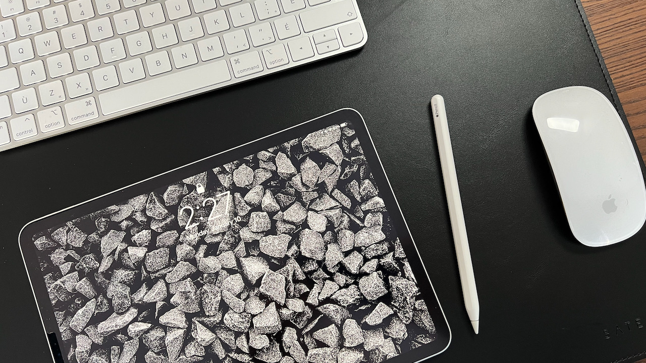
Working from home since March 2020. Over the months, I made quite a few tweaks to my home office. I’m so much more at ease at home than at the office with a desk, a chair, a lamp, and devices that I chose, instead of being imposed on me.
 2022-01-11
Carriers vs Apple
Om Malik writing on the iPhone fifteen anniversary and the carrier companies at the time (emphasis is mine):
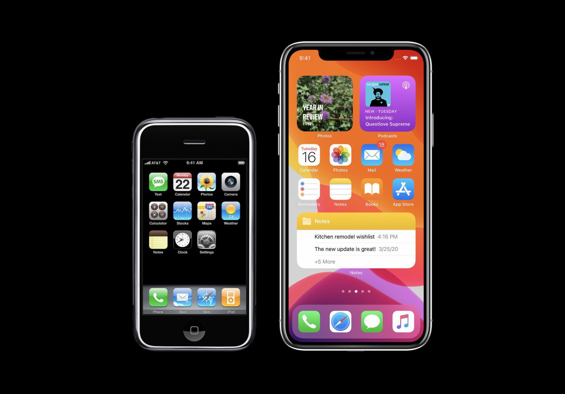
These were wireless walled gardens crammed with absolutely rotten apps, games, and everything from mobile backgrounds to ringtones. They were an opportunity for carriers to nickel-and-dime their customers and extracted mafia-like fees from startups. Source: Looking back: iPhone & its impact on mobile industry & us. – On my Om
I have great admiration for Mr. Malik, but a lot of people, especially developers, would jump in right here and use the same paragraph to describe Apple and its App Store today. You may agree or not with them. I mostly don’t.
2022-01-11
Bye Bye 500px
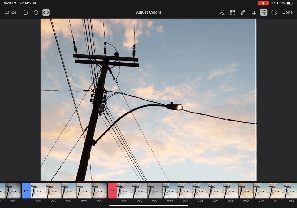
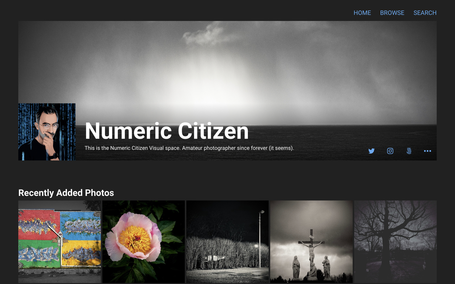
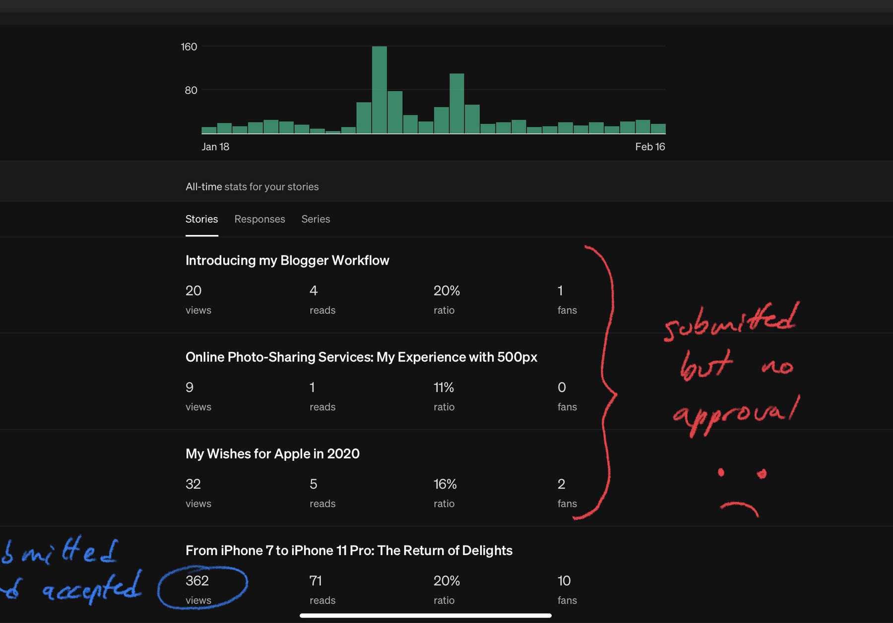
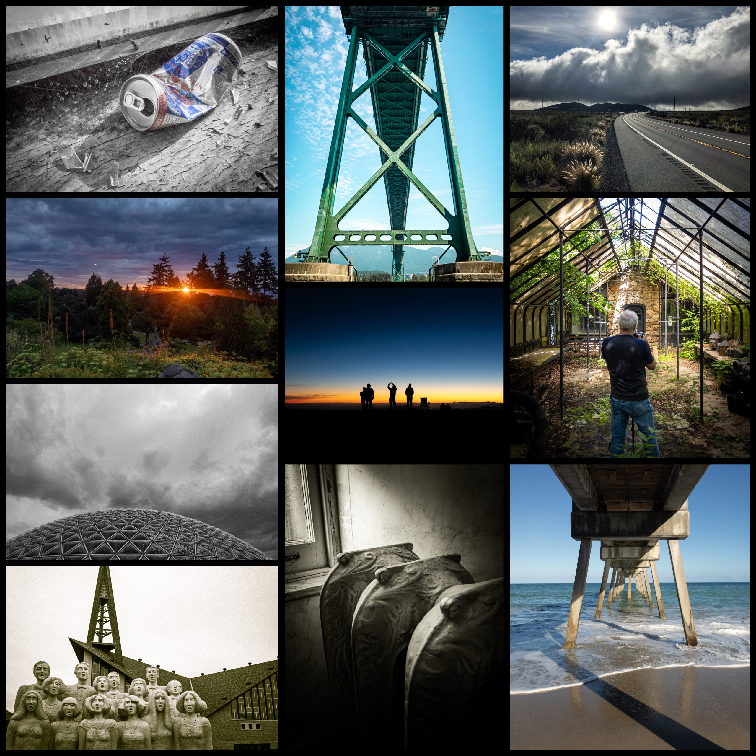
It was written on the walls: my subscription to 500px is coming to an end next week, and I won’t renew. It was a nice ride for sure, but Smugmug + Glass took over. Sure, comparing those services isn’t fair. For my needs, 500px doesn’t fit anymore. Another reason is the fact that I’m not taking as many photos as I used to, thanks to the pandemic.
I’ll keep my 500px account but in “read-only” mode for the year to come.
2022-01-12
On iOS 15 Update Conundrum — Why Apple Is Changing is Mind
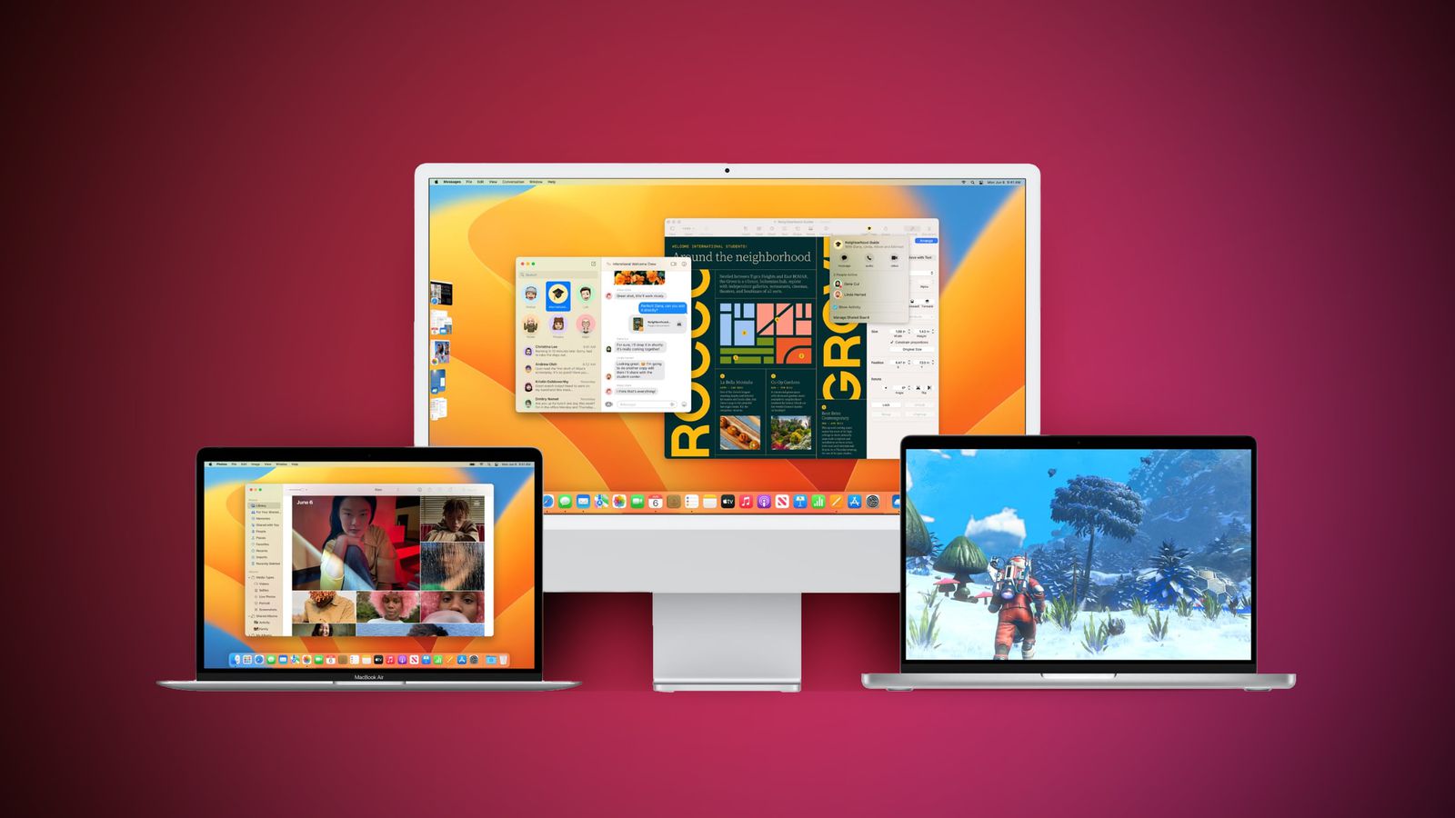
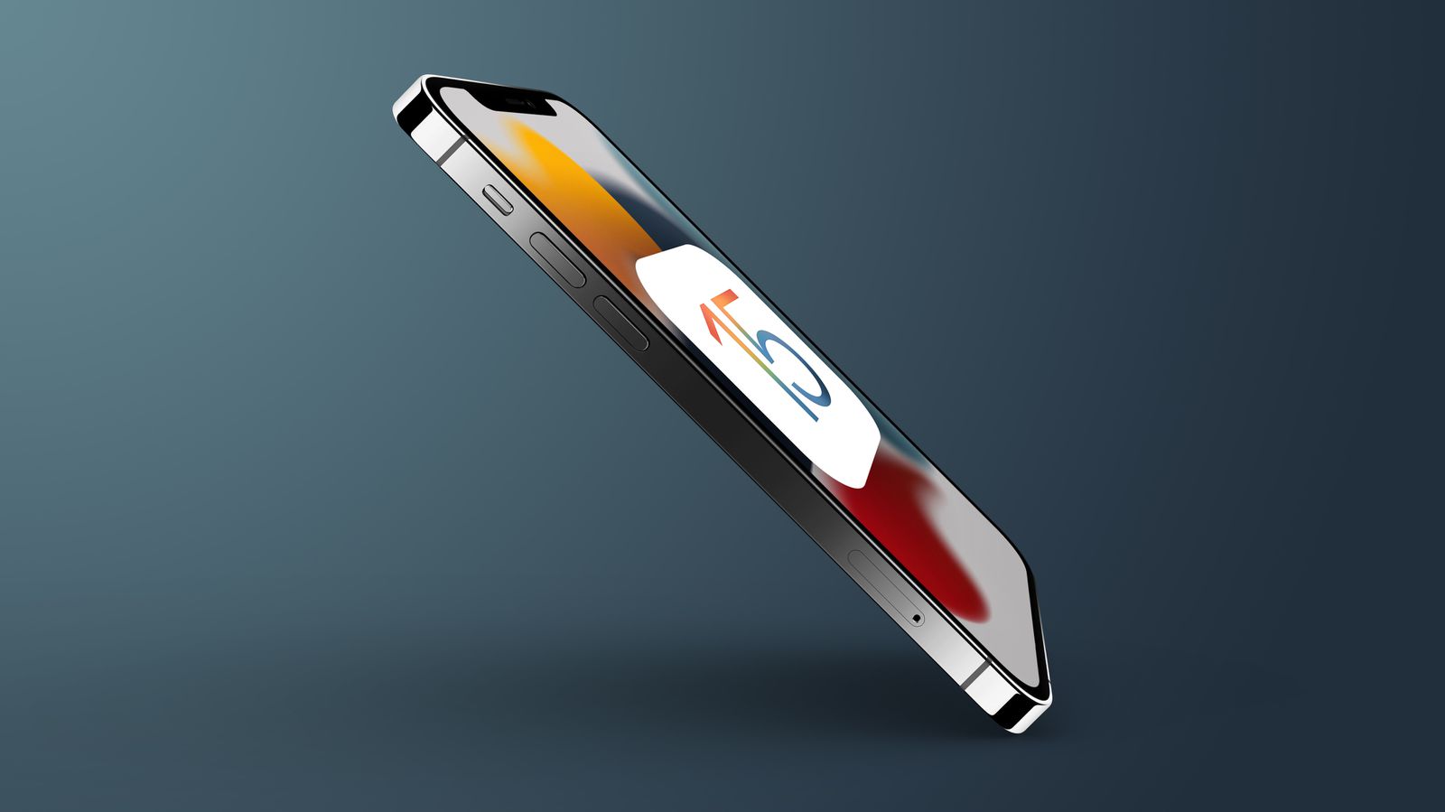
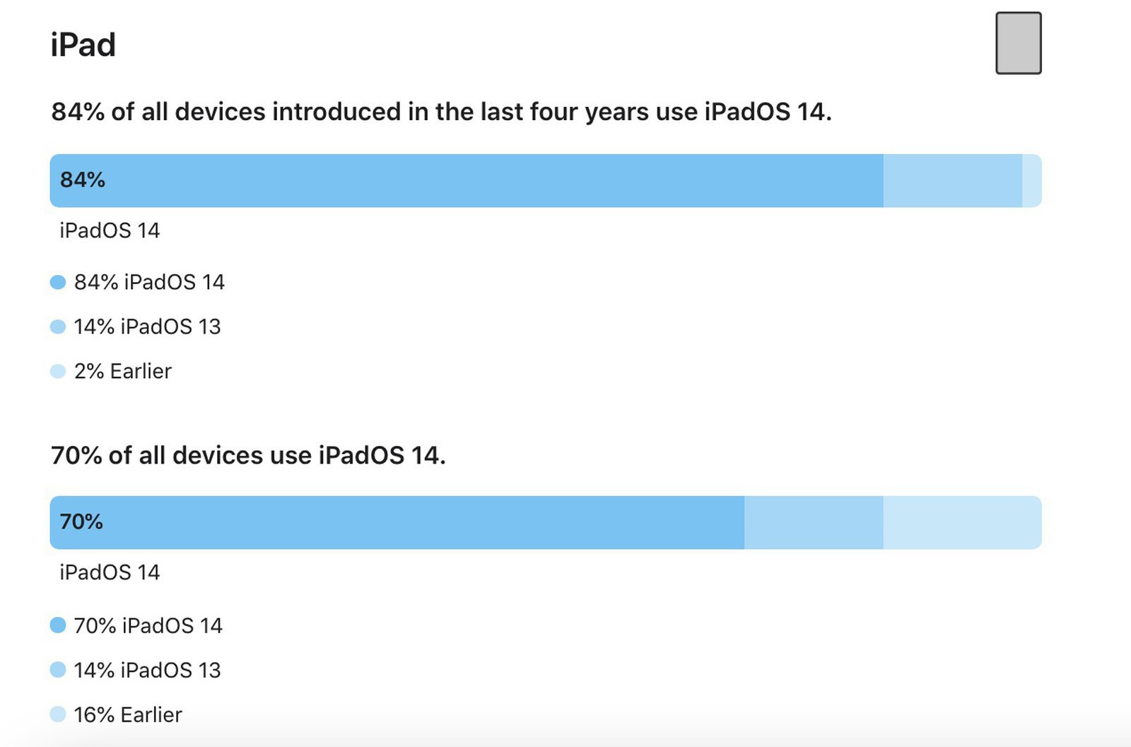
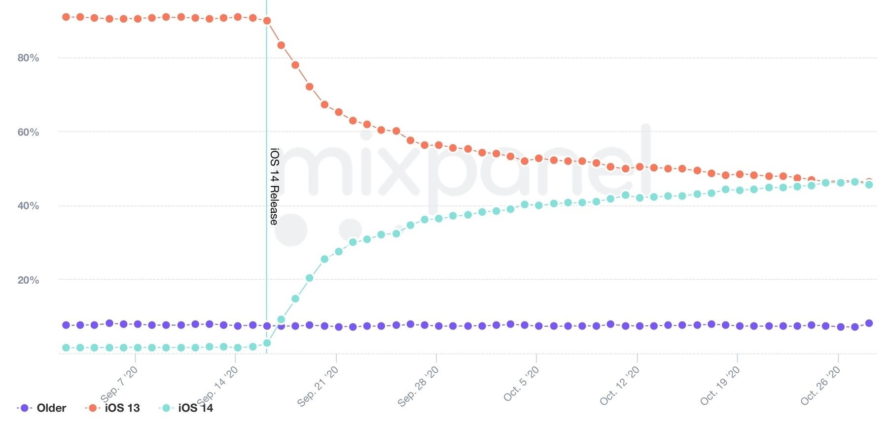
Apple finally published the numbers of people who upgraded to iOS 15 and iPadOS 15. While the percentages show the vast majority of users upgraded their devices, there are more people than with previous years who didn’t. It’s probably Apple’s fault.
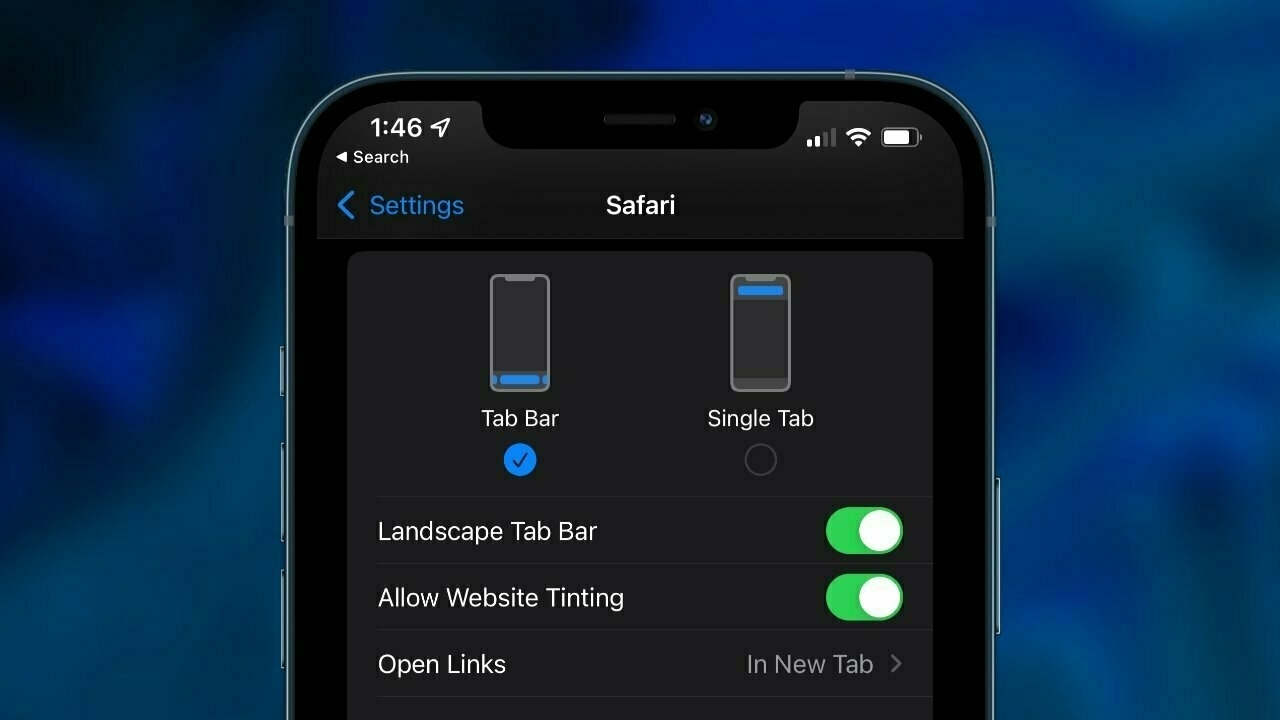
With iOS 15, Apple is no longer forcing users to adopt the latest release to get the latest security updates. A user running iOS 14.7 can stay there as long as he can apply the security patches made available for that version. It’s an entirely new approach for Apple. I wonder why Apple made that change. I think I found one big reason.
If you compare Apple’s ecosystem to Android, Apple has a clear advantage here by being able to move the needle much faster for releases adoption, until now. In a single year, Apple can transform its ecosystem of users by adding features that are quickly making their way into people’s devices. By allowing users to stay on previous releases, Apple is shooting itself in the foot. Now they seem to change their mind, though. Apple could be changing his mind. As reported by MacRumors:
iOS 15 used to be listed as an optional update on devices running iOS 14, but now it is front and center on devices that still have iOS 14, and it is the only available update option as Apple has now stopped making security updates available for devices running iOS 14. Those who want the latest security fixes need to upgrade to iOS 15, as all devices capable of running iOS 14 also support iOS 15.
I think it’s the right move for Apple, since they tend to support old devices longer than other manufacturers. Apple could tweak iOS to be less aggressive is upgrading to the latest release by introducing delays in a random manner. Users eager to upgrade can do so manually, others would randomly get a notification suggesting the availability of the newer release. As time passes, those notifications would increase in frequency. This new behaviour will probably never come to like and not be enough. Here is why.
There might be another reason behind this change of mind on Apple’s part. Look at antitrust regulations looming on the horizon all around the world. Apple is probably making sure that all users adopt the latest release faster to comply with possible new regulations imposed by lawmakers, which would need to trigger changes to the operating system.
2022-01-14
Green vs Blue Bubbles: The Definitive And Honest Point of View
A few days ago, I wrote a small commentary post regarding the WSJ article on Apple’s iMessage, its effects on the crowd of young iPhone users, and how Apple is being evil. Man, it’s a pale and superficial perspective compared to Gruber’s view of the article, and the controversy that followed. Must read, if this short-lived controversy is picking up your curiosity.
2022-01-15